Responsive Vertical Timeline Design using HTML and CSS
Discover how to craft a Responsive Vertical Timeline Design utilizing HTML & CSS effortlessly. In a previous blog, I unveiled the process of fashioning a Responsive Testimonials Section exclusively with HTML & CSS. Now, I’d like you to go into creating a Vertical Timeline using the same tools. This sought-after design was inspired by one of our subscribers. If you crave more coding tutorials or wish to suggest topics, comment on my YouTube channel or blog.
A timeline serves as a chronological chart detailing pivotal events across historical periods. The Vertical Timeline, guided by a vertical axis, facilitates seamless event navigation. It has become a ubiquitous feature on websites, serving as both a functional and aesthetic component of web design, offering a succinct showcase of significant historical moments.
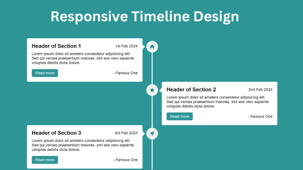
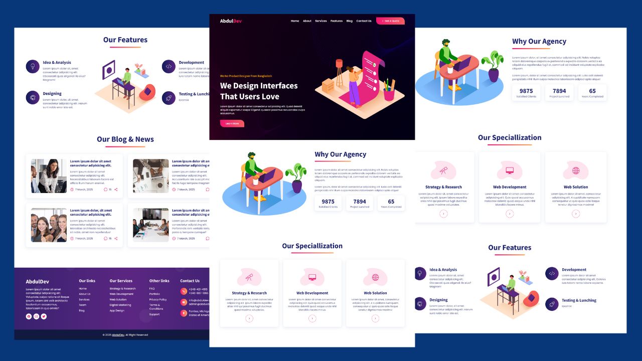
My Vertical Timeline Design, as depicted in the preview image, impeccably presents event titles, descriptions, dates, and authors. Positioned centrally is a white vertical line embellished with icons, each corresponding to a specific event. While my design currently encompasses six events, it remains effortlessly scalable to accommodate additional entries.
Concluding the timeline is a scroll-up icon, simplifying navigation to the page’s apex with a single click. This timeline boasts responsiveness, ensuring optimal display across various devices, and is exclusively crafted using HTML & CSS.
Check Out Those Useful Articles
Responsive Vertical Timeline Design Using HTML and CSS (Source Code)
To implement this Animated Login Form on your website, adhere to these straightforward steps:
Start by establishing a directory for your project. You have the liberty to name this folder as per your preference. Within this folder, we’ll generate the requisite files.
Generate a new file titled index.html. It’s essential that the file be named “index” with the extension “.html”.
Subsequently, craft another file named style.css. Once more, confirm that the file name is “style” with the extension “.css”.
First, Copy the bellow HTML code and paste the codes into your index.html file.
					<!DOCTYPE html>
<html lang="en">
<head>
    <meta charset="UTF-8">
    <meta name="viewport" content="width=device-width, initial-scale=1.0">
    <title>Responsive Vertical Timeline Design By AbdulDev</title>

    <link rel="stylesheet" href="style.css">
     <script type="litespeed/javascript" data-src="https://kit.fontawesome.com/8b7107198b.js"></script> </head>
<body>
    <div class="container">
      <div class="center-line">
        <a href="#" class="scroll-icon"><i class="fas fa-caret-up"></i></a>
      </div>
      <div class="row first">
        <section>
          <i class="icon fas fa-home"></i>
          <div class="details">
            <span class="title">Header of Section 1</span>
            <span>1st Feb 2024</span>
          </div>
          <p>Lorem ipsum dolor sit ameters consectetur adipisicing elit. Sed qui veroes praesentium maiores, sint eos vero sapiente voluptas debitis dicta dolore.</p>
          <div class="bottom">
            <a href="#">Read more</a>
            <i>- Famous One</i>
          </div>
        </section>
      </div>
      <div class="row second">
        <section>
          <i class="icon fas fa-star"></i>
          <div class="details">
            <span class="title">Header of Section 2</span>
            <span>2nd Feb 2024</span>
          </div>
          <p>Lorem ipsum dolor sit ameters consectetur adipisicing elit. Sed qui veroes praesentium maiores, sint eos vero sapiente voluptas debitis dicta dolore.</p>
          <div class="bottom">
            <a href="#">Read more</a>
            <i>- Famous One</i>
          </div>
        </section>
      </div>
      <div class="row first">
        <section>
          <i class="icon fas fa-rocket"></i>
          <div class="details">
            <span class="title">Header of Section 3</span>
            <span>3rd Feb 2024</span>
          </div>
          <p>Lorem ipsum dolor sit ameters consectetur adipisicing elit. Sed qui veroes praesentium maiores, sint eos vero sapiente voluptas debitis dicta dolore.</p>
          <div class="bottom">
            <a href="#">Read more</a>
            <i>- Famous One</i>
          </div>
        </section>
      </div>
      <div class="row second">
        <section>
          <i class="icon fas fa-globe"></i>
          <div class="details">
            <span class="title">Header of Section 4</span>
            <span>4th Feb 2024</span>
          </div>
          <p>Lorem ipsum dolor sit ameters consectetur adipisicing elit. Sed qui veroes praesentium maiores, sint eos vero sapiente voluptas debitis dicta dolore.</p>
          <div class="bottom">
            <a href="#">Read more</a>
            <i>- Famous One</i>
          </div>
        </section>
      </div>
      <div class="row first">
        <section>
          <i class="icon fas fa-paper-plane"></i>
          <div class="details">
            <span class="title">Header of Section 5</span>
            <span>5th Feb 2024</span>
          </div>
          <p>Lorem ipsum dolor sit ameters consectetur adipisicing elit. Sed qui veroes praesentium maiores, sint eos vero sapiente voluptas debitis dicta dolore.</p>
          <div class="bottom">
            <a href="#">Read more</a>
            <i>- Famous One</i>
          </div>
        </section>
      </div>
      <div class="row second">
        <section>
          <i class="icon fas fa-map-marker-alt"></i>
          <div class="details">
            <span class="title">Header of Section 6</span>
            <span>6th Feb 2024</span>
          </div>
          <p>Lorem ipsum, dolor sit amet consectetur adipisicing elit. Quaerat tempora necessitatibus laboriosam deleniti repellendus? Dolorem odit aut ea repellat id sed.</p>
          <div class="bottom">
            <a href="#">Read more</a>
            <i>- Famous One</i>
          </div>
        </section>
      </div>
    </div> <script data-no-optimize="1">window.lazyLoadOptions=Object.assign({},{threshold:300},window.lazyLoadOptions||{});!function(t,e){"object"==typeof exports&&"undefined"!=typeof module?module.exports=e():"function"==typeof define&&define.amd?define(e):(t="undefined"!=typeof globalThis?globalThis:t||self).LazyLoad=e()}(this,function(){"use strict";function e(){return(e=Object.assign||function(t){for(var e=1;e<arguments.length;e++){var n,a=arguments[e];for(n in a)Object.prototype.hasOwnProperty.call(a,n)&&(t[n]=a[n])}return t}).apply(this,arguments)}function o(t){return e({},at,t)}function l(t,e){return t.getAttribute(gt+e)}function c(t){return l(t,vt)}function s(t,e){return function(t,e,n){e=gt+e;null!==n?t.setAttribute(e,n):t.removeAttribute(e)}(t,vt,e)}function i(t){return s(t,null),0}function r(t){return null===c(t)}function u(t){return c(t)===_t}function d(t,e,n,a){t&&(void 0===a?void 0===n?t(e):t(e,n):t(e,n,a))}function f(t,e){et?t.classList.add(e):t.className+=(t.className?" ":"")+e}function _(t,e){et?t.classList.remove(e):t.className=t.className.replace(new RegExp("(^|\\s+)"+e+"(\\s+|$)")," ").replace(/^\s+/,"").replace(/\s+$/,"")}function g(t){return t.llTempImage}function v(t,e){!e||(e=e._observer)&&e.unobserve(t)}function b(t,e){t&&(t.loadingCount+=e)}function p(t,e){t&&(t.toLoadCount=e)}function n(t){for(var e,n=[],a=0;e=t.children[a];a+=1)"SOURCE"===e.tagName&&n.push(e);return n}function h(t,e){(t=t.parentNode)&&"PICTURE"===t.tagName&&n(t).forEach(e)}function a(t,e){n(t).forEach(e)}function m(t){return!!t[lt]}function E(t){return t[lt]}function I(t){return delete t[lt]}function y(e,t){var n;m(e)||(n={},t.forEach(function(t){n[t]=e.getAttribute(t)}),e[lt]=n)}function L(a,t){var o;m(a)&&(o=E(a),t.forEach(function(t){var e,n;e=a,(t=o[n=t])?e.setAttribute(n,t):e.removeAttribute(n)}))}function k(t,e,n){f(t,e.class_loading),s(t,st),n&&(b(n,1),d(e.callback_loading,t,n))}function A(t,e,n){n&&t.setAttribute(e,n)}function O(t,e){A(t,rt,l(t,e.data_sizes)),A(t,it,l(t,e.data_srcset)),A(t,ot,l(t,e.data_src))}function w(t,e,n){var a=l(t,e.data_bg_multi),o=l(t,e.data_bg_multi_hidpi);(a=nt&&o?o:a)&&(t.style.backgroundImage=a,n=n,f(t=t,(e=e).class_applied),s(t,dt),n&&(e.unobserve_completed&&v(t,e),d(e.callback_applied,t,n)))}function x(t,e){!e||0<e.loadingCount||0<e.toLoadCount||d(t.callback_finish,e)}function M(t,e,n){t.addEventListener(e,n),t.llEvLisnrs[e]=n}function N(t){return!!t.llEvLisnrs}function z(t){if(N(t)){var e,n,a=t.llEvLisnrs;for(e in a){var o=a[e];n=e,o=o,t.removeEventListener(n,o)}delete t.llEvLisnrs}}function C(t,e,n){var a;delete t.llTempImage,b(n,-1),(a=n)&&--a.toLoadCount,_(t,e.class_loading),e.unobserve_completed&&v(t,n)}function R(i,r,c){var l=g(i)||i;N(l)||function(t,e,n){N(t)||(t.llEvLisnrs={});var a="VIDEO"===t.tagName?"loadeddata":"load";M(t,a,e),M(t,"error",n)}(l,function(t){var e,n,a,o;n=r,a=c,o=u(e=i),C(e,n,a),f(e,n.class_loaded),s(e,ut),d(n.callback_loaded,e,a),o||x(n,a),z(l)},function(t){var e,n,a,o;n=r,a=c,o=u(e=i),C(e,n,a),f(e,n.class_error),s(e,ft),d(n.callback_error,e,a),o||x(n,a),z(l)})}function T(t,e,n){var a,o,i,r,c;t.llTempImage=document.createElement("IMG"),R(t,e,n),m(c=t)||(c[lt]={backgroundImage:c.style.backgroundImage}),i=n,r=l(a=t,(o=e).data_bg),c=l(a,o.data_bg_hidpi),(r=nt&&c?c:r)&&(a.style.backgroundImage='url("'.concat(r,'")'),g(a).setAttribute(ot,r),k(a,o,i)),w(t,e,n)}function G(t,e,n){var a;R(t,e,n),a=e,e=n,(t=Et[(n=t).tagName])&&(t(n,a),k(n,a,e))}function D(t,e,n){var a;a=t,(-1<It.indexOf(a.tagName)?G:T)(t,e,n)}function S(t,e,n){var a;t.setAttribute("loading","lazy"),R(t,e,n),a=e,(e=Et[(n=t).tagName])&&e(n,a),s(t,_t)}function V(t){t.removeAttribute(ot),t.removeAttribute(it),t.removeAttribute(rt)}function j(t){h(t,function(t){L(t,mt)}),L(t,mt)}function F(t){var e;(e=yt[t.tagName])?e(t):m(e=t)&&(t=E(e),e.style.backgroundImage=t.backgroundImage)}function P(t,e){var n;F(t),n=e,r(e=t)||u(e)||(_(e,n.class_entered),_(e,n.class_exited),_(e,n.class_applied),_(e,n.class_loading),_(e,n.class_loaded),_(e,n.class_error)),i(t),I(t)}function U(t,e,n,a){var o;n.cancel_on_exit&&(c(t)!==st||"IMG"===t.tagName&&(z(t),h(o=t,function(t){V(t)}),V(o),j(t),_(t,n.class_loading),b(a,-1),i(t),d(n.callback_cancel,t,e,a)))}function $(t,e,n,a){var o,i,r=(i=t,0<=bt.indexOf(c(i)));s(t,"entered"),f(t,n.class_entered),_(t,n.class_exited),o=t,i=a,n.unobserve_entered&&v(o,i),d(n.callback_enter,t,e,a),r||D(t,n,a)}function q(t){return t.use_native&&"loading"in HTMLImageElement.prototype}function H(t,o,i){t.forEach(function(t){return(a=t).isIntersecting||0<a.intersectionRatio?$(t.target,t,o,i):(e=t.target,n=t,a=o,t=i,void(r(e)||(f(e,a.class_exited),U(e,n,a,t),d(a.callback_exit,e,n,t))));var e,n,a})}function B(e,n){var t;tt&&!q(e)&&(n._observer=new IntersectionObserver(function(t){H(t,e,n)},{root:(t=e).container===document?null:t.container,rootMargin:t.thresholds||t.threshold+"px"}))}function J(t){return Array.prototype.slice.call(t)}function K(t){return t.container.querySelectorAll(t.elements_selector)}function Q(t){return c(t)===ft}function W(t,e){return e=t||K(e),J(e).filter(r)}function X(e,t){var n;(n=K(e),J(n).filter(Q)).forEach(function(t){_(t,e.class_error),i(t)}),t.update()}function t(t,e){var n,a,t=o(t);this._settings=t,this.loadingCount=0,B(t,this),n=t,a=this,Y&&window.addEventListener("online",function(){X(n,a)}),this.update(e)}var Y="undefined"!=typeof window,Z=Y&&!("onscroll"in window)||"undefined"!=typeof navigator&&/(gle|ing|ro)bot|crawl|spider/i.test(navigator.userAgent),tt=Y&&"IntersectionObserver"in window,et=Y&&"classList"in document.createElement("p"),nt=Y&&1<window.devicePixelRatio,at={elements_selector:".lazy",container:Z||Y?document:null,threshold:300,thresholds:null,data_src:"src",data_srcset:"srcset",data_sizes:"sizes",data_bg:"bg",data_bg_hidpi:"bg-hidpi",data_bg_multi:"bg-multi",data_bg_multi_hidpi:"bg-multi-hidpi",data_poster:"poster",class_applied:"applied",class_loading:"litespeed-loading",class_loaded:"litespeed-loaded",class_error:"error",class_entered:"entered",class_exited:"exited",unobserve_completed:!0,unobserve_entered:!1,cancel_on_exit:!0,callback_enter:null,callback_exit:null,callback_applied:null,callback_loading:null,callback_loaded:null,callback_error:null,callback_finish:null,callback_cancel:null,use_native:!1},ot="src",it="srcset",rt="sizes",ct="poster",lt="llOriginalAttrs",st="loading",ut="loaded",dt="applied",ft="error",_t="native",gt="data-",vt="ll-status",bt=[st,ut,dt,ft],pt=[ot],ht=[ot,ct],mt=[ot,it,rt],Et={IMG:function(t,e){h(t,function(t){y(t,mt),O(t,e)}),y(t,mt),O(t,e)},IFRAME:function(t,e){y(t,pt),A(t,ot,l(t,e.data_src))},VIDEO:function(t,e){a(t,function(t){y(t,pt),A(t,ot,l(t,e.data_src))}),y(t,ht),A(t,ct,l(t,e.data_poster)),A(t,ot,l(t,e.data_src)),t.load()}},It=["IMG","IFRAME","VIDEO"],yt={IMG:j,IFRAME:function(t){L(t,pt)},VIDEO:function(t){a(t,function(t){L(t,pt)}),L(t,ht),t.load()}},Lt=["IMG","IFRAME","VIDEO"];return t.prototype={update:function(t){var e,n,a,o=this._settings,i=W(t,o);{if(p(this,i.length),!Z&&tt)return q(o)?(e=o,n=this,i.forEach(function(t){-1!==Lt.indexOf(t.tagName)&&S(t,e,n)}),void p(n,0)):(t=this._observer,o=i,t.disconnect(),a=t,void o.forEach(function(t){a.observe(t)}));this.loadAll(i)}},destroy:function(){this._observer&&this._observer.disconnect(),K(this._settings).forEach(function(t){I(t)}),delete this._observer,delete this._settings,delete this.loadingCount,delete this.toLoadCount},loadAll:function(t){var e=this,n=this._settings;W(t,n).forEach(function(t){v(t,e),D(t,n,e)})},restoreAll:function(){var e=this._settings;K(e).forEach(function(t){P(t,e)})}},t.load=function(t,e){e=o(e);D(t,e)},t.resetStatus=function(t){i(t)},t}),function(t,e){"use strict";function n(){e.body.classList.add("litespeed_lazyloaded")}function a(){console.log("[LiteSpeed] Start Lazy Load"),o=new LazyLoad(Object.assign({},t.lazyLoadOptions||{},{elements_selector:"[data-lazyloaded]",callback_finish:n})),i=function(){o.update()},t.MutationObserver&&new MutationObserver(i).observe(e.documentElement,{childList:!0,subtree:!0,attributes:!0})}var o,i;t.addEventListener?t.addEventListener("load",a,!1):t.attachEvent("onload",a)}(window,document);</script><script data-no-optimize="1">window.litespeed_ui_events=window.litespeed_ui_events||["mouseover","click","keydown","wheel","touchmove","touchstart"];var urlCreator=window.URL||window.webkitURL;function litespeed_load_delayed_js_force(){console.log("[LiteSpeed] Start Load JS Delayed"),litespeed_ui_events.forEach(e=>{window.removeEventListener(e,litespeed_load_delayed_js_force,{passive:!0})}),document.querySelectorAll("iframe[data-litespeed-src]").forEach(e=>{e.setAttribute("src",e.getAttribute("data-litespeed-src"))}),"loading"==document.readyState?window.addEventListener("DOMContentLoaded",litespeed_load_delayed_js):litespeed_load_delayed_js()}litespeed_ui_events.forEach(e=>{window.addEventListener(e,litespeed_load_delayed_js_force,{passive:!0})});async function litespeed_load_delayed_js(){let t=[];for(var d in document.querySelectorAll('script[type="litespeed/javascript"]').forEach(e=>{t.push(e)}),t)await new Promise(e=>litespeed_load_one(t[d],e));document.dispatchEvent(new Event("DOMContentLiteSpeedLoaded")),window.dispatchEvent(new Event("DOMContentLiteSpeedLoaded"))}function litespeed_load_one(t,e){console.log("[LiteSpeed] Load ",t);var d=document.createElement("script");d.addEventListener("load",e),d.addEventListener("error",e),t.getAttributeNames().forEach(e=>{"type"!=e&&d.setAttribute("data-src"==e?"src":e,t.getAttribute(e))});let a=!(d.type="text/javascript");!d.src&&t.textContent&&(d.src=litespeed_inline2src(t.textContent),a=!0),t.after(d),t.remove(),a&&e()}function litespeed_inline2src(t){try{var d=urlCreator.createObjectURL(new Blob([t.replace(/^(?:<!--)?(.*?)(?:-->)?$/gm,"$1")],{type:"text/javascript"}))}catch(e){d="data:text/javascript;base64,"+btoa(t.replace(/^(?:<!--)?(.*?)(?:-->)?$/gm,"$1"))}return d}</script><script data-no-optimize="1">var litespeed_vary=document.cookie.replace(/(?:(?:^|.*;\s*)_lscache_vary\s*\=\s*([^;]*).*$)|^.*$/,"");litespeed_vary||(sessionStorage.getItem("litespeed_reloaded")?console.log("LiteSpeed: skipping guest vary reload (already reloaded this session)"):fetch("/wp-content/plugins/litespeed-cache/guest.vary.php",{method:"POST",cache:"no-cache",redirect:"follow"}).then(e=>e.json()).then(e=>{console.log(e),e.hasOwnProperty("reload")&&"yes"==e.reload&&(sessionStorage.setItem("litespeed_docref",document.referrer),sessionStorage.setItem("litespeed_reloaded","1"),window.location.reload(!0))}));</script><script data-optimized="1" type="litespeed/javascript" data-src="https://abduldev.com/wp-content/litespeed/js/0b11d7b176723f098ea69bc8efdbb073.js?ver=0291f"></script></body>
</html>
Second, Copy the bellow CSS code and paste the codes into your style.css file.
					*{
    margin: 0;
    padding: 0;
    box-sizing: border-box;
    font-family: sans-serif;
  }
  html{
    scroll-behavior: smooth;
  }
  body{
    background: #2D9596;
  }
  .container{
    max-width: 1080px;
    margin: 50px auto;
    padding: 0 20px;
    position: relative;
  }
  .container .center-line{
    position: absolute;
    height: 100%;
    width: 4px;
    background: #fff;
    left: 50%;
    top: 20px;
    transform: translateX(-50%);
  }
  .container .row{
    display: flex;
  }
  .container .first{
    justify-content: flex-start;
  }
  .container .second{
    justify-content: flex-end;
  }
  .container .row section{
    background: #fff;
    border-radius: 5px;
    width: calc(50% - 40px);
    padding: 20px;
    position: relative;
  }
  .container .row section::before{
    position: absolute;
    content: "";
    height: 15px;
    width: 15px;
    background: #fff;
    top: 28px;
    z-index: -1;
    transform: rotate(45deg);
  }
  .first section::before{
    right: -7px;
  }
  .second section::before{
    left: -7px;
  }
  .row section .icon,
  .center-line .scroll-icon{
    position: absolute;
    background: #f2f2f2;
    height: 40px;
    width: 40px;
    text-align: center;
    line-height: 40px;
    border-radius: 50%;
    color: #2D9596;
    font-size: 17px;
    box-shadow: 0 0 0 4px #fff, inset 0 2px 0 rgba(0,0,0,0.08), 0 3px 0 4px rgba(0,0,0,0.05);
  }
  .center-line .scroll-icon{
    bottom: 0px;
    left: 50%;
    font-size: 25px;
    transform: translateX(-50%);
  }
  .first section .icon{
    top: 15px;
    right: -60px;
  }
  .second section .icon{
    top: 15px;
    left: -60px;
  }
  .row section .details,
  .row section .bottom{
    display: flex;
    align-items: center;
    justify-content: space-between;
  }
  .row section .details .title{
    font-size: 22px;
    font-weight: 600;
  }
  .row section p{
    margin: 10px 0 17px 0;
  }
  .row section .bottom a{
    text-decoration: none;
    background: #2D9596;
    color: #fff;
    padding: 7px 15px;
    border-radius: 5px;
    font-weight: 400;
    transition: all 0.3s ease;
  }
  .row section .bottom a:hover{
    transform:scale(0.97);
  }
  /* Responsive Code */
  @media screen and (max-width: 790px) {
    .container .center-line{
        left: 40px;
    }
    .container .row{
        margin: 30px 0 3px 60px;
    }
    .container .row section{
        width: 100%;
    }
    .first section .icon{
        left: -60px;
    }
    .first section::before{
        left: -7px;
    }
  }
  @media screen and (max-width: 440px){
    .container .center-line,
    .row section::before,
    .row section .icon{
        display: none;
    }
    .container .row{
        margin: 10px 0;
    }
  }
Conclusion
In my video tutorial offers a comprehensive guide to creating a vertical timeline using pure CSS, catering to both novice and experienced web designers. By harnessing the power of the CSS flexbox property, I’ve ensured seamless responsiveness, eliminating the need for outdated methods like float – left/right. Embrace modern web design techniques and embark on a journey to elevate your projects with efficiency and elegance.
Recent Posts


Categories


FAQs
A responsive vertical timeline is a design pattern commonly used to display a series of events or milestones in chronological order vertically on a webpage. It adjusts its layout dynamically to fit various screen sizes and devices.
HTML provides the structure for content, while CSS allows you to style and position elements on the webpage. Together, they offer a flexible and customizable way to design a vertical timeline that adapts to different screen sizes and devices.
A vertical timeline design is important because it helps present information in a clear and visually appealing manner. It’s particularly useful for showcasing a sequence of events, a company’s history, or a project timeline. Its vertical structure makes it easy for users to scroll through and understand the chronological flow of information.
To make your vertical timeline responsive, use flexible layout techniques such as CSS Grid or Flexbox. Media queries are also essential for adjusting the design based on screen size. Additionally, consider using relative units like percentages, and ensure that images and text scale appropriately.
Common use cases for a vertical timeline design include:
- Company history pages
- Event schedules
- Project milestones
- Educational timelines
- Personal resumes or portfolios
- Product release histories
You can create a responsive vertical timeline using just HTML and CSS. For more advanced features or quicker development, frameworks like Bootstrap or Materialize provide pre-built components. Additionally, libraries like jQuery can add interactivity, while CSS preprocessors like SASS can streamline your styling process.
Key design elements include:
- Timeline markers to represent dates or events.
- Connectors (lines) to show the flow from one event to the next.
- Event descriptions that provide details about each point on the timeline.
- Icons or images to enhance visual interest.
- Responsive layout that adjusts the timeline for various screen sizes.
To ensure accessibility, use semantic HTML elements like <section>, <article>, and <time> to structure your timeline. Provide text alternatives for images and use ARIA roles where necessary. Make sure the timeline is navigable using keyboard controls and that it maintains readability with screen readers.
Yes, you can add animations to a vertical timeline to enhance user engagement. CSS animations or transitions can be used to animate the appearance of timeline events as the user scrolls. JavaScript libraries like AOS (Animate On Scroll) can also provide smooth, scroll-triggered animations.
Share on Social Media
Related Articles
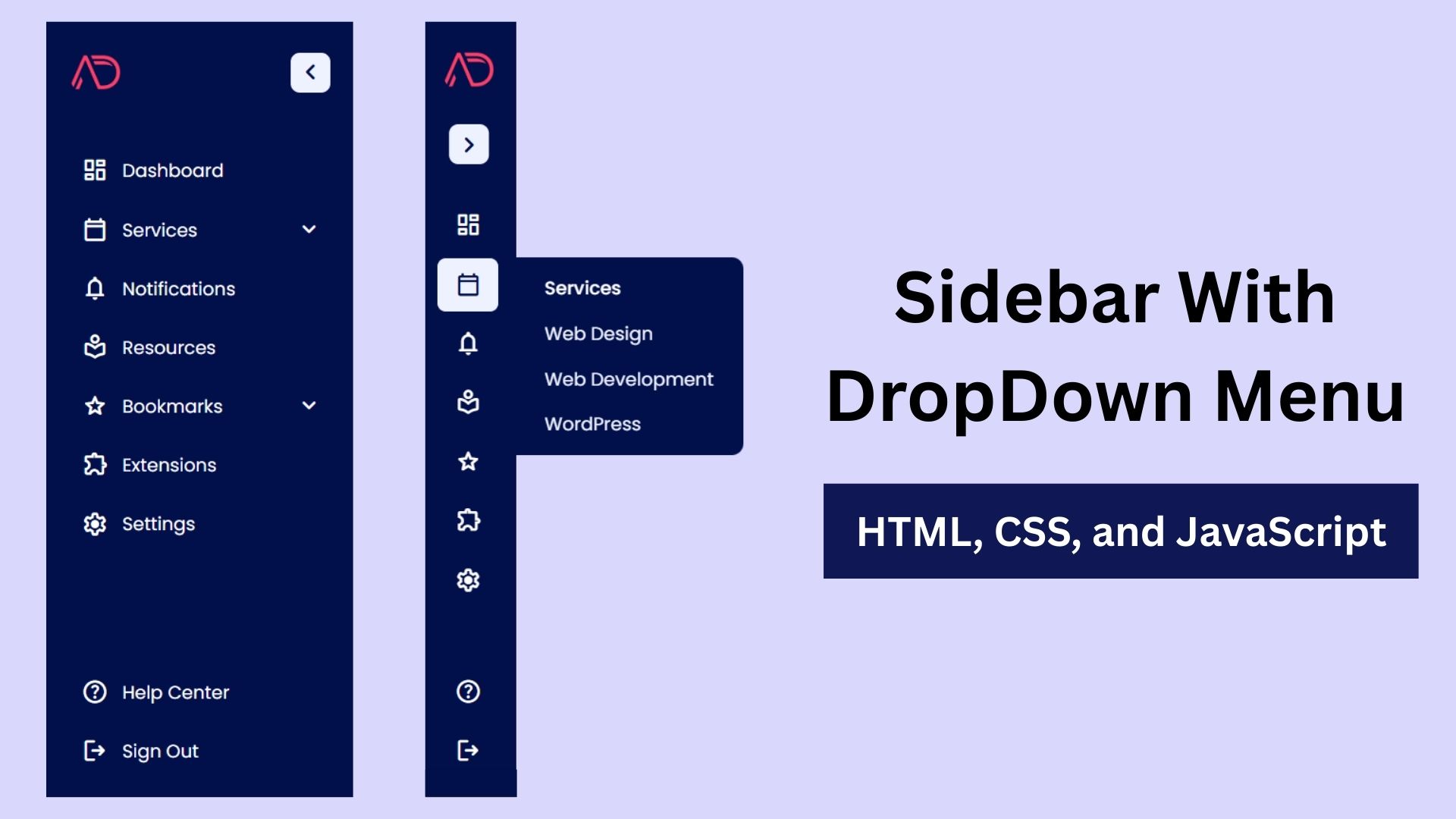
Build a Fully Responsive Sidebar with Dropdown Menu – HTML, CSS & JS
Learn how to build a fully responsive sidebar with dropdown menus using HTML, CSS, and JavaScript. Step-by-step guide with code
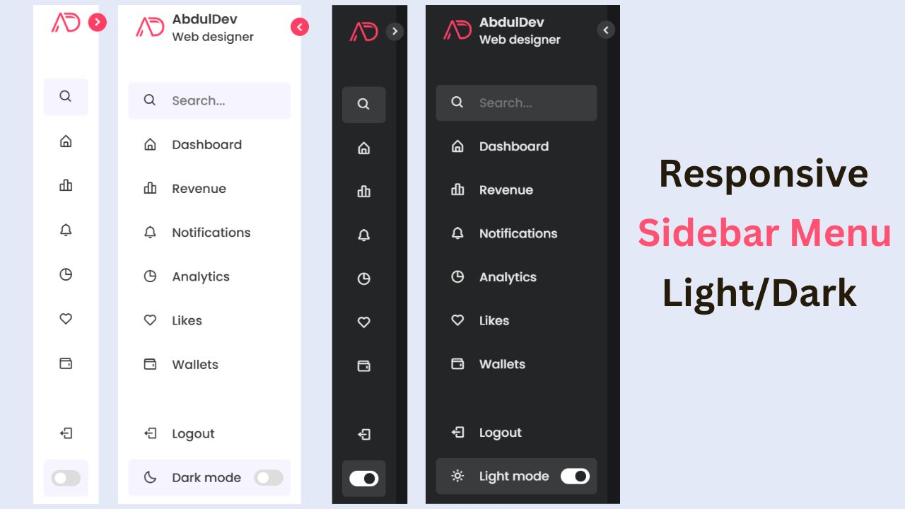
Responsive Sidebar Menu in HTML, CSS & JS | Light/Dark Mode
Learn how to create a modern responsive sidebar menu with a light and dark theme switcher using HTML, CSS, and
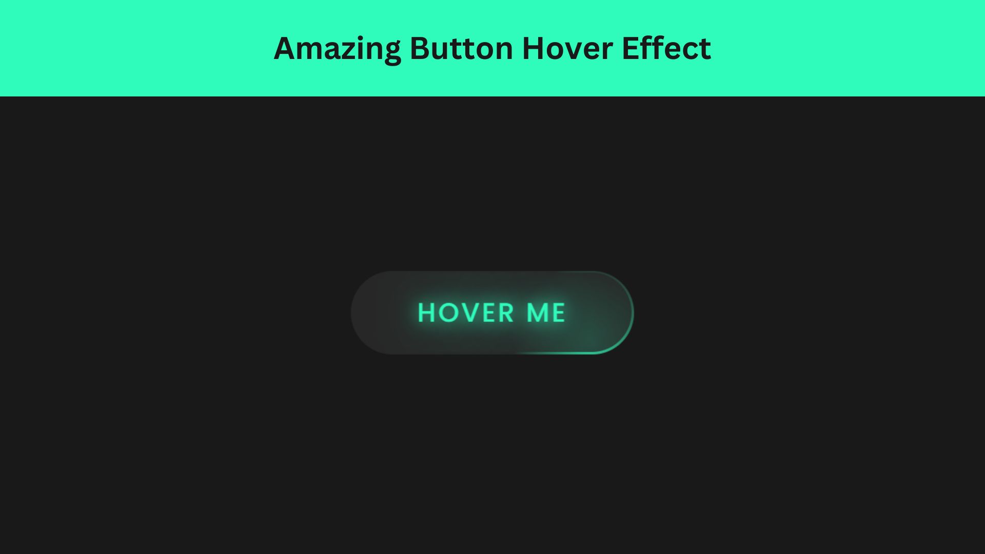
Amazing Button Hover Effect Using HTML, CSS, and JavaScript
Discover how to create amazing button hover effects using HTML, CSS, and JavaScript. Learn step-by-step with free source code to