Create a Responsive Sticky Navigation Bar Using HTML, CSS, and JavaScript

Creating a responsive sticky navigation bar is essential for modern web design. It enhances user experience by allowing easy navigation and constant access to key menu items. In this article, you’ll learn how to create a sticky navigation bar that stays at the top of the page as you scroll. We’ll provide the full source code so you can follow along and implement it in your projects.
Check Out Those Useful Articles
Prerequisites
Before we start, ensure you have a basic understanding of:
- HTML
- CSS
- JavaScript
Responsive Navigation Bar HTML, CSS and JavaScript (Free Source Code)
To create a Navigation Bar using HTML, CSS, and JavaScript, follow these steps:
- Create a folder: Name the folder anything you like. Inside this folder, create the following files:
- Create an index.html file: The file must be named index with a .html extension.
- Create a style.css file: The file must be named style with a .css extension.
- Create a main.js file: The file must be named main with a .js extension.
After creating these files, copy and paste the provided code snippets into the respective files. Alternatively, you can download the complete Navigation Bar HTML, CSS, and JavaScript files by clicking the download button below.
First, paste the following codes into your index.html file.
					<!DOCTYPE html>
<html lang="en">
<head>
    <meta charset="UTF-8">
    <meta name="viewport" content="width=device-width, initial-scale=1.0">
    <title>Responsive Sticky Navigation Bar</title>
    <link rel="stylesheet" href="style.css">
</head>
<body>
    <header>
        <a href="#" class="logo">Abdul<span>Dev</span></a>
        <div class="menuToggle"></div>
        <ul class="nav">
            <li class="active"><a href="#">Home</a></li>
            <li><a href="#">About</a></li>
            <li><a href="#">Services</a></li>
            <li><a href="#">Blog</a></li>
            <li><a href="#">Contact</a></li>
        </ul>
    </header>
    <section id="hero"></section>
    <section id="about">
        <div class="secText">
            <h2>Responsive Sticky Navigation Bar</h2>
            <p>Lorem ipsum, dolor sit amet consectetur adipisicing elit. Neque distinctio itaque beatae? Necessitatibus aperiam expedita esse autem quae ipsum. Sint dignissimos delectus molestias sunt illo ipsum numquam cupiditate labore tenetur nobis ut, laboriosam incidunt recusandae laborum maiores! Ad sapiente ipsum deleniti impedit maxime error facere ullam? Architecto corporis consectetur sequi?</p><br>
            <p>Lorem ipsum dolor sit amet consectetur, adipisicing elit. Deserunt sapiente repellendus alias, possimus error adipisci, magnam eum eligendi exercitationem beatae temporibus, officia asperiores! Suscipit ipsa ullam earum hic quia, repellendus quod exercitationem sint quos odit facere quam dolorem error, officiis expedita asperiores voluptate, tempora praesentium nam! Quam doloribus vel doloremque.</p>
        </div>
    </section>

     <script type="litespeed/javascript" data-src="main.js"></script> <script data-no-optimize="1">window.lazyLoadOptions=Object.assign({},{threshold:300},window.lazyLoadOptions||{});!function(t,e){"object"==typeof exports&&"undefined"!=typeof module?module.exports=e():"function"==typeof define&&define.amd?define(e):(t="undefined"!=typeof globalThis?globalThis:t||self).LazyLoad=e()}(this,function(){"use strict";function e(){return(e=Object.assign||function(t){for(var e=1;e<arguments.length;e++){var n,a=arguments[e];for(n in a)Object.prototype.hasOwnProperty.call(a,n)&&(t[n]=a[n])}return t}).apply(this,arguments)}function o(t){return e({},at,t)}function l(t,e){return t.getAttribute(gt+e)}function c(t){return l(t,vt)}function s(t,e){return function(t,e,n){e=gt+e;null!==n?t.setAttribute(e,n):t.removeAttribute(e)}(t,vt,e)}function i(t){return s(t,null),0}function r(t){return null===c(t)}function u(t){return c(t)===_t}function d(t,e,n,a){t&&(void 0===a?void 0===n?t(e):t(e,n):t(e,n,a))}function f(t,e){et?t.classList.add(e):t.className+=(t.className?" ":"")+e}function _(t,e){et?t.classList.remove(e):t.className=t.className.replace(new RegExp("(^|\\s+)"+e+"(\\s+|$)")," ").replace(/^\s+/,"").replace(/\s+$/,"")}function g(t){return t.llTempImage}function v(t,e){!e||(e=e._observer)&&e.unobserve(t)}function b(t,e){t&&(t.loadingCount+=e)}function p(t,e){t&&(t.toLoadCount=e)}function n(t){for(var e,n=[],a=0;e=t.children[a];a+=1)"SOURCE"===e.tagName&&n.push(e);return n}function h(t,e){(t=t.parentNode)&&"PICTURE"===t.tagName&&n(t).forEach(e)}function a(t,e){n(t).forEach(e)}function m(t){return!!t[lt]}function E(t){return t[lt]}function I(t){return delete t[lt]}function y(e,t){var n;m(e)||(n={},t.forEach(function(t){n[t]=e.getAttribute(t)}),e[lt]=n)}function L(a,t){var o;m(a)&&(o=E(a),t.forEach(function(t){var e,n;e=a,(t=o[n=t])?e.setAttribute(n,t):e.removeAttribute(n)}))}function k(t,e,n){f(t,e.class_loading),s(t,st),n&&(b(n,1),d(e.callback_loading,t,n))}function A(t,e,n){n&&t.setAttribute(e,n)}function O(t,e){A(t,rt,l(t,e.data_sizes)),A(t,it,l(t,e.data_srcset)),A(t,ot,l(t,e.data_src))}function w(t,e,n){var a=l(t,e.data_bg_multi),o=l(t,e.data_bg_multi_hidpi);(a=nt&&o?o:a)&&(t.style.backgroundImage=a,n=n,f(t=t,(e=e).class_applied),s(t,dt),n&&(e.unobserve_completed&&v(t,e),d(e.callback_applied,t,n)))}function x(t,e){!e||0<e.loadingCount||0<e.toLoadCount||d(t.callback_finish,e)}function M(t,e,n){t.addEventListener(e,n),t.llEvLisnrs[e]=n}function N(t){return!!t.llEvLisnrs}function z(t){if(N(t)){var e,n,a=t.llEvLisnrs;for(e in a){var o=a[e];n=e,o=o,t.removeEventListener(n,o)}delete t.llEvLisnrs}}function C(t,e,n){var a;delete t.llTempImage,b(n,-1),(a=n)&&--a.toLoadCount,_(t,e.class_loading),e.unobserve_completed&&v(t,n)}function R(i,r,c){var l=g(i)||i;N(l)||function(t,e,n){N(t)||(t.llEvLisnrs={});var a="VIDEO"===t.tagName?"loadeddata":"load";M(t,a,e),M(t,"error",n)}(l,function(t){var e,n,a,o;n=r,a=c,o=u(e=i),C(e,n,a),f(e,n.class_loaded),s(e,ut),d(n.callback_loaded,e,a),o||x(n,a),z(l)},function(t){var e,n,a,o;n=r,a=c,o=u(e=i),C(e,n,a),f(e,n.class_error),s(e,ft),d(n.callback_error,e,a),o||x(n,a),z(l)})}function T(t,e,n){var a,o,i,r,c;t.llTempImage=document.createElement("IMG"),R(t,e,n),m(c=t)||(c[lt]={backgroundImage:c.style.backgroundImage}),i=n,r=l(a=t,(o=e).data_bg),c=l(a,o.data_bg_hidpi),(r=nt&&c?c:r)&&(a.style.backgroundImage='url("'.concat(r,'")'),g(a).setAttribute(ot,r),k(a,o,i)),w(t,e,n)}function G(t,e,n){var a;R(t,e,n),a=e,e=n,(t=Et[(n=t).tagName])&&(t(n,a),k(n,a,e))}function D(t,e,n){var a;a=t,(-1<It.indexOf(a.tagName)?G:T)(t,e,n)}function S(t,e,n){var a;t.setAttribute("loading","lazy"),R(t,e,n),a=e,(e=Et[(n=t).tagName])&&e(n,a),s(t,_t)}function V(t){t.removeAttribute(ot),t.removeAttribute(it),t.removeAttribute(rt)}function j(t){h(t,function(t){L(t,mt)}),L(t,mt)}function F(t){var e;(e=yt[t.tagName])?e(t):m(e=t)&&(t=E(e),e.style.backgroundImage=t.backgroundImage)}function P(t,e){var n;F(t),n=e,r(e=t)||u(e)||(_(e,n.class_entered),_(e,n.class_exited),_(e,n.class_applied),_(e,n.class_loading),_(e,n.class_loaded),_(e,n.class_error)),i(t),I(t)}function U(t,e,n,a){var o;n.cancel_on_exit&&(c(t)!==st||"IMG"===t.tagName&&(z(t),h(o=t,function(t){V(t)}),V(o),j(t),_(t,n.class_loading),b(a,-1),i(t),d(n.callback_cancel,t,e,a)))}function $(t,e,n,a){var o,i,r=(i=t,0<=bt.indexOf(c(i)));s(t,"entered"),f(t,n.class_entered),_(t,n.class_exited),o=t,i=a,n.unobserve_entered&&v(o,i),d(n.callback_enter,t,e,a),r||D(t,n,a)}function q(t){return t.use_native&&"loading"in HTMLImageElement.prototype}function H(t,o,i){t.forEach(function(t){return(a=t).isIntersecting||0<a.intersectionRatio?$(t.target,t,o,i):(e=t.target,n=t,a=o,t=i,void(r(e)||(f(e,a.class_exited),U(e,n,a,t),d(a.callback_exit,e,n,t))));var e,n,a})}function B(e,n){var t;tt&&!q(e)&&(n._observer=new IntersectionObserver(function(t){H(t,e,n)},{root:(t=e).container===document?null:t.container,rootMargin:t.thresholds||t.threshold+"px"}))}function J(t){return Array.prototype.slice.call(t)}function K(t){return t.container.querySelectorAll(t.elements_selector)}function Q(t){return c(t)===ft}function W(t,e){return e=t||K(e),J(e).filter(r)}function X(e,t){var n;(n=K(e),J(n).filter(Q)).forEach(function(t){_(t,e.class_error),i(t)}),t.update()}function t(t,e){var n,a,t=o(t);this._settings=t,this.loadingCount=0,B(t,this),n=t,a=this,Y&&window.addEventListener("online",function(){X(n,a)}),this.update(e)}var Y="undefined"!=typeof window,Z=Y&&!("onscroll"in window)||"undefined"!=typeof navigator&&/(gle|ing|ro)bot|crawl|spider/i.test(navigator.userAgent),tt=Y&&"IntersectionObserver"in window,et=Y&&"classList"in document.createElement("p"),nt=Y&&1<window.devicePixelRatio,at={elements_selector:".lazy",container:Z||Y?document:null,threshold:300,thresholds:null,data_src:"src",data_srcset:"srcset",data_sizes:"sizes",data_bg:"bg",data_bg_hidpi:"bg-hidpi",data_bg_multi:"bg-multi",data_bg_multi_hidpi:"bg-multi-hidpi",data_poster:"poster",class_applied:"applied",class_loading:"litespeed-loading",class_loaded:"litespeed-loaded",class_error:"error",class_entered:"entered",class_exited:"exited",unobserve_completed:!0,unobserve_entered:!1,cancel_on_exit:!0,callback_enter:null,callback_exit:null,callback_applied:null,callback_loading:null,callback_loaded:null,callback_error:null,callback_finish:null,callback_cancel:null,use_native:!1},ot="src",it="srcset",rt="sizes",ct="poster",lt="llOriginalAttrs",st="loading",ut="loaded",dt="applied",ft="error",_t="native",gt="data-",vt="ll-status",bt=[st,ut,dt,ft],pt=[ot],ht=[ot,ct],mt=[ot,it,rt],Et={IMG:function(t,e){h(t,function(t){y(t,mt),O(t,e)}),y(t,mt),O(t,e)},IFRAME:function(t,e){y(t,pt),A(t,ot,l(t,e.data_src))},VIDEO:function(t,e){a(t,function(t){y(t,pt),A(t,ot,l(t,e.data_src))}),y(t,ht),A(t,ct,l(t,e.data_poster)),A(t,ot,l(t,e.data_src)),t.load()}},It=["IMG","IFRAME","VIDEO"],yt={IMG:j,IFRAME:function(t){L(t,pt)},VIDEO:function(t){a(t,function(t){L(t,pt)}),L(t,ht),t.load()}},Lt=["IMG","IFRAME","VIDEO"];return t.prototype={update:function(t){var e,n,a,o=this._settings,i=W(t,o);{if(p(this,i.length),!Z&&tt)return q(o)?(e=o,n=this,i.forEach(function(t){-1!==Lt.indexOf(t.tagName)&&S(t,e,n)}),void p(n,0)):(t=this._observer,o=i,t.disconnect(),a=t,void o.forEach(function(t){a.observe(t)}));this.loadAll(i)}},destroy:function(){this._observer&&this._observer.disconnect(),K(this._settings).forEach(function(t){I(t)}),delete this._observer,delete this._settings,delete this.loadingCount,delete this.toLoadCount},loadAll:function(t){var e=this,n=this._settings;W(t,n).forEach(function(t){v(t,e),D(t,n,e)})},restoreAll:function(){var e=this._settings;K(e).forEach(function(t){P(t,e)})}},t.load=function(t,e){e=o(e);D(t,e)},t.resetStatus=function(t){i(t)},t}),function(t,e){"use strict";function n(){e.body.classList.add("litespeed_lazyloaded")}function a(){console.log("[LiteSpeed] Start Lazy Load"),o=new LazyLoad(Object.assign({},t.lazyLoadOptions||{},{elements_selector:"[data-lazyloaded]",callback_finish:n})),i=function(){o.update()},t.MutationObserver&&new MutationObserver(i).observe(e.documentElement,{childList:!0,subtree:!0,attributes:!0})}var o,i;t.addEventListener?t.addEventListener("load",a,!1):t.attachEvent("onload",a)}(window,document);</script><script data-no-optimize="1">window.litespeed_ui_events=window.litespeed_ui_events||["mouseover","click","keydown","wheel","touchmove","touchstart"];var urlCreator=window.URL||window.webkitURL;function litespeed_load_delayed_js_force(){console.log("[LiteSpeed] Start Load JS Delayed"),litespeed_ui_events.forEach(e=>{window.removeEventListener(e,litespeed_load_delayed_js_force,{passive:!0})}),document.querySelectorAll("iframe[data-litespeed-src]").forEach(e=>{e.setAttribute("src",e.getAttribute("data-litespeed-src"))}),"loading"==document.readyState?window.addEventListener("DOMContentLoaded",litespeed_load_delayed_js):litespeed_load_delayed_js()}litespeed_ui_events.forEach(e=>{window.addEventListener(e,litespeed_load_delayed_js_force,{passive:!0})});async function litespeed_load_delayed_js(){let t=[];for(var d in document.querySelectorAll('script[type="litespeed/javascript"]').forEach(e=>{t.push(e)}),t)await new Promise(e=>litespeed_load_one(t[d],e));document.dispatchEvent(new Event("DOMContentLiteSpeedLoaded")),window.dispatchEvent(new Event("DOMContentLiteSpeedLoaded"))}function litespeed_load_one(t,e){console.log("[LiteSpeed] Load ",t);var d=document.createElement("script");d.addEventListener("load",e),d.addEventListener("error",e),t.getAttributeNames().forEach(e=>{"type"!=e&&d.setAttribute("data-src"==e?"src":e,t.getAttribute(e))});let a=!(d.type="text/javascript");!d.src&&t.textContent&&(d.src=litespeed_inline2src(t.textContent),a=!0),t.after(d),t.remove(),a&&e()}function litespeed_inline2src(t){try{var d=urlCreator.createObjectURL(new Blob([t.replace(/^(?:<!--)?(.*?)(?:-->)?$/gm,"$1")],{type:"text/javascript"}))}catch(e){d="data:text/javascript;base64,"+btoa(t.replace(/^(?:<!--)?(.*?)(?:-->)?$/gm,"$1"))}return d}</script><script data-no-optimize="1">var litespeed_vary=document.cookie.replace(/(?:(?:^|.*;\s*)_lscache_vary\s*\=\s*([^;]*).*$)|^.*$/,"");litespeed_vary||(sessionStorage.getItem("litespeed_reloaded")?console.log("LiteSpeed: skipping guest vary reload (already reloaded this session)"):fetch("/wp-content/plugins/litespeed-cache/guest.vary.php",{method:"POST",cache:"no-cache",redirect:"follow"}).then(e=>e.json()).then(e=>{console.log(e),e.hasOwnProperty("reload")&&"yes"==e.reload&&(sessionStorage.setItem("litespeed_docref",document.referrer),sessionStorage.setItem("litespeed_reloaded","1"),window.location.reload(!0))}));</script><script data-optimized="1" type="litespeed/javascript" data-src="https://abduldev.com/wp-content/litespeed/js/b2e5c4b9ca9ad614a921aa4a30a080aa.js?ver=fcae6"></script></body>
</html>
Second, paste the following codes into your style.css file.
					@import url('https://fonts.googleapis.com/css2?family=Poppins:wght@400;500;700&display=swap');

*{
    margin: 0;
    padding: 0;
    box-sizing: border-box;
    font-family: "Poppins", sans-serif;
}
header{
    position: fixed;
    top: 0;
    left: 0;
    width: 100%;
    padding: 20px 100px;
    display: flex;
    justify-content: space-between;
    align-items: center;
    z-index: 1000;
    transition: 0.5s;
}
/* Sticky CodeK */
.stickyNav{
    padding: 5px 100px;
    background: #fff;
}
.stickyNav .logo{
    color: #000;
}
.stickyNav ul li a{
    color: #000;
}
header .logo{
    position: relative;
    text-decoration: none;
    font-size: 36px;
    font-weight: 700;
    transition: 0.5s;
    color: #fff;
}
.logo span{
    color: #f7a328;
}
header ul{
    position: relative;
    display: flex;
    gap: 40px;
}
header ul li{
    list-style: none;
}
header ul li a{
    text-decoration: none;
    font-size: 16px;
    font-weight: 500;
    transition: 0.5s;
    color: #fff;
}
header ul li.active a,
header ul li:hover a{
    color: #f7a328;
}
#hero{
    position: relative;
    width: 100%;
    min-height: 100vh;
    background-image: url(Hero-section1.png);
    background-position: center;
    background-repeat: no-repeat;
    background-size: cover;
    background-blend-mode: color;
    background-color: #0000007a;
}
#about{
    position: relative;
    background: #006f72;
    width: 100%;
    min-height: 100vh;
    padding: 120px 100px;
    display: flex;
    justify-content: center;
    flex-direction: column;
}
#about .secText{
    position: relative;
    width: 100%;
    display: flex;
    align-items: center;
    justify-content: center;
    flex-direction: column;
}
.secText h2{
    font-size: 45px;
    color: #fff;
    padding-bottom: 20px;
}
.secText p{
    text-align: center;
    color: #fff;
    font-size: 16px;
    line-height: 26px;
}
/* Need to Make Responsive for all Devices */
@media screen and (max-width: 900px) {
    header{
        padding: 20px 50px;
    }
    .secText h2{
        font-size: 30px;
        line-height: 36px;
        text-align: center;
        padding-bottom: 30px;
    }
    #about{
        padding: 100px 50px;
    }
    .menuToggle{
        position: relative;
        width: 30px;
        height: 20px;
        cursor: pointer;
        display: flex;
        justify-content: center;
        align-items: center;
    }
    .menuToggle::before{
        content: '';
        position: absolute;
        width: 100%;
        height: 2px;
        background: #fff;
        transform: translateY(-10px);
        box-shadow: 0 10px #fff;
        transition: 0.5s;
    }
    .menuToggle::after{
        content: '';
        position: absolute;
        width: 100%;
        height: 2px;
        background: #fff;
        transform: translateY(10px);
        transition: 0.5s;
    }
    header.active .menuToggle::before{
        transform: translateY(0) rotate(45deg);
        box-shadow: 0 0 #fff;
    }
    header.active .menuToggle::after{
        transform: translateY(0) rotate(315deg);
    }
    header ul{
        display: none;
    }
    header.active ul{
        position: fixed;
        left: 0;
        top: 84px;
        width: 100%;
        height: calc(100vh - 84px);
        background: #036960fe;
        display: flex;
        justify-content: center;
        align-items: center;
        flex-direction: column;
        gap: 16px;
    }
    header.active ul a{
        font-size: 22px;
        transition: 0.5s;
    }
    .stickyNav .menuToggle::before{
        background: #000;
        box-shadow: 0 10px #000;
    }
    .stickyNav .menuToggle::after{
        background: #000;
    }
    .stickyNav ul.nav{
        top: 60px !important;
        height: calc(100vh - 60px);
    }
    .stickyNav  ul li a{
        color: #fff;
    }
    .stickyNav{
        padding: 5px 50px;
    }
}
Third, paste the following codes into your main.js file.
					window.addEventListener("scroll", function (){
    var header = document.querySelector("header");
    header.classList.toggle("stickyNav", window.scrollY > 0);
})
let menuToggle = document.querySelector(".menuToggle");
let header = document.querySelector("header");
menuToggle.onclick = function(){
    header.classList.toggle("active");
}
Conclusion
You’ve successfully created a responsive sticky navigation bar using HTML, CSS, and JavaScript. This navigation bar will enhance user experience by providing easy access to the main sections of your website at all times.
Recent Posts


Categories


FAQs
A sticky navigation bar is a menu that remains fixed at the top of the webpage as the user scrolls down. This ensures that the navigation menu is always accessible, enhancing the user experience by allowing easy access to different sections of the website.
To make your navigation bar responsive, you can use CSS media queries to adjust the layout based on the screen size. For example, you can switch from a horizontal to a vertical layout on smaller screens. Here’s an example of how to do this:
@media screen and (max-width: 600px) {
header nav ul {
flex-direction: column;
}
header nav ul li {
margin: 10px 0;
}
}
Common reasons why your sticky navigation bar might not be working include:
- Incorrect JavaScript function or missing event listener for the scroll event.
- Missing or incorrect CSS styling for the sticky class.
- HTML elements not correctly identified in your JavaScript.
Ensure your JavaScript is correctly implemented to add and remove the sticky class based on the scroll position, and verify your HTML and CSS selectors are accurate.
You can add smooth scrolling to your navigation links using CSS or JavaScript. Here’s a simple way to do it with CSS:
html {
scroll-behavior: smooth;
}
This CSS property ensures that when users click on navigation links, the page scrolls smoothly to the corresponding section.
Yes, you can customize the appearance of your sticky navigation bar by modifying the CSS. You can change colors, add hover effects, adjust padding, and more. For example, to change the background color and add a box shadow when the navbar becomes sticky, you can use:
header.sticky {
background-color: #444;
box-shadow: 0 4px 2px -2px gray;
}
Share on Social Media
Related Articles
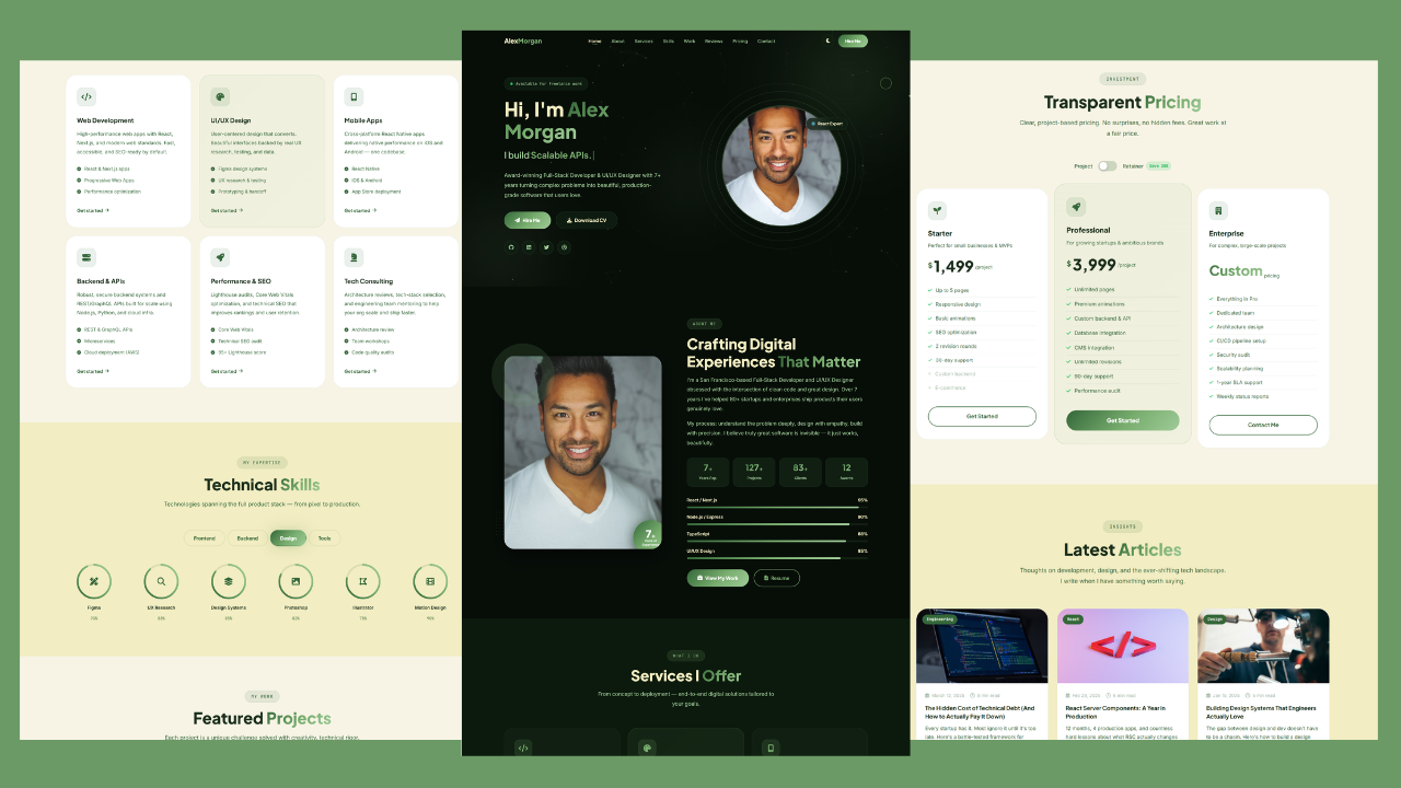
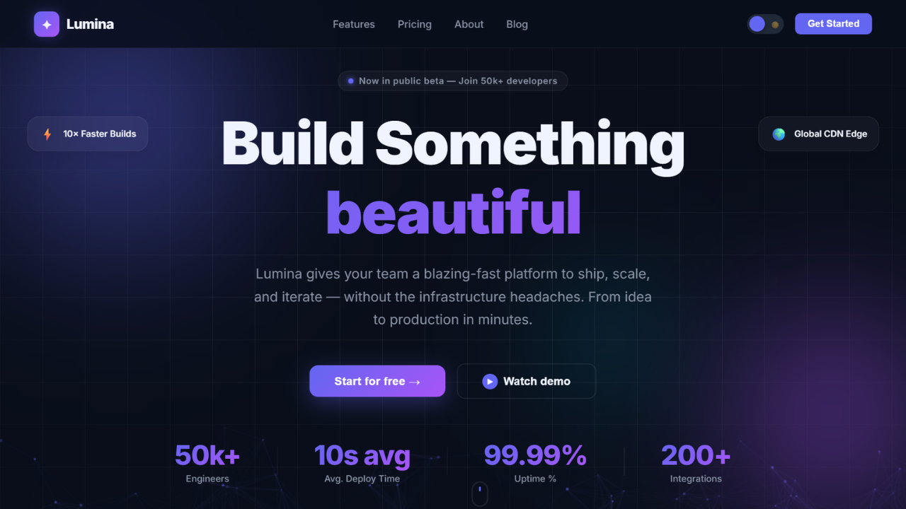
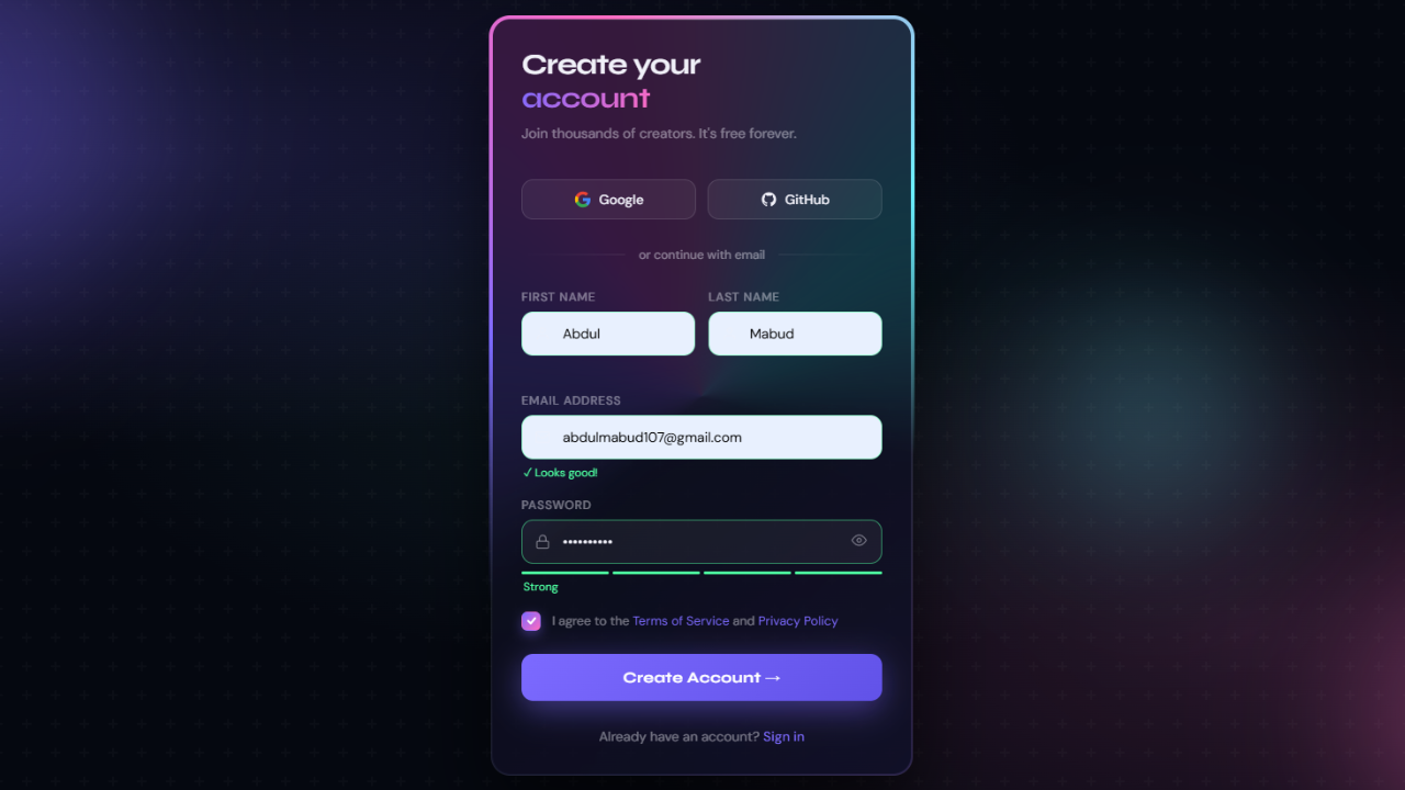
Responsive Animated Hero Section with Dark Light Theme | Free Source Code
Responsive Animated Hero Section with Dark Light Theme Let’s be real for a second. The first thing visitors notice on
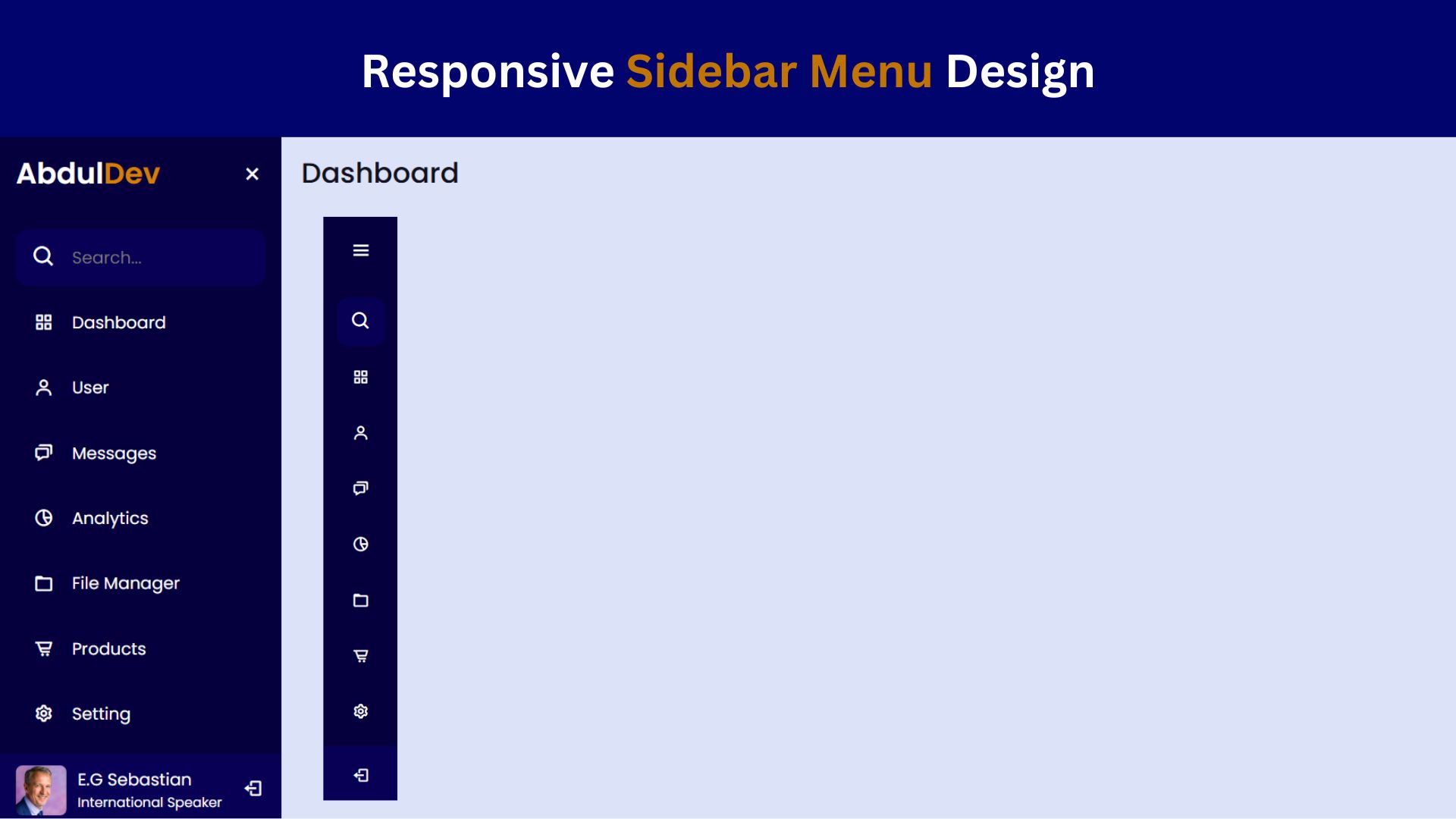
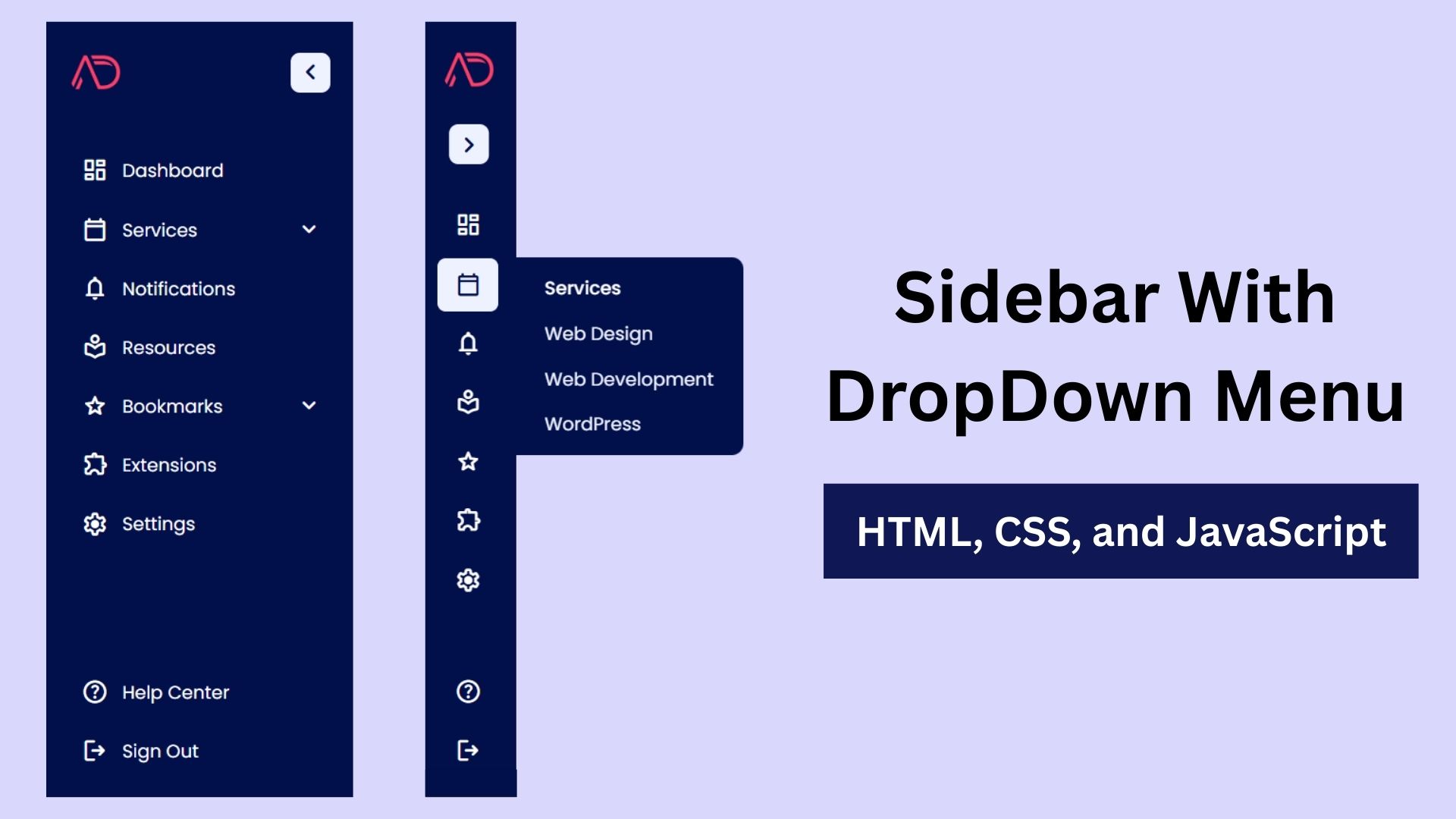
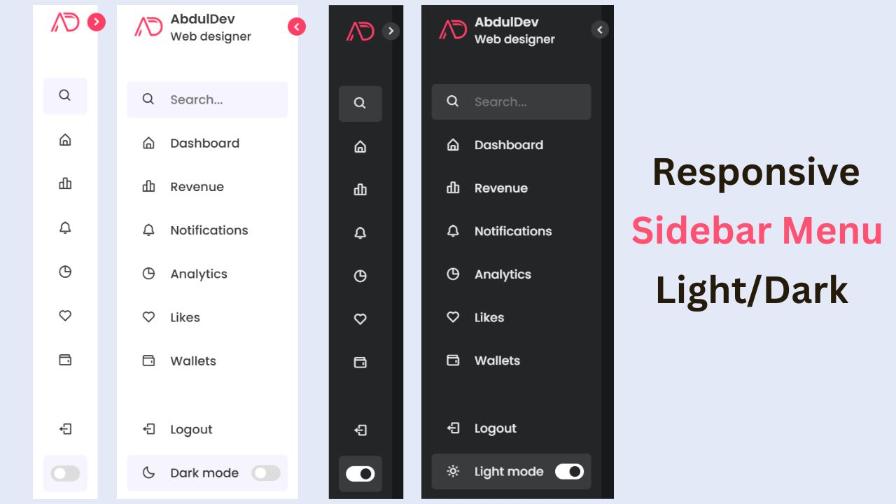
How to Create a Responsive Sidebar Menu Design
Learn how to create a responsive sidebar menu using HTML, CSS, and JavaScript. This step-by-step guide includes free source code

Responsive Website Homepage Design Using HTML and CSS
Learn how to create a responsive website homepage using HTML and CSS. This step-by-step guide covers mobile-friendly layouts, styling tips,