Creating a Fully Responsive Navigation Menu using HTML & CSS
I’m excited to share how to craft a fully responsive navigation menu bar using HTML and CSS. In a previous blog, I explored building a Responsive Registration Form for your website.
The navigation bar, or navbar, is integral to any website. It provides users easy access to different site sections and enhances overall navigation. With responsive design becoming increasingly crucial in today’s digital landscape, ensuring that your website’s elements adapt seamlessly to various screen sizes is essential.
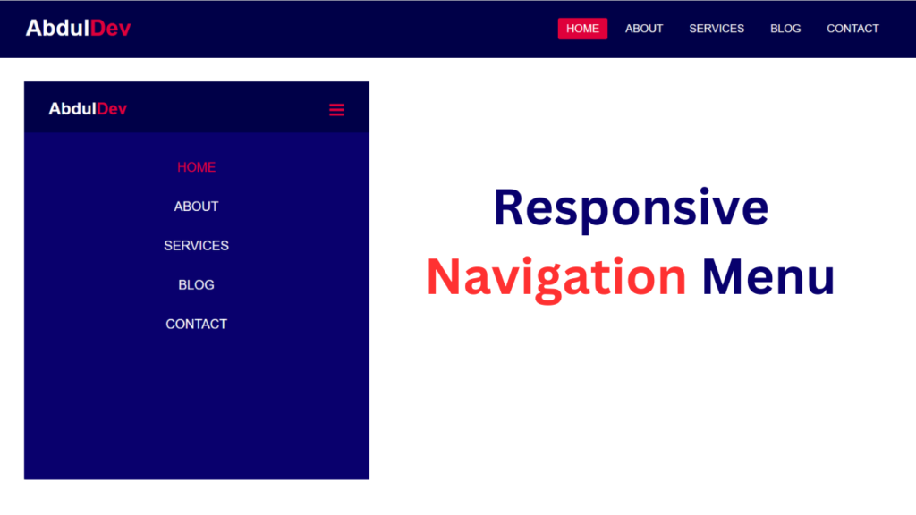
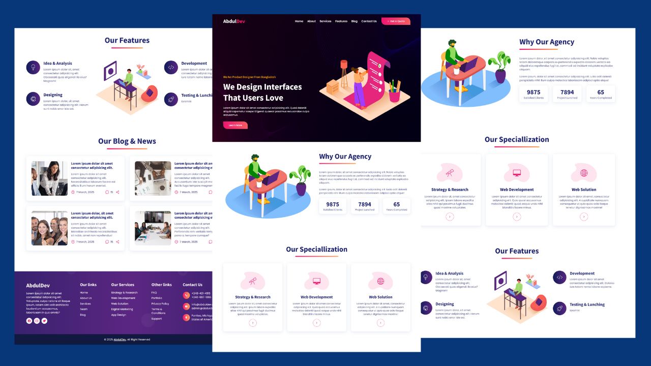
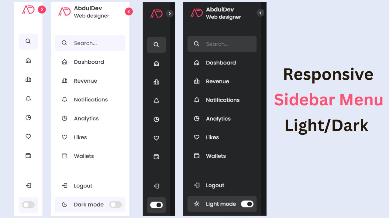
In my design, as depicted in the preview image, we have a horizontal navbar with a logo positioned on the left and navigation links aligned to the right. This navigation bar is elegantly simple yet highly functional, and it’s achieved using only HTML and CSS.
One of the standout features of my navigation bar is its full responsiveness across all devices, including mobile phones. It appears as a horizontal bar on desktop screens, while on mobile devices, it transforms into a vertical layout. Users can easily toggle the menu by clicking the hamburger menu icon, providing a smooth navigation experience on smaller screens.
Responsive Navigation Menu Using HTML and CSS (Source Code)
To replicate this responsive navigation bar on your website, follow these simple steps:
- Begin by creating a folder for your project. You’re free to name this folder as you wish. Inside this folder, we’ll create the necessary files.
- Create a new file named index.html. The file name must be “index” with the extension “.html”.
- Next, create another file named style.css. Again, ensure the file name is “style” with the extension “.css”.
First, Copy the bellow HTML code and paste the codes into your index.html file.
					<!DOCTYPE html>
<html lang="en">
<head>
    <meta charset="UTF-8">
    <meta name="viewport" content="width=device-width, initial-scale=1.0">
    <title>Responsive Navigation Menu</title>

    <link rel="stylesheet" href="style.css">

    <link rel="stylesheet" href="https://cdnjs.cloudflare.com/ajax/libs/font-awesome/4.7.0/css/font-awesome.min.css">
</head>
<body>
    <nav>
        <input type="checkbox" id="check">
        <label for="check" class="checkbtn">
            <i class="fa fa-bars"></i>
        </label>
        <label class="logo">Abdul<span>Dev</span></label>
        <ul>
            <li><a class="active" href="#">Home</a></li>
            <li><a href="#">About</a></li>
            <li><a href="#">Services</a></li>
            <li><a href="#">Blog</a></li>
            <li><a href="#">Contact</a></li>
        </ul>
    </nav>
    <div class="container">
        <h2>Responsive Navigation Menu</h2>
        <button>About Me</button>
    </div> <script data-no-optimize="1">window.lazyLoadOptions=Object.assign({},{threshold:300},window.lazyLoadOptions||{});!function(t,e){"object"==typeof exports&&"undefined"!=typeof module?module.exports=e():"function"==typeof define&&define.amd?define(e):(t="undefined"!=typeof globalThis?globalThis:t||self).LazyLoad=e()}(this,function(){"use strict";function e(){return(e=Object.assign||function(t){for(var e=1;e<arguments.length;e++){var n,a=arguments[e];for(n in a)Object.prototype.hasOwnProperty.call(a,n)&&(t[n]=a[n])}return t}).apply(this,arguments)}function o(t){return e({},at,t)}function l(t,e){return t.getAttribute(gt+e)}function c(t){return l(t,vt)}function s(t,e){return function(t,e,n){e=gt+e;null!==n?t.setAttribute(e,n):t.removeAttribute(e)}(t,vt,e)}function i(t){return s(t,null),0}function r(t){return null===c(t)}function u(t){return c(t)===_t}function d(t,e,n,a){t&&(void 0===a?void 0===n?t(e):t(e,n):t(e,n,a))}function f(t,e){et?t.classList.add(e):t.className+=(t.className?" ":"")+e}function _(t,e){et?t.classList.remove(e):t.className=t.className.replace(new RegExp("(^|\\s+)"+e+"(\\s+|$)")," ").replace(/^\s+/,"").replace(/\s+$/,"")}function g(t){return t.llTempImage}function v(t,e){!e||(e=e._observer)&&e.unobserve(t)}function b(t,e){t&&(t.loadingCount+=e)}function p(t,e){t&&(t.toLoadCount=e)}function n(t){for(var e,n=[],a=0;e=t.children[a];a+=1)"SOURCE"===e.tagName&&n.push(e);return n}function h(t,e){(t=t.parentNode)&&"PICTURE"===t.tagName&&n(t).forEach(e)}function a(t,e){n(t).forEach(e)}function m(t){return!!t[lt]}function E(t){return t[lt]}function I(t){return delete t[lt]}function y(e,t){var n;m(e)||(n={},t.forEach(function(t){n[t]=e.getAttribute(t)}),e[lt]=n)}function L(a,t){var o;m(a)&&(o=E(a),t.forEach(function(t){var e,n;e=a,(t=o[n=t])?e.setAttribute(n,t):e.removeAttribute(n)}))}function k(t,e,n){f(t,e.class_loading),s(t,st),n&&(b(n,1),d(e.callback_loading,t,n))}function A(t,e,n){n&&t.setAttribute(e,n)}function O(t,e){A(t,rt,l(t,e.data_sizes)),A(t,it,l(t,e.data_srcset)),A(t,ot,l(t,e.data_src))}function w(t,e,n){var a=l(t,e.data_bg_multi),o=l(t,e.data_bg_multi_hidpi);(a=nt&&o?o:a)&&(t.style.backgroundImage=a,n=n,f(t=t,(e=e).class_applied),s(t,dt),n&&(e.unobserve_completed&&v(t,e),d(e.callback_applied,t,n)))}function x(t,e){!e||0<e.loadingCount||0<e.toLoadCount||d(t.callback_finish,e)}function M(t,e,n){t.addEventListener(e,n),t.llEvLisnrs[e]=n}function N(t){return!!t.llEvLisnrs}function z(t){if(N(t)){var e,n,a=t.llEvLisnrs;for(e in a){var o=a[e];n=e,o=o,t.removeEventListener(n,o)}delete t.llEvLisnrs}}function C(t,e,n){var a;delete t.llTempImage,b(n,-1),(a=n)&&--a.toLoadCount,_(t,e.class_loading),e.unobserve_completed&&v(t,n)}function R(i,r,c){var l=g(i)||i;N(l)||function(t,e,n){N(t)||(t.llEvLisnrs={});var a="VIDEO"===t.tagName?"loadeddata":"load";M(t,a,e),M(t,"error",n)}(l,function(t){var e,n,a,o;n=r,a=c,o=u(e=i),C(e,n,a),f(e,n.class_loaded),s(e,ut),d(n.callback_loaded,e,a),o||x(n,a),z(l)},function(t){var e,n,a,o;n=r,a=c,o=u(e=i),C(e,n,a),f(e,n.class_error),s(e,ft),d(n.callback_error,e,a),o||x(n,a),z(l)})}function T(t,e,n){var a,o,i,r,c;t.llTempImage=document.createElement("IMG"),R(t,e,n),m(c=t)||(c[lt]={backgroundImage:c.style.backgroundImage}),i=n,r=l(a=t,(o=e).data_bg),c=l(a,o.data_bg_hidpi),(r=nt&&c?c:r)&&(a.style.backgroundImage='url("'.concat(r,'")'),g(a).setAttribute(ot,r),k(a,o,i)),w(t,e,n)}function G(t,e,n){var a;R(t,e,n),a=e,e=n,(t=Et[(n=t).tagName])&&(t(n,a),k(n,a,e))}function D(t,e,n){var a;a=t,(-1<It.indexOf(a.tagName)?G:T)(t,e,n)}function S(t,e,n){var a;t.setAttribute("loading","lazy"),R(t,e,n),a=e,(e=Et[(n=t).tagName])&&e(n,a),s(t,_t)}function V(t){t.removeAttribute(ot),t.removeAttribute(it),t.removeAttribute(rt)}function j(t){h(t,function(t){L(t,mt)}),L(t,mt)}function F(t){var e;(e=yt[t.tagName])?e(t):m(e=t)&&(t=E(e),e.style.backgroundImage=t.backgroundImage)}function P(t,e){var n;F(t),n=e,r(e=t)||u(e)||(_(e,n.class_entered),_(e,n.class_exited),_(e,n.class_applied),_(e,n.class_loading),_(e,n.class_loaded),_(e,n.class_error)),i(t),I(t)}function U(t,e,n,a){var o;n.cancel_on_exit&&(c(t)!==st||"IMG"===t.tagName&&(z(t),h(o=t,function(t){V(t)}),V(o),j(t),_(t,n.class_loading),b(a,-1),i(t),d(n.callback_cancel,t,e,a)))}function $(t,e,n,a){var o,i,r=(i=t,0<=bt.indexOf(c(i)));s(t,"entered"),f(t,n.class_entered),_(t,n.class_exited),o=t,i=a,n.unobserve_entered&&v(o,i),d(n.callback_enter,t,e,a),r||D(t,n,a)}function q(t){return t.use_native&&"loading"in HTMLImageElement.prototype}function H(t,o,i){t.forEach(function(t){return(a=t).isIntersecting||0<a.intersectionRatio?$(t.target,t,o,i):(e=t.target,n=t,a=o,t=i,void(r(e)||(f(e,a.class_exited),U(e,n,a,t),d(a.callback_exit,e,n,t))));var e,n,a})}function B(e,n){var t;tt&&!q(e)&&(n._observer=new IntersectionObserver(function(t){H(t,e,n)},{root:(t=e).container===document?null:t.container,rootMargin:t.thresholds||t.threshold+"px"}))}function J(t){return Array.prototype.slice.call(t)}function K(t){return t.container.querySelectorAll(t.elements_selector)}function Q(t){return c(t)===ft}function W(t,e){return e=t||K(e),J(e).filter(r)}function X(e,t){var n;(n=K(e),J(n).filter(Q)).forEach(function(t){_(t,e.class_error),i(t)}),t.update()}function t(t,e){var n,a,t=o(t);this._settings=t,this.loadingCount=0,B(t,this),n=t,a=this,Y&&window.addEventListener("online",function(){X(n,a)}),this.update(e)}var Y="undefined"!=typeof window,Z=Y&&!("onscroll"in window)||"undefined"!=typeof navigator&&/(gle|ing|ro)bot|crawl|spider/i.test(navigator.userAgent),tt=Y&&"IntersectionObserver"in window,et=Y&&"classList"in document.createElement("p"),nt=Y&&1<window.devicePixelRatio,at={elements_selector:".lazy",container:Z||Y?document:null,threshold:300,thresholds:null,data_src:"src",data_srcset:"srcset",data_sizes:"sizes",data_bg:"bg",data_bg_hidpi:"bg-hidpi",data_bg_multi:"bg-multi",data_bg_multi_hidpi:"bg-multi-hidpi",data_poster:"poster",class_applied:"applied",class_loading:"litespeed-loading",class_loaded:"litespeed-loaded",class_error:"error",class_entered:"entered",class_exited:"exited",unobserve_completed:!0,unobserve_entered:!1,cancel_on_exit:!0,callback_enter:null,callback_exit:null,callback_applied:null,callback_loading:null,callback_loaded:null,callback_error:null,callback_finish:null,callback_cancel:null,use_native:!1},ot="src",it="srcset",rt="sizes",ct="poster",lt="llOriginalAttrs",st="loading",ut="loaded",dt="applied",ft="error",_t="native",gt="data-",vt="ll-status",bt=[st,ut,dt,ft],pt=[ot],ht=[ot,ct],mt=[ot,it,rt],Et={IMG:function(t,e){h(t,function(t){y(t,mt),O(t,e)}),y(t,mt),O(t,e)},IFRAME:function(t,e){y(t,pt),A(t,ot,l(t,e.data_src))},VIDEO:function(t,e){a(t,function(t){y(t,pt),A(t,ot,l(t,e.data_src))}),y(t,ht),A(t,ct,l(t,e.data_poster)),A(t,ot,l(t,e.data_src)),t.load()}},It=["IMG","IFRAME","VIDEO"],yt={IMG:j,IFRAME:function(t){L(t,pt)},VIDEO:function(t){a(t,function(t){L(t,pt)}),L(t,ht),t.load()}},Lt=["IMG","IFRAME","VIDEO"];return t.prototype={update:function(t){var e,n,a,o=this._settings,i=W(t,o);{if(p(this,i.length),!Z&&tt)return q(o)?(e=o,n=this,i.forEach(function(t){-1!==Lt.indexOf(t.tagName)&&S(t,e,n)}),void p(n,0)):(t=this._observer,o=i,t.disconnect(),a=t,void o.forEach(function(t){a.observe(t)}));this.loadAll(i)}},destroy:function(){this._observer&&this._observer.disconnect(),K(this._settings).forEach(function(t){I(t)}),delete this._observer,delete this._settings,delete this.loadingCount,delete this.toLoadCount},loadAll:function(t){var e=this,n=this._settings;W(t,n).forEach(function(t){v(t,e),D(t,n,e)})},restoreAll:function(){var e=this._settings;K(e).forEach(function(t){P(t,e)})}},t.load=function(t,e){e=o(e);D(t,e)},t.resetStatus=function(t){i(t)},t}),function(t,e){"use strict";function n(){e.body.classList.add("litespeed_lazyloaded")}function a(){console.log("[LiteSpeed] Start Lazy Load"),o=new LazyLoad(Object.assign({},t.lazyLoadOptions||{},{elements_selector:"[data-lazyloaded]",callback_finish:n})),i=function(){o.update()},t.MutationObserver&&new MutationObserver(i).observe(e.documentElement,{childList:!0,subtree:!0,attributes:!0})}var o,i;t.addEventListener?t.addEventListener("load",a,!1):t.attachEvent("onload",a)}(window,document);</script><script data-no-optimize="1">window.litespeed_ui_events=window.litespeed_ui_events||["mouseover","click","keydown","wheel","touchmove","touchstart"];var urlCreator=window.URL||window.webkitURL;function litespeed_load_delayed_js_force(){console.log("[LiteSpeed] Start Load JS Delayed"),litespeed_ui_events.forEach(e=>{window.removeEventListener(e,litespeed_load_delayed_js_force,{passive:!0})}),document.querySelectorAll("iframe[data-litespeed-src]").forEach(e=>{e.setAttribute("src",e.getAttribute("data-litespeed-src"))}),"loading"==document.readyState?window.addEventListener("DOMContentLoaded",litespeed_load_delayed_js):litespeed_load_delayed_js()}litespeed_ui_events.forEach(e=>{window.addEventListener(e,litespeed_load_delayed_js_force,{passive:!0})});async function litespeed_load_delayed_js(){let t=[];for(var d in document.querySelectorAll('script[type="litespeed/javascript"]').forEach(e=>{t.push(e)}),t)await new Promise(e=>litespeed_load_one(t[d],e));document.dispatchEvent(new Event("DOMContentLiteSpeedLoaded")),window.dispatchEvent(new Event("DOMContentLiteSpeedLoaded"))}function litespeed_load_one(t,e){console.log("[LiteSpeed] Load ",t);var d=document.createElement("script");d.addEventListener("load",e),d.addEventListener("error",e),t.getAttributeNames().forEach(e=>{"type"!=e&&d.setAttribute("data-src"==e?"src":e,t.getAttribute(e))});let a=!(d.type="text/javascript");!d.src&&t.textContent&&(d.src=litespeed_inline2src(t.textContent),a=!0),t.after(d),t.remove(),a&&e()}function litespeed_inline2src(t){try{var d=urlCreator.createObjectURL(new Blob([t.replace(/^(?:<!--)?(.*?)(?:-->)?$/gm,"$1")],{type:"text/javascript"}))}catch(e){d="data:text/javascript;base64,"+btoa(t.replace(/^(?:<!--)?(.*?)(?:-->)?$/gm,"$1"))}return d}</script><script data-no-optimize="1">var litespeed_vary=document.cookie.replace(/(?:(?:^|.*;\s*)_lscache_vary\s*\=\s*([^;]*).*$)|^.*$/,"");litespeed_vary||(sessionStorage.getItem("litespeed_reloaded")?console.log("LiteSpeed: skipping guest vary reload (already reloaded this session)"):fetch("/wp-content/plugins/litespeed-cache/guest.vary.php",{method:"POST",cache:"no-cache",redirect:"follow"}).then(e=>e.json()).then(e=>{console.log(e),e.hasOwnProperty("reload")&&"yes"==e.reload&&(sessionStorage.setItem("litespeed_docref",document.referrer),sessionStorage.setItem("litespeed_reloaded","1"),window.location.reload(!0))}));</script><script data-optimized="1" type="litespeed/javascript" data-src="https://abduldev.com/wp-content/litespeed/js/0b11d7b176723f098ea69bc8efdbb073.js?ver=0291f"></script></body>
</html>
Second, Copy the bellow CSS code and paste the codes into your style.css file.
					*{
    padding: 0;
    margin: 0;
    box-sizing: border-box;
  }
  body{
    font-family: sans-serif;
  }
  nav{
    background: #000048;
    height: 90px;
    width: 100%;
  }
  label.logo{
    color: white;
    font-size: 35px;
    line-height: 86px;
    padding: 0 40px;
    font-weight: bold;

  }
  .logo span{
    color: #df003b;
  }
  nav ul{
    float: right;
    margin-right: 40px;
  }
  nav ul li{
    display: inline-block;
    line-height: 80px;
    margin: 5px;
  }
  nav ul li a{
    text-decoration: none;
    list-style: none;
    color: white;
    font-size: 17px;
    padding: 7px 13px;
    border-radius: 3px;
    text-transform: uppercase;
  }
  a.active,a:hover{
    background: #df003b;
    transition: .5s;
  }
  .checkbtn{
    font-size: 30px;
    color: #df003b;
    float: right;
    line-height: 80px;
    margin-right: 40px;
    cursor: pointer;
    display: none;
  }
  #check{
    display: none;
  }
  @media screen and (max-width: 952px){
    label.logo{
      font-size: 26px;
      padding-left: 40px;
    }
    nav ul li a{
      font-size: 20px;
    }
  }
  @media screen and (max-width: 858px) {
    .checkbtn{
      display: block;
      font-size: 26px;
      margin-right: 40px;
      margin-top: 5px;
    }
    ul{
      position: fixed;
      width: 100%;
      height: 100vh;
      background: #09006d;
      top: 80px;
      left: -100%;
      text-align: center;
      transition: all .5s;
    }
    nav ul li{
      display: block;
      margin: 50px 0;
      line-height: 10px;
    }
    nav ul li a{
      font-size: 20px;
    }
    a:hover,a.active{
      background: none;
      color: #df003b;
    }
    #check:checked ~ ul{
      left: 0;
    }
  }
  .container{
    width: 100%;
    height: 86vh;
    display: flex;
    justify-content: center;
    align-items: center;
    flex-direction: column;
    background-image: url(bgimage4.png);
    background-position: center;
    background-repeat: no-repeat;
    background-size: cover;
    background-blend-mode: overlay;
    background-color: #00000073;
  }
  .container h2{
    color: #fff;
    font-size: 45px;
    font-weight: 600;
    line-height: 55px;
    text-align: center;
  }
  .container button{
    margin-top: 30px;
    padding: 15px 36px;
    border: 2px solid #df003b;
    border-radius: 45px;
    font-family: 18px;
    text-transform: uppercase;
    font-weight: 600;
    letter-spacing: 1px;
    color: #fff;
    background-color: #df003b;
    cursor: pointer;
    transition: all 0.6s ease;
  }
  .container button:hover{
    background-color: transparent;
  }
That’s it! Using HTML and CSS, you’ve successfully created a fully responsive navigation menu bar. Download the source code files from the provided link if you encounter any issues or errors while implementing the code. The download is free, and you’ll receive a .zip file containing all the necessary resources.
Enhance your website’s user experience and navigation with this sleek, adaptable, responsive menu bar. Happy coding!
Recent Posts


Categories


FAQs
A responsive navigation menu bar is a user interface element on a website that adjusts its layout and design dynamically based on the size and resolution of the device screen. It ensures optimal viewing and navigation experience across various devices such as desktops, tablets, and mobile phones.
A responsive navigation menu bar is crucial for providing a consistent and user-friendly experience across different devices. It enhances usability, accessibility, and engagement by ensuring that visitors can easily navigate through the website regardless of the device they are using.
You can create a responsive navigation menu bar using HTML and CSS. By employing media queries, flexible layouts, and CSS techniques such as flexbox or grid, you can design a menu bar that adapts smoothly to various screen sizes.
Some best practices include keeping the menu simple and intuitive, using clear labels and icons, prioritizing important links, implementing touch-friendly design for mobile devices, and testing the responsiveness across different screen sizes and devices.
Yes, having a responsive navigation menu bar can positively impact SEO (Search Engine Optimization). Google considers mobile-friendliness as a ranking factor, so websites with responsive designs tend to rank higher in search results. Additionally, responsive design enhances user experience, which can lead to lower bounce rates and higher engagement, further boosting SEO.
Share on Social Media
Related Articles
Responsive Animated Hero Section with Dark Light Theme | Free Source Code
Responsive Animated Hero Section with Dark Light Theme Let’s be real for a second. The first thing visitors notice on
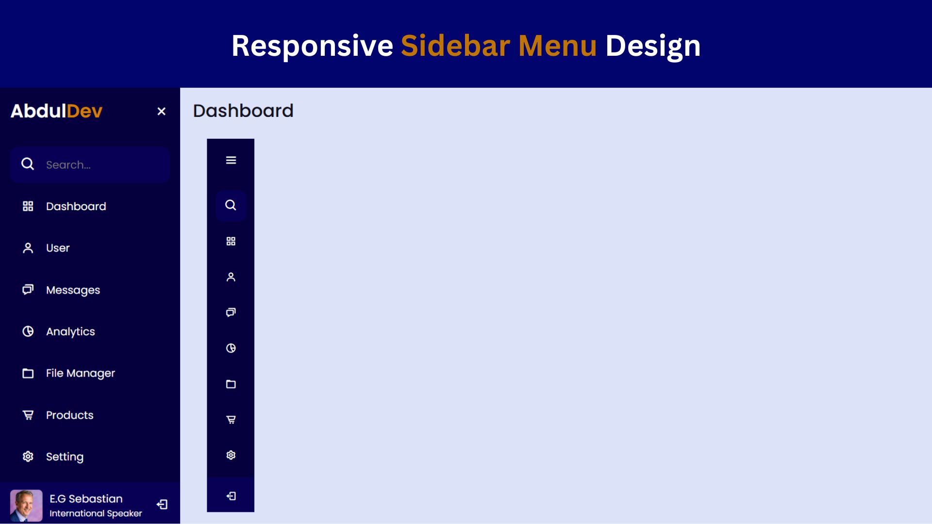
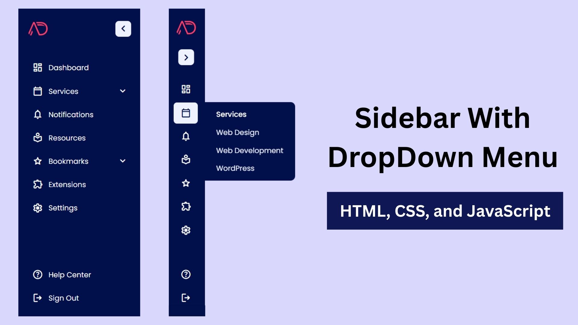
How to Create a Responsive Sidebar Menu Design
Learn how to create a responsive sidebar menu using HTML, CSS, and JavaScript. This step-by-step guide includes free source code

Responsive Website Homepage Design Using HTML and CSS
Learn how to create a responsive website homepage using HTML and CSS. This step-by-step guide covers mobile-friendly layouts, styling tips,