Creating a Responsive Portfolio Website with HTML, CSS, and JavaScript
In today’s digital age, having a responsive portfolio website is crucial for showcasing your work and skills to potential clients and employers. A responsive portfolio website looks great on any device and provides a seamless user experience. This guide will walk you through creating a responsive portfolio website using HTML, CSS, and JavaScript.
Check Out Those Useful Articles
Understanding the Basics of Responsive Design
Responsive design is fundamental to modern web development, ensuring a website delivers an optimal viewing experience across various devices. This approach hinges on using media queries to detect the device’s screen size accessing the site, enabling developers to apply different styling rules based on this information.
By utilizing flexible grids, layouts adapt seamlessly to the screen, whether a desktop, tablet, or smartphone, ensuring content is readable and accessible. Fluid images are another cornerstone, scaling appropriately to fit the container’s size, preventing distortion or loss of quality.
Embracing these principles allows for creating websites that respond to the user’s environment, providing a consistent and engaging user experience regardless of how they access your site. Implementing responsive design techniques early in the development process establishes a solid foundation for a portfolio website that is genuinely accessible to all.
Setting Up Your Project Structure
Kickstarting your responsive portfolio website begins with organizing your project’s foundation. Start by creating a leading directory dedicated to your project.
Within this directory, establish at least three crucial files: an index.html file, which will serve as the skeleton of your website; a style.css file, to breathe life into your website’s appearance; and a main.js file, where you’ll script the interactive elements that enhance user engagement.
Organizing your files from the outset streamlines the development process and helps maintain clarity as your project grows. Additionally, consider creating subdirectories for assets such as images or fonts, ensuring these resources are neatly categorized and easily accessible. Setting up a well-structured project folder is paramount in building a solid foundation for your responsive portfolio website.
Crafting the HTML Structure
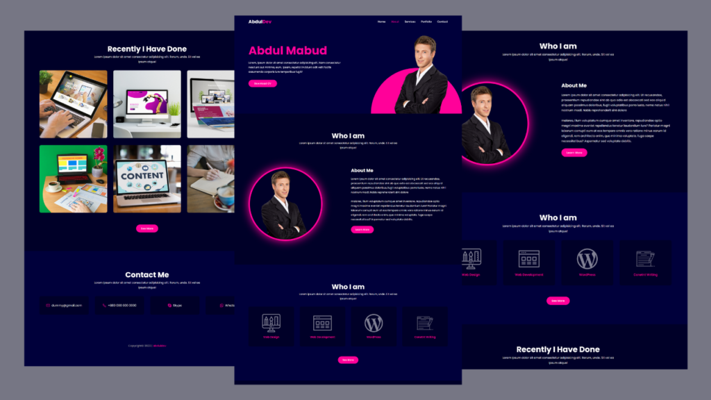
To lay the groundwork for your responsive portfolio website, begin with a comprehensive HTML structure that delineates your site’s various sections such as your biography, a gallery showcasing your projects, your contact details, and any other essential information you wish to share. Utilize semantic HTML5 tags—such as, —to enhance both accessibility and search engine optimization (SEO).
It’s essential to structure your content logically to facilitate easy user navigation. For instance, your portfolio section could be arranged in a grid layout using tags wrapped in a tag, each representing a different project. Remember to include tags in the section of your document for responsiveness, such as the viewport tag which ensures your site scales correctly on various devices.
By prioritizing semantic markup and logical structure from the start, you’ll create a strong foundation for the responsive and user-friendly portfolio website you aim to build.
First, copy the HTML code below and paste the codes into your index.html file.
					<!DOCTYPE html>
<html lang="en">
<head>
    <meta charset="UTF-8">
    <meta name="viewport" content="width=device-width, initial-scale=1.0">
    <title>Responsive Portfolio Website by AbdulDev</title>
    <link rel="stylesheet" href="style.css">
</head>
<body>
    <header>
        <a href="#" class="logo">Abdul<span>Dev</span></a>
        <div class="menuToggle"></div>
        <ul class="nav">
            <li class="active"><a href="#home">Home</a></li>
            <li><a href="#about">About</a></li>
            <li><a href="#services">Services</a></li>
            <li><a href="#portfolio">Portfolio</a></li>
            <li><a href="#contact">Contact</a></li>
        </ul>
    </header>
    <section id="home">
        <div class="content">
            <h2>Abdul Mabud</h2>
            <p>Lorem, ipsum dolor sit amet consectetur adipisicing elit. Nam consectetur nesciunt aut minima, eum, ipsam, repellat incidunt odit velit facilis assumenda corporis iure temporibus fugit?</p>
            <a href="#" class="btn">Download CV</a>
        </div>
        <img data-lazyloaded="1" src="data:image/gif;base64,R0lGODdhAQABAPAAAMPDwwAAACwAAAAAAQABAAACAkQBADs=" decoding="async" data-src="Images/hero-men.png" alt="Men" class="men">
    </section>
    <section id="about">
        <div class="secText">
            <h2>Who I am</h2>
            <p>Lorem ipsum dolor sit amet consectetur adipisicing elit. Rerum, unde. Sit vel ea ipsum atque!</p>
        </div>
        <div class="content">
            <div class="imgBx">
                <img data-lazyloaded="1" src="data:image/gif;base64,R0lGODdhAQABAPAAAMPDwwAAACwAAAAAAQABAAACAkQBADs=" decoding="async" data-src="Images/about-men.png" alt="Men">
            </div>
            <div class="contBx">
                <h3>About Me</h3>
                <p>Lorem ipsum dolor sit amet consectetur adipisicing elit. Ut recusandae, praesentium repudiandae sint ab quo odio est obcaecati sed eos aliquid aliquam possimus doloribus, fugit voluptatibus porro iusto, nemo natus nihil nostrum modi. Nobis reprehenderit sint dolore</br> </br>maiores, illum voluptatum cumque amet inventore, repudiandae optio magni maxime eveniet repellendus tenetur laudantium iure? Pariatur magni laborum corrupti eum at eos tempore omnis vero ratione minus earum id eligendi, rem architecto enim, quo minima voluptate, fuga saepe necessitatibus? Aspernatur sed voluptate debitis.</p>
                <a href="#" class="btn">Learn More</a>
            </div>
        </div>
    </section>
    <section id="services">
        <div class="secText">
            <h2>Who I am</h2>
            <p>Lorem ipsum dolor sit amet consectetur adipisicing elit. Rerum, unde. Sit vel ea ipsum atque!</p>
        </div>
        <div class="content">
            <div class="serviceBx">
                <img data-lazyloaded="1" src="data:image/gif;base64,R0lGODdhAQABAPAAAMPDwwAAACwAAAAAAQABAAACAkQBADs=" decoding="async" data-src="Images/icon1.png" alt="Services">
                <h3>Web Design</h3>
            </div>
            <div class="serviceBx">
                <img data-lazyloaded="1" src="data:image/gif;base64,R0lGODdhAQABAPAAAMPDwwAAACwAAAAAAQABAAACAkQBADs=" decoding="async" data-src="Images/icon2.png" alt="Services">
                <h3>Web Development</h3>
            </div>
            <div class="serviceBx">
                <img data-lazyloaded="1" src="data:image/gif;base64,R0lGODdhAQABAPAAAMPDwwAAACwAAAAAAQABAAACAkQBADs=" decoding="async" data-src="Images/icon3.png" alt="Services">
                <h3>WordPress</h3>
            </div>
            <div class="serviceBx">
                <img data-lazyloaded="1" src="data:image/gif;base64,R0lGODdhAQABAPAAAMPDwwAAACwAAAAAAQABAAACAkQBADs=" decoding="async" data-src="Images/icon4.png" alt="Services">
                <h3>Conetnt Writing</h3>
            </div>
        </div>
        <div class="center">
            <a href="#" class="btn">See More</a>
        </div>
    </section>
    <section id="portfolio">
        <div class="secText">
            <h2>Recently I Have Done</h2>
            <p>Lorem ipsum dolor sit amet consectetur adipisicing elit. Rerum, unde. Sit vel ea ipsum atque!</p>
        </div>
        <div class="content">
            <div class="imgBx">
                <img data-lazyloaded="1" src="data:image/gif;base64,R0lGODdhAQABAPAAAMPDwwAAACwAAAAAAQABAAACAkQBADs=" decoding="async" data-src="Images/image1.png" alt="image1">
            </div>
            <div class="imgBx">
                <img data-lazyloaded="1" src="data:image/gif;base64,R0lGODdhAQABAPAAAMPDwwAAACwAAAAAAQABAAACAkQBADs=" decoding="async" data-src="Images/image2.png" alt="image2">
            </div>
            <div class="imgBx">
                <img data-lazyloaded="1" src="data:image/gif;base64,R0lGODdhAQABAPAAAMPDwwAAACwAAAAAAQABAAACAkQBADs=" decoding="async" data-src="Images/image3.png" alt="image3">
            </div>
            <div class="imgBx">
                <img data-lazyloaded="1" src="data:image/gif;base64,R0lGODdhAQABAPAAAMPDwwAAACwAAAAAAQABAAACAkQBADs=" decoding="async" data-src="Images/image4.png" alt="image4">
            </div>
            <div class="imgBx">
                <img data-lazyloaded="1" src="data:image/gif;base64,R0lGODdhAQABAPAAAMPDwwAAACwAAAAAAQABAAACAkQBADs=" decoding="async" data-src="Images/image5.png" alt="image5">
            </div>
            <div class="imgBx">
                <img data-lazyloaded="1" src="data:image/gif;base64,R0lGODdhAQABAPAAAMPDwwAAACwAAAAAAQABAAACAkQBADs=" decoding="async" data-src="Images/image6.png" alt="image6">
            </div>
        </div>
        <div class="center">
            <a href="#" class="btn">See More</a>
        </div>
    </section>
    <section id="contact">
        <div class="secText">
            <h2>Contact Me</h2>
            <p>Lorem ipsum dolor sit amet consectetur adipisicing elit. Rerum, unde. Sit vel ea ipsum atque!</p>
        </div>
        <div class="content">
            <a href="#"><ion-icon name="mail-outline"></ion-icon>dummy@gmail.com</a>
            <a href="#"><ion-icon name="call-outline"></ion-icon>+880 000 000 0000</a>
            <a href="#"><ion-icon name="logo-skype"></ion-icon>Skype</a>
            <a href="#"><ion-icon name="logo-whatsapp"></ion-icon>WhatsApp</a>
        </div>
        <div class="center">
            <p class="copyright">Copyright© 2023 | <a href="#">abduldev</a></p>
        </div>
    </section> <script type="module" src="https://unpkg.com/ionicons@7.1.0/dist/ionicons/ionicons.esm.js"></script> <script nomodule type="litespeed/javascript" data-src="https://unpkg.com/ionicons@7.1.0/dist/ionicons/ionicons.js"></script> <script type="litespeed/javascript" data-src="main.js"></script> <script data-no-optimize="1">window.lazyLoadOptions=Object.assign({},{threshold:300},window.lazyLoadOptions||{});!function(t,e){"object"==typeof exports&&"undefined"!=typeof module?module.exports=e():"function"==typeof define&&define.amd?define(e):(t="undefined"!=typeof globalThis?globalThis:t||self).LazyLoad=e()}(this,function(){"use strict";function e(){return(e=Object.assign||function(t){for(var e=1;e<arguments.length;e++){var n,a=arguments[e];for(n in a)Object.prototype.hasOwnProperty.call(a,n)&&(t[n]=a[n])}return t}).apply(this,arguments)}function o(t){return e({},at,t)}function l(t,e){return t.getAttribute(gt+e)}function c(t){return l(t,vt)}function s(t,e){return function(t,e,n){e=gt+e;null!==n?t.setAttribute(e,n):t.removeAttribute(e)}(t,vt,e)}function i(t){return s(t,null),0}function r(t){return null===c(t)}function u(t){return c(t)===_t}function d(t,e,n,a){t&&(void 0===a?void 0===n?t(e):t(e,n):t(e,n,a))}function f(t,e){et?t.classList.add(e):t.className+=(t.className?" ":"")+e}function _(t,e){et?t.classList.remove(e):t.className=t.className.replace(new RegExp("(^|\\s+)"+e+"(\\s+|$)")," ").replace(/^\s+/,"").replace(/\s+$/,"")}function g(t){return t.llTempImage}function v(t,e){!e||(e=e._observer)&&e.unobserve(t)}function b(t,e){t&&(t.loadingCount+=e)}function p(t,e){t&&(t.toLoadCount=e)}function n(t){for(var e,n=[],a=0;e=t.children[a];a+=1)"SOURCE"===e.tagName&&n.push(e);return n}function h(t,e){(t=t.parentNode)&&"PICTURE"===t.tagName&&n(t).forEach(e)}function a(t,e){n(t).forEach(e)}function m(t){return!!t[lt]}function E(t){return t[lt]}function I(t){return delete t[lt]}function y(e,t){var n;m(e)||(n={},t.forEach(function(t){n[t]=e.getAttribute(t)}),e[lt]=n)}function L(a,t){var o;m(a)&&(o=E(a),t.forEach(function(t){var e,n;e=a,(t=o[n=t])?e.setAttribute(n,t):e.removeAttribute(n)}))}function k(t,e,n){f(t,e.class_loading),s(t,st),n&&(b(n,1),d(e.callback_loading,t,n))}function A(t,e,n){n&&t.setAttribute(e,n)}function O(t,e){A(t,rt,l(t,e.data_sizes)),A(t,it,l(t,e.data_srcset)),A(t,ot,l(t,e.data_src))}function w(t,e,n){var a=l(t,e.data_bg_multi),o=l(t,e.data_bg_multi_hidpi);(a=nt&&o?o:a)&&(t.style.backgroundImage=a,n=n,f(t=t,(e=e).class_applied),s(t,dt),n&&(e.unobserve_completed&&v(t,e),d(e.callback_applied,t,n)))}function x(t,e){!e||0<e.loadingCount||0<e.toLoadCount||d(t.callback_finish,e)}function M(t,e,n){t.addEventListener(e,n),t.llEvLisnrs[e]=n}function N(t){return!!t.llEvLisnrs}function z(t){if(N(t)){var e,n,a=t.llEvLisnrs;for(e in a){var o=a[e];n=e,o=o,t.removeEventListener(n,o)}delete t.llEvLisnrs}}function C(t,e,n){var a;delete t.llTempImage,b(n,-1),(a=n)&&--a.toLoadCount,_(t,e.class_loading),e.unobserve_completed&&v(t,n)}function R(i,r,c){var l=g(i)||i;N(l)||function(t,e,n){N(t)||(t.llEvLisnrs={});var a="VIDEO"===t.tagName?"loadeddata":"load";M(t,a,e),M(t,"error",n)}(l,function(t){var e,n,a,o;n=r,a=c,o=u(e=i),C(e,n,a),f(e,n.class_loaded),s(e,ut),d(n.callback_loaded,e,a),o||x(n,a),z(l)},function(t){var e,n,a,o;n=r,a=c,o=u(e=i),C(e,n,a),f(e,n.class_error),s(e,ft),d(n.callback_error,e,a),o||x(n,a),z(l)})}function T(t,e,n){var a,o,i,r,c;t.llTempImage=document.createElement("IMG"),R(t,e,n),m(c=t)||(c[lt]={backgroundImage:c.style.backgroundImage}),i=n,r=l(a=t,(o=e).data_bg),c=l(a,o.data_bg_hidpi),(r=nt&&c?c:r)&&(a.style.backgroundImage='url("'.concat(r,'")'),g(a).setAttribute(ot,r),k(a,o,i)),w(t,e,n)}function G(t,e,n){var a;R(t,e,n),a=e,e=n,(t=Et[(n=t).tagName])&&(t(n,a),k(n,a,e))}function D(t,e,n){var a;a=t,(-1<It.indexOf(a.tagName)?G:T)(t,e,n)}function S(t,e,n){var a;t.setAttribute("loading","lazy"),R(t,e,n),a=e,(e=Et[(n=t).tagName])&&e(n,a),s(t,_t)}function V(t){t.removeAttribute(ot),t.removeAttribute(it),t.removeAttribute(rt)}function j(t){h(t,function(t){L(t,mt)}),L(t,mt)}function F(t){var e;(e=yt[t.tagName])?e(t):m(e=t)&&(t=E(e),e.style.backgroundImage=t.backgroundImage)}function P(t,e){var n;F(t),n=e,r(e=t)||u(e)||(_(e,n.class_entered),_(e,n.class_exited),_(e,n.class_applied),_(e,n.class_loading),_(e,n.class_loaded),_(e,n.class_error)),i(t),I(t)}function U(t,e,n,a){var o;n.cancel_on_exit&&(c(t)!==st||"IMG"===t.tagName&&(z(t),h(o=t,function(t){V(t)}),V(o),j(t),_(t,n.class_loading),b(a,-1),i(t),d(n.callback_cancel,t,e,a)))}function $(t,e,n,a){var o,i,r=(i=t,0<=bt.indexOf(c(i)));s(t,"entered"),f(t,n.class_entered),_(t,n.class_exited),o=t,i=a,n.unobserve_entered&&v(o,i),d(n.callback_enter,t,e,a),r||D(t,n,a)}function q(t){return t.use_native&&"loading"in HTMLImageElement.prototype}function H(t,o,i){t.forEach(function(t){return(a=t).isIntersecting||0<a.intersectionRatio?$(t.target,t,o,i):(e=t.target,n=t,a=o,t=i,void(r(e)||(f(e,a.class_exited),U(e,n,a,t),d(a.callback_exit,e,n,t))));var e,n,a})}function B(e,n){var t;tt&&!q(e)&&(n._observer=new IntersectionObserver(function(t){H(t,e,n)},{root:(t=e).container===document?null:t.container,rootMargin:t.thresholds||t.threshold+"px"}))}function J(t){return Array.prototype.slice.call(t)}function K(t){return t.container.querySelectorAll(t.elements_selector)}function Q(t){return c(t)===ft}function W(t,e){return e=t||K(e),J(e).filter(r)}function X(e,t){var n;(n=K(e),J(n).filter(Q)).forEach(function(t){_(t,e.class_error),i(t)}),t.update()}function t(t,e){var n,a,t=o(t);this._settings=t,this.loadingCount=0,B(t,this),n=t,a=this,Y&&window.addEventListener("online",function(){X(n,a)}),this.update(e)}var Y="undefined"!=typeof window,Z=Y&&!("onscroll"in window)||"undefined"!=typeof navigator&&/(gle|ing|ro)bot|crawl|spider/i.test(navigator.userAgent),tt=Y&&"IntersectionObserver"in window,et=Y&&"classList"in document.createElement("p"),nt=Y&&1<window.devicePixelRatio,at={elements_selector:".lazy",container:Z||Y?document:null,threshold:300,thresholds:null,data_src:"src",data_srcset:"srcset",data_sizes:"sizes",data_bg:"bg",data_bg_hidpi:"bg-hidpi",data_bg_multi:"bg-multi",data_bg_multi_hidpi:"bg-multi-hidpi",data_poster:"poster",class_applied:"applied",class_loading:"litespeed-loading",class_loaded:"litespeed-loaded",class_error:"error",class_entered:"entered",class_exited:"exited",unobserve_completed:!0,unobserve_entered:!1,cancel_on_exit:!0,callback_enter:null,callback_exit:null,callback_applied:null,callback_loading:null,callback_loaded:null,callback_error:null,callback_finish:null,callback_cancel:null,use_native:!1},ot="src",it="srcset",rt="sizes",ct="poster",lt="llOriginalAttrs",st="loading",ut="loaded",dt="applied",ft="error",_t="native",gt="data-",vt="ll-status",bt=[st,ut,dt,ft],pt=[ot],ht=[ot,ct],mt=[ot,it,rt],Et={IMG:function(t,e){h(t,function(t){y(t,mt),O(t,e)}),y(t,mt),O(t,e)},IFRAME:function(t,e){y(t,pt),A(t,ot,l(t,e.data_src))},VIDEO:function(t,e){a(t,function(t){y(t,pt),A(t,ot,l(t,e.data_src))}),y(t,ht),A(t,ct,l(t,e.data_poster)),A(t,ot,l(t,e.data_src)),t.load()}},It=["IMG","IFRAME","VIDEO"],yt={IMG:j,IFRAME:function(t){L(t,pt)},VIDEO:function(t){a(t,function(t){L(t,pt)}),L(t,ht),t.load()}},Lt=["IMG","IFRAME","VIDEO"];return t.prototype={update:function(t){var e,n,a,o=this._settings,i=W(t,o);{if(p(this,i.length),!Z&&tt)return q(o)?(e=o,n=this,i.forEach(function(t){-1!==Lt.indexOf(t.tagName)&&S(t,e,n)}),void p(n,0)):(t=this._observer,o=i,t.disconnect(),a=t,void o.forEach(function(t){a.observe(t)}));this.loadAll(i)}},destroy:function(){this._observer&&this._observer.disconnect(),K(this._settings).forEach(function(t){I(t)}),delete this._observer,delete this._settings,delete this.loadingCount,delete this.toLoadCount},loadAll:function(t){var e=this,n=this._settings;W(t,n).forEach(function(t){v(t,e),D(t,n,e)})},restoreAll:function(){var e=this._settings;K(e).forEach(function(t){P(t,e)})}},t.load=function(t,e){e=o(e);D(t,e)},t.resetStatus=function(t){i(t)},t}),function(t,e){"use strict";function n(){e.body.classList.add("litespeed_lazyloaded")}function a(){console.log("[LiteSpeed] Start Lazy Load"),o=new LazyLoad(Object.assign({},t.lazyLoadOptions||{},{elements_selector:"[data-lazyloaded]",callback_finish:n})),i=function(){o.update()},t.MutationObserver&&new MutationObserver(i).observe(e.documentElement,{childList:!0,subtree:!0,attributes:!0})}var o,i;t.addEventListener?t.addEventListener("load",a,!1):t.attachEvent("onload",a)}(window,document);</script><script data-no-optimize="1">window.litespeed_ui_events=window.litespeed_ui_events||["mouseover","click","keydown","wheel","touchmove","touchstart"];var urlCreator=window.URL||window.webkitURL;function litespeed_load_delayed_js_force(){console.log("[LiteSpeed] Start Load JS Delayed"),litespeed_ui_events.forEach(e=>{window.removeEventListener(e,litespeed_load_delayed_js_force,{passive:!0})}),document.querySelectorAll("iframe[data-litespeed-src]").forEach(e=>{e.setAttribute("src",e.getAttribute("data-litespeed-src"))}),"loading"==document.readyState?window.addEventListener("DOMContentLoaded",litespeed_load_delayed_js):litespeed_load_delayed_js()}litespeed_ui_events.forEach(e=>{window.addEventListener(e,litespeed_load_delayed_js_force,{passive:!0})});async function litespeed_load_delayed_js(){let t=[];for(var d in document.querySelectorAll('script[type="litespeed/javascript"]').forEach(e=>{t.push(e)}),t)await new Promise(e=>litespeed_load_one(t[d],e));document.dispatchEvent(new Event("DOMContentLiteSpeedLoaded")),window.dispatchEvent(new Event("DOMContentLiteSpeedLoaded"))}function litespeed_load_one(t,e){console.log("[LiteSpeed] Load ",t);var d=document.createElement("script");d.addEventListener("load",e),d.addEventListener("error",e),t.getAttributeNames().forEach(e=>{"type"!=e&&d.setAttribute("data-src"==e?"src":e,t.getAttribute(e))});let a=!(d.type="text/javascript");!d.src&&t.textContent&&(d.src=litespeed_inline2src(t.textContent),a=!0),t.after(d),t.remove(),a&&e()}function litespeed_inline2src(t){try{var d=urlCreator.createObjectURL(new Blob([t.replace(/^(?:<!--)?(.*?)(?:-->)?$/gm,"$1")],{type:"text/javascript"}))}catch(e){d="data:text/javascript;base64,"+btoa(t.replace(/^(?:<!--)?(.*?)(?:-->)?$/gm,"$1"))}return d}</script><script data-no-optimize="1">var litespeed_vary=document.cookie.replace(/(?:(?:^|.*;\s*)_lscache_vary\s*\=\s*([^;]*).*$)|^.*$/,"");litespeed_vary||(sessionStorage.getItem("litespeed_reloaded")?console.log("LiteSpeed: skipping guest vary reload (already reloaded this session)"):fetch("/wp-content/plugins/litespeed-cache/guest.vary.php",{method:"POST",cache:"no-cache",redirect:"follow"}).then(e=>e.json()).then(e=>{console.log(e),e.hasOwnProperty("reload")&&"yes"==e.reload&&(sessionStorage.setItem("litespeed_docref",document.referrer),sessionStorage.setItem("litespeed_reloaded","1"),window.location.reload(!0))}));</script><script data-optimized="1" type="litespeed/javascript" data-src="https://abduldev.com/wp-content/litespeed/js/0b11d7b176723f098ea69bc8efdbb073.js?ver=0291f"></script></body>
</html>
Styling with CSS for a Responsive Layout
Embarking on the CSS journey transforms the bare-bones HTML structure into a visually appealing, responsive portfolio website. The heart of this transformation lies in effectively utilizing media queries. These CSS tools allow you to apply different styling rules for various screen sizes, ensuring your portfolio’s adaptability across devices. The magic starts with defining breakpoints—specific widths at which your site’s layout changes—to cater to devices like smartphones, tablets, and desktops.
Incorporate CSS Grid or Flexbox to create flexible and maintainable layouts. These layout models offer a robust framework for designing complex responsive layouts with minimal effort. For instance, a CSS Grid can arrange project thumbnails in a seamless, adaptive grid that reflows content based on screen width, ensuring your work is presented in the best possible light, no matter the device.
Pay special attention to your site’s visual elements. Choose typography that’s legible across devices, employ a color scheme that reflects your personal brand, and utilize spacing to guide the user’s eye through your content. Remember, the goal is to create a cohesive, visually engaging experience that complements the quality of your work showcased in your portfolio.
Responsive design is more than just making things fit on a screen; it’s about creating a harmonious user experience that feels intuitive and effortless. Through strategic use of CSS, your portfolio website will be responsive and reflect your unique skills and creativity.
Second, Copy the CSS code below and paste the codes into your style.css file.
					@import url('https://fonts.googleapis.com/css2?family=Poppins:wght@400;500;700&display=swap');

*{
    margin: 0;
    padding: 0;
    box-sizing: border-box;
    font-family: "Poppins", sans-serif;
    scroll-behavior: smooth;
}
header{
    position: fixed;
    top: 0;
    left: 0;
    width: 100%;
    padding: 20px 100px;
    display: flex;
    justify-content: space-between;
    align-items: center;
    z-index: 1000;
    backdrop-filter: blur(40px);
}
header .logo{
    position: relative;
    text-decoration: none;
    font-size: 2em;
    font-weight: 700;
    color: #fff;
}
.logo span{
    color: #ff0199;
}
header ul{
    position: relative;
    display: flex;
    gap: 40px;
}
header ul li{
    list-style: none;
}
header ul li a{
    text-decoration: none;
    font-size: 18px;
    font-weight: 500;
    color: #fff;
    transition: 0.5s;
}
header ul li.active a,
header ul li:hover a{
    color: #ff0199;
}
/* Hero Section */
#home{
    position: relative;
    width: 100%;
    min-height: 100vh;
    background: #00003b;
    display: flex;
    justify-content: space-between;
    align-items: center;
    padding: 100px;
}
#home .content{
    position: relative;
    display: flex;
    flex-direction: column;
    max-width: 650px;
    gap: 10px;
    z-index: 10;
}
#home .content h2{
    position: relative;
    font-size: 5em;
    color: #ff0199;
}
#home .content p{
    position: relative;
    color: #fff;
    font-size: 1.1em;
    line-height: 1.8em;
}
/* Global Button Style */
.btn{
    position: relative;
    display: inline-block;
    background: #ff0199;
    max-width: 200px;
    color: #fff;
    text-align: center;
    padding: 12px 30px;
    border-radius: 45px;
    font-weight: 500;
    letter-spacing: 0.05em;
    text-decoration: none;
    margin-top: 30px;
    border: 2px solid #ff0199;
    transition: 0.5s;
}
.btn:hover{
    background: transparent;
    color: #ff0199;
}
#home .men{
    position: absolute;
    bottom: 0;
    right: 100px;
    max-height: 80vh;
}
#home::before{
    content: '';
    position: absolute;
    bottom: 0;
    right: 0;
    width: 40vw;
    height: 20vw;
    background: #ff0199;
    border-radius: 25vw 25vw 0 0;
}
/* About Section */
#about{
    position: relative;
    background: #000028;
    min-height: 100vh;
    padding: 120px 100px;
    display: flex;
    justify-content: center;
    flex-direction: column;
}
#about .secText{
    position: relative;
    width: 100%;
    display: flex;
    justify-content: center;
    align-items: center;
    flex-direction: column;
    padding-bottom: 80px;
}
.secText h2{
    font-size: 3em;
    color: #fff;
}
.secText p{
    max-width: 700px;
    text-align: center;
    color: #fff;
    font-size: 1.1em;
    line-height: 1.8em;
}
#about .content{
    display: grid;
    grid-template-columns: repeat(2, 1fr);
    grid-gap: 40px;
    margin: 40px 0;
}
#about .content .imgBx img{
    border: 10px solid #ff0199;
    border-radius: 50%;
    box-shadow: 0 0 60px #ff0199;
}
.contBx h3{
    font-size: 2em;
    color: #fff;
    padding-bottom: 20px;
}
.contBx p{
    font-size: 1.1em;
    color: #fff;
    line-height: 1.8em;
}
#services,
#portfolio,
#contact{
    position: relative;
    background: #00003b;
    min-height: 100vh;
    padding: 120px 100px;
    display: flex;
    justify-content: center;
    flex-direction: column;
}
/* Service Section */
.secText{
    position: relative;
    width: 100%;
    display: flex;
    justify-content: center;
    align-items: center;
    flex-direction: column;
}
#services .content{
    display: grid;
    grid-template-columns: repeat(4, 1fr);
    grid-gap: 40px;
    margin: 40px 0;
}
#services .content .serviceBx{
    background: #000028;
    padding: 50px 20px;
    display: flex;
    justify-content: center;
    align-items: center;
    flex-direction: column;
    border: 2px solid #000028;
    border-radius: 10px;
    gap: 20px;
    transition: 0.5s;
}
#services .content .serviceBx:hover{
    border: 2px solid #ff0199;
}
#services .content .serviceBx img{
    max-width: 100%;
    filter: invert(1);
    opacity: 0.5;
    transition: 0.5s;
}
#services .content .serviceBx:hover img{
    opacity: 1;
}
#services .content .serviceBx h3{
    color: #ff0199;
    font-weight: 500;
}
.center{
    width: 100%;
    text-align: center;
}
/* Portfolio Section */
#portfolio{
    background: #000028;
    text-align: center;
}
#portfolio .content{
    display: grid;
    grid-template-columns: repeat(3, 1fr);
    grid-gap: 40px;
    margin: 40px 0;
}
#portfolio .content .imgBx{
    position: relative;
}
#portfolio .content .imgBx img{
    width: 100%;
    border-radius: 10px;
}
/* Contact Section */
#contact .content{
    display: grid;
    grid-template-columns: repeat(4, 1fr);
    grid-gap: 40px;
    margin: 40px 0;
}
#contact .content a{
    background: #000028;
    height: 120px;
    display: flex;
    align-items: center;
    justify-content: center;
    text-decoration: none;
    font-size: 1.2em;
    color: #fff;
    border-radius: 10px;
    transition: 0.5s;
}
#contact .content a:hover{
    background: #ff0199;
}
#contact .content a ion-icon{
    color: #ff0199;
    margin-right: 10px;
    font-size: 1.3em;
    transition: 0.5s;
}
#contact .content a:hover,
#contact .content a:hover ion-icon{
    color: #fff;
}
.copyright{
    position: relative;
    margin-top: 150px;
    font-size: 1.1em;
    color: #aaa;
}
.copyright a{
    text-decoration: none;
    color: #ff0199;
}
/* Responsive Code */
@media  screen and (max-width: 900px) {
    header{
        padding: 20px 50px;
    }
    #home{
        padding: 150px 50px;
        flex-direction: column;
        padding-bottom: 0;
    }
    #home .content h2{
        font-size: 4em;
    }
    .btn{
        max-width: 160px;
        padding: 12px 20px;
        font-size: 0.9em;
    }
    #home .men{
        position: absolute;
        height: 40vh;
        right: 30px;
    }
    .secText h2{
        font-size: 2em;
        text-align: center;
    }
    #about .content{
        grid-template-columns: repeat(1, 1fr);
    }
    #about .content .imgBx img{
        width: 80%;
        margin-left: 40px;
    }
    #about .secText{
        padding-bottom: 40px;
    }
    #about,
    #services,
    #portfolio,
    #contact{
        padding: 100px 50px 50px;
    }
    #services .content,
    #portfolio .content,
    #contact .content{
        grid-template-columns: repeat(2, 1fr);
    }
    /* Mobile Menu */
    .menuToggle{
        position: relative;
        width: 30px;
        height: 20px;
        cursor: pointer;
        display: flex;
        justify-content: center;
        align-items: center;
    }
    .menuToggle::before{
        content: '';
        position: absolute;
        width: 100%;
        height: 2px;
        background: #fff;
        transform: translateY(-10px);
        box-shadow: 0 10px #fff;
        transition: 0.5s;
    }
    .menuToggle::after{
        content: '';
        position: absolute;
        width: 100%;
        height: 2px;
        background: #fff;
        transform: translateY(10px);
        transition: 0.5s;
    }
    header.active .menuToggle::before{
        transform: translateY(0) rotate(45deg);
        box-shadow: 0 0 #fff;
    }
    header.active .menuToggle::after{
        transform: translateY(0) rotate(315deg);
    }
    header ul{
        display: none;
    }
    header.active ul{
        position: fixed;
        left: 0;
        top: 84px;
        width: 100%;
        height: calc(100vh - 84px);
        background: #000000f0;
        display: flex;
        justify-content: center;
        align-items: center;
        flex-direction: column;
        gap: 20px;
    }
    header.active ul a{
        font-size: 1.4em;
    }
}
@media  screen and (max-width: 700px) {
    header{
        padding: 20px 30px;
    }
    #home{
        padding: 150px 30px;
    }
    #about,
    #services,
    #portfolio,
    #contact{
        padding: 50px 30px;
    }
    #home .content h2{
        font-size: 3em;
    }
    #home::before{
        width: 60vw;
        height: 30vw;
        background: #ff0199;
        border-radius: 80vw 80vw 0 0;
    }
    #home .men{
        position: absolute;
        height: 40vh;
        right: 30px;
    }
    #services .content,
    #portfolio .content,
    #contact .content{
        grid-template-columns: repeat(1, 1fr);
    }
}
Enhancing Interactivity with JavaScript
JavaScript is the key to bringing dynamic content to your responsive portfolio website and elevating user engagement through interactive features.
By incorporating JavaScript, you can implement dynamic elements such as a hamburger menu for mobile devices, modals for detailed project information, and smooth scroll functions for a seamless navigation experience. Crafting a responsive slider for your project showcase or a filterable gallery allows users to interact with your work engagingly.
Additionally, leveraging JavaScript for form validation adds a layer of interaction that enhances user satisfaction by providing immediate feedback on their input. Ensuring that your JavaScript enhances the site’s functionality without compromising performance is essential.
Efficiently written scripts contribute to a swift, responsive user experience across all devices, making your portfolio a showcase of your work and a demonstration of your skill in creating modern, interactive web experiences.
Third, Copy the JavaScript code below and paste the codes into your main.js file
					let list = document.querySelectorAll('.nav li');
function active(){
    list.forEach((i) =>
    i.classList.remove('active'));
    this.classList.add('active');
}
list.forEach((i) =>
i.addEventListener('click', active));

let menuToggle = document.querySelector('.menuToggle');
let header = document.querySelector('header');
menuToggle.onclick = function(){
    header.classList.toggle('active');
}
Testing and Optimizing Your Website
Ensuring your responsive portfolio website runs smoothly across different platforms and devices is paramount. Begin rigorously testing it on various devices, including smartphones, tablets, and desktops, to identify and resolve layout shifts or functionality issues. Employ browser developer tools and responsive design testing websites to simulate various screen sizes and environments. This proactive approach highlights areas for improvement and ensures your site’s layout and features perform as intended.
In addition to layout testing, assess your website’s performance metrics using tools such as Google PageSpeed Insights. This analysis reveals opportunities to enhance site speed, a critical factor in user experience and SEO rankings. Techniques such as compressing images without sacrificing quality, minifying CSS and JavaScript files to reduce their load time, and leveraging browser caching to store resource files locally on visitors’ devices can significantly improve loading times.
Accessibility testing should also be conducted to guarantee that your site is usable by everyone, including people with disabilities. Utilize accessibility-checking tools to identify and rectify any barriers preventing users from fully accessing your content.
Focusing on these optimization strategies ensures that your portfolio website offers a fast, efficient, and inclusive user experience. Regularly revisiting these testing and optimization processes as you update your site keeps performance at its peak, maintaining the professional and polished presence essential for your online portfolio.
Deploying Your Portfolio Website
Choosing the right platform for your responsive portfolio website’s deployment is crucial in making your project accessible to the world. After completing your website’s development and thorough testing, it’s time to select a hosting service that aligns with your needs.
Whether you prefer traditional web hosting providers or modern cloud-based solutions, ensure the one you choose offers robust performance and reliability. Once you’ve decided on a hosting service, upload your project files, keeping an eye on the directory structure to maintain the organization of your site. Implementing HTTPS is a non-negotiable deployment aspect, as it secures your website’s connection and protects visitors’ information.
After your website goes live, continuous monitoring is essential. Utilize tools that track your site’s uptime and performance, allowing you to address any issues that may arise quickly. Regular updates are also vital, not only to add fresh content but also to patch any security vulnerabilities and optimize for evolving web standards.
Deploying your portfolio marks the beginning of its journey online, setting the stage for showcasing your talents to a global audience.
Conclusion
Embarking on the journey to create a responsive portfolio website requires dedication, creativity, and a keen understanding of web technologies. By utilizing HTML, CSS, and JavaScript, you’re equipped to build a platform that effectively showcases your skills and projects.
Emphasize regular maintenance and updates to keep your site relevant and engaging for visitors. Always look for new trends and technologies to enhance your website’s functionality and design. Embrace feedback and continuously seek to improve your site’s usability and accessibility.
This proactive approach ensures that your portfolio serves as a dynamic representation of your work and a testament to your commitment to excellence in the digital domain. With these principles in mind, you’re on your way to creating a portfolio website that resonates with your audience and sets the foundation for your professional growth.
Recent Posts


Categories


FAQs
A responsive portfolio website is designed to provide an optimal viewing experience across various devices, from desktop computers to mobile phones. It adjusts the layout and content dynamically based on the screen size and orientation of the device, ensuring a seamless user experience.
Responsiveness is crucial because it ensures your portfolio is accessible and visually appealing on any device. This improves user experience, increases engagement, and boosts your site’s SEO ranking. With more people accessing the web via mobile devices, having a responsive site is essential.
The primary technologies required are HTML for structuring the content, CSS for styling and layout, and JavaScript for adding interactivity. Additionally, frameworks like Bootstrap and libraries like jQuery can expedite the development process and enhance functionality.
To make a website responsive with CSS, use flexible grid layouts, flexible images, and media queries. Media queries allow you to apply different styles based on the device’s characteristics, such as width, height, or orientation, ensuring the site looks good on all screen sizes.
Media queries are a CSS feature that enables you to apply styles selectively based on the conditions of the user’s device, such as screen width, height, resolution, and orientation. They are essential for creating responsive designs that adapt to various screen sizes.
JavaScript enhances a portfolio website by adding interactive elements like image sliders, modal pop-ups, form validation, and animations. It improves user experience by making the site more dynamic and engaging.
Share on Social Media
Related Articles
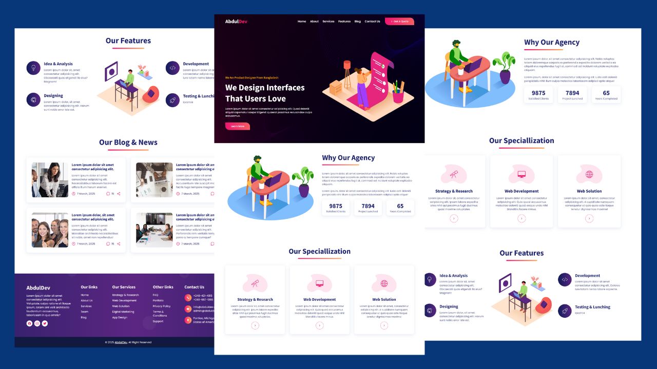
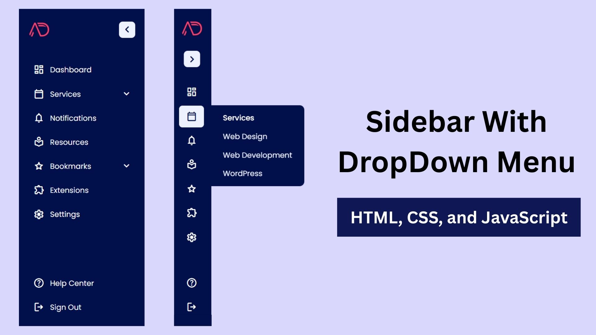
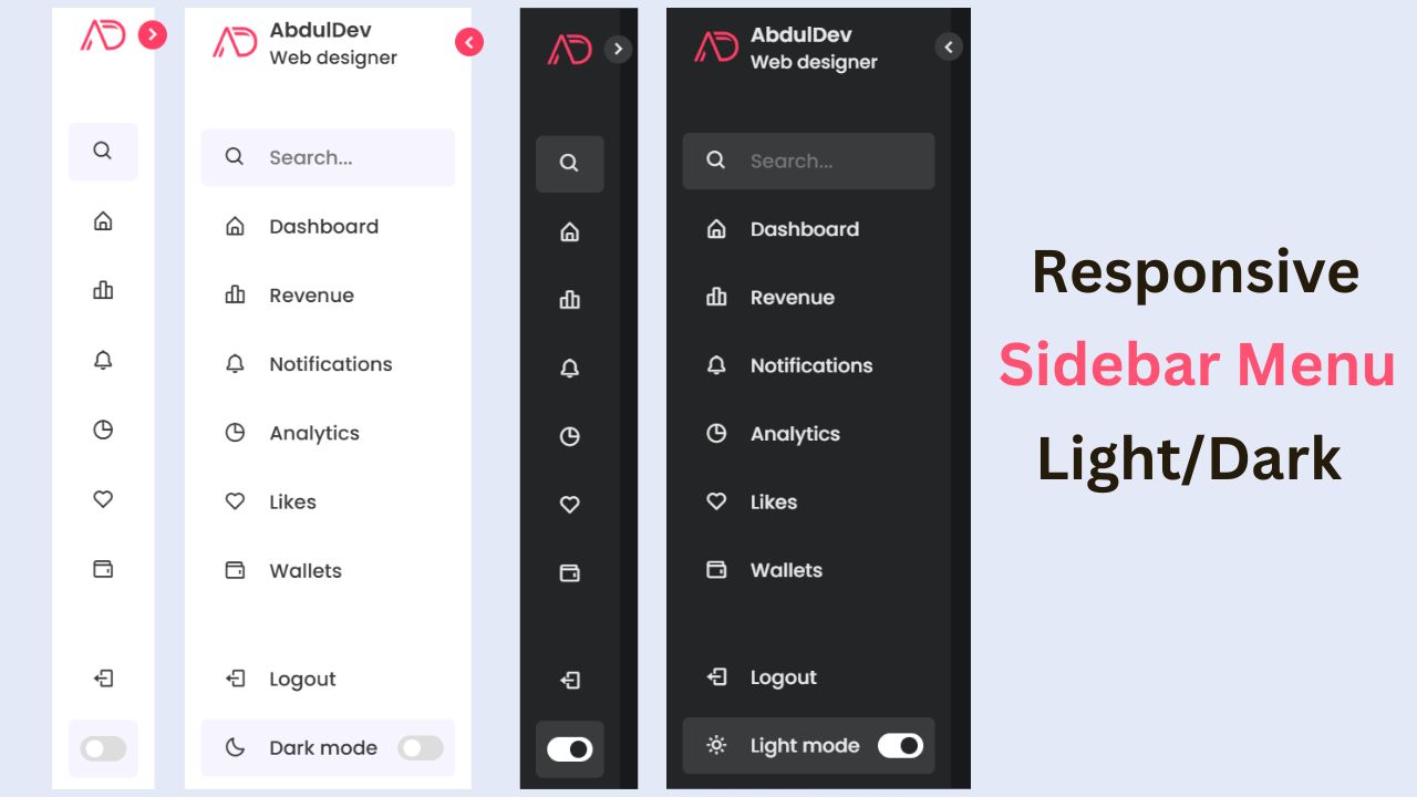
Build a Responsive Animated Portfolio Website with Dark & Light Mode | Free Source Code
Build a Responsive Animated Portfolio Website with Dark & Light Mode Free Download Code Files Preview The Demo Your portfolio
Responsive Animated Hero Section with Dark Light Theme | Free Source Code
Responsive Animated Hero Section with Dark Light Theme Let’s be real for a second. The first thing visitors notice on
How to Design Agency Website Using HTML, CSS, and JavaScript
Learn how to build a stunning, responsive design agency website using HTML, CSS, and JavaScript. This beginner-friendly guide covers planning,