Creating an Animated Login Form Using HTML and CSS
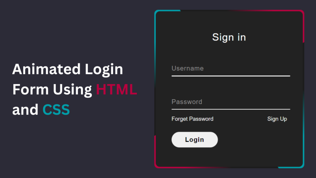
Animated Login Form is one of the best user experiences in today’s digital age. A smooth and visually appealing login process can significantly enhance a website’s overall appeal. Fortunately, with HTML and CSS, you can create stunning animated login forms that captivate users from arrival. In this tutorial, I’ll walk you through the steps to design an animated login form and provide you with free source code to kickstart your project.
Why Animated Login Forms Matter
A login form is often the first interaction users have with a website. An animated login form not only adds visual interest but also communicates professionalism and attention to detail. Animation can guide users’ attention, provide feedback, and create a memorable experience, all of which contribute to higher engagement and retention rates.
Check Out Those Useful Articles
Animated Login Form Using HTML and CSS (Source Code)
To implement this Animated Login Form on your website, adhere to these straightforward steps:
Start by establishing a directory for your project. You have the liberty to name this folder as per your preference. Within this folder, we’ll generate the requisite files.
Generate a new file titled index.html. It’s essential that the file be named “index” with the extension “.html”.
Subsequently, craft another file named style.css. Once more, confirm that the file name is “style” with the extension “.css”.
First, Copy the bellow HTML code and paste the codes into your index.html file.
					<!DOCTYPE html>
<html lang="en">
<head>
    <meta charset="UTF-8">
    <meta name="viewport" content="width=device-width, initial-scale=1.0">
    <title>Animated Login Form</title>

    <link rel="stylesheet" href="style.css">
</head>
<body>
    <div class="box">
        <div class="border-line"></div>
        <form action="#">
            <h2>Sign in</h2>
            <div class="input-box">
                <input type="text" required="required">
                <span>Username</span>
                <i></i>
            </div>
            <div class="input-box">
                <input type="password" required="required">
                <span>Password</span>
                <i></i>
            </div>
            <div class="imp-links">
                <a href="#">Forget Password</a>
                <a href="#">Sign up</a>
            </div>
            <input type="submit" value="Login" class="btn">
        <input
                    class="apbct_special_field apbct_email_id__elementor_form"
                    name="apbct__email_id__elementor_form"
                    aria-label="apbct__label_id__elementor_form"
                    type="text" size="30" maxlength="200" autocomplete="off"
                    value=""
                /></form>
    </div> <script data-no-optimize="1">window.lazyLoadOptions=Object.assign({},{threshold:300},window.lazyLoadOptions||{});!function(t,e){"object"==typeof exports&&"undefined"!=typeof module?module.exports=e():"function"==typeof define&&define.amd?define(e):(t="undefined"!=typeof globalThis?globalThis:t||self).LazyLoad=e()}(this,function(){"use strict";function e(){return(e=Object.assign||function(t){for(var e=1;e<arguments.length;e++){var n,a=arguments[e];for(n in a)Object.prototype.hasOwnProperty.call(a,n)&&(t[n]=a[n])}return t}).apply(this,arguments)}function o(t){return e({},at,t)}function l(t,e){return t.getAttribute(gt+e)}function c(t){return l(t,vt)}function s(t,e){return function(t,e,n){e=gt+e;null!==n?t.setAttribute(e,n):t.removeAttribute(e)}(t,vt,e)}function i(t){return s(t,null),0}function r(t){return null===c(t)}function u(t){return c(t)===_t}function d(t,e,n,a){t&&(void 0===a?void 0===n?t(e):t(e,n):t(e,n,a))}function f(t,e){et?t.classList.add(e):t.className+=(t.className?" ":"")+e}function _(t,e){et?t.classList.remove(e):t.className=t.className.replace(new RegExp("(^|\\s+)"+e+"(\\s+|$)")," ").replace(/^\s+/,"").replace(/\s+$/,"")}function g(t){return t.llTempImage}function v(t,e){!e||(e=e._observer)&&e.unobserve(t)}function b(t,e){t&&(t.loadingCount+=e)}function p(t,e){t&&(t.toLoadCount=e)}function n(t){for(var e,n=[],a=0;e=t.children[a];a+=1)"SOURCE"===e.tagName&&n.push(e);return n}function h(t,e){(t=t.parentNode)&&"PICTURE"===t.tagName&&n(t).forEach(e)}function a(t,e){n(t).forEach(e)}function m(t){return!!t[lt]}function E(t){return t[lt]}function I(t){return delete t[lt]}function y(e,t){var n;m(e)||(n={},t.forEach(function(t){n[t]=e.getAttribute(t)}),e[lt]=n)}function L(a,t){var o;m(a)&&(o=E(a),t.forEach(function(t){var e,n;e=a,(t=o[n=t])?e.setAttribute(n,t):e.removeAttribute(n)}))}function k(t,e,n){f(t,e.class_loading),s(t,st),n&&(b(n,1),d(e.callback_loading,t,n))}function A(t,e,n){n&&t.setAttribute(e,n)}function O(t,e){A(t,rt,l(t,e.data_sizes)),A(t,it,l(t,e.data_srcset)),A(t,ot,l(t,e.data_src))}function w(t,e,n){var a=l(t,e.data_bg_multi),o=l(t,e.data_bg_multi_hidpi);(a=nt&&o?o:a)&&(t.style.backgroundImage=a,n=n,f(t=t,(e=e).class_applied),s(t,dt),n&&(e.unobserve_completed&&v(t,e),d(e.callback_applied,t,n)))}function x(t,e){!e||0<e.loadingCount||0<e.toLoadCount||d(t.callback_finish,e)}function M(t,e,n){t.addEventListener(e,n),t.llEvLisnrs[e]=n}function N(t){return!!t.llEvLisnrs}function z(t){if(N(t)){var e,n,a=t.llEvLisnrs;for(e in a){var o=a[e];n=e,o=o,t.removeEventListener(n,o)}delete t.llEvLisnrs}}function C(t,e,n){var a;delete t.llTempImage,b(n,-1),(a=n)&&--a.toLoadCount,_(t,e.class_loading),e.unobserve_completed&&v(t,n)}function R(i,r,c){var l=g(i)||i;N(l)||function(t,e,n){N(t)||(t.llEvLisnrs={});var a="VIDEO"===t.tagName?"loadeddata":"load";M(t,a,e),M(t,"error",n)}(l,function(t){var e,n,a,o;n=r,a=c,o=u(e=i),C(e,n,a),f(e,n.class_loaded),s(e,ut),d(n.callback_loaded,e,a),o||x(n,a),z(l)},function(t){var e,n,a,o;n=r,a=c,o=u(e=i),C(e,n,a),f(e,n.class_error),s(e,ft),d(n.callback_error,e,a),o||x(n,a),z(l)})}function T(t,e,n){var a,o,i,r,c;t.llTempImage=document.createElement("IMG"),R(t,e,n),m(c=t)||(c[lt]={backgroundImage:c.style.backgroundImage}),i=n,r=l(a=t,(o=e).data_bg),c=l(a,o.data_bg_hidpi),(r=nt&&c?c:r)&&(a.style.backgroundImage='url("'.concat(r,'")'),g(a).setAttribute(ot,r),k(a,o,i)),w(t,e,n)}function G(t,e,n){var a;R(t,e,n),a=e,e=n,(t=Et[(n=t).tagName])&&(t(n,a),k(n,a,e))}function D(t,e,n){var a;a=t,(-1<It.indexOf(a.tagName)?G:T)(t,e,n)}function S(t,e,n){var a;t.setAttribute("loading","lazy"),R(t,e,n),a=e,(e=Et[(n=t).tagName])&&e(n,a),s(t,_t)}function V(t){t.removeAttribute(ot),t.removeAttribute(it),t.removeAttribute(rt)}function j(t){h(t,function(t){L(t,mt)}),L(t,mt)}function F(t){var e;(e=yt[t.tagName])?e(t):m(e=t)&&(t=E(e),e.style.backgroundImage=t.backgroundImage)}function P(t,e){var n;F(t),n=e,r(e=t)||u(e)||(_(e,n.class_entered),_(e,n.class_exited),_(e,n.class_applied),_(e,n.class_loading),_(e,n.class_loaded),_(e,n.class_error)),i(t),I(t)}function U(t,e,n,a){var o;n.cancel_on_exit&&(c(t)!==st||"IMG"===t.tagName&&(z(t),h(o=t,function(t){V(t)}),V(o),j(t),_(t,n.class_loading),b(a,-1),i(t),d(n.callback_cancel,t,e,a)))}function $(t,e,n,a){var o,i,r=(i=t,0<=bt.indexOf(c(i)));s(t,"entered"),f(t,n.class_entered),_(t,n.class_exited),o=t,i=a,n.unobserve_entered&&v(o,i),d(n.callback_enter,t,e,a),r||D(t,n,a)}function q(t){return t.use_native&&"loading"in HTMLImageElement.prototype}function H(t,o,i){t.forEach(function(t){return(a=t).isIntersecting||0<a.intersectionRatio?$(t.target,t,o,i):(e=t.target,n=t,a=o,t=i,void(r(e)||(f(e,a.class_exited),U(e,n,a,t),d(a.callback_exit,e,n,t))));var e,n,a})}function B(e,n){var t;tt&&!q(e)&&(n._observer=new IntersectionObserver(function(t){H(t,e,n)},{root:(t=e).container===document?null:t.container,rootMargin:t.thresholds||t.threshold+"px"}))}function J(t){return Array.prototype.slice.call(t)}function K(t){return t.container.querySelectorAll(t.elements_selector)}function Q(t){return c(t)===ft}function W(t,e){return e=t||K(e),J(e).filter(r)}function X(e,t){var n;(n=K(e),J(n).filter(Q)).forEach(function(t){_(t,e.class_error),i(t)}),t.update()}function t(t,e){var n,a,t=o(t);this._settings=t,this.loadingCount=0,B(t,this),n=t,a=this,Y&&window.addEventListener("online",function(){X(n,a)}),this.update(e)}var Y="undefined"!=typeof window,Z=Y&&!("onscroll"in window)||"undefined"!=typeof navigator&&/(gle|ing|ro)bot|crawl|spider/i.test(navigator.userAgent),tt=Y&&"IntersectionObserver"in window,et=Y&&"classList"in document.createElement("p"),nt=Y&&1<window.devicePixelRatio,at={elements_selector:".lazy",container:Z||Y?document:null,threshold:300,thresholds:null,data_src:"src",data_srcset:"srcset",data_sizes:"sizes",data_bg:"bg",data_bg_hidpi:"bg-hidpi",data_bg_multi:"bg-multi",data_bg_multi_hidpi:"bg-multi-hidpi",data_poster:"poster",class_applied:"applied",class_loading:"litespeed-loading",class_loaded:"litespeed-loaded",class_error:"error",class_entered:"entered",class_exited:"exited",unobserve_completed:!0,unobserve_entered:!1,cancel_on_exit:!0,callback_enter:null,callback_exit:null,callback_applied:null,callback_loading:null,callback_loaded:null,callback_error:null,callback_finish:null,callback_cancel:null,use_native:!1},ot="src",it="srcset",rt="sizes",ct="poster",lt="llOriginalAttrs",st="loading",ut="loaded",dt="applied",ft="error",_t="native",gt="data-",vt="ll-status",bt=[st,ut,dt,ft],pt=[ot],ht=[ot,ct],mt=[ot,it,rt],Et={IMG:function(t,e){h(t,function(t){y(t,mt),O(t,e)}),y(t,mt),O(t,e)},IFRAME:function(t,e){y(t,pt),A(t,ot,l(t,e.data_src))},VIDEO:function(t,e){a(t,function(t){y(t,pt),A(t,ot,l(t,e.data_src))}),y(t,ht),A(t,ct,l(t,e.data_poster)),A(t,ot,l(t,e.data_src)),t.load()}},It=["IMG","IFRAME","VIDEO"],yt={IMG:j,IFRAME:function(t){L(t,pt)},VIDEO:function(t){a(t,function(t){L(t,pt)}),L(t,ht),t.load()}},Lt=["IMG","IFRAME","VIDEO"];return t.prototype={update:function(t){var e,n,a,o=this._settings,i=W(t,o);{if(p(this,i.length),!Z&&tt)return q(o)?(e=o,n=this,i.forEach(function(t){-1!==Lt.indexOf(t.tagName)&&S(t,e,n)}),void p(n,0)):(t=this._observer,o=i,t.disconnect(),a=t,void o.forEach(function(t){a.observe(t)}));this.loadAll(i)}},destroy:function(){this._observer&&this._observer.disconnect(),K(this._settings).forEach(function(t){I(t)}),delete this._observer,delete this._settings,delete this.loadingCount,delete this.toLoadCount},loadAll:function(t){var e=this,n=this._settings;W(t,n).forEach(function(t){v(t,e),D(t,n,e)})},restoreAll:function(){var e=this._settings;K(e).forEach(function(t){P(t,e)})}},t.load=function(t,e){e=o(e);D(t,e)},t.resetStatus=function(t){i(t)},t}),function(t,e){"use strict";function n(){e.body.classList.add("litespeed_lazyloaded")}function a(){console.log("[LiteSpeed] Start Lazy Load"),o=new LazyLoad(Object.assign({},t.lazyLoadOptions||{},{elements_selector:"[data-lazyloaded]",callback_finish:n})),i=function(){o.update()},t.MutationObserver&&new MutationObserver(i).observe(e.documentElement,{childList:!0,subtree:!0,attributes:!0})}var o,i;t.addEventListener?t.addEventListener("load",a,!1):t.attachEvent("onload",a)}(window,document);</script><script data-no-optimize="1">window.litespeed_ui_events=window.litespeed_ui_events||["mouseover","click","keydown","wheel","touchmove","touchstart"];var urlCreator=window.URL||window.webkitURL;function litespeed_load_delayed_js_force(){console.log("[LiteSpeed] Start Load JS Delayed"),litespeed_ui_events.forEach(e=>{window.removeEventListener(e,litespeed_load_delayed_js_force,{passive:!0})}),document.querySelectorAll("iframe[data-litespeed-src]").forEach(e=>{e.setAttribute("src",e.getAttribute("data-litespeed-src"))}),"loading"==document.readyState?window.addEventListener("DOMContentLoaded",litespeed_load_delayed_js):litespeed_load_delayed_js()}litespeed_ui_events.forEach(e=>{window.addEventListener(e,litespeed_load_delayed_js_force,{passive:!0})});async function litespeed_load_delayed_js(){let t=[];for(var d in document.querySelectorAll('script[type="litespeed/javascript"]').forEach(e=>{t.push(e)}),t)await new Promise(e=>litespeed_load_one(t[d],e));document.dispatchEvent(new Event("DOMContentLiteSpeedLoaded")),window.dispatchEvent(new Event("DOMContentLiteSpeedLoaded"))}function litespeed_load_one(t,e){console.log("[LiteSpeed] Load ",t);var d=document.createElement("script");d.addEventListener("load",e),d.addEventListener("error",e),t.getAttributeNames().forEach(e=>{"type"!=e&&d.setAttribute("data-src"==e?"src":e,t.getAttribute(e))});let a=!(d.type="text/javascript");!d.src&&t.textContent&&(d.src=litespeed_inline2src(t.textContent),a=!0),t.after(d),t.remove(),a&&e()}function litespeed_inline2src(t){try{var d=urlCreator.createObjectURL(new Blob([t.replace(/^(?:<!--)?(.*?)(?:-->)?$/gm,"$1")],{type:"text/javascript"}))}catch(e){d="data:text/javascript;base64,"+btoa(t.replace(/^(?:<!--)?(.*?)(?:-->)?$/gm,"$1"))}return d}</script><script data-no-optimize="1">var litespeed_vary=document.cookie.replace(/(?:(?:^|.*;\s*)_lscache_vary\s*\=\s*([^;]*).*$)|^.*$/,"");litespeed_vary||(sessionStorage.getItem("litespeed_reloaded")?console.log("LiteSpeed: skipping guest vary reload (already reloaded this session)"):fetch("/wp-content/plugins/litespeed-cache/guest.vary.php",{method:"POST",cache:"no-cache",redirect:"follow"}).then(e=>e.json()).then(e=>{console.log(e),e.hasOwnProperty("reload")&&"yes"==e.reload&&(sessionStorage.setItem("litespeed_docref",document.referrer),sessionStorage.setItem("litespeed_reloaded","1"),window.location.reload(!0))}));</script><script data-optimized="1" type="litespeed/javascript" data-src="https://abduldev.com/wp-content/litespeed/js/0b11d7b176723f098ea69bc8efdbb073.js?ver=0291f"></script></body>
</html>
Second, Copy the bellow CSS code and paste the codes into your style.css file.
					*{
    margin: 0;
    padding: 0;
    box-sizing: border-box;
    font-family: sans-serif;
}
body{
    min-height: 100vh;
    display: flex;
    align-items: center;
    justify-content: center;
    background: #2c2b37;
}
.box{
    position: relative;
    width: 380px;
    height: 400px;
    background: #1c1c1c;
    border-radius: 10px;
    overflow: hidden;
}
.box::before{
    content: '';
    position: absolute;
    top: -50%;
    left: -50%;
    width: 380px;
    height: 400px;
    background: linear-gradient(0deg,transparent,transparent,#019da8,#019da8,#019da8);
    z-index: 1;
    transform-origin: bottom right;
    animation: animate 6s linear infinite;
}
.box::after{
    content: '';
    position: absolute;
    top: -50%;
    left: -50%;
    width: 380px;
    height: 400px;
    background: linear-gradient(0deg,transparent,transparent,#019da8,#019da8,#019da8);
    z-index: 1;
    transform-origin: bottom right;
    animation: animate 6s linear infinite;
    animation-delay: -3s;
}
.border-line{
    position: absolute;
    top: 0;
    inset: 0;
}
.border-line::before{
    content: '';
    position: absolute;
    top: -50%;
    left: -50%;
    width: 380px;
    height: 400px;
    background: linear-gradient(0deg,transparent,transparent,#b7023e,#b7023e,#b7023e);
    z-index: 1;
    transform-origin: bottom right;
    animation: animate 6s linear infinite;
    animation-delay: -1.5s;
}
.border-line::after{
    content: '';
    position: absolute;
    top: -50%;
    left: -50%;
    width: 380px;
    height: 400px;
    background: linear-gradient(0deg,transparent,transparent,#b7023e,#b7023e,#b7023e);
    z-index: 1;
    transform-origin: bottom right;
    animation: animate 6s linear infinite;
    animation-delay: -4.5s;
}
@keyframes animate {
    0%{
        transform: rotate(0deg);
    }
    100%{
        transform: rotate(360deg);
    }
}
.box form{
    position: absolute;
    inset: 4px;
    background: #222;
    padding: 50px 40px;
    border-radius: 10px;
    z-index: 2;
    display: flex;
    flex-direction: column;
}
.box form h2{
    color: #fff;
    font-size: 26px;
    font-weight: 500;
    text-align: center;
    letter-spacing: 1px;
}
.input-box{
    position: relative;
    width: 300px;
    margin-top: 35px;
}
.input-box input{
    position: relative;
    width: 100%;
    padding: 20px 10px 10px;
    background: transparent;
    border: none;
    outline: none;
    box-shadow: none;
    color: #23242a;
    font-size: 16px;
    letter-spacing: 1px;
    transition: 0.5s;
    z-index: 10;
}
.input-box span{
    position: absolute;
    left: 0;
    padding: 20px 0px 10px;
    pointer-events: none;
    color: #8f8f8f;
    font-size: 16px;
    letter-spacing: 1px;
    transition: 0.5s;
    z-index: 10;
}
.input-box input:valid ~ span,
.input-box input:focus ~ span{
    color: #fff;
    font-size: 12px;
    transform: translateY(-34px);
}
.input-box i{
    position: absolute;
    left: 0;
    bottom: 0;
    width: 100%;
    height: 2px;
    background: #fff;
    border-radius: 4px;
    overflow: hidden;
    transition: 0.5s;
    pointer-events: none;
}
.input-box input:valid ~ i,
.input-box input:focus ~ i{
    height: 44px;
}
.imp-links{
    display: flex;
    justify-content: space-between;
}
.imp-links a{
    color: #ececec;
    font-size: 14px;
    text-decoration: none;
    margin: 15px 0;
}
.imp-links a:hover{
    color: #fff;
}
.btn{
    width: 40%;
    border: none;
    outline: none;
    padding: 10px;
    border-radius: 45px;
    font-size: 16px;
    font-weight: 600;
    letter-spacing: 1px;
    margin-top: 10px;
    cursor: pointer;
}
.btn:active{
    opacity: 0.8;
}
Conclusion
Creating an animated login form using HTML and CSS is a fantastic way to elevate your website’s user experience. By incorporating subtle animations and thoughtful design elements, you can make a lasting impression on your visitors. Feel free to experiment with different animations and styles to find what works best for your project. And remember, the provided source code is yours to use and customize as you see fit. Happy coding!
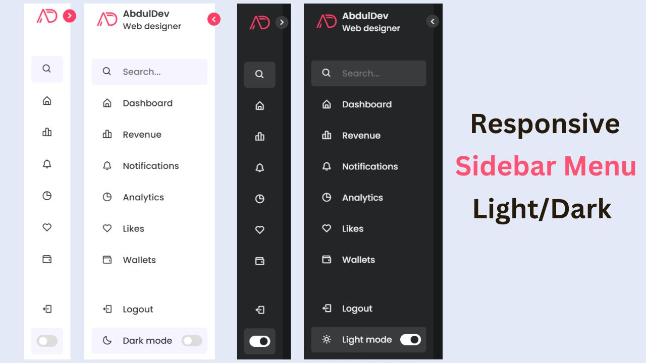
Read more about Responsive Navigation menu.
Recent Posts


Categories


FAQs
Absolutely! The provided CSS file is fully customizable. You can adjust colors, fonts, sizes, and animations to align with your website’s branding.
No, this tutorial utilizes only HTML and CSS. There are no external dependencies or libraries needed.
While the tutorial focuses primarily on desktop implementation, the form structure and CSS can be adapted to create a responsive design suitable for various screen sizes.
Yes, you can extend the form by adding additional input fields or buttons. Simply modify the HTML structure and CSS styles accordingly.
While this tutorial covers the visual aspect of the login form, ensuring security involves implementing server-side validation and encryption techniques, such as HTTPS.
Share on Social Media
Related Articles
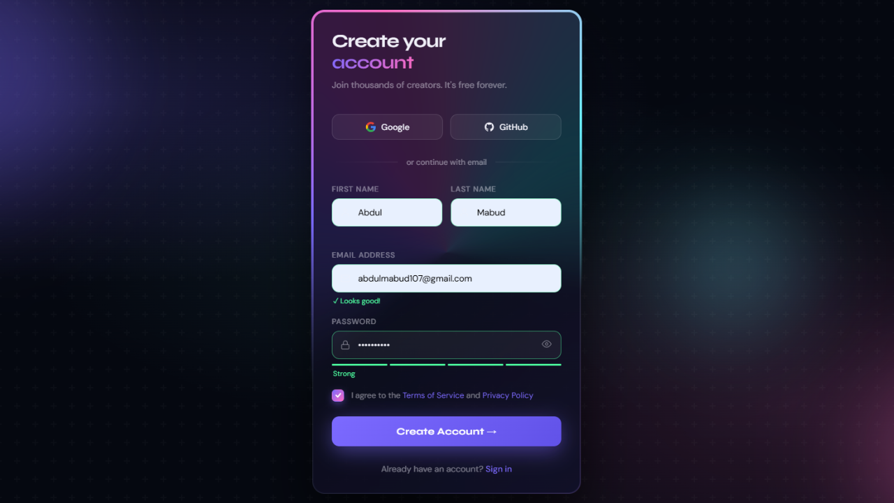
Modern Animated Sign Up Form Design with Free Source Code
Modern Animated Sign Up Form Design with Free Source Code A sign up form is often the first real interaction
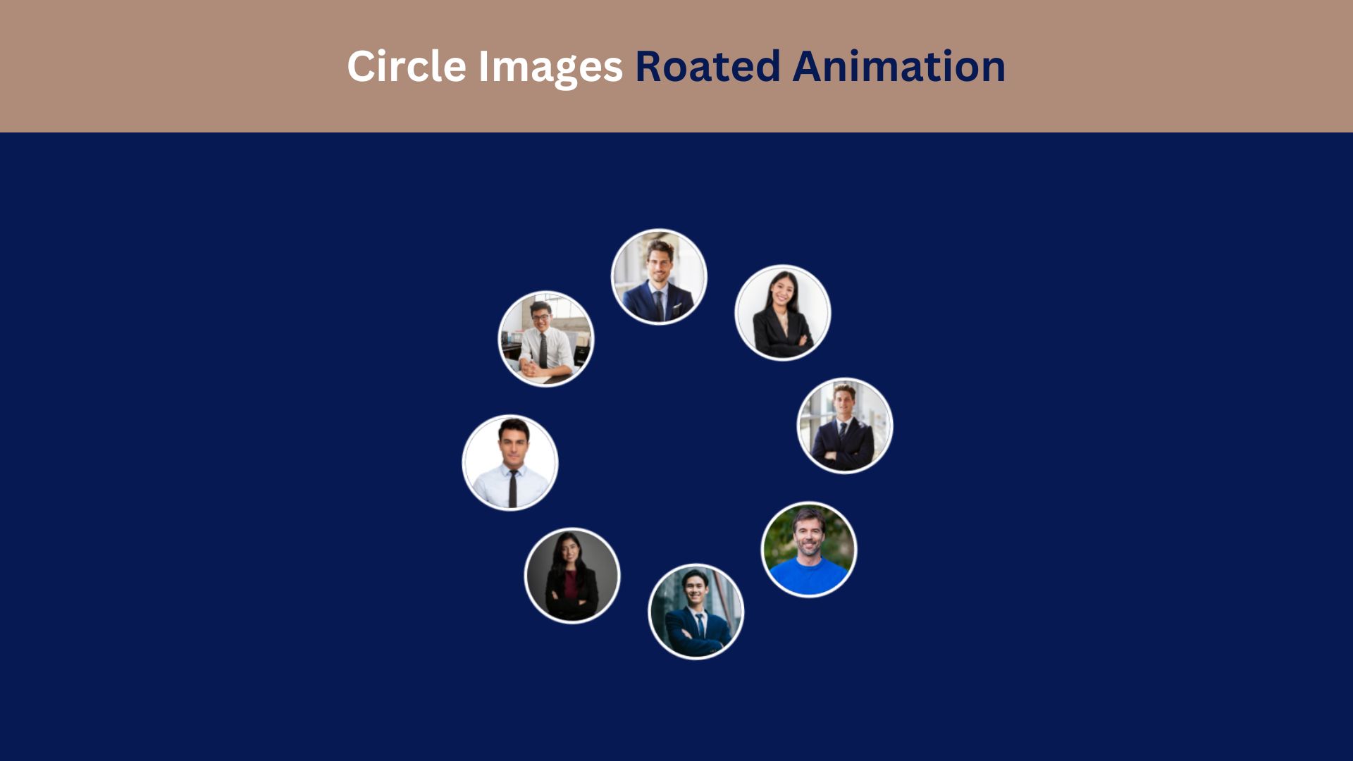
Circle Images Rotated Animation Using HTML and CSS
Learn how to create a captivating Circle Images Rotated Animation using HTML and CSS. This step-by-step guide helps you design
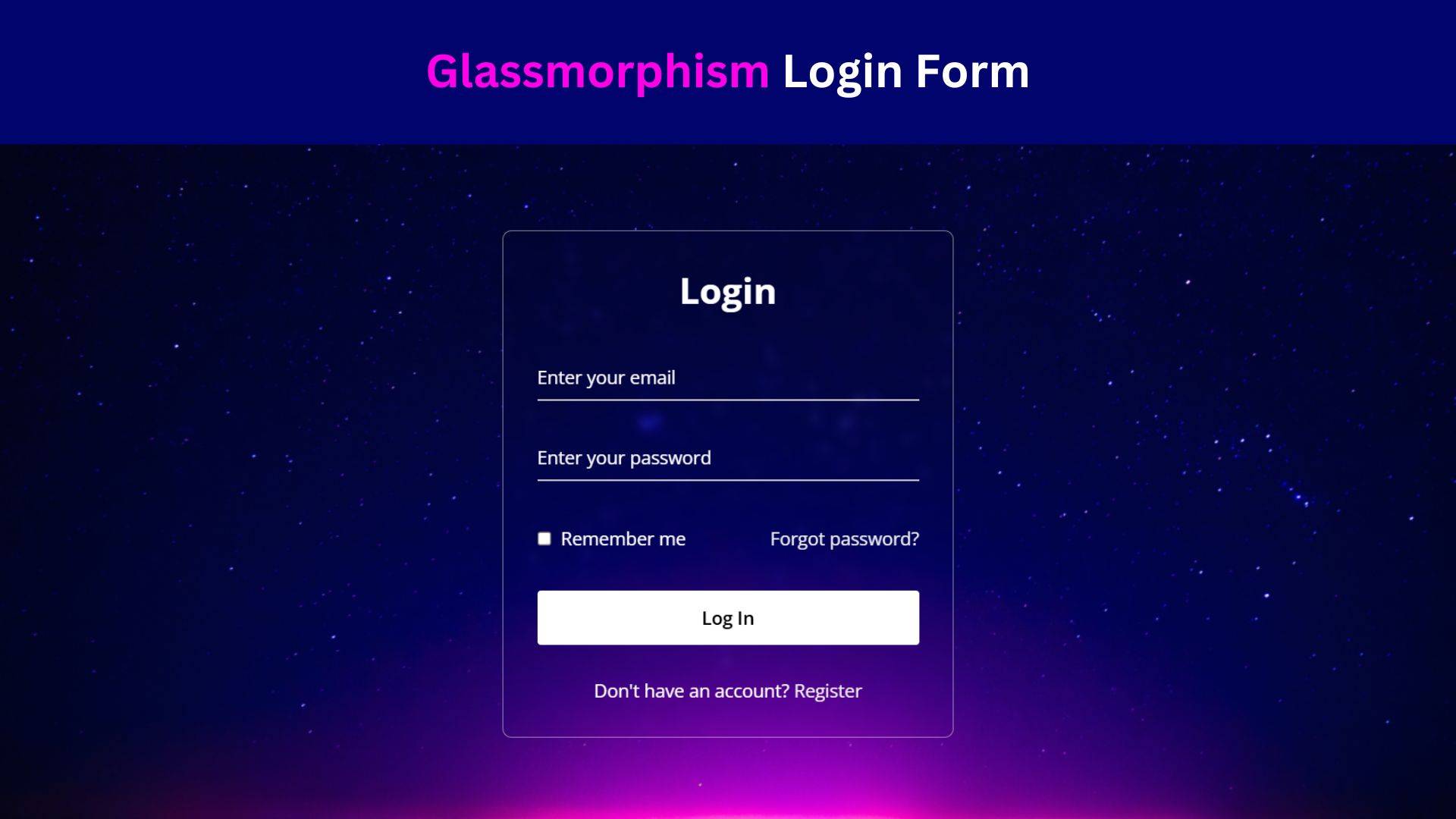
Design a Glassmorphism Login Form Using HTML and CSS
Learn how to design a sleek Glassmorphism Login Form using HTML and CSS! Follow this step-by-step guide to create a