
How to Make a Parallax Scrolling Website using HTML, CSS, and JS?

Parallax scrolling websites have become increasingly popular in recent years, with their dynamic and visually appealing design capturing the attention of website visitors. This technique involves creating an illusion of depth and movement by having different elements of a webpage move at different speeds as the user scrolls. At the same time, it may seem like a complex and advanced feature, but the good news is that you don’t need any fancy software to create a parallax scrolling website. In fact, with just HTML, CSS, and JS, you can quickly bring this impressive effect to your website. In this blog post, we’ll guide you through the steps to create a parallax scrolling website using these three languages so that you can add an extra layer of interactivity and engagement to your website design. Whether you’re a beginner or an experienced web developer, you’ll find this tutorial helpful in enhancing your web design skills and creating a visually stunning parallax scrolling website.
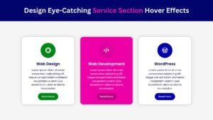
Check Out Those Useful Articles
Prerequisites
Before we start, ensure you have a basic understanding of:
- HTML
- CSS
- JavaScript
Understanding Parallax Scrolling Website and Its Impact
Parallax scrolling, a web design technique that creates a more immersive experience for users, plays on the optical illusion where objects closer to the observer move faster than those further away.
This method has revolutionized the user experience by introducing depth and a sense of animation to static pages. As visitors scroll down a website, the foreground and background content move at different speeds, making the website feel dynamic and interactive. This not only captivates users but also significantly boosts engagement by encouraging them to scroll through the entire page to discover more content.
Additionally, incorporating parallax scrolling can greatly enhance storytelling on websites, guiding visitors through a narrative in a visually compelling manner. From a marketing perspective, this can be particularly effective in highlighting products, services, or critical messages memorably.
However, it’s crucial to strike the right balance in its use to ensure it complements the website’s design and purpose without overwhelming users or distracting them from the core message. When done correctly, parallax scrolling can elevate a website’s aesthetic appeal and overall impact, making it a powerful tool in the web developer’s arsenal.
Setting Up Your Project Structure
To begin creating your parallax scrolling website, you’ll first need to set up a basic project structure. This will involve organizing your files in a way that keeps your coding process streamlined and efficient.
Start by creating a new folder for your project, which will serve as the root directory. Inside this folder, create three subfolders named “html”, “css”, and “js”, which will hold your HTML files, CSS stylesheets, and JavaScript files, respectively. Your main HTML file, typically named “index.html”, should reside in the “html” folder. Correspondingly, your main stylesheet, often called “style.css”, will be in the “css” folder, and your JavaScript file, which could be named “main.js”, will be placed in the “js” folder.
It’s essential to keep your project structure organized from the start to ensure that as your website grows in complexity, you can easily maintain and update your code. This setup not only aids in the development process but also helps in optimizing your website’s loading time, which is crucial for maintaining a smooth parallax effect and enhancing user experience.
Remember, a well-structured project is the foundation of any effective parallax scrolling website, setting the stage for the immersive visual journey you’re about to create.
Crafting Your Website's HTML Structure
Crafting the HTML structure for your parallax scrolling website is a fundamental step towards creating a dynamic user experience.
Begin by opening your “index.html” file located in the “html” folder of your project structure. Here, you’ll lay down the skeleton of your website, which will later be enhanced with CSS for styling and JavaScript for the parallax effect.
Start with the basic HTML5 structure. Copy the HTML code below and paste it into the “index.html” file.
					<!DOCTYPE html>
<html lang="en">
<head>
    <meta charset="UTF-8">
    <meta name="viewport" content="width=device-width, initial-scale=1.0">
    <title>Parallax Scrolling Website Design by Abduldev</title>
    <link rel="stylesheet" href="style.css">
    <!-- Font-awesome Link -->
    <link rel="stylesheet" href="https://cdnjs.cloudflare.com/ajax/libs/font-awesome/4.7.0/css/font-awesome.min.css">
</head>
<body>
    <nav>
        <input type="checkbox" id="check">
        <label for="check" class="checkbtn">
            <i class="fa fa-bars"></i>
        </label>
        <a href="#" class="logo">Eid-Ul-Adha</a>
        <ul>
            <li><a class="active" href="#">Home</a></li>
            <li><a href="#">About</a></li>
            <li><a href="#">Donate</a></li>
            <li><a href="#">Blog</a></li>
            <li><a href="#">Contact</a></li>
        </ul>
    </nav>
    <section id="scane">
        <h2 id="text">EId Mubarak</h2>
        <img decoding="async" src="Images/image1.png" alt="Image" id="img1">
        <img decoding="async" src="Images/image2.png" alt="Image" id="img2">
        <img decoding="async" src="Images/image3.png" alt="Image" id="img3">
        <img decoding="async" src="Images/image4.png" alt="Image" id="img4">
    </section>
    <div class="para-sec">
        <h2>Parallax Scrolling Effects</h2>
        <p>Lorem ipsum dolor sit amet, consectetur adipisicing elit. Magnam voluptate est labore voluptatibus iste, blanditiis adipisci, rerum minus dolorem placeat asperiores vel neque, dolore perspiciatis mollitia culpa odio necessitatibus error cum deleniti minima. Ab laborum pariatur ex. Accusamus animi harum quibusdam maxime non suscipit ratione exercitationem officia! Dolorum dolorem distinctio accusamus fuga doloribus architecto quisquam beatae molestias quasi, non quo. Deleniti vero consectetur, consequuntur esse nihil assumenda similique. Est reiciendis quisquam voluptatum labore repudiandae dolorum debitis saepe qui, similique maiores et nostrum ut quo at molestiae cupiditate neque aperiam sunt provident iusto, reprehenderit nisi eos voluptates nobis. Repudiandae aliquid quae, quaerat vel non, voluptatum numquam aspernatur in officia facilis quam fugiat itaque odit consequatur, dolorum tempora optio sequi tempore ad cupiditate id nisi! Recusandae, nesciunt doloremque iure obcaecati adipisci veniam in, molestiae, officiis aperiam laudantium eveniet modi sapiente eligendi amet nostrum tempora consequuntur commodi minus blanditiis? Vero, perspiciatis nulla? In.</p>
        <p>Lorem ipsum dolor sit, amet consectetur adipisicing elit. Id reprehenderit quia neque, corrupti cumque recusandae amet ab blanditiis eveniet fuga tenetur libero iusto aliquid debitis, omnis alias sed! Adipisci voluptas minus quos error reprehenderit laboriosam quibusdam ipsum est, magnam, id dolor sapiente magni repudiandae omnis recusandae nobis nostrum incidunt dolorum suscipit neque atque labore sed. Quia, dolorem repudiandae. Nihil tempora earum, vel quod hic odit eaque ipsam consectetur molestias obcaecati asperiores sint cumque corrupti cum, veritatis error nemo sed fuga aut, quo ullam ex unde iste itaque? Repellendus inventore officia numquam, velit incidunt corporis dolorum earum? Sunt harum, suscipit error non quidem dolorum natus soluta quibusdam assumenda, sequi ipsum sint deleniti dolor ipsam eaque unde nihil! Quas pariatur rem fuga sed sequi dolor illo harum dicta veniam, dolore iusto assumenda suscipit itaque velit recusandae, adipisci repellendus molestiae aliquid laboriosam iste. Eveniet doloribus sapiente quos vel corrupti quam sint modi laudantium.</p>
        <p>Lorem ipsum dolor sit, amet consectetur adipisicing elit. Unde suscipit earum rem tempore ipsum delectus consequatur aperiam laboriosam accusamus et? Illum nobis in, aliquam quidem qui reprehenderit hic veniam, iusto modi saepe animi eaque debitis iure similique libero omnis corporis perspiciatis quibusdam. Repellendus perferendis, ipsa libero ex perspiciatis consequatur possimus cumque voluptatem, quaerat non, sed vero est. Quod rerum nisi exercitationem est aut? Tempore iste nemo quia cumque quod assumenda ad impedit vero, optio illum libero, mollitia molestias quasi aspernatur ea non quas? Nobis ea, consequatur aut maxime nisi iste deserunt molestiae sed aperiam quae ipsa dolore? Cumque soluta porro praesentium repudiandae vitae molestias labore dolores quis eum, laborum magnam modi voluptates earum fugit, quod ratione, excepturi culpa natus error hic! Ducimus itaque perferendis reiciendis, id quae nobis ipsa, fuga sint commodi quibusdam magnam placeat? Aliquam doloremque consequuntur doloribus omnis quia, nihil ipsum eveniet vel expedita ullam ducimus tempora magnam!</p>
    </div>
    <script src="main.js"></script>
</body>
</html>
Styling with CSS for a Parallax Effect
To achieve a parallax effect purely through CSS, one must understand how to manipulate backgrounds and layers effectively.
The core principle revolves around the CSS property `background-attachment: fixed,` which is essential for creating the parallax scrolling effect. By applying this property to background images, they remain stationary as the user scrolls, creating an illusion of depth as foreground content moves.
Copy the CSS code below and paste it into the “style.css” file.
					@import url('https://fonts.googleapis.com/css2?family=Roboto:wght@400;500;700&display=swap');
@import url('https://fonts.googleapis.com/css2?family=Rancho&display=swap');

*{
    font-family: "Roboto", sans-serif;
    margin: 0;
    padding: 0;
    box-sizing: border-box;
}
nav{
    background: #ffffff;
    height: 90px;
    width: 100%;
  }
  .logo{
    color: #101E4B;
    font-size: 35px;
    line-height: 90px;
    padding: 0 40px;
    font-weight: bold;
    text-decoration: none;
    margin-left: 35px;
  }
  nav ul{
    float: right;
    margin-right: 40px;
  }
  nav ul li{
    display: inline-block;
    line-height: 80px;
    margin: 5px;
  }
  nav ul li a{
    text-decoration: none;
    list-style: none;
    color: #101E4B;
    font-size: 17px;
    padding: 10px 30px;
    border-radius: 45px;
    transition: .5s;
    font-weight: 500;
  }
  ul li a:hover,
  ul li a.active{
    background: #101E4B;
    color: #fff;
  }
  .checkbtn{
    font-size: 30px;
    color: #101E4B;
    float: right;
    line-height: 80px;
    margin-right: 40px;
    cursor: pointer;
    display: none;
  }
  #check{
    display: none;
  }
  @media screen and (max-width: 952px){
    .logo{
      font-size: 30px;
      padding-left: 40px;
      margin-left: 0;
    }
    nav ul li a{
      font-size: 20px;
    }
  }
  @media screen and (max-width: 858px) {
    .checkbtn{
      display: block;
      font-size: 26px;
      margin-right: 40px;
      margin-top: 5px;
    }
    ul{
      position: absolute;
      width: 100%;
      height: 100vh;
      background: #101E4B;
      top: 90px;
      left: -100%;
      text-align: center;
      transition: all .5s;
      z-index: 100;
    }
    nav ul li{
      display: block;
      margin: 50px 0;
      line-height: 10px;
    }
    nav ul li a{
      font-size: 20px;
      color: #fff;
    }
    ul li a:hover,
    ul li a.active{
      background: #ffffff;
      color: #101E4B;
    }
    #check:checked ~ ul{
      left: 0;
    }
  }
#scane{
    position: relative;
    width: 100%;
    height: 100vh;
    display: flex;
    justify-content: center;
    align-items: center;
    overflow: hidden;
}
#scane #text{
    position: absolute;
    transform: translateY(100%);
    color: #101E4B;
    font-family: "Rancho", cursive;
    font-size: 10vw;
    white-space: no-wrap;
    text-align: center;

}
#scane img{
    position: absolute;
    top: 0;
    left: 0;
    width: 100%;
    height: 100%;
    object-fit: cover;
    pointer-events: none;
}
.para-sec{
    position: relative;
    padding: 100px;
    background: #101E4B;
}
.para-sec h2{
    font-size: 3.5em;
    color: #fff;
}
.para-sec p{
    color: #f0efef;
    font-size: 16px;
    line-height: 26px;
    padding-top: 30px;
}
@media screen and (max-width: 858px){
    .para-sec{
        padding: 40px 30px;
    }
    .para-sec h2{
        font-size: 2.5em;
        line-height: 60px;
    }
}
Implementing Parallax Scrolling with JavaScript
Incorporating JavaScript is vital for a truly dynamic parallax scrolling website. JavaScript allows you to control the speed and direction of scroll-triggered animations, providing a richer interactive experience.
To start, select elements in your HTML document that you want to animate using `document.querySelector` or `document.querySelectorAll`. Assign each element a unique ID or class for easy targeting.
Next, create a function that will be triggered on the window’s `scroll` event. Inside this function, calculate the scroll position using `window.pageYOffset` and use this value to adjust the CSS properties of your targeted elements dynamically. For instance, changing the `transform` property based on scroll position can move elements at different speeds,
Copy the JS code below and paste it into the “main.js” file.
					let text = document.getElementById('text');
let img1 = document.getElementById('img1');
let img2 = document.getElementById('img2');
let img3 = document.getElementById('img3');

window.addEventListener('scroll', function(){
    let value = window.scrollY;
    text.style.marginTop = value * -1.5+'px';
    img1.style.top = value * 0.75+'px';
    img2.style.top = value * 0.5+'px';
    img3.style.top = value * 0.25+'px';
})
Optimizing Your Parallax Scrolling Website for Performance
Optimizing your parallax scrolling website for performance is crucial to ensuring a seamless user experience. High-quality images and animations can significantly impact your site’s loading times, potentially deterring visitors.
To mitigate this, consider compressing images without sacrificing quality using tools like TinyPNG or ImageOptim. Implementing lazy loading for images and content that appear off-screen can also enhance site speed, as it loads these elements only when they’re needed.
Leveraging browser caching is another effective strategy. By storing elements of your website locally in the browser, repeat visitors can experience quicker loading times.
Additionally, minimize the use of heavy JavaScript libraries that might slow down your website. Instead, opt for vanilla JavaScript for the parallax effects or choose lightweight libraries designed for performance. Keep your CSS and JavaScript files minified, reducing unnecessary characters to ensure your code is as efficient as possible.
By prioritizing these optimization techniques, you can create a parallax scrolling website that not only captivates users with its dynamic visuals but also offers the smooth, fast performance essential for a positive user experience.
Cross-Browser Compatibility and Responsive Design
Ensuring your parallax scrolling website performs flawlessly across various browsers and devices is vital to reaching a broader audience.
The variety in browser rendering engines means your website may appear or behave differently from one browser to another. Utilize CSS prefixes for key animations and transitions to maintain consistency in your parallax effects, enhancing cross-browser functionality.
Additionally, feature detection libraries like Modernizr can help identify browser capabilities, allowing you to implement fallbacks or adjustments as needed. Responsive design plays a crucial role in adapting your parallax website for tablets, smartphones, and other mobile devices.
Techniques such as media queries enable your website to adjust layouts, image sizes, and parallax effects based on the device’s screen size and orientation. Remember, the goal is to ensure your parallax scrolling website delivers an immersive and engaging user experience, regardless of how or where it’s being accessed.
Testing your website across multiple devices and browsers using tools like BrowserStack can provide insights into user experience, helping you to fine-tune performance and design elements. By focusing on cross-browser compatibility and responsive design, your parallax scrolling website can achieve the broadest possible reach and impact.
Conclusion
Creating a parallax-scrolling website with HTML, CSS, and JavaScript elevates the visual appeal of your online presence and significantly enhances user engagement through interactive storytelling and dynamic design.
This guide has walked you through the essential steps, from setting up a robust project structure and crafting the foundational HTML to implementing the parallax effect with CSS and JavaScript for a fully immersive experience.
Alongside this, we’ve addressed important considerations like optimizing for performance, ensuring cross-browser compatibility, and adapting your site for a responsive design to meet the demands of modern web users across various devices. While the journey to mastering parallax scrolling may seem daunting at first, the result is a captivating web experience that stands out in the digital landscape.
Embrace the challenge, experiment with different techniques, and continue refining your skills. The dynamic world of web development is constantly evolving, and mastering parallax scrolling is a step forward in creating websites that not only look exceptional but also function seamlessly, offering users an unforgettable browsing experience.
Recent Posts


Categories

FAQs
A parallax scrolling website uses a technique where background images move slower than foreground images when scrolling. This creates a 3D effect and adds depth to your website.
Parallax scrolling can make your website more engaging and visually appealing. It helps highlight important content, keeps users interested, and enhances storytelling.
Key HTML elements for a parallax effect include sections with background images. Use <div> elements to structure your content and assign specific classes for styling and scripting.
Yes, parallax scrolling can affect website performance, especially on mobile devices. Optimize images, minimize JavaScript, and consider using will-change: transform in CSS to improve performance.
Absolutely! Parallax scrolling can be combined with other techniques, such as animations, transitions, and interactive elements, to create a rich and engaging user experience. However, these additions must not compromise site performance.
Share on Social Media
Related Articles
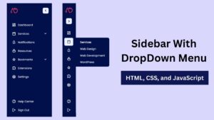
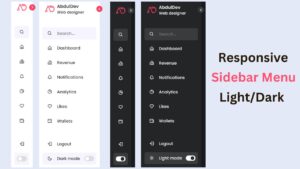
Build a Responsive Animated Portfolio Website with Dark & Light Mode | Free Source Code
Build a Responsive Animated Portfolio Website with Dark & Light Mode Free Download Code Files Preview The Demo Your portfolio

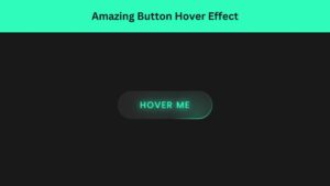
Responsive Animated Hero Section with Dark Light Theme | Free Source Code
Responsive Animated Hero Section with Dark Light Theme Let’s be real for a second. The first thing visitors notice on

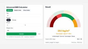
Advanced BMI Calculator: Accurate Body Mass Index & Health Insights
Discover how an Advanced BMI Calculator provides accurate, personalized health insights by considering age, gender, body fat, and more.