Create a Stunning Card Hover Effects for Your Services Section Using HTML and CSS
In today’s web design landscape, creating visually appealing and interactive elements is essential to capture users’ attention and improve the user experience. One such element that can make your services section stand out is a card with hover effects. These effects can add a layer of interactivity and professionalism to your website. In this tutorial, we will walk you through how to create stunning card hover effects using just HTML and CSS.
Check Out Those Useful Articles
Why Use Card Hover Effects?
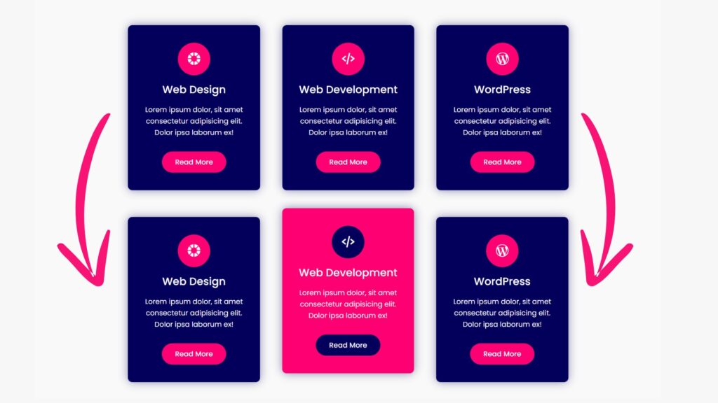
Card hover effects are a great way to make your service offerings more engaging. When users hover over a card, it can expand, flip, change colors, or reveal additional information, making the interaction more dynamic. These effects are not just visually appealing; they also provide a subtle yet effective way to encourage users to interact with your content.
Steps to Build Card Hover Effects for Your Services Section
To build Card Hover Effects for Your Services section using HTML and CSS, follow these step-by-step instructions:
- Create a folder. You can name this folder whatever you want. Inside this folder, create the mentioned files.
- Create an index.html file. The file name must be index and its extension .html
- Create a style.css file. The file name must be style, and its extension .css
Setting Up the HTML Structure
First, let’s create the basic HTML structure for the service cards. We’ll start with a simple card layout, and then we’ll add the hover effects using CSS.
Copy the below HTML codes and paste your index.html file.
					<!DOCTYPE html>
<html lang="en">
<head>
    <meta charset="UTF-8">
    <meta name="viewport" content="width=device-width, initial-scale=1.0">
    <title>Services Section Card Hover Effects by AbdulDev</title>
    <link rel="stylesheet" href="style.css">
    <link href='https://unpkg.com/boxicons@2.1.4/css/boxicons.min.css' rel='stylesheet'>
</head>
<body>
    <div class="container">
        <div class="card">
            <div class="card-box">
                <div class="icon"><i class='bx bxs-color'></i></div>
                <div class="content">
                    <h2>Web Design</h2>
                    <p>Lorem ipsum dolor, sit amet consectetur adipisicing elit. Dolor ipsa laborum ex!</p>
                    <a href="#" class="btn">Read More</a>
                </div>
            </div>
        </div>
        <div class="card">
            <div class="card-box">
                <div class="icon"><i class='bx bx-code-alt' ></i></div>
                <div class="content">
                    <h2>Web Development</h2>
                    <p>Lorem ipsum dolor, sit amet consectetur adipisicing elit. Dolor ipsa laborum ex!</p>
                    <a href="#" class="btn">Read More</a>
                </div>
            </div>
        </div>
        <div class="card">
            <div class="card-box">
                <div class="icon"><i class='bx bxl-wordpress' ></i></div>
                <div class="content">
                    <h2>WordPress</h2>
                    <p>Lorem ipsum dolor, sit amet consectetur adipisicing elit. Dolor ipsa laborum ex!</p>
                    <a href="#" class="btn">Read More</a>
                </div>
            </div>
        </div>
    </div> <script data-no-optimize="1">window.lazyLoadOptions=Object.assign({},{threshold:300},window.lazyLoadOptions||{});!function(t,e){"object"==typeof exports&&"undefined"!=typeof module?module.exports=e():"function"==typeof define&&define.amd?define(e):(t="undefined"!=typeof globalThis?globalThis:t||self).LazyLoad=e()}(this,function(){"use strict";function e(){return(e=Object.assign||function(t){for(var e=1;e<arguments.length;e++){var n,a=arguments[e];for(n in a)Object.prototype.hasOwnProperty.call(a,n)&&(t[n]=a[n])}return t}).apply(this,arguments)}function o(t){return e({},at,t)}function l(t,e){return t.getAttribute(gt+e)}function c(t){return l(t,vt)}function s(t,e){return function(t,e,n){e=gt+e;null!==n?t.setAttribute(e,n):t.removeAttribute(e)}(t,vt,e)}function i(t){return s(t,null),0}function r(t){return null===c(t)}function u(t){return c(t)===_t}function d(t,e,n,a){t&&(void 0===a?void 0===n?t(e):t(e,n):t(e,n,a))}function f(t,e){et?t.classList.add(e):t.className+=(t.className?" ":"")+e}function _(t,e){et?t.classList.remove(e):t.className=t.className.replace(new RegExp("(^|\\s+)"+e+"(\\s+|$)")," ").replace(/^\s+/,"").replace(/\s+$/,"")}function g(t){return t.llTempImage}function v(t,e){!e||(e=e._observer)&&e.unobserve(t)}function b(t,e){t&&(t.loadingCount+=e)}function p(t,e){t&&(t.toLoadCount=e)}function n(t){for(var e,n=[],a=0;e=t.children[a];a+=1)"SOURCE"===e.tagName&&n.push(e);return n}function h(t,e){(t=t.parentNode)&&"PICTURE"===t.tagName&&n(t).forEach(e)}function a(t,e){n(t).forEach(e)}function m(t){return!!t[lt]}function E(t){return t[lt]}function I(t){return delete t[lt]}function y(e,t){var n;m(e)||(n={},t.forEach(function(t){n[t]=e.getAttribute(t)}),e[lt]=n)}function L(a,t){var o;m(a)&&(o=E(a),t.forEach(function(t){var e,n;e=a,(t=o[n=t])?e.setAttribute(n,t):e.removeAttribute(n)}))}function k(t,e,n){f(t,e.class_loading),s(t,st),n&&(b(n,1),d(e.callback_loading,t,n))}function A(t,e,n){n&&t.setAttribute(e,n)}function O(t,e){A(t,rt,l(t,e.data_sizes)),A(t,it,l(t,e.data_srcset)),A(t,ot,l(t,e.data_src))}function w(t,e,n){var a=l(t,e.data_bg_multi),o=l(t,e.data_bg_multi_hidpi);(a=nt&&o?o:a)&&(t.style.backgroundImage=a,n=n,f(t=t,(e=e).class_applied),s(t,dt),n&&(e.unobserve_completed&&v(t,e),d(e.callback_applied,t,n)))}function x(t,e){!e||0<e.loadingCount||0<e.toLoadCount||d(t.callback_finish,e)}function M(t,e,n){t.addEventListener(e,n),t.llEvLisnrs[e]=n}function N(t){return!!t.llEvLisnrs}function z(t){if(N(t)){var e,n,a=t.llEvLisnrs;for(e in a){var o=a[e];n=e,o=o,t.removeEventListener(n,o)}delete t.llEvLisnrs}}function C(t,e,n){var a;delete t.llTempImage,b(n,-1),(a=n)&&--a.toLoadCount,_(t,e.class_loading),e.unobserve_completed&&v(t,n)}function R(i,r,c){var l=g(i)||i;N(l)||function(t,e,n){N(t)||(t.llEvLisnrs={});var a="VIDEO"===t.tagName?"loadeddata":"load";M(t,a,e),M(t,"error",n)}(l,function(t){var e,n,a,o;n=r,a=c,o=u(e=i),C(e,n,a),f(e,n.class_loaded),s(e,ut),d(n.callback_loaded,e,a),o||x(n,a),z(l)},function(t){var e,n,a,o;n=r,a=c,o=u(e=i),C(e,n,a),f(e,n.class_error),s(e,ft),d(n.callback_error,e,a),o||x(n,a),z(l)})}function T(t,e,n){var a,o,i,r,c;t.llTempImage=document.createElement("IMG"),R(t,e,n),m(c=t)||(c[lt]={backgroundImage:c.style.backgroundImage}),i=n,r=l(a=t,(o=e).data_bg),c=l(a,o.data_bg_hidpi),(r=nt&&c?c:r)&&(a.style.backgroundImage='url("'.concat(r,'")'),g(a).setAttribute(ot,r),k(a,o,i)),w(t,e,n)}function G(t,e,n){var a;R(t,e,n),a=e,e=n,(t=Et[(n=t).tagName])&&(t(n,a),k(n,a,e))}function D(t,e,n){var a;a=t,(-1<It.indexOf(a.tagName)?G:T)(t,e,n)}function S(t,e,n){var a;t.setAttribute("loading","lazy"),R(t,e,n),a=e,(e=Et[(n=t).tagName])&&e(n,a),s(t,_t)}function V(t){t.removeAttribute(ot),t.removeAttribute(it),t.removeAttribute(rt)}function j(t){h(t,function(t){L(t,mt)}),L(t,mt)}function F(t){var e;(e=yt[t.tagName])?e(t):m(e=t)&&(t=E(e),e.style.backgroundImage=t.backgroundImage)}function P(t,e){var n;F(t),n=e,r(e=t)||u(e)||(_(e,n.class_entered),_(e,n.class_exited),_(e,n.class_applied),_(e,n.class_loading),_(e,n.class_loaded),_(e,n.class_error)),i(t),I(t)}function U(t,e,n,a){var o;n.cancel_on_exit&&(c(t)!==st||"IMG"===t.tagName&&(z(t),h(o=t,function(t){V(t)}),V(o),j(t),_(t,n.class_loading),b(a,-1),i(t),d(n.callback_cancel,t,e,a)))}function $(t,e,n,a){var o,i,r=(i=t,0<=bt.indexOf(c(i)));s(t,"entered"),f(t,n.class_entered),_(t,n.class_exited),o=t,i=a,n.unobserve_entered&&v(o,i),d(n.callback_enter,t,e,a),r||D(t,n,a)}function q(t){return t.use_native&&"loading"in HTMLImageElement.prototype}function H(t,o,i){t.forEach(function(t){return(a=t).isIntersecting||0<a.intersectionRatio?$(t.target,t,o,i):(e=t.target,n=t,a=o,t=i,void(r(e)||(f(e,a.class_exited),U(e,n,a,t),d(a.callback_exit,e,n,t))));var e,n,a})}function B(e,n){var t;tt&&!q(e)&&(n._observer=new IntersectionObserver(function(t){H(t,e,n)},{root:(t=e).container===document?null:t.container,rootMargin:t.thresholds||t.threshold+"px"}))}function J(t){return Array.prototype.slice.call(t)}function K(t){return t.container.querySelectorAll(t.elements_selector)}function Q(t){return c(t)===ft}function W(t,e){return e=t||K(e),J(e).filter(r)}function X(e,t){var n;(n=K(e),J(n).filter(Q)).forEach(function(t){_(t,e.class_error),i(t)}),t.update()}function t(t,e){var n,a,t=o(t);this._settings=t,this.loadingCount=0,B(t,this),n=t,a=this,Y&&window.addEventListener("online",function(){X(n,a)}),this.update(e)}var Y="undefined"!=typeof window,Z=Y&&!("onscroll"in window)||"undefined"!=typeof navigator&&/(gle|ing|ro)bot|crawl|spider/i.test(navigator.userAgent),tt=Y&&"IntersectionObserver"in window,et=Y&&"classList"in document.createElement("p"),nt=Y&&1<window.devicePixelRatio,at={elements_selector:".lazy",container:Z||Y?document:null,threshold:300,thresholds:null,data_src:"src",data_srcset:"srcset",data_sizes:"sizes",data_bg:"bg",data_bg_hidpi:"bg-hidpi",data_bg_multi:"bg-multi",data_bg_multi_hidpi:"bg-multi-hidpi",data_poster:"poster",class_applied:"applied",class_loading:"litespeed-loading",class_loaded:"litespeed-loaded",class_error:"error",class_entered:"entered",class_exited:"exited",unobserve_completed:!0,unobserve_entered:!1,cancel_on_exit:!0,callback_enter:null,callback_exit:null,callback_applied:null,callback_loading:null,callback_loaded:null,callback_error:null,callback_finish:null,callback_cancel:null,use_native:!1},ot="src",it="srcset",rt="sizes",ct="poster",lt="llOriginalAttrs",st="loading",ut="loaded",dt="applied",ft="error",_t="native",gt="data-",vt="ll-status",bt=[st,ut,dt,ft],pt=[ot],ht=[ot,ct],mt=[ot,it,rt],Et={IMG:function(t,e){h(t,function(t){y(t,mt),O(t,e)}),y(t,mt),O(t,e)},IFRAME:function(t,e){y(t,pt),A(t,ot,l(t,e.data_src))},VIDEO:function(t,e){a(t,function(t){y(t,pt),A(t,ot,l(t,e.data_src))}),y(t,ht),A(t,ct,l(t,e.data_poster)),A(t,ot,l(t,e.data_src)),t.load()}},It=["IMG","IFRAME","VIDEO"],yt={IMG:j,IFRAME:function(t){L(t,pt)},VIDEO:function(t){a(t,function(t){L(t,pt)}),L(t,ht),t.load()}},Lt=["IMG","IFRAME","VIDEO"];return t.prototype={update:function(t){var e,n,a,o=this._settings,i=W(t,o);{if(p(this,i.length),!Z&&tt)return q(o)?(e=o,n=this,i.forEach(function(t){-1!==Lt.indexOf(t.tagName)&&S(t,e,n)}),void p(n,0)):(t=this._observer,o=i,t.disconnect(),a=t,void o.forEach(function(t){a.observe(t)}));this.loadAll(i)}},destroy:function(){this._observer&&this._observer.disconnect(),K(this._settings).forEach(function(t){I(t)}),delete this._observer,delete this._settings,delete this.loadingCount,delete this.toLoadCount},loadAll:function(t){var e=this,n=this._settings;W(t,n).forEach(function(t){v(t,e),D(t,n,e)})},restoreAll:function(){var e=this._settings;K(e).forEach(function(t){P(t,e)})}},t.load=function(t,e){e=o(e);D(t,e)},t.resetStatus=function(t){i(t)},t}),function(t,e){"use strict";function n(){e.body.classList.add("litespeed_lazyloaded")}function a(){console.log("[LiteSpeed] Start Lazy Load"),o=new LazyLoad(Object.assign({},t.lazyLoadOptions||{},{elements_selector:"[data-lazyloaded]",callback_finish:n})),i=function(){o.update()},t.MutationObserver&&new MutationObserver(i).observe(e.documentElement,{childList:!0,subtree:!0,attributes:!0})}var o,i;t.addEventListener?t.addEventListener("load",a,!1):t.attachEvent("onload",a)}(window,document);</script><script data-no-optimize="1">window.litespeed_ui_events=window.litespeed_ui_events||["mouseover","click","keydown","wheel","touchmove","touchstart"];var urlCreator=window.URL||window.webkitURL;function litespeed_load_delayed_js_force(){console.log("[LiteSpeed] Start Load JS Delayed"),litespeed_ui_events.forEach(e=>{window.removeEventListener(e,litespeed_load_delayed_js_force,{passive:!0})}),document.querySelectorAll("iframe[data-litespeed-src]").forEach(e=>{e.setAttribute("src",e.getAttribute("data-litespeed-src"))}),"loading"==document.readyState?window.addEventListener("DOMContentLoaded",litespeed_load_delayed_js):litespeed_load_delayed_js()}litespeed_ui_events.forEach(e=>{window.addEventListener(e,litespeed_load_delayed_js_force,{passive:!0})});async function litespeed_load_delayed_js(){let t=[];for(var d in document.querySelectorAll('script[type="litespeed/javascript"]').forEach(e=>{t.push(e)}),t)await new Promise(e=>litespeed_load_one(t[d],e));document.dispatchEvent(new Event("DOMContentLiteSpeedLoaded")),window.dispatchEvent(new Event("DOMContentLiteSpeedLoaded"))}function litespeed_load_one(t,e){console.log("[LiteSpeed] Load ",t);var d=document.createElement("script");d.addEventListener("load",e),d.addEventListener("error",e),t.getAttributeNames().forEach(e=>{"type"!=e&&d.setAttribute("data-src"==e?"src":e,t.getAttribute(e))});let a=!(d.type="text/javascript");!d.src&&t.textContent&&(d.src=litespeed_inline2src(t.textContent),a=!0),t.after(d),t.remove(),a&&e()}function litespeed_inline2src(t){try{var d=urlCreator.createObjectURL(new Blob([t.replace(/^(?:<!--)?(.*?)(?:-->)?$/gm,"$1")],{type:"text/javascript"}))}catch(e){d="data:text/javascript;base64,"+btoa(t.replace(/^(?:<!--)?(.*?)(?:-->)?$/gm,"$1"))}return d}</script><script data-no-optimize="1">var litespeed_vary=document.cookie.replace(/(?:(?:^|.*;\s*)_lscache_vary\s*\=\s*([^;]*).*$)|^.*$/,"");litespeed_vary||(sessionStorage.getItem("litespeed_reloaded")?console.log("LiteSpeed: skipping guest vary reload (already reloaded this session)"):fetch("/wp-content/plugins/litespeed-cache/guest.vary.php",{method:"POST",cache:"no-cache",redirect:"follow"}).then(e=>e.json()).then(e=>{console.log(e),e.hasOwnProperty("reload")&&"yes"==e.reload&&(sessionStorage.setItem("litespeed_docref",document.referrer),sessionStorage.setItem("litespeed_reloaded","1"),window.location.reload(!0))}));</script><script data-optimized="1" type="litespeed/javascript" data-src="https://abduldev.com/wp-content/litespeed/js/1e31850a96f3fe2749443c2388299c8f.js?ver=4a1aa"></script></body>
</html>
In the above HTML, we have created a container for our cards, with each card containing a title and a short description. This is a basic structure that we will enhance with CSS.
Styling the Cards with CSS
Now that we have the HTML structure, it’s time to add some styles using CSS. We will create a simple card design and then add hover effects to make it interactive.
Copy the below CSS codes and paste your style.css file.
					@import url('https://fonts.googleapis.com/css2?family=Poppins:wght@400;500;600;700&display=swap');

*{
    margin: 0;
    padding: 0;
    box-sizing: border-box;
    font-family: "Poppins", sans-serif;
}
body{
    min-height: 100vh;
    display: flex;
    align-items: center;
    justify-content: center;
    background: #f9f9f9;
}
.container{
    position: relative;
    display: flex;
    justify-content: center;
    align-items: center;
    flex-wrap: wrap;
    padding: 80px 40px;
    gap: 50px;
}
.container .card-box{
    position: relative;
    display: flex;
    justify-content: center;
    align-items: center;
    flex-direction: column;
    width: 300px;
    background: #02005a;
    padding: 40px 30px;
    border-radius: 10px;
    box-shadow: 0 0 20px #02005770;
    transition: 0.5s;
}
.container .card-box:hover{
    background: #ff0073;
    transform: translateY(-20px);
}
.container .card-box .icon{
    position: relative;
    display: flex;
    justify-content: center;
    align-items: center;
    font-size: 34px;
    color: #ffffff;
    background: #ff0073;
    padding: 20px;
    border-radius: 50%;
    transition: 0.5s;
}
.container .card-box:hover .icon{
    color: #ffffff;
    background: #02005a;
}
.container .card-box .content{
    position: relative;
    display: flex;
    justify-content: center;
    align-items: center;
    flex-direction: column;
}
.container .card-box .content h2{
    font-size: 24px;
    font-weight: 500;
    color: #ffffff;
    padding: 15px 0;
}
.container .card-box .content p{
    font-size: 16px;
    line-height: 26px;
    color: #ffffff;
    padding-bottom: 30px;
    text-align: center;
}
.container .card-box .content .btn{
    text-decoration: none;
    background: #ff0073;
    padding: 12px 30px;
    border-radius: 45px;
    color: #ffffff;
    font-size: 16px;
    font-weight: 500;
    transition: 0.5s;
}
.container .card-box:hover .btn{
    background: #02005a;
}
Conclusion
With just a few lines of HTML and CSS, you can create beautiful and interactive card hover effects that will make your services section pop. These effects not only enhance the visual appeal of your site but also improve user engagement. Experiment with different animations and styles to find the perfect fit for your website.
By integrating these card hover effects, you’ll be one step closer to creating a professional and captivating online presence.
Recent Posts


Categories


FAQs
Card hover effects are interactive animations that are triggered when a user hovers their cursor over a card element on a webpage. These effects are significant because they enhance the user experience by making your website more dynamic and engaging. They can draw attention to specific content, improve navigation, and make your services or products stand out.
No, you don’t need advanced coding skills to create primary card hover effects. With a fundamental understanding of HTML and CSS, you can quickly implement and customize these effects. The code examples provided in this article are straightforward and designed for beginners. However, as you become more comfortable, you can experiment with more complex effects.
Card hover effects are typically lightweight and should not significantly impact your website’s performance if implemented correctly. However, it’s essential to avoid overloading your site with too many animations or using overly complex effects that could slow down page load times, especially on mobile devices. Always test your website to ensure that it remains responsive and fast.
Most modern web browsers support CSS-based hover effects, including Chrome, Firefox, Safari, and Edge. However, older versions of some browsers may not fully support advanced CSS animations. It’s always a good idea to test your website on different browsers and devices to ensure compatibility and a consistent user experience.
You can customize card hover effects by adjusting various CSS properties, such as colors, fonts, shadows, and animations. For example, you can change the background color, and text color or even add unique animations like scaling, rotating, or fading. By tweaking these properties, you can create hover effects that align with your website’s branding and style.
Absolutely! While card hover effects are commonly used in the services section, they can be applied to various other areas of your website. You can use them for product displays, portfolio items, blog posts, team member profiles, or any other content you want to highlight. The flexibility of these effects allows you to enhance multiple sections of your site.
Share on Social Media
Related Articles

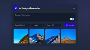
Build a Fully Responsive Sidebar with Dropdown Menu – HTML, CSS & JS
Learn how to build a fully responsive sidebar with dropdown menus using HTML, CSS, and JavaScript. Step-by-step guide with code
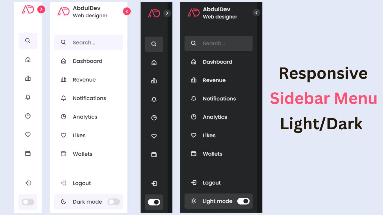
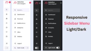
Responsive Sidebar Menu in HTML, CSS & JS | Light/Dark Mode
Learn how to create a modern responsive sidebar menu with a light and dark theme switcher using HTML, CSS, and
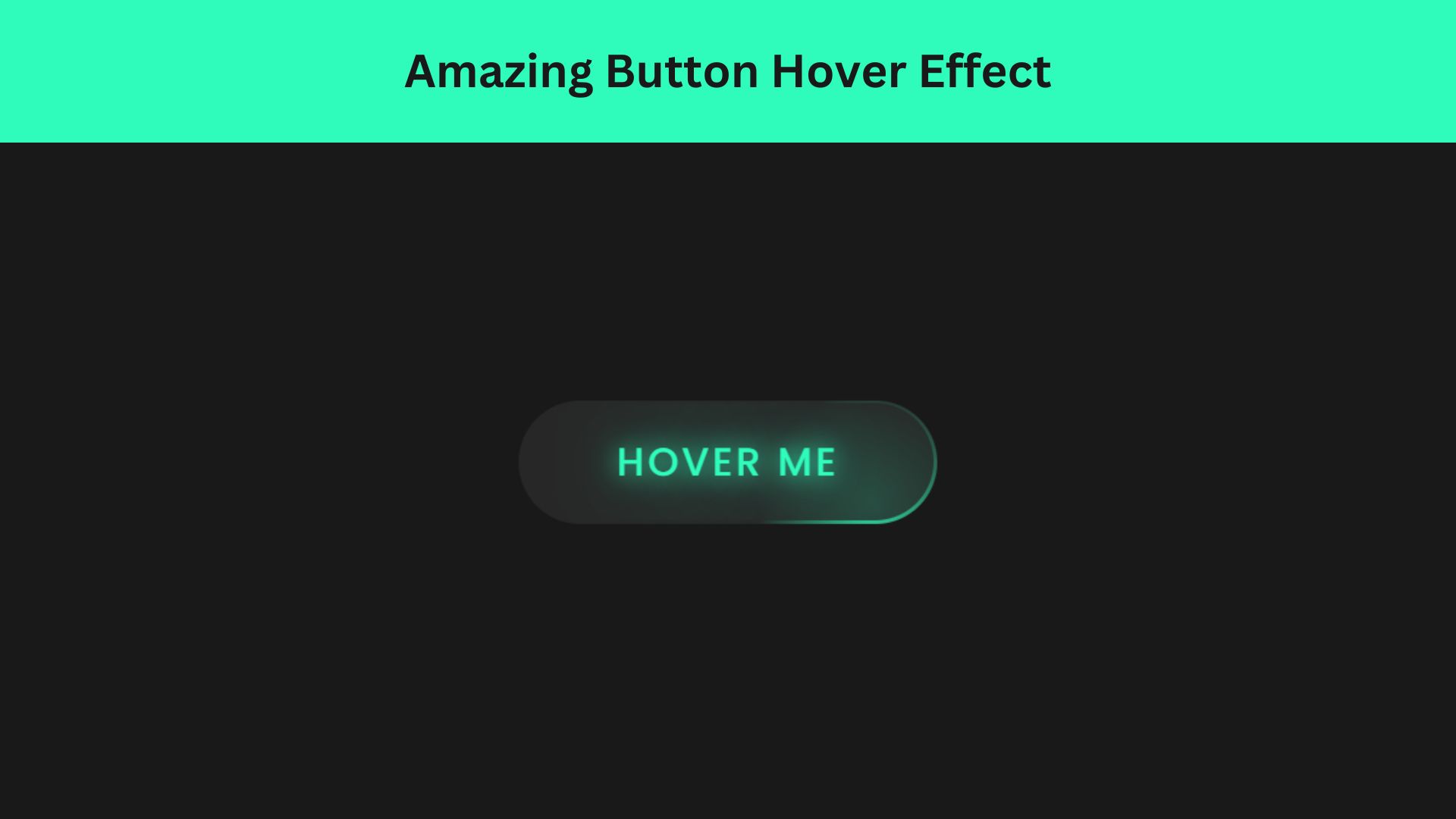
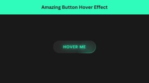
Amazing Button Hover Effect Using HTML, CSS, and JavaScript
Discover how to create amazing button hover effects using HTML, CSS, and JavaScript. Learn step-by-step with free source code to