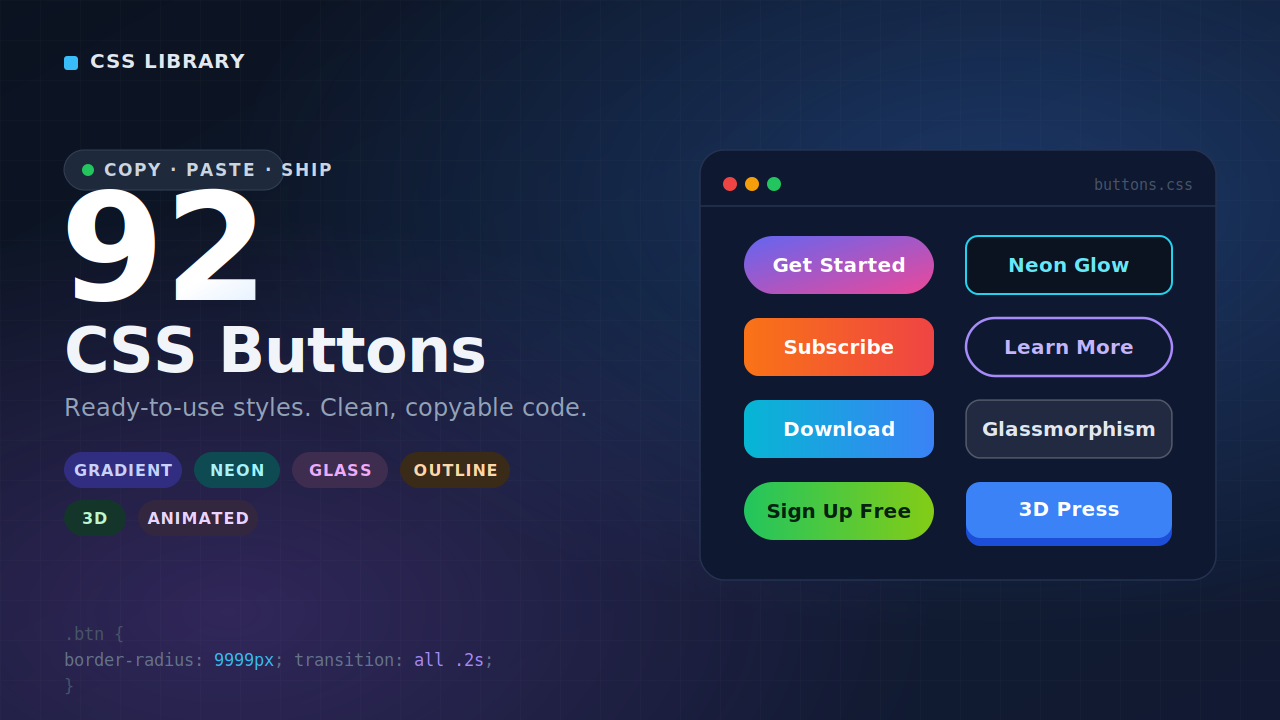
92 CSS Buttons — Copy-Ready Styles for Every Web Project
Buttons are everywhere on the web, and yet they’re surprisingly easy to get wrong. Too plain and they disappear into the page. Too flashy and they distract from everything around them. Getting the balance right — something that looks intentional, fits the design, and actually makes people want to click — takes more thought than most people expect.
That’s why we put together this collection of 92 CSS buttons. Whether you’re building something from scratch, polishing up a client project, or just tired of your default browser button looking like it wandered in from 2009, this library gives you a serious range of options to work with. Copy the code, drop it in, and move on with your day.
Why Button Design Matters More Than You Think
It’s easy to treat buttons as an afterthought. You’ve got the layout figured out, the content is in place, the colors are sorted — and then at the end you slap a button on and call it done. Most designers and developers have been there.
But buttons carry a lot of weight in user experience. They’re the primary way visitors interact with your site. Every “Buy Now,” “Get Started,” “Subscribe,” and “Learn More” is a moment of decision — and how that button looks, feels, and behaves has a real effect on whether someone clicks it or doesn’t.
Studies on conversion rate optimization consistently show that button design — including color, shape, size, label, and hover behavior — influences click-through rates in meaningful ways. A well-designed button communicates confidence and clarity. A poorly designed one creates hesitation, even if the visitor can’t quite articulate why.
So no, buttons aren’t just decoration. They’re functional UI elements that deserve proper attention.
What's Inside This CSS Button Collection
Ninety-two buttons is a lot, so let’s talk about what kinds of styles are actually represented here, because this isn’t just 92 slight variations of the same rounded rectangle.
The collection spans a genuinely wide range of design directions. You’ll find clean, minimal buttons built for professional interfaces where simplicity is the point. You’ll find outlined ghost buttons that sit elegantly on image backgrounds or dark sections without overwhelming the visual hierarchy. There are gradient buttons for brands that want a bit more visual energy, and flat solid buttons for designs that prioritize clarity over personality.
On the animation side, things get more interesting. Hover effects range from subtle color shifts and gentle lifts to more expressive transitions — fill effects that sweep in from the left, ripple effects that radiate from the click point, sliding underlines, glowing edges, and border animations that feel alive without being distracting. There are also buttons with built-in icon support, pill-shaped styles for softer UI systems, and sharp-cornered options that work well in more technical or editorial contexts.
The point is variety with purpose. Every button in here exists because it solves a real design problem, not just to pad the number.
How to Use These CSS Buttons
Every button in this collection comes with clean, copy-ready CSS. There’s no framework dependency, no build tool required, no npm install to run. It’s plain CSS that works in any project — WordPress themes, static HTML pages, React apps, Webflow sites, Elementor sections, or wherever else you’re building.
To use a button, you pick the style you want, copy the CSS, and apply the class to your HTML button element. That’s genuinely it. The code is written to be self-contained, so it won’t fight with your existing styles or require a bunch of overrides to get working.
For developers who are integrating these into larger component systems, the CSS is structured cleanly enough to translate into Sass variables, CSS custom properties, or component-scoped styles with minimal effort. The patterns are intentional and readable, not minified or obfuscated.
Check Out Those Useful Articles
Choosing the Right Button Style for Your Project
With 92 options available, the real challenge isn’t finding a button you like — it’s knowing which one is right for the specific context you’re working in. Here’s a practical way to think about it.
Match the button to the UI’s energy. A SaaS dashboard with a clean, data-dense interface calls for something different than a lifestyle brand’s landing page. The former benefits from simple, crisp buttons that don’t compete with the data around them. The latter can afford something more expressive — a gradient, a bold fill, an animated hover state.
Consider the button’s role on the page. Primary actions — the thing you most want the user to do — should be visually dominant. Secondary actions should step back. Using dramatically different button styles for these two roles (solid vs. outlined, for example) creates a clear visual hierarchy without you having to say a word.
Think about your color palette. Some buttons in this collection are built with specific color relationships in mind — high-contrast fills, monochromatic borders, complementary accent tones. Choosing a button that works with your existing brand colors rather than against them will always look more intentional than forcing a style to fit.
Don’t overlook hover and focus states. A button that looks great at rest but has a jarring or nonexistent hover effect feels unfinished. Several styles in this collection shine specifically because of their hover behavior — animated fills, scale effects, color inversions — so spend time previewing the interactive states, not just the static appearance.
CSS Buttons and Accessibility — What You Should Know
Good button design isn’t only about aesthetics. Accessibility is a real consideration, especially if you’re building for a professional context or working under WCAG compliance requirements.
A few things to keep in mind as you work with these styles. Color contrast matters — your button text needs sufficient contrast against the button background to be readable by people with low vision or color blindness. The WCAG AA standard requires a contrast ratio of at least 4.5:1 for normal text. Running your chosen color combination through a contrast checker takes thirty seconds and is always worth doing.
Focus states are another consideration. By default, browsers add a visible focus ring to buttons so keyboard users can see where they are on the page. If you’re overriding this with your CSS (which is common when styling buttons), make sure you’re replacing it with something equally visible rather than just removing it. The styles in this collection account for this where relevant, but it’s worth double-checking in your specific implementation.
Button size matters too. Touch targets should be large enough for mobile users to tap comfortably — a minimum of 44 by 44 pixels is a widely cited guideline. If you’re using a smaller decorative button, consider whether it’s serving a primary function that mobile users need to access.
CSS Buttons vs. Design System Components
If you’re working within a formal design system — something like Material Design, Ant Design, or a custom internal system — you might be wondering how a standalone CSS button collection fits into that picture.
The honest answer is that it depends on how rigidly your system is defined. For teams with strict token-based systems where every interactive element needs to be a sanctioned component, this collection is probably more useful as a reference and inspiration source than as something you’d drop in directly.
But for the majority of projects — especially freelance work, smaller team builds, personal projects, and sites where the “design system” is more of a loose set of conventions — this collection is exactly the kind of resource that saves hours. You get professional-quality styling without the overhead of installing and configuring a full component library for a project that doesn’t need one.
Why Pure CSS Still Wins for Buttons
There’s a tendency in modern web development to reach for JavaScript libraries for anything interactive. And while JavaScript certainly has its place, buttons are one of those elements where CSS can do everything you need — and do it better.
CSS-only button styles load faster because there’s no script to parse and execute. They work without JavaScript enabled. They integrate cleanly with any tech stack. They’re easier to override and customize. And they perform better on lower-powered devices because there’s no runtime overhead.
The animated buttons in this collection achieve their effects entirely through CSS transitions and keyframe animations. That means smooth, hardware-accelerated motion that doesn’t block the main thread or cause layout jank. For a UI element as frequently rendered as a button, that matters.
Practical Use Cases for This Button Library
To make this a bit more concrete, here are some real scenarios where having a library like this on hand is genuinely useful.
You’re building a landing page quickly and need a primary CTA button that looks polished without spending an hour writing custom styles. You pull a gradient or fill-animation button, adjust the color to match the brand, done.
You’re working on a client site in Elementor or Divi and the default button styles look generic. You grab something from this collection, add it as custom CSS, and the result looks like it was designed intentionally for that site.
You’re a developer who’s good with logic but less confident about design, and you want your personal project to look like you care about the front-end. These buttons do a lot of visual work for you with minimal effort on your part.
You’re a designer prototyping something in code and you want to quickly test several button treatments to see what fits the vibe. Having 92 options in one place makes that exploration fast.
Browse, Copy, Build
There’s nothing worse than finding a button style you like on some design inspiration site and then realizing you have to write the CSS from scratch to actually use it. This collection exists to eliminate that friction entirely.
Every style here is ready to use today. Browse through the collection, find what works for your project, copy the code, and move on. If something is almost right but not quite, the CSS is clean enough to modify quickly without unraveling anything.
Good buttons make better websites. This library makes good buttons easy. That’s the whole idea.
Recent Posts
Categories

FAQs
Are these CSS buttons completely free to use?
Yes. All 92 button styles in this collection are free to use in personal and commercial projects. There’s no attribution required, no license to worry about, and no hidden costs. Copy and use them however you need.
Do I need a CSS framework like Bootstrap or Tailwind to use these buttons?
No. Every button in this collection is written in plain, vanilla CSS with no framework dependencies. They’ll work in any project regardless of what tools or stack you’re using.
Can I customize the colors and fonts to match my brand?
Absolutely. The CSS is intentionally readable and easy to modify. Changing colors, font sizes, border radii, padding, and other properties is straightforward — the code is not minified or obfuscated, so you can edit it directly.
Will these buttons work in WordPress?
Yes. You can add the CSS through your theme’s custom CSS section, a child theme stylesheet, or a plugin that allows custom CSS. Pair the class with the appropriate button HTML and you’re good to go.
Are the animated buttons performance-friendly?
Yes. All animations in this collection use CSS transitions and keyframe animations, which are hardware-accelerated and don’t rely on JavaScript. They’re lightweight and won’t negatively impact your page’s performance.
Do these buttons meet accessibility standards?
The styles are built with accessibility in mind, but you should always verify contrast ratios and focus states in your specific implementation. A contrast checker tool and basic keyboard navigation testing go a long way toward ensuring compliance.
Can I use these buttons in a React or Vue project?
Yes. You can import the CSS into your component styles, use it as a global stylesheet, or translate the styles into CSS modules or styled-components. The patterns are clean enough to adapt to any modern frontend setup.
Are there button styles suitable for dark mode designs?
Yes. Several buttons in the collection are specifically designed to work well on dark backgrounds — including outlined ghost buttons, glowing edge styles, and high-contrast fills that pop against dark UI environments.
How do I add an icon to these buttons?
Most of the button styles in this collection are designed to accommodate icons using inline SVGs or icon font classes. You can add an icon inside the button HTML element alongside the label text, and the existing padding and spacing will generally accommodate it without needing major CSS adjustments.
Can I submit a button style to be added to the collection?
We love hearing from the community. If you’ve created a CSS button style you think belongs in the collection, feel free to reach out through our contact page. We review community submissions and update the library periodically with new styles.
Share on Social Media
Related Articles
92 CSS Buttons | Free Source Code
92 CSS Buttons — Copy-Ready Styles for Every Web Project Free Download Code Files Preview The Demo Buttons are everywhere
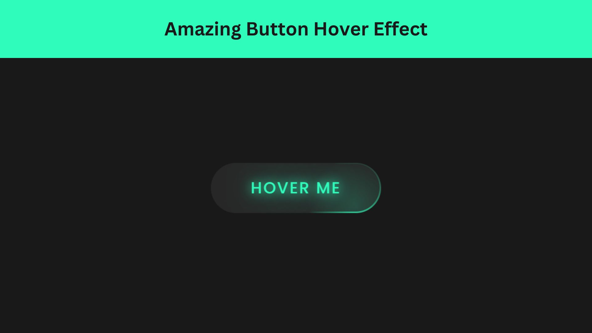
Amazing Button Hover Effect Using HTML, CSS, and JavaScript
Discover how to create amazing button hover effects using HTML, CSS, and JavaScript. Learn step-by-step with free source code to