Responsive Animated Hero Section with Dark Light Theme

Let’s be real for a second. The first thing visitors notice on any website is the hero section. It’s that big, bold area right at the top that either pulls them in or pushes them away within seconds.
If your hero section looks dull, outdated, or broken on mobile, you’ve already lost the game. That’s why building a modern animated hero section is one of the smartest investments you can make as a developer.
In this article, I’ll walk you through a beautifully crafted responsive animated hero section with a dark light theme toggle. The best part? The free source code is included, so you can grab it and start customizing right away.
Whether you’re a beginner trying to level up your frontend skills or a seasoned developer hunting for a quick template, this project has something valuable for you. Let’s dive in.
Why Hero Sections Matter
Think of the hero section as the digital handshake of your website. It’s the first impression, and we all know how much first impressions matter online.
A strong hero section design does more than look pretty. It communicates your brand identity, guides users toward action, and sets the tone for the entire experience.
Studies on user behavior consistently show that visitors decide within just a few seconds whether to stay or leave. A well-built hero banner animation can dramatically boost that decision in your favor.
Here’s what a great hero section actually accomplishes:
- Captures attention instantly with visual appeal
- Communicates your core message clearly
- Encourages users to scroll, click, or sign up
- Builds trust through professional design
- Sets the visual tone for the rest of the page
When you nail the homepage design, everything else flows naturally. That’s why developers and designers obsess over getting it right.
Features of This Animated Hero Section
Let me break down what makes this particular animated hero section stand out from the crowd. It’s not just another template floating around the internet.
This project was built with attention to every small detail, from smooth transitions to thoughtful color choices. Here’s what you’ll get when you download the free source code.
Smooth Animation Effects
The hero section comes packed with smooth CSS animation effects that feel natural rather than flashy. Elements fade in, slide gently, and respond to user interactions with elegance.
You won’t find any jarring movements or distracting bounces here. Everything is timed perfectly to enhance the user experience without overwhelming the senses.
Dark and Light Theme Toggle
One of the highlights is the built-in dark light theme switcher. Users can flip between modes with a single click, and the entire interface adapts instantly.
This isn’t just a color swap. The typography, shadows, and accent colors all adjust to look perfect in both modes.
Fully Responsive Layout
The responsive hero section adapts beautifully to every screen size. Whether someone visits from a giant desktop monitor or a tiny smartphone, the layout stays clean and readable.
No horizontal scrolling, no broken elements, no awkward spacing. Just a smooth experience across all devices.
Interactive Elements
Buttons hover gracefully, icons animate on interaction, and text elements come alive as users explore. These small touches make the interactive hero section feel premium and engaging.
Clean Modern Typography
Typography can make or break a design. This project uses modern, web-optimized fonts that look sharp on every device and pair beautifully with both themes.
Lightweight and Fast
Despite all the animations and features, the project stays lightweight. Pages load fast, animations run smoothly, and there’s no unnecessary bloat slowing things down.
Dark and Light Theme Benefits
The dark and light theme combination has become a staple of modern web design. And honestly, there are solid reasons behind this trend that go beyond aesthetics.
Let’s talk about why offering both modes matters so much for your users.
Benefits of Dark Mode
Dark mode websites have exploded in popularity, and for good reason. It’s not just a style choice anymore, it’s a usability feature.
- Reduced eye strain: Dark backgrounds are easier on the eyes during long browsing sessions or in low-light environments
- Battery savings: On OLED and AMOLED screens, dark pixels consume significantly less power
- Modern aesthetic: Dark mode gives websites a sleek, premium feel that resonates with modern users
- Better focus: Content stands out more dramatically against dark backgrounds
- Accessibility: Many users with light sensitivity prefer dark interfaces
Benefits of Light Mode
Light mode UI isn’t going anywhere either. It still serves the majority of users in many situations.
- Better readability: In bright daylight, light backgrounds are much easier to read
- Familiarity: Most users grew up with light interfaces and feel comfortable with them
- Cleaner appearance: Light backgrounds give a fresh, open, professional vibe
- Color accuracy: Designs with vibrant colors tend to pop more against light backgrounds
- Print friendliness: Light themes translate better when users want to print content
By offering both, you respect user preference and create a more inclusive experience. That’s a big win for any modern landing page.
Check Out Those Useful Articles
Setting Up the Project Folder and Boilerplate Code
Once your design is mapped out, the next step is setting up your project environment. Creating a clean folder structure is essential when working on a modern animated sign-up form design. It keeps everything organized and makes collaboration or future updates easier.
To create a Responsive Animated Hero Section, follow these steps:
- Create a Folder: Name this folder according to your preference. Inside this folder, you’ll need to set up the following files:
- Create an index.html File: This file should be named index with the .html extension.
- Create a style.css File: This file should be named style with the .css extension.
- Create a main.js File: This file should be name main with the .js extension.
These files will form the basis of your Responsive Animated Hero Section.
Writing the HTML Structure for the Responsive Animated Hero Section
Now, open your code editor and set up a new HTML file, copy those HTML Codes and Paste those Codes on index.html file.
<!DOCTYPE html>
<html lang="en" data-theme="dark">
<head>
<meta charset="UTF-8" />
<meta name="viewport" content="width=device-width, initial-scale=1.0" />
<title>Animated Hero Section Design By AbdulDev</title>
<link rel="preconnect" href="https://fonts.googleapis.com" />
<link rel="preconnect" href="https://fonts.gstatic.com" crossorigin />
<link rel="stylesheet" href="style.css">
</head>
<body>
<nav id="navbar">
<a href="#" class="nav-logo">
<div class="logo-icon">✦</div>
Lumina
</a>
<ul class="nav-links">
<li><a href="#">Features</a></li>
<li><a href="#">Pricing</a></li>
<li><a href="#">About</a></li>
<li><a href="#">Blog</a></li>
</ul>
<div class="nav-right">
<button class="theme-toggle" id="themeToggle" aria-label="Toggle theme">
<span class="toggle-icon moon">🌙</span>
<span class="toggle-icon sun">☀️</span>
</button>
<button class="btn-nav">Get Started</button>
<button class="hamburger" id="hamburger" aria-label="Menu">
<span></span><span></span><span></span>
</button>
</div>
</nav>
<div class="mobile-menu" id="mobileMenu">
<a href="#">Features</a>
<a href="#">Pricing</a>
<a href="#">About</a>
<a href="#">Blog</a>
<button class="btn-nav" style="width:fit-content">Get Started</button>
</div>
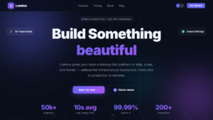
<section class="hero" id="hero">
<canvas id="particle-canvas"></canvas>
<div class="grid-overlay"></div>
<div class="orb orb-1"></div>
<div class="orb orb-2"></div>
<div class="orb orb-3"></div>
<div class="floating-cards">
<div class="f-card c1">
<span class="f-card-icon">⚡</span>
<span>10× Faster Builds</span>
</div>
<div class="f-card c2">
<span class="f-card-icon">🛡️</span>
<span>Zero-Trust Security</span>
</div>
<div class="f-card c3">
<span class="f-card-icon">🌍</span>
<span>Global CDN Edge</span>
</div>
<div class="f-card c4">
<span class="f-card-icon">📈</span>
<span>99.99% Uptime SLA</span>
</div>
</div>
<div class="hero-content">
<div class="badge">
<span class="badge-dot"></span>
Now in public beta — Join 50k+ developers
</div>
<h1 class="hero-headline">
Build Something
<span class="rotating-wrapper" id="rotatingWrapper">
<span class="rotating-word headline-gradient">amazing</span>
<span class="rotating-word headline-gradient">powerful</span>
<span class="rotating-word headline-gradient">beautiful</span>
<span class="rotating-word headline-gradient">blazing-fast</span>
<span class="rotating-word headline-gradient">remarkable</span>
</span>
</h1>
<p class="hero-sub">
Lumina gives your team a blazing-fast platform to ship, scale, and iterate —
without the infrastructure headaches. From idea to production in minutes.
</p>
<div class="hero-actions">
<button class="btn-primary">Start for free →</button>
<button class="btn-secondary">
<span class="play-icon">▶</span>
Watch demo
</button>
</div>
<div class="hero-stats">
<div class="stat">
<div class="stat-value" data-target="50">0</div>
<div class="stat-label">Engineers</div>
</div>
<div class="stat-divider"></div>
<div class="stat">
<div class="stat-value" data-target="10">0</div>
<div class="stat-label">Avg. Deploy Time</div>
</div>
<div class="stat-divider"></div>
<div class="stat">
<div class="stat-value" data-target="99">0</div>
<div class="stat-label">Uptime %</div>
</div>
<div class="stat-divider"></div>
<div class="stat">
<div class="stat-value" data-target="200">0</div>
<div class="stat-label">Integrations</div>
</div>
</div>
</div>
<button class="scroll-indicator" id="scrollBtn" aria-label="Scroll down">
<div class="scroll-mouse">
<div class="scroll-wheel"></div>
</div>
Scroll
</button>
</section>
<script type="litespeed/javascript" data-src="main.js"></script> <script data-no-optimize="1">window.lazyLoadOptions=Object.assign({},{threshold:300},window.lazyLoadOptions||{});!function(t,e){"object"==typeof exports&&"undefined"!=typeof module?module.exports=e():"function"==typeof define&&define.amd?define(e):(t="undefined"!=typeof globalThis?globalThis:t||self).LazyLoad=e()}(this,function(){"use strict";function e(){return(e=Object.assign||function(t){for(var e=1;e<arguments.length;e++){var n,a=arguments[e];for(n in a)Object.prototype.hasOwnProperty.call(a,n)&&(t[n]=a[n])}return t}).apply(this,arguments)}function o(t){return e({},at,t)}function l(t,e){return t.getAttribute(gt+e)}function c(t){return l(t,vt)}function s(t,e){return function(t,e,n){e=gt+e;null!==n?t.setAttribute(e,n):t.removeAttribute(e)}(t,vt,e)}function i(t){return s(t,null),0}function r(t){return null===c(t)}function u(t){return c(t)===_t}function d(t,e,n,a){t&&(void 0===a?void 0===n?t(e):t(e,n):t(e,n,a))}function f(t,e){et?t.classList.add(e):t.className+=(t.className?" ":"")+e}function _(t,e){et?t.classList.remove(e):t.className=t.className.replace(new RegExp("(^|\\s+)"+e+"(\\s+|$)")," ").replace(/^\s+/,"").replace(/\s+$/,"")}function g(t){return t.llTempImage}function v(t,e){!e||(e=e._observer)&&e.unobserve(t)}function b(t,e){t&&(t.loadingCount+=e)}function p(t,e){t&&(t.toLoadCount=e)}function n(t){for(var e,n=[],a=0;e=t.children[a];a+=1)"SOURCE"===e.tagName&&n.push(e);return n}function h(t,e){(t=t.parentNode)&&"PICTURE"===t.tagName&&n(t).forEach(e)}function a(t,e){n(t).forEach(e)}function m(t){return!!t[lt]}function E(t){return t[lt]}function I(t){return delete t[lt]}function y(e,t){var n;m(e)||(n={},t.forEach(function(t){n[t]=e.getAttribute(t)}),e[lt]=n)}function L(a,t){var o;m(a)&&(o=E(a),t.forEach(function(t){var e,n;e=a,(t=o[n=t])?e.setAttribute(n,t):e.removeAttribute(n)}))}function k(t,e,n){f(t,e.class_loading),s(t,st),n&&(b(n,1),d(e.callback_loading,t,n))}function A(t,e,n){n&&t.setAttribute(e,n)}function O(t,e){A(t,rt,l(t,e.data_sizes)),A(t,it,l(t,e.data_srcset)),A(t,ot,l(t,e.data_src))}function w(t,e,n){var a=l(t,e.data_bg_multi),o=l(t,e.data_bg_multi_hidpi);(a=nt&&o?o:a)&&(t.style.backgroundImage=a,n=n,f(t=t,(e=e).class_applied),s(t,dt),n&&(e.unobserve_completed&&v(t,e),d(e.callback_applied,t,n)))}function x(t,e){!e||0<e.loadingCount||0<e.toLoadCount||d(t.callback_finish,e)}function M(t,e,n){t.addEventListener(e,n),t.llEvLisnrs[e]=n}function N(t){return!!t.llEvLisnrs}function z(t){if(N(t)){var e,n,a=t.llEvLisnrs;for(e in a){var o=a[e];n=e,o=o,t.removeEventListener(n,o)}delete t.llEvLisnrs}}function C(t,e,n){var a;delete t.llTempImage,b(n,-1),(a=n)&&--a.toLoadCount,_(t,e.class_loading),e.unobserve_completed&&v(t,n)}function R(i,r,c){var l=g(i)||i;N(l)||function(t,e,n){N(t)||(t.llEvLisnrs={});var a="VIDEO"===t.tagName?"loadeddata":"load";M(t,a,e),M(t,"error",n)}(l,function(t){var e,n,a,o;n=r,a=c,o=u(e=i),C(e,n,a),f(e,n.class_loaded),s(e,ut),d(n.callback_loaded,e,a),o||x(n,a),z(l)},function(t){var e,n,a,o;n=r,a=c,o=u(e=i),C(e,n,a),f(e,n.class_error),s(e,ft),d(n.callback_error,e,a),o||x(n,a),z(l)})}function T(t,e,n){var a,o,i,r,c;t.llTempImage=document.createElement("IMG"),R(t,e,n),m(c=t)||(c[lt]={backgroundImage:c.style.backgroundImage}),i=n,r=l(a=t,(o=e).data_bg),c=l(a,o.data_bg_hidpi),(r=nt&&c?c:r)&&(a.style.backgroundImage='url("'.concat(r,'")'),g(a).setAttribute(ot,r),k(a,o,i)),w(t,e,n)}function G(t,e,n){var a;R(t,e,n),a=e,e=n,(t=Et[(n=t).tagName])&&(t(n,a),k(n,a,e))}function D(t,e,n){var a;a=t,(-1<It.indexOf(a.tagName)?G:T)(t,e,n)}function S(t,e,n){var a;t.setAttribute("loading","lazy"),R(t,e,n),a=e,(e=Et[(n=t).tagName])&&e(n,a),s(t,_t)}function V(t){t.removeAttribute(ot),t.removeAttribute(it),t.removeAttribute(rt)}function j(t){h(t,function(t){L(t,mt)}),L(t,mt)}function F(t){var e;(e=yt[t.tagName])?e(t):m(e=t)&&(t=E(e),e.style.backgroundImage=t.backgroundImage)}function P(t,e){var n;F(t),n=e,r(e=t)||u(e)||(_(e,n.class_entered),_(e,n.class_exited),_(e,n.class_applied),_(e,n.class_loading),_(e,n.class_loaded),_(e,n.class_error)),i(t),I(t)}function U(t,e,n,a){var o;n.cancel_on_exit&&(c(t)!==st||"IMG"===t.tagName&&(z(t),h(o=t,function(t){V(t)}),V(o),j(t),_(t,n.class_loading),b(a,-1),i(t),d(n.callback_cancel,t,e,a)))}function $(t,e,n,a){var o,i,r=(i=t,0<=bt.indexOf(c(i)));s(t,"entered"),f(t,n.class_entered),_(t,n.class_exited),o=t,i=a,n.unobserve_entered&&v(o,i),d(n.callback_enter,t,e,a),r||D(t,n,a)}function q(t){return t.use_native&&"loading"in HTMLImageElement.prototype}function H(t,o,i){t.forEach(function(t){return(a=t).isIntersecting||0<a.intersectionRatio?$(t.target,t,o,i):(e=t.target,n=t,a=o,t=i,void(r(e)||(f(e,a.class_exited),U(e,n,a,t),d(a.callback_exit,e,n,t))));var e,n,a})}function B(e,n){var t;tt&&!q(e)&&(n._observer=new IntersectionObserver(function(t){H(t,e,n)},{root:(t=e).container===document?null:t.container,rootMargin:t.thresholds||t.threshold+"px"}))}function J(t){return Array.prototype.slice.call(t)}function K(t){return t.container.querySelectorAll(t.elements_selector)}function Q(t){return c(t)===ft}function W(t,e){return e=t||K(e),J(e).filter(r)}function X(e,t){var n;(n=K(e),J(n).filter(Q)).forEach(function(t){_(t,e.class_error),i(t)}),t.update()}function t(t,e){var n,a,t=o(t);this._settings=t,this.loadingCount=0,B(t,this),n=t,a=this,Y&&window.addEventListener("online",function(){X(n,a)}),this.update(e)}var Y="undefined"!=typeof window,Z=Y&&!("onscroll"in window)||"undefined"!=typeof navigator&&/(gle|ing|ro)bot|crawl|spider/i.test(navigator.userAgent),tt=Y&&"IntersectionObserver"in window,et=Y&&"classList"in document.createElement("p"),nt=Y&&1<window.devicePixelRatio,at={elements_selector:".lazy",container:Z||Y?document:null,threshold:300,thresholds:null,data_src:"src",data_srcset:"srcset",data_sizes:"sizes",data_bg:"bg",data_bg_hidpi:"bg-hidpi",data_bg_multi:"bg-multi",data_bg_multi_hidpi:"bg-multi-hidpi",data_poster:"poster",class_applied:"applied",class_loading:"litespeed-loading",class_loaded:"litespeed-loaded",class_error:"error",class_entered:"entered",class_exited:"exited",unobserve_completed:!0,unobserve_entered:!1,cancel_on_exit:!0,callback_enter:null,callback_exit:null,callback_applied:null,callback_loading:null,callback_loaded:null,callback_error:null,callback_finish:null,callback_cancel:null,use_native:!1},ot="src",it="srcset",rt="sizes",ct="poster",lt="llOriginalAttrs",st="loading",ut="loaded",dt="applied",ft="error",_t="native",gt="data-",vt="ll-status",bt=[st,ut,dt,ft],pt=[ot],ht=[ot,ct],mt=[ot,it,rt],Et={IMG:function(t,e){h(t,function(t){y(t,mt),O(t,e)}),y(t,mt),O(t,e)},IFRAME:function(t,e){y(t,pt),A(t,ot,l(t,e.data_src))},VIDEO:function(t,e){a(t,function(t){y(t,pt),A(t,ot,l(t,e.data_src))}),y(t,ht),A(t,ct,l(t,e.data_poster)),A(t,ot,l(t,e.data_src)),t.load()}},It=["IMG","IFRAME","VIDEO"],yt={IMG:j,IFRAME:function(t){L(t,pt)},VIDEO:function(t){a(t,function(t){L(t,pt)}),L(t,ht),t.load()}},Lt=["IMG","IFRAME","VIDEO"];return t.prototype={update:function(t){var e,n,a,o=this._settings,i=W(t,o);{if(p(this,i.length),!Z&&tt)return q(o)?(e=o,n=this,i.forEach(function(t){-1!==Lt.indexOf(t.tagName)&&S(t,e,n)}),void p(n,0)):(t=this._observer,o=i,t.disconnect(),a=t,void o.forEach(function(t){a.observe(t)}));this.loadAll(i)}},destroy:function(){this._observer&&this._observer.disconnect(),K(this._settings).forEach(function(t){I(t)}),delete this._observer,delete this._settings,delete this.loadingCount,delete this.toLoadCount},loadAll:function(t){var e=this,n=this._settings;W(t,n).forEach(function(t){v(t,e),D(t,n,e)})},restoreAll:function(){var e=this._settings;K(e).forEach(function(t){P(t,e)})}},t.load=function(t,e){e=o(e);D(t,e)},t.resetStatus=function(t){i(t)},t}),function(t,e){"use strict";function n(){e.body.classList.add("litespeed_lazyloaded")}function a(){console.log("[LiteSpeed] Start Lazy Load"),o=new LazyLoad(Object.assign({},t.lazyLoadOptions||{},{elements_selector:"[data-lazyloaded]",callback_finish:n})),i=function(){o.update()},t.MutationObserver&&new MutationObserver(i).observe(e.documentElement,{childList:!0,subtree:!0,attributes:!0})}var o,i;t.addEventListener?t.addEventListener("load",a,!1):t.attachEvent("onload",a)}(window,document);</script><script data-no-optimize="1">window.litespeed_ui_events=window.litespeed_ui_events||["mouseover","click","keydown","wheel","touchmove","touchstart"];var urlCreator=window.URL||window.webkitURL;function litespeed_load_delayed_js_force(){console.log("[LiteSpeed] Start Load JS Delayed"),litespeed_ui_events.forEach(e=>{window.removeEventListener(e,litespeed_load_delayed_js_force,{passive:!0})}),document.querySelectorAll("iframe[data-litespeed-src]").forEach(e=>{e.setAttribute("src",e.getAttribute("data-litespeed-src"))}),"loading"==document.readyState?window.addEventListener("DOMContentLoaded",litespeed_load_delayed_js):litespeed_load_delayed_js()}litespeed_ui_events.forEach(e=>{window.addEventListener(e,litespeed_load_delayed_js_force,{passive:!0})});async function litespeed_load_delayed_js(){let t=[];for(var d in document.querySelectorAll('script[type="litespeed/javascript"]').forEach(e=>{t.push(e)}),t)await new Promise(e=>litespeed_load_one(t[d],e));document.dispatchEvent(new Event("DOMContentLiteSpeedLoaded")),window.dispatchEvent(new Event("DOMContentLiteSpeedLoaded"))}function litespeed_load_one(t,e){console.log("[LiteSpeed] Load ",t);var d=document.createElement("script");d.addEventListener("load",e),d.addEventListener("error",e),t.getAttributeNames().forEach(e=>{"type"!=e&&d.setAttribute("data-src"==e?"src":e,t.getAttribute(e))});let a=!(d.type="text/javascript");!d.src&&t.textContent&&(d.src=litespeed_inline2src(t.textContent),a=!0),t.after(d),t.remove(),a&&e()}function litespeed_inline2src(t){try{var d=urlCreator.createObjectURL(new Blob([t.replace(/^(?:<!--)?(.*?)(?:-->)?$/gm,"$1")],{type:"text/javascript"}))}catch(e){d="data:text/javascript;base64,"+btoa(t.replace(/^(?:<!--)?(.*?)(?:-->)?$/gm,"$1"))}return d}</script><script data-no-optimize="1">var litespeed_vary=document.cookie.replace(/(?:(?:^|.*;\s*)_lscache_vary\s*\=\s*([^;]*).*$)|^.*$/,"");litespeed_vary||(sessionStorage.getItem("litespeed_reloaded")?console.log("LiteSpeed: skipping guest vary reload (already reloaded this session)"):fetch("/wp-content/plugins/litespeed-cache/guest.vary.php",{method:"POST",cache:"no-cache",redirect:"follow"}).then(e=>e.json()).then(e=>{console.log(e),e.hasOwnProperty("reload")&&"yes"==e.reload&&(sessionStorage.setItem("litespeed_docref",document.referrer),sessionStorage.setItem("litespeed_reloaded","1"),window.location.reload(!0))}));</script><script data-optimized="1" type="litespeed/javascript" data-src="https://abduldev.com/wp-content/litespeed/js/0b11d7b176723f098ea69bc8efdbb073.js?ver=0291f"></script></body>
</html>
Styling the CSS Animated Sign-up Form Using CSS
After that, copy those CSS Codes and Paste those Codes on style.css file.
					 /* ── CSS Variables ── */
    :root {
      --transition: 0.4s cubic-bezier(0.4, 0, 0.2, 1);
    }

    [data-theme="dark"] {
      --bg:           #090e1a;
      --bg-nav:       rgba(9, 14, 26, 0.85);
      --surface:      #111827;
      --border:       rgba(255,255,255,0.08);
      --text:         #f0f4ff;
      --text-muted:   #8892a4;
      --accent:       #6366f1;
      --accent-2:     #a855f7;
      --accent-glow:  rgba(99, 102, 241, 0.35);
      --btn-text:     #ffffff;
      --toggle-bg:    #1f2937;
      --toggle-knob:  #6366f1;
      --card-bg:      rgba(255,255,255,0.04);
    }

    [data-theme="light"] {
      --bg:           #f5f7ff;
      --bg-nav:       rgba(245, 247, 255, 0.88);
      --surface:      #ffffff;
      --border:       rgba(0,0,0,0.08);
      --text:         #0f172a;
      --text-muted:   #64748b;
      --accent:       #4f46e5;
      --accent-2:     #9333ea;
      --accent-glow:  rgba(79, 70, 229, 0.25);
      --btn-text:     #ffffff;
      --toggle-bg:    #e2e8f0;
      --toggle-knob:  #f59e0b;
      --card-bg:      rgba(0,0,0,0.03);
    }

    /* ── Reset ── */
    *, *::before, *::after { box-sizing: border-box; margin: 0; padding: 0; }

    html { scroll-behavior: smooth; }

    body {
      font-family: 'Inter', sans-serif;
      background: var(--bg);
      color: var(--text);
      transition: background var(--transition), color var(--transition);
      overflow-x: hidden;
      min-height: 100vh;
    }

    /* ── NAV ── */
    nav {
      position: fixed;
      top: 0; left: 0; right: 0;
      z-index: 1000;
      padding: 0 clamp(1rem, 5vw, 3rem);
      height: 68px;
      display: flex;
      align-items: center;
      justify-content: space-between;
      background: var(--bg-nav);
      border-bottom: 1px solid var(--border);
      backdrop-filter: blur(18px) saturate(160%);
      -webkit-backdrop-filter: blur(18px) saturate(160%);
      transition: background var(--transition), border-color var(--transition);
    }

    .nav-logo {
      display: flex;
      align-items: center;
      gap: 10px;
      text-decoration: none;
      color: var(--text);
      font-weight: 800;
      font-size: 1.2rem;
      letter-spacing: -0.5px;
    }

    .logo-icon {
      width: 36px; height: 36px;
      border-radius: 10px;
      background: linear-gradient(135deg, var(--accent), var(--accent-2));
      display: flex; align-items: center; justify-content: center;
      font-size: 1rem;
      box-shadow: 0 0 18px var(--accent-glow);
      transition: box-shadow var(--transition);
    }

    .nav-links {
      display: flex;
      align-items: center;
      gap: 2rem;
      list-style: none;
    }

    .nav-links a {
      text-decoration: none;
      color: var(--text-muted);
      font-size: 0.9rem;
      font-weight: 500;
      transition: color 0.25s;
      position: relative;
    }

    .nav-links a::after {
      content: '';
      position: absolute;
      bottom: -3px; left: 0;
      width: 0; height: 2px;
      background: var(--accent);
      border-radius: 2px;
      transition: width 0.3s ease;
    }

    .nav-links a:hover { color: var(--text); }
    .nav-links a:hover::after { width: 100%; }

    .nav-right {
      display: flex;
      align-items: center;
      gap: 1rem;
    }

    /* ── Theme Toggle ── */
    .theme-toggle {
      width: 52px; height: 28px;
      border-radius: 50px;
      background: var(--toggle-bg);
      border: none;
      cursor: pointer;
      position: relative;
      transition: background var(--transition);
      outline: none;
      flex-shrink: 0;
    }

    .theme-toggle::after {
      content: '';
      position: absolute;
      top: 3px; left: 3px;
      width: 22px; height: 22px;
      border-radius: 50%;
      background: var(--toggle-knob);
      transition: transform var(--transition), background var(--transition);
      box-shadow: 0 2px 6px rgba(0,0,0,0.3);
    }

    [data-theme="light"] .theme-toggle::after {
      transform: translateX(24px);
    }

    .toggle-icon {
      position: absolute;
      top: 50%; transform: translateY(-50%);
      font-size: 0.65rem;
      pointer-events: none;
      user-select: none;
    }

    .toggle-icon.moon { left: 6px; }
    .toggle-icon.sun  { right: 5px; }

    [data-theme="light"] .toggle-icon.moon { opacity: 0.4; }
    [data-theme="dark"]  .toggle-icon.sun  { opacity: 0.4; }

    /* ── CTA Nav Button ── */
    .btn-nav {
      padding: 0.45rem 1.1rem;
      border-radius: 8px;
      background: var(--accent);
      color: var(--btn-text);
      border: none;
      font-size: 0.85rem;
      font-weight: 600;
      cursor: pointer;
      transition: opacity 0.2s, transform 0.2s, box-shadow 0.2s;
      white-space: nowrap;
    }

    .btn-nav:hover {
      opacity: 0.88;
      transform: translateY(-1px);
      box-shadow: 0 6px 20px var(--accent-glow);
    }

    /* ── Hamburger ── */
    .hamburger {
      display: none;
      flex-direction: column;
      gap: 5px;
      cursor: pointer;
      background: none;
      border: none;
      padding: 4px;
    }

    .hamburger span {
      display: block;
      width: 24px; height: 2px;
      border-radius: 2px;
      background: var(--text);
      transition: transform 0.35s, opacity 0.35s, background var(--transition);
    }

    .hamburger.open span:nth-child(1) { transform: translateY(7px) rotate(45deg); }
    .hamburger.open span:nth-child(2) { opacity: 0; transform: scaleX(0); }
    .hamburger.open span:nth-child(3) { transform: translateY(-7px) rotate(-45deg); }

    /* Mobile menu */
    .mobile-menu {
      display: none;
      position: fixed;
      top: 68px; left: 0; right: 0;
      background: var(--bg-nav);
      border-bottom: 1px solid var(--border);
      backdrop-filter: blur(18px) saturate(160%);
      -webkit-backdrop-filter: blur(18px) saturate(160%);
      padding: 1.5rem clamp(1rem, 5vw, 3rem);
      flex-direction: column;
      gap: 1.2rem;
      z-index: 999;
      transform: translateY(-10px);
      opacity: 0;
      transition: transform 0.35s ease, opacity 0.35s ease, background var(--transition);
    }

    .mobile-menu.open {
      display: flex;
      transform: translateY(0);
      opacity: 1;
    }

    .mobile-menu a {
      text-decoration: none;
      color: var(--text-muted);
      font-size: 1rem;
      font-weight: 500;
      transition: color 0.25s;
    }

    .mobile-menu a:hover { color: var(--text); }

    /* ── Canvas (particle bg) ── */
    #particle-canvas {
      position: absolute;
      inset: 0;
      width: 100%;
      height: 100%;
      z-index: 0;
      pointer-events: none;
      display: block;
    }

    /* ── Hero ── */
    .hero {
      position: relative;
      min-height: 100vh;
      display: flex;
      align-items: center;
      justify-content: center;
      padding: 68px clamp(1rem, 6vw, 4rem) 4rem;
      overflow: hidden;
    }

    /* Gradient orbs */
    .orb {
      position: absolute;
      border-radius: 50%;
      filter: blur(80px);
      opacity: 0.55;
      pointer-events: none;
      animation: float 8s ease-in-out infinite alternate;
    }

    .orb-1 {
      width: clamp(300px, 45vw, 650px);
      height: clamp(300px, 45vw, 650px);
      top: -15%; left: -10%;
      background: radial-gradient(circle, var(--accent) 0%, transparent 70%);
      animation-delay: 0s;
    }

    .orb-2 {
      width: clamp(250px, 35vw, 500px);
      height: clamp(250px, 35vw, 500px);
      bottom: -10%; right: -8%;
      background: radial-gradient(circle, var(--accent-2) 0%, transparent 70%);
      animation-delay: -4s;
    }

    .orb-3 {
      width: clamp(150px, 20vw, 300px);
      height: clamp(150px, 20vw, 300px);
      top: 50%; left: 55%;
      background: radial-gradient(circle, #06b6d4 0%, transparent 70%);
      animation-delay: -2s;
      opacity: 0.3;
    }

    @keyframes float {
      from { transform: translate(0, 0) scale(1); }
      to   { transform: translate(30px, 20px) scale(1.06); }
    }

    /* Grid overlay */
    .grid-overlay {
      position: absolute;
      inset: 0;
      background-image:
        linear-gradient(var(--border) 1px, transparent 1px),
        linear-gradient(90deg, var(--border) 1px, transparent 1px);
      background-size: 60px 60px;
      mask-image: radial-gradient(ellipse 80% 80% at 50% 50%, black 20%, transparent 100%);
      -webkit-mask-image: radial-gradient(ellipse 80% 80% at 50% 50%, black 20%, transparent 100%);
      pointer-events: none;
      transition: background-image var(--transition);
    }

    /* Hero content */
    .hero-content {
      position: relative;
      z-index: 2;
      max-width: 820px;
      text-align: center;
    }

    /* Badge */
    .badge {
      display: inline-flex;
      align-items: center;
      gap: 8px;
      padding: 6px 14px;
      border-radius: 50px;
      background: var(--card-bg);
      border: 1px solid var(--border);
      font-size: 0.78rem;
      font-weight: 600;
      color: var(--text-muted);
      margin-bottom: 1.8rem;
      margin-top: 2rem;
      letter-spacing: 0.5px;
      opacity: 0;
      transform: translateY(20px);
      animation: slideUp 0.7s 0.2s forwards;
      transition: background var(--transition), border-color var(--transition), color var(--transition);
    }

    .badge-dot {
      width: 7px; height: 7px;
      border-radius: 50%;
      background: var(--accent);
      box-shadow: 0 0 8px var(--accent);
      animation: pulse-dot 1.8s ease-in-out infinite;
    }

    @keyframes pulse-dot {
      0%, 100% { box-shadow: 0 0 4px var(--accent); transform: scale(1); }
      50%       { box-shadow: 0 0 12px var(--accent); transform: scale(1.3); }
    }

    /* Headline */
    .hero-headline {
      font-size: clamp(2.4rem, 7vw, 5.2rem);
      font-weight: 900;
      line-height: 1.08;
      letter-spacing: -2px;
      margin-bottom: 1.4rem;
      opacity: 0;
      transform: translateY(30px);
      animation: slideUp 0.8s 0.4s forwards;
    }

    .headline-gradient {
      background: linear-gradient(135deg, var(--accent) 0%, var(--accent-2) 50%, #06b6d4 100%);
      -webkit-background-clip: text;
      -webkit-text-fill-color: transparent;
      background-clip: text;
      background-size: 200% 200%;
      animation: gradientShift 4s ease infinite;
    }

    @keyframes gradientShift {
      0%   { background-position: 0% 50%; }
      50%  { background-position: 100% 50%; }
      100% { background-position: 0% 50%; }
    }

    /* Rotating word */
    .rotating-wrapper {
      display: block;
      position: relative;
      overflow: hidden;
      height: 1.15em;
      margin-top: 0.06em;
    }

    .rotating-word {
      position: absolute;
      inset: 0;
      display: flex;
      align-items: center;
      justify-content: center;
      opacity: 0;
      transform: translateY(110%);
      transition: transform 0.65s cubic-bezier(0.16, 1, 0.3, 1),
                  opacity  0.5s  ease;
    }

    .rotating-word.active {
      opacity: 1;
      transform: translateY(0);
    }

    .rotating-word.exit {
      opacity: 0;
      transform: translateY(-110%);
      transition: transform 0.5s cubic-bezier(0.4, 0, 1, 1),
                  opacity  0.35s ease;
    }

    /* Sub */
    .hero-sub {
      font-size: clamp(1rem, 2.2vw, 1.2rem);
      font-weight: 400;
      color: var(--text-muted);
      line-height: 1.7;
      max-width: 580px;
      margin: 0 auto 2.8rem;
      opacity: 0;
      transform: translateY(30px);
      animation: slideUp 0.8s 0.6s forwards;
      transition: color var(--transition);
    }

    /* Buttons */
    .hero-actions {
      display: flex;
      align-items: center;
      justify-content: center;
      gap: 1rem;
      flex-wrap: wrap;
      opacity: 0;
      transform: translateY(30px);
      animation: slideUp 0.8s 0.8s forwards;
    }

    .btn-primary {
      padding: 0.85rem 2.2rem;
      border-radius: 12px;
      background: linear-gradient(135deg, var(--accent), var(--accent-2));
      color: #ffffff;
      border: none;
      font-size: 1rem;
      font-weight: 700;
      cursor: pointer;
      transition: transform 0.25s, box-shadow 0.25s, opacity 0.25s;
      box-shadow: 0 8px 30px var(--accent-glow);
      letter-spacing: 0.3px;
    }

    .btn-primary:hover {
      transform: translateY(-3px) scale(1.02);
      box-shadow: 0 14px 40px var(--accent-glow);
    }

    .btn-secondary {
      padding: 0.83rem 2.2rem;
      border-radius: 12px;
      background: transparent;
      color: var(--text);
      border: 1.5px solid var(--border);
      font-size: 1rem;
      font-weight: 600;
      cursor: pointer;
      transition: background 0.25s, border-color 0.25s, transform 0.25s, color var(--transition);
      display: flex;
      align-items: center;
      gap: 8px;
    }

    .btn-secondary:hover {
      background: var(--card-bg);
      border-color: var(--accent);
      transform: translateY(-3px);
    }

    .play-icon {
      width: 22px; height: 22px;
      border-radius: 50%;
      background: var(--accent);
      display: flex; align-items: center; justify-content: center;
      font-size: 0.6rem;
      color: #fff;
      transition: background var(--transition);
    }

    /* Stats row */
    .hero-stats {
      display: flex;
      align-items: center;
      justify-content: center;
      gap: clamp(1.5rem, 4vw, 3.5rem);
      margin-top: 3.5rem;
      flex-wrap: wrap;
      opacity: 0;
      transform: translateY(30px);
      animation: slideUp 0.8s 1s forwards;
    }

    .stat {
      text-align: center;
    }

    .stat-value {
      font-size: clamp(1.6rem, 4vw, 2.4rem);
      font-weight: 800;
      letter-spacing: -1px;
      background: linear-gradient(135deg, var(--accent), var(--accent-2));
      -webkit-background-clip: text;
      -webkit-text-fill-color: transparent;
      background-clip: text;
    }

    .stat-label {
      font-size: 0.8rem;
      color: var(--text-muted);
      margin-top: 2px;
      font-weight: 500;
      transition: color var(--transition);
    }

    .stat-divider {
      width: 1px;
      height: 40px;
      background: var(--border);
      transition: background var(--transition);
    }

    /* Floating cards */
    .floating-cards {
      position: absolute;
      inset: 0;
      pointer-events: none;
      z-index: 1;
    }

    .f-card {
      position: absolute;
      background: var(--card-bg);
      border: 1px solid var(--border);
      backdrop-filter: blur(12px);
      -webkit-backdrop-filter: blur(12px);
      border-radius: 16px;
      padding: 12px 16px;
      display: flex;
      align-items: center;
      gap: 10px;
      font-size: 0.78rem;
      font-weight: 600;
      color: var(--text);
      white-space: nowrap;
      box-shadow: 0 8px 32px rgba(0,0,0,0.12);
      transition: background var(--transition), border-color var(--transition), color var(--transition);
      animation: cardFloat 6s ease-in-out infinite alternate;
    }

    .f-card-icon {
      font-size: 1.1rem;
    }

    .f-card.c1 { top: 22%; left: 3%; animation-delay: 0s; }
    .f-card.c2 { top: 62%; left: 2%; animation-delay: -2s; }
    .f-card.c3 { top: 22%; right: 3%; animation-delay: -1s; }
    .f-card.c4 { top: 62%; right: 2%; animation-delay: -3s; }

    @keyframes cardFloat {
      from { transform: translateY(0px); }
      to   { transform: translateY(-12px); }
    }

    @keyframes slideUp {
      to { opacity: 1; transform: translateY(0); }
    }

    /* ── Responsive ── */
    @media (max-width: 768px) {
      /* Nav */
      .nav-links, .btn-nav { display: none; }
      .hamburger { display: flex; }

      /* Hide side cards */
      .f-card.c1, .f-card.c2, .f-card.c3, .f-card.c4 { display: none; }

      /* Hero: align from top so badge + headline are never clipped */
      .hero {
        align-items: flex-start;
        padding: calc(68px + 2.5rem) 1.5rem 6rem;
        min-height: 100dvh;
      }

      .hero-content {
        width: 100%;
        max-width: 100%;
      }

      /* Badge smaller */
      .badge {
        font-size: 0.72rem;
        padding: 5px 12px;
      }

      /* Rotating word wrapper height */
      .rotating-wrapper {
        height: 1.18em;
      }

      /* Stats: 2×2 grid instead of broken row */
      .stat-divider { display: none; }

      .hero-stats {
        display: grid;
        grid-template-columns: 1fr 1fr;
        gap: 1.5rem 2rem;
        margin-top: 2.5rem;
        width: 100%;
        max-width: 340px;
        margin-left: auto;
        margin-right: auto;
      }

      .stat-value {
        font-size: clamp(1.5rem, 8vw, 2rem);
      }

      /* Scroll button clear of stats */
      .scroll-indicator {
        bottom: 0.75rem;
        font-size: 0.68rem;
      }
    }

    @media (max-width: 480px) {
      .hero {
        padding: calc(68px + 2rem) 1.25rem 5.5rem;
      }

      .hero-sub {
        font-size: 0.95rem;
      }

      .btn-primary, .btn-secondary {
        width: 100%;
        justify-content: center;
      }

      .hero-actions {
        flex-direction: column;
        width: 100%;
        margin: 0 auto;
      }
    }

    /* Scroll indicator */
    .scroll-indicator {
      position: absolute;
      bottom: 0.25rem;
      left: 50%;
      transform: translateX(-50%);
      display: flex;
      flex-direction: column;
      align-items: center;
      gap: 6px;
      color: var(--text-muted);
      font-size: 0.72rem;
      font-weight: 500;
      letter-spacing: 1px;
      text-transform: uppercase;
      opacity: 0;
      animation: slideUp 0.8s 1.2s forwards;
      transition: color var(--transition), opacity 0.25s;
      background: none;
      border: none;
      cursor: pointer;
      padding: 0.5rem 0.75rem;
      border-radius: 12px;
      z-index: 5;
      -webkit-tap-highlight-color: transparent;
    }

    .scroll-indicator:hover {
      color: var(--text);
    }

    .scroll-indicator:hover .scroll-mouse {
      border-color: var(--accent);
    }

    .scroll-indicator:active {
      transform: translateX(-50%) scale(0.94);
    }

    .scroll-mouse {
      width: 24px; height: 36px;
      border: 2px solid var(--border);
      border-radius: 12px;
      display: flex;
      justify-content: center;
      padding-top: 5px;
      transition: border-color 0.25s;
    }

    .scroll-wheel {
      width: 3px; height: 7px;
      border-radius: 3px;
      background: var(--accent);
      animation: scrollWheel 1.8s ease-in-out infinite;
    }

    @keyframes scrollWheel {
      0%   { transform: translateY(0); opacity: 1; }
      100% { transform: translateY(10px); opacity: 0; }
    }

    @media (max-width: 768px) {
      .scroll-indicator {
        bottom: 0rem;
        font-size: 0.68rem;
      }
    }
Adding JavaScript for Animated Sign-up Form
And lastly, Copy the below JS code and paste it into the script.js file.
					 /* ── Theme Toggle ── */
    const html        = document.documentElement;
    const themeToggle = document.getElementById('themeToggle');
    const saved       = localStorage.getItem('theme') || 'dark';
    html.setAttribute('data-theme', saved);

    themeToggle.addEventListener('click', () => {
      const next = html.getAttribute('data-theme') === 'dark' ? 'light' : 'dark';
      html.setAttribute('data-theme', next);
      localStorage.setItem('theme', next);
    });

    /* ── Hamburger ── */
    const hamburger  = document.getElementById('hamburger');
    const mobileMenu = document.getElementById('mobileMenu');

    hamburger.addEventListener('click', () => {
      hamburger.classList.toggle('open');
      mobileMenu.classList.toggle('open');
    });

    mobileMenu.querySelectorAll('a, button').forEach(el =>
      el.addEventListener('click', () => {
        hamburger.classList.remove('open');
        mobileMenu.classList.remove('open');
      })
    );

    /* ── Navbar scroll shadow ── */
    const navbar = document.getElementById('navbar');
    window.addEventListener('scroll', () => {
      navbar.style.boxShadow = window.scrollY > 10
        ? '0 4px 30px rgba(0,0,0,0.15)'
        : 'none';
    }, { passive: true });

    /* ── Counter animation ── */
    const suffixes = { 50: 'k+', 10: 's avg', 99: '.99%', 200: '+' };

    function animateCounters() {
      document.querySelectorAll('.stat-value[data-target]').forEach(el => {
        const target = +el.dataset.target;
        const suffix = suffixes[target] || '';
        let current  = 0;
        const step   = target / 60;

        const tick = () => {
          current = Math.min(current + step, target);
          el.textContent = Math.floor(current) + suffix;
          if (current < target) requestAnimationFrame(tick);
        };
        requestAnimationFrame(tick);
      });
    }

    /* Start counters once stats row appears (after animation delay) */
    setTimeout(animateCounters, 1100);

    /* ── Particle Canvas ── */
    const canvas  = document.getElementById('particle-canvas');
    const ctx     = canvas.getContext('2d');
    const hero    = document.getElementById('hero');
    let particles = [];
    let W, H;

    function resize() {
      W = canvas.width  = hero.offsetWidth;
      H = canvas.height = hero.offsetHeight;
    }

    window.addEventListener('resize', resize, { passive: true });
    resize();

    function getAccentColor() {
      return html.getAttribute('data-theme') === 'dark'
        ? '99, 102, 241'
        : '79, 70, 229';
    }

    class Particle {
      constructor() { this.reset(true); }

      reset(init = false) {
        this.x  = Math.random() * W;
        this.y  = init ? Math.random() * H : H + 10;
        this.r  = Math.random() * 1.8 + 0.4;
        this.vx = (Math.random() - 0.5) * 0.35;
        this.vy = -(Math.random() * 0.5 + 0.15);
        this.life   = 0;
        this.maxLife = Math.random() * 220 + 120;
      }

      update() {
        this.x += this.vx;
        this.y += this.vy;
        this.life++;
        if (this.life > this.maxLife) this.reset();
      }

      draw() {
        const alpha = Math.sin((this.life / this.maxLife) * Math.PI) * 0.55;
        ctx.beginPath();
        ctx.arc(this.x, this.y, this.r, 0, Math.PI * 2);
        ctx.fillStyle = `rgba(${getAccentColor()}, ${alpha})`;
        ctx.fill();
      }
    }

    /* Init particles */
    for (let i = 0; i < 90; i++) particles.push(new Particle());

    /* Draw connection lines between nearby particles */
    function drawConnections() {
      const maxDist = 120;
      for (let i = 0; i < particles.length; i++) {
        for (let j = i + 1; j < particles.length; j++) {
          const dx   = particles[i].x - particles[j].x;
          const dy   = particles[i].y - particles[j].y;
          const dist = Math.sqrt(dx * dx + dy * dy);
          if (dist < maxDist) {
            const alpha = (1 - dist / maxDist) * 0.15;
            ctx.beginPath();
            ctx.moveTo(particles[i].x, particles[i].y);
            ctx.lineTo(particles[j].x, particles[j].y);
            ctx.strokeStyle = `rgba(${getAccentColor()}, ${alpha})`;
            ctx.lineWidth   = 0.6;
            ctx.stroke();
          }
        }
      }
    }

    function loop() {
      ctx.clearRect(0, 0, W, H);
      drawConnections();
      particles.forEach(p => { p.update(); p.draw(); });
      requestAnimationFrame(loop);
    }

    loop();

    /* ── Scroll button ── */
    document.getElementById('scrollBtn').addEventListener('click', () => {
      window.scrollBy({ top: window.innerHeight, behavior: 'smooth' });
    });

    /* ── Rotating headline words ── */
    (function () {
      const words = Array.from(document.querySelectorAll('.rotating-word'));
      let current = 0;

      words[0].classList.add('active');

      setInterval(() => {
        const next = (current + 1) % words.length;

        words[current].classList.remove('active');
        words[current].classList.add('exit');

        const exiting = words[current];
        setTimeout(() => exiting.classList.remove('exit'), 550);

        current = next;
        words[current].classList.add('active');
      }, 2200);
    })();

    /* ── Mouse parallax on orbs ── */
    const orbs = document.querySelectorAll('.orb');
    document.addEventListener('mousemove', e => {
      const cx = window.innerWidth  / 2;
      const cy = window.innerHeight / 2;
      const dx = (e.clientX - cx) / cx;
      const dy = (e.clientY - cy) / cy;

      orbs.forEach((orb, i) => {
        const factor = (i + 1) * 12;
        orb.style.transform = `translate(${dx * factor}px, ${dy * factor}px)`;
      });
    }, { passive: true });
Responsive Design Explained
Let me be honest with you. Responsive website design isn’t optional anymore. It’s the bare minimum.
With more than half of all web traffic coming from mobile devices, your hero section absolutely must look great on small screens. This project handles that responsibility seriously.
Mobile-First Approach
The design was crafted with a mobile-first mindset. That means the smallest screens were considered first, then scaled up gracefully for larger displays.
This approach ensures nothing breaks when the viewport shrinks. Text remains readable, buttons stay tappable, and images scale proportionally.
Flexible Grids and Units
Instead of fixed pixel values everywhere, the layout uses flexible units like percentages, viewport widths, and rem values. This makes the design fluid and adaptable.
When the screen size changes, elements rearrange themselves naturally without losing their visual harmony.
Media Queries Done Right
Smart media queries kick in at strategic breakpoints to optimize the experience for tablets, laptops, and large monitors. Each device gets the version of the design that works best for it.
Touch-Friendly Interactions
On mobile devices, buttons and interactive elements are sized appropriately for fingertips. There’s no frustrating squinting or accidental taps.
This level of care turns a good design into a great one. It’s what separates amateur projects from professional ones.
Animation Effects and User Engagement
Animations are tricky. Done well, they elevate the experience. Done poorly, they annoy users and slow down pages.
This animated website design strikes the perfect balance. Every animation serves a purpose, and nothing feels random or overdone.
Entrance Animations
When the page loads, hero elements glide into view with subtle fade and slide effects. This creates a sense of life and movement without being distracting.
The timing is carefully tuned so users feel welcomed rather than overwhelmed.
Hover Effects
Buttons and clickable elements respond gracefully when users hover over them. Colors shift, shadows deepen, and subtle scaling adds depth.
These small interactions build trust by signaling that the interface is alive and responsive.
Scroll-Triggered Animations
As users scroll, additional elements come into focus with timed animations. This keeps engagement high and rewards exploration.
JavaScript Animation Integration
The project uses smart JavaScript animation techniques to handle the dark light theme toggle and other dynamic interactions. The code is clean, modular, and easy to extend.
Performance-First Animation
All animations are GPU-accelerated where possible, using transform and opacity properties. This keeps everything smooth even on lower-end devices.
The result is a hero banner animation that feels premium without slowing your site down.
Best Use Cases
One of the things I love about this project is how versatile it is. The premium hero section can fit into so many different types of websites.
Here are some of the best ways to use it.
Personal Portfolios
If you’re a developer, designer, or creative professional, this hero section makes a stunning portfolio introduction. The animations grab attention immediately and the dark light theme shows off your technical skills.
SaaS Websites
For software companies, a strong hero section is critical. It needs to communicate value fast and drive signups. This template handles both with style.
Digital Agencies
Agencies live and die by their visual presentation. A modern hero section like this signals that you understand current design trends and care about quality.
Startups
Early-stage startups often need to look more established than they actually are. A polished animated hero section helps create that perception of credibility.
Landing Pages
Marketing landing pages need to convert visitors quickly. The clean layout, clear hierarchy, and engaging animations make this perfect for campaign-specific pages.
Business Websites
Small and medium businesses benefit from professional-looking websites that compete with bigger players. This project levels the playing field.
Blogs and Magazines
Even content-focused sites benefit from striking hero sections. They can highlight featured articles and draw readers deeper into the content.
The bottom line is that this template adapts to almost any niche or industry.
Technologies Used
Let’s talk briefly about what powers this project under the hood. Don’t worry, I won’t share any code, just an overview of the stack.
HTML5
The foundation is clean, semantic HTML5. Proper tags are used throughout to ensure accessibility and SEO friendliness.
Semantic markup also makes the code easier to read and maintain for anyone who wants to customize it.
Modern CSS
The styling uses modern CSS features including flexbox, grid, custom properties, and advanced selectors. CSS variables make the theming system efficient and easy to adjust.
All the smooth animations are powered by pure CSS where possible, keeping things lightweight.
Vanilla JavaScript
There are no heavy frameworks here. The JavaScript is pure and vanilla, which means it loads fast and runs anywhere.
The HTML CSS JavaScript hero section combination is timeless. It works on every browser and doesn’t lock you into any ecosystem.
No External Dependencies
You won’t need to install anything complicated. No build tools, no npm packages, no compilation steps. Just open the files and start editing.
This makes the project incredibly approachable for beginners while still being powerful enough for pros.
Customization Possibilities
Here’s where things get really fun. The website UI design is built to be customized easily.
You don’t have to be a CSS wizard to make this template your own. The code is organized in a way that makes changes intuitive.
Color Customization
Want different brand colors? Just update the CSS custom properties at the top of the stylesheet. Both light and dark themes update automatically.
You can completely transform the look in under five minutes.
Typography Swaps
Don’t love the default fonts? Swap them out for your favorites by changing just one or two lines. Google Fonts, custom fonts, system fonts, they all work seamlessly.
Content Replacement
The headlines, descriptions, and call-to-action buttons are clearly marked in the HTML. Just replace the placeholder text with your own messaging.
Layout Adjustments
If you want to rearrange elements, the flexbox and grid structures make it simple. Move things around without breaking the responsive behavior.
Animation Tweaks
Want faster or slower animations? Adjust the CSS transition durations. Want different effects? The well-commented code makes experimentation easy.
Adding New Sections
The hero section is just the beginning. You can use it as a foundation and build out a complete modern web design from there.
This flexibility is what makes the project truly valuable. It’s not just a static template, it’s a launchpad.
SEO and Performance Benefits
Beautiful design means nothing if your site loads slowly or hides from search engines. Thankfully, this project takes performance and SEO seriously.
Fast Loading Times
The lightweight code, optimized animations, and lack of bloated dependencies all contribute to fast page loads. Google rewards fast sites, and so do users.
Semantic HTML for SEO
The use of proper HTML5 tags helps search engines understand your content structure. This improves your chances of ranking well for relevant queries.
Accessibility Considerations
Good SEO and good accessibility go hand in hand. The project includes proper alt attributes, ARIA labels where needed, and keyboard navigation support.
Mobile Performance
Since Google uses mobile-first indexing, having a truly responsive hero section is a major SEO advantage. This project nails the mobile experience.
Core Web Vitals Friendly
The smooth animations and minimal layout shifts help with Core Web Vitals metrics. That’s another ranking signal Google cares about deeply.
When you combine great design with great performance, you get a website that ranks well and converts visitors.
Beginner-Friendly Learning Project
If you’re just starting your frontend journey, this project is a goldmine. It’s the perfect example of a clean, real-world frontend project you can learn from.
Easy to Understand Code
The code is written with clarity in mind. Comments explain what’s happening, and the structure follows best practices.
You can read through the files and actually understand what each piece does. That’s rare in template land.
Real-World Patterns
The techniques used here are the same ones professional developers use every day. Learning this project teaches you patterns you’ll use throughout your career.
Things like CSS custom properties, theme switching, responsive design, and smooth animations are essential skills.
Practical Application
Instead of learning concepts in isolation, you see how they all fit together to create something useful. That’s how real learning happens.
Customization as Practice
After you get the basic version working, try customizing it. Change colors, swap fonts, modify animations. Each tweak teaches you something new.
Foundation for Bigger Projects
Once you understand this hero section, you can apply the same principles to build full websites, dashboards, web apps, and more.
It’s a stepping stone to becoming a confident frontend developer.
Conclusion
Building a great website starts with a great first impression. And nothing creates a better first impression than a beautifully designed, animated, responsive hero section with dark light theme support.
This project gives you all of that, plus the free source code to make it your own. Whether you’re showcasing your portfolio, launching a SaaS product, or building a client website, you now have a powerful starting point.
The animations are smooth, the design is modern, the code is clean, and the responsiveness is flawless. It’s everything a developer or beginner could ask for in a starter template.
Stop staring at boring landing pages and start building something memorable. Download the source code, open it in your favorite editor, and bring your vision to life today.
Your next stunning website homepage design is just a few clicks away. Grab the files, experiment freely, and create something you’ll be proud to share with the world.
Recent Posts


Categories

FAQs
Is the source code really free to use?
Yes, absolutely. The complete source code is provided for free so you can download it and use it for personal or commercial projects without any cost.
Do I need to know advanced coding to use this hero section?
Not at all. Basic familiarity with HTML, CSS, and JavaScript is enough. The code is beginner-friendly and well-organized for easy understanding.
Will this hero section work on mobile devices?
Yes, the responsive hero section is fully optimized for mobile, tablet, and desktop screens. It adapts smoothly to any device size.
Can I customize the dark and light themes?
Definitely. The themes use CSS custom properties, making it incredibly easy to change colors, accents, and styles for both modes.
Is this suitable for commercial projects?
Yes, you can use this animated hero section for client work, business websites, SaaS products, agencies, startups, and landing pages without restrictions.
Does it require any frameworks or libraries?
No, the project is built with pure HTML, CSS, and vanilla JavaScript. There are no heavy frameworks or dependencies to install.
Will the animations slow down my website?
No, the CSS animation effects and JavaScript animation are optimized for performance. They run smoothly without affecting load times.
Can beginners use this as a learning project?
Absolutely. It’s one of the best frontend projects for beginners to study, modify, and learn modern web design techniques from.
Is this SEO friendly?
Yes, the project uses semantic HTML5, fast loading times, and mobile-friendly design, all of which help with SEO rankings.
Can I add more sections after the hero?
Definitely. The hero section is built to be a foundation. You can easily extend it into a full modern landing page by adding more sections below.
Share on Social Media
Related Articles
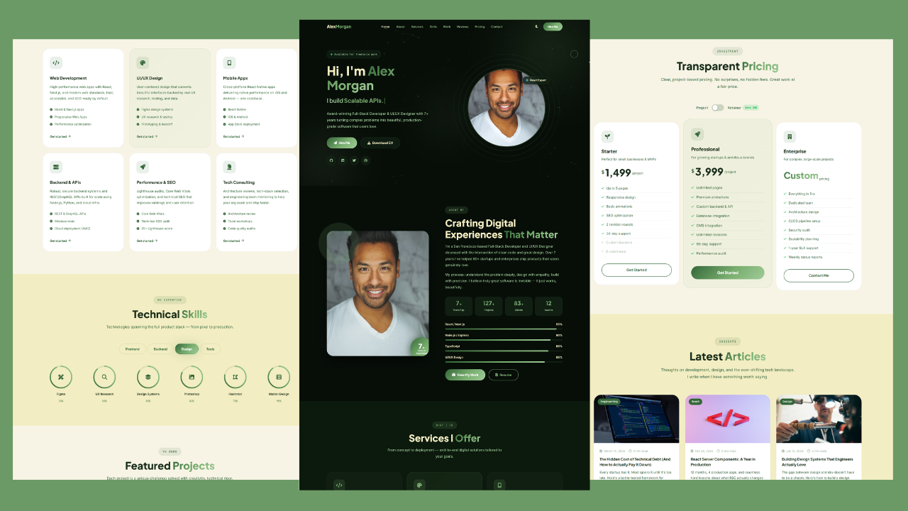
Build a Responsive Animated Portfolio Website with Dark & Light Mode | Free Source Code
Build a Responsive Animated Portfolio Website with Dark & Light Mode Free Download Code Files Preview The Demo Your portfolio
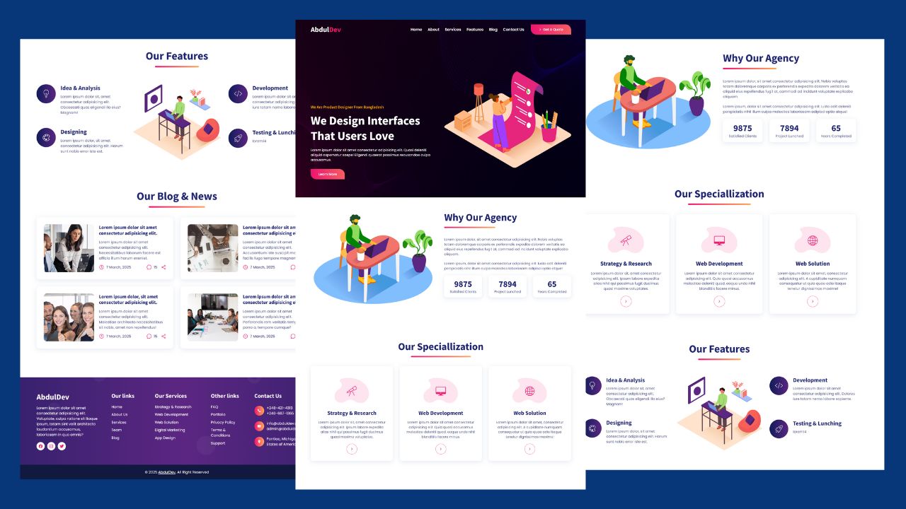
Responsive Animated Hero Section with Dark Light Theme | Free Source Code
Responsive Animated Hero Section with Dark Light Theme Let’s be real for a second. The first thing visitors notice on
How to Design Agency Website Using HTML, CSS, and JavaScript
Learn how to build a stunning, responsive design agency website using HTML, CSS, and JavaScript. This beginner-friendly guide covers planning,