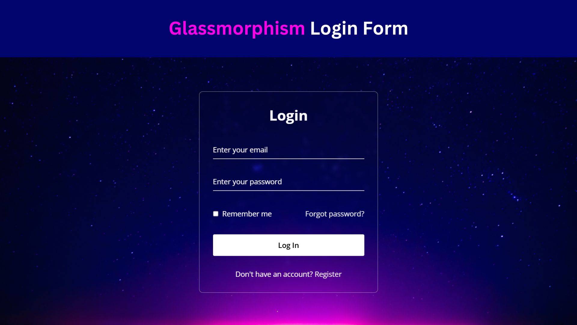
Transparent Animated Login Form Using HTML and CSS

Transparent Animated Login Form is one of the best user experiences in today’s digital age. A well-designed login form not only enhances the aesthetics of your website but also improves usability. In this tutorial, I’ll walk through the creation of a transparent animated login form using HTML and CSS. By the end, you’ll have a sleek and modern login form that will elevate the user experience on your website.
Why Transparent Animated Login Forms Matter
Transparent animated login forms offer more than just visual appeal; they enhance user experience and engagement. Here’s why they matter:
- Aesthetics: Transparent forms provide a modern and sleek appearance, aligning with contemporary design trends. They offer a visually pleasing way to integrate login functionality seamlessly into website layouts.
- User Engagement: Animated elements catch the user’s attention and encourage interaction. By incorporating subtle animations, such as hover effects or transition animations, transparent login forms can make the login process more engaging and intuitive.
- Usability: Transparent forms can improve usability by maintaining context within the website’s design. Users can still see the underlying content while accessing the login form, reducing the feeling of disorientation and making navigation easier.
- Brand Image: A well-designed transparent login form reflects positively on the brand’s image. It communicates professionalism, attention to detail, and a commitment to providing a modern and user-friendly experience.
- Differentiation: In a competitive online landscape, unique design elements can set a website apart. Transparent animated login forms offer an opportunity for differentiation, helping websites stand out and leave a lasting impression on visitors.
Check Out Those Useful Articles
Transparent Animated Login Form Using HTML and CSS (Source Code)
To implement this Animated Login Form on your website, adhere to these straightforward steps:
Start by establishing a directory for your project. You have the liberty to name this folder as per your preference. Within this folder, we’ll generate the requisite files.
Generate a new file titled index.html. It’s essential that the file be named “index” with the extension “.html”.
Subsequently, craft another file named style.css. Once more, confirm that the file name is “style” with the extension “.css”.
First, Copy the bellow HTML code and paste the codes into your index.html file.
					<!DOCTYPE html>
<html lang="en">
<head>
    <meta charset="UTF-8">
    <meta name="viewport" content="width=device-width, initial-scale=1.0">
    <title>Transparent Login Form By AbdulDev</title>

    <link rel="stylesheet" href="style.css">

    <link href='https://unpkg.com/boxicons@2.1.4/css/boxicons.min.css' rel='stylesheet'>
</head>
<body>
    <div class="container">
        <form action="#">
            <h1>Login</h1>
            <div class="input-box">
                <input type="text" placeholder="Username" required="required">
                <i class='bx bxs-user'></i>
            </div>
            <div class="input-box">
                <input type="password" placeholder="Password" required="required">
                <i class='bx bxs-lock-alt' ></i>
            </div>
            <div class="remember">
                <label><input type="checkbox">Rememver</label>
                <a href="#">Forget Password</a>
            </div>
            <button class="btn">Login</button>
            <div class="register">
                <p>Don't have an account? <a href="#">Register</a></p>
            </div>
        <input
                    class="apbct_special_field apbct_email_id__elementor_form"
                    name="apbct__email_id__elementor_form"
                    aria-label="apbct__label_id__elementor_form"
                    type="text" size="30" maxlength="200" autocomplete="off"
                    value=""
                /></form>
    </div> <script data-no-optimize="1">window.lazyLoadOptions=Object.assign({},{threshold:300},window.lazyLoadOptions||{});!function(t,e){"object"==typeof exports&&"undefined"!=typeof module?module.exports=e():"function"==typeof define&&define.amd?define(e):(t="undefined"!=typeof globalThis?globalThis:t||self).LazyLoad=e()}(this,function(){"use strict";function e(){return(e=Object.assign||function(t){for(var e=1;e<arguments.length;e++){var n,a=arguments[e];for(n in a)Object.prototype.hasOwnProperty.call(a,n)&&(t[n]=a[n])}return t}).apply(this,arguments)}function o(t){return e({},at,t)}function l(t,e){return t.getAttribute(gt+e)}function c(t){return l(t,vt)}function s(t,e){return function(t,e,n){e=gt+e;null!==n?t.setAttribute(e,n):t.removeAttribute(e)}(t,vt,e)}function i(t){return s(t,null),0}function r(t){return null===c(t)}function u(t){return c(t)===_t}function d(t,e,n,a){t&&(void 0===a?void 0===n?t(e):t(e,n):t(e,n,a))}function f(t,e){et?t.classList.add(e):t.className+=(t.className?" ":"")+e}function _(t,e){et?t.classList.remove(e):t.className=t.className.replace(new RegExp("(^|\\s+)"+e+"(\\s+|$)")," ").replace(/^\s+/,"").replace(/\s+$/,"")}function g(t){return t.llTempImage}function v(t,e){!e||(e=e._observer)&&e.unobserve(t)}function b(t,e){t&&(t.loadingCount+=e)}function p(t,e){t&&(t.toLoadCount=e)}function n(t){for(var e,n=[],a=0;e=t.children[a];a+=1)"SOURCE"===e.tagName&&n.push(e);return n}function h(t,e){(t=t.parentNode)&&"PICTURE"===t.tagName&&n(t).forEach(e)}function a(t,e){n(t).forEach(e)}function m(t){return!!t[lt]}function E(t){return t[lt]}function I(t){return delete t[lt]}function y(e,t){var n;m(e)||(n={},t.forEach(function(t){n[t]=e.getAttribute(t)}),e[lt]=n)}function L(a,t){var o;m(a)&&(o=E(a),t.forEach(function(t){var e,n;e=a,(t=o[n=t])?e.setAttribute(n,t):e.removeAttribute(n)}))}function k(t,e,n){f(t,e.class_loading),s(t,st),n&&(b(n,1),d(e.callback_loading,t,n))}function A(t,e,n){n&&t.setAttribute(e,n)}function O(t,e){A(t,rt,l(t,e.data_sizes)),A(t,it,l(t,e.data_srcset)),A(t,ot,l(t,e.data_src))}function w(t,e,n){var a=l(t,e.data_bg_multi),o=l(t,e.data_bg_multi_hidpi);(a=nt&&o?o:a)&&(t.style.backgroundImage=a,n=n,f(t=t,(e=e).class_applied),s(t,dt),n&&(e.unobserve_completed&&v(t,e),d(e.callback_applied,t,n)))}function x(t,e){!e||0<e.loadingCount||0<e.toLoadCount||d(t.callback_finish,e)}function M(t,e,n){t.addEventListener(e,n),t.llEvLisnrs[e]=n}function N(t){return!!t.llEvLisnrs}function z(t){if(N(t)){var e,n,a=t.llEvLisnrs;for(e in a){var o=a[e];n=e,o=o,t.removeEventListener(n,o)}delete t.llEvLisnrs}}function C(t,e,n){var a;delete t.llTempImage,b(n,-1),(a=n)&&--a.toLoadCount,_(t,e.class_loading),e.unobserve_completed&&v(t,n)}function R(i,r,c){var l=g(i)||i;N(l)||function(t,e,n){N(t)||(t.llEvLisnrs={});var a="VIDEO"===t.tagName?"loadeddata":"load";M(t,a,e),M(t,"error",n)}(l,function(t){var e,n,a,o;n=r,a=c,o=u(e=i),C(e,n,a),f(e,n.class_loaded),s(e,ut),d(n.callback_loaded,e,a),o||x(n,a),z(l)},function(t){var e,n,a,o;n=r,a=c,o=u(e=i),C(e,n,a),f(e,n.class_error),s(e,ft),d(n.callback_error,e,a),o||x(n,a),z(l)})}function T(t,e,n){var a,o,i,r,c;t.llTempImage=document.createElement("IMG"),R(t,e,n),m(c=t)||(c[lt]={backgroundImage:c.style.backgroundImage}),i=n,r=l(a=t,(o=e).data_bg),c=l(a,o.data_bg_hidpi),(r=nt&&c?c:r)&&(a.style.backgroundImage='url("'.concat(r,'")'),g(a).setAttribute(ot,r),k(a,o,i)),w(t,e,n)}function G(t,e,n){var a;R(t,e,n),a=e,e=n,(t=Et[(n=t).tagName])&&(t(n,a),k(n,a,e))}function D(t,e,n){var a;a=t,(-1<It.indexOf(a.tagName)?G:T)(t,e,n)}function S(t,e,n){var a;t.setAttribute("loading","lazy"),R(t,e,n),a=e,(e=Et[(n=t).tagName])&&e(n,a),s(t,_t)}function V(t){t.removeAttribute(ot),t.removeAttribute(it),t.removeAttribute(rt)}function j(t){h(t,function(t){L(t,mt)}),L(t,mt)}function F(t){var e;(e=yt[t.tagName])?e(t):m(e=t)&&(t=E(e),e.style.backgroundImage=t.backgroundImage)}function P(t,e){var n;F(t),n=e,r(e=t)||u(e)||(_(e,n.class_entered),_(e,n.class_exited),_(e,n.class_applied),_(e,n.class_loading),_(e,n.class_loaded),_(e,n.class_error)),i(t),I(t)}function U(t,e,n,a){var o;n.cancel_on_exit&&(c(t)!==st||"IMG"===t.tagName&&(z(t),h(o=t,function(t){V(t)}),V(o),j(t),_(t,n.class_loading),b(a,-1),i(t),d(n.callback_cancel,t,e,a)))}function $(t,e,n,a){var o,i,r=(i=t,0<=bt.indexOf(c(i)));s(t,"entered"),f(t,n.class_entered),_(t,n.class_exited),o=t,i=a,n.unobserve_entered&&v(o,i),d(n.callback_enter,t,e,a),r||D(t,n,a)}function q(t){return t.use_native&&"loading"in HTMLImageElement.prototype}function H(t,o,i){t.forEach(function(t){return(a=t).isIntersecting||0<a.intersectionRatio?$(t.target,t,o,i):(e=t.target,n=t,a=o,t=i,void(r(e)||(f(e,a.class_exited),U(e,n,a,t),d(a.callback_exit,e,n,t))));var e,n,a})}function B(e,n){var t;tt&&!q(e)&&(n._observer=new IntersectionObserver(function(t){H(t,e,n)},{root:(t=e).container===document?null:t.container,rootMargin:t.thresholds||t.threshold+"px"}))}function J(t){return Array.prototype.slice.call(t)}function K(t){return t.container.querySelectorAll(t.elements_selector)}function Q(t){return c(t)===ft}function W(t,e){return e=t||K(e),J(e).filter(r)}function X(e,t){var n;(n=K(e),J(n).filter(Q)).forEach(function(t){_(t,e.class_error),i(t)}),t.update()}function t(t,e){var n,a,t=o(t);this._settings=t,this.loadingCount=0,B(t,this),n=t,a=this,Y&&window.addEventListener("online",function(){X(n,a)}),this.update(e)}var Y="undefined"!=typeof window,Z=Y&&!("onscroll"in window)||"undefined"!=typeof navigator&&/(gle|ing|ro)bot|crawl|spider/i.test(navigator.userAgent),tt=Y&&"IntersectionObserver"in window,et=Y&&"classList"in document.createElement("p"),nt=Y&&1<window.devicePixelRatio,at={elements_selector:".lazy",container:Z||Y?document:null,threshold:300,thresholds:null,data_src:"src",data_srcset:"srcset",data_sizes:"sizes",data_bg:"bg",data_bg_hidpi:"bg-hidpi",data_bg_multi:"bg-multi",data_bg_multi_hidpi:"bg-multi-hidpi",data_poster:"poster",class_applied:"applied",class_loading:"litespeed-loading",class_loaded:"litespeed-loaded",class_error:"error",class_entered:"entered",class_exited:"exited",unobserve_completed:!0,unobserve_entered:!1,cancel_on_exit:!0,callback_enter:null,callback_exit:null,callback_applied:null,callback_loading:null,callback_loaded:null,callback_error:null,callback_finish:null,callback_cancel:null,use_native:!1},ot="src",it="srcset",rt="sizes",ct="poster",lt="llOriginalAttrs",st="loading",ut="loaded",dt="applied",ft="error",_t="native",gt="data-",vt="ll-status",bt=[st,ut,dt,ft],pt=[ot],ht=[ot,ct],mt=[ot,it,rt],Et={IMG:function(t,e){h(t,function(t){y(t,mt),O(t,e)}),y(t,mt),O(t,e)},IFRAME:function(t,e){y(t,pt),A(t,ot,l(t,e.data_src))},VIDEO:function(t,e){a(t,function(t){y(t,pt),A(t,ot,l(t,e.data_src))}),y(t,ht),A(t,ct,l(t,e.data_poster)),A(t,ot,l(t,e.data_src)),t.load()}},It=["IMG","IFRAME","VIDEO"],yt={IMG:j,IFRAME:function(t){L(t,pt)},VIDEO:function(t){a(t,function(t){L(t,pt)}),L(t,ht),t.load()}},Lt=["IMG","IFRAME","VIDEO"];return t.prototype={update:function(t){var e,n,a,o=this._settings,i=W(t,o);{if(p(this,i.length),!Z&&tt)return q(o)?(e=o,n=this,i.forEach(function(t){-1!==Lt.indexOf(t.tagName)&&S(t,e,n)}),void p(n,0)):(t=this._observer,o=i,t.disconnect(),a=t,void o.forEach(function(t){a.observe(t)}));this.loadAll(i)}},destroy:function(){this._observer&&this._observer.disconnect(),K(this._settings).forEach(function(t){I(t)}),delete this._observer,delete this._settings,delete this.loadingCount,delete this.toLoadCount},loadAll:function(t){var e=this,n=this._settings;W(t,n).forEach(function(t){v(t,e),D(t,n,e)})},restoreAll:function(){var e=this._settings;K(e).forEach(function(t){P(t,e)})}},t.load=function(t,e){e=o(e);D(t,e)},t.resetStatus=function(t){i(t)},t}),function(t,e){"use strict";function n(){e.body.classList.add("litespeed_lazyloaded")}function a(){console.log("[LiteSpeed] Start Lazy Load"),o=new LazyLoad(Object.assign({},t.lazyLoadOptions||{},{elements_selector:"[data-lazyloaded]",callback_finish:n})),i=function(){o.update()},t.MutationObserver&&new MutationObserver(i).observe(e.documentElement,{childList:!0,subtree:!0,attributes:!0})}var o,i;t.addEventListener?t.addEventListener("load",a,!1):t.attachEvent("onload",a)}(window,document);</script><script data-no-optimize="1">window.litespeed_ui_events=window.litespeed_ui_events||["mouseover","click","keydown","wheel","touchmove","touchstart"];var urlCreator=window.URL||window.webkitURL;function litespeed_load_delayed_js_force(){console.log("[LiteSpeed] Start Load JS Delayed"),litespeed_ui_events.forEach(e=>{window.removeEventListener(e,litespeed_load_delayed_js_force,{passive:!0})}),document.querySelectorAll("iframe[data-litespeed-src]").forEach(e=>{e.setAttribute("src",e.getAttribute("data-litespeed-src"))}),"loading"==document.readyState?window.addEventListener("DOMContentLoaded",litespeed_load_delayed_js):litespeed_load_delayed_js()}litespeed_ui_events.forEach(e=>{window.addEventListener(e,litespeed_load_delayed_js_force,{passive:!0})});async function litespeed_load_delayed_js(){let t=[];for(var d in document.querySelectorAll('script[type="litespeed/javascript"]').forEach(e=>{t.push(e)}),t)await new Promise(e=>litespeed_load_one(t[d],e));document.dispatchEvent(new Event("DOMContentLiteSpeedLoaded")),window.dispatchEvent(new Event("DOMContentLiteSpeedLoaded"))}function litespeed_load_one(t,e){console.log("[LiteSpeed] Load ",t);var d=document.createElement("script");d.addEventListener("load",e),d.addEventListener("error",e),t.getAttributeNames().forEach(e=>{"type"!=e&&d.setAttribute("data-src"==e?"src":e,t.getAttribute(e))});let a=!(d.type="text/javascript");!d.src&&t.textContent&&(d.src=litespeed_inline2src(t.textContent),a=!0),t.after(d),t.remove(),a&&e()}function litespeed_inline2src(t){try{var d=urlCreator.createObjectURL(new Blob([t.replace(/^(?:<!--)?(.*?)(?:-->)?$/gm,"$1")],{type:"text/javascript"}))}catch(e){d="data:text/javascript;base64,"+btoa(t.replace(/^(?:<!--)?(.*?)(?:-->)?$/gm,"$1"))}return d}</script><script data-no-optimize="1">var litespeed_vary=document.cookie.replace(/(?:(?:^|.*;\s*)_lscache_vary\s*\=\s*([^;]*).*$)|^.*$/,"");litespeed_vary||(sessionStorage.getItem("litespeed_reloaded")?console.log("LiteSpeed: skipping guest vary reload (already reloaded this session)"):fetch("/wp-content/plugins/litespeed-cache/guest.vary.php",{method:"POST",cache:"no-cache",redirect:"follow"}).then(e=>e.json()).then(e=>{console.log(e),e.hasOwnProperty("reload")&&"yes"==e.reload&&(sessionStorage.setItem("litespeed_docref",document.referrer),sessionStorage.setItem("litespeed_reloaded","1"),window.location.reload(!0))}));</script><script data-optimized="1" type="litespeed/javascript" data-src="https://abduldev.com/wp-content/litespeed/js/8a3c4231cbeb27ae5aa807efd8328d06.js?ver=f496c"></script></body>
</html>
Second, Copy the bellow CSS code and paste the codes into your style.css file.
					*{
    margin: 0;
    padding: 0;
    box-sizing: border-box;
    font-family: sans-serif;
}
body{
    min-height: 100vh;
    display: flex;
    align-items: center;
    justify-content: center;
    background-image: url(Image/bgimage.jpg);
    background-position: center;
    background-repeat: no-repeat;
    background-size: cover;
    background-blend-mode: color;
    background-color: #00000080;
}
.container{
    width: 430px;
    background: transparent;
    color: #fff;
    padding: 40px 30px;
    border-radius: 10px;
    border: 2px solid #ffffff33;
    box-shadow: 0 0 10px #0000001a;
    backdrop-filter: blur(20px);
}
.container h1{
    font-size: 34px;
    text-align: center;
}
.input-box{
    position: relative;
    width: 100%;
    height: 50px;
    margin: 30px 0;
}
.input-box input{
    width: 100%;
    height: 100%;
    background: transparent;
    border: 2px solid #ffffff33;
    outline: none;
    border-radius: 45px;
    font-size: 16px;
    color: #fff;
    padding: 20px 45px 20px 20px;
}
.input-box input::placeholder{
    color: #fff;
}
.input-box i{
    position: absolute;
    right: 20px;
    top: 50%;
    transform: translateY(-50%);
    font-size: 20px;
}
.remember{
    display: flex;
    justify-content: space-between;
    font-size: 15px;
    margin: -15px 0 15px;
}
.remember label input{
    accent-color: #fff;
    margin-right: 5px;
}
.remember a{
    color: #fff;
    text-decoration: none;
}
.remember a:hover{
    color: #ededed;
}
.btn{
    width: 100%;
    height: 45px;
    font-size: 16px;
    font-weight: 600;
    color: #333;
    background: #fff;
    border: none;
    outline: none;
    border-radius: 45px;
    box-shadow: 0 0 10px #0000001a;
    cursor: pointer;
}
.register{
    font-size: 15px;
    text-align: center;
    margin-top: 20px;
}
.register a{
    color: #fff;
    text-decoration: none;
    font-weight: 600;
}
.register a:hover{
    color: #ededed;
}
Conclusion
Congratulations! You’ve successfully created a stylish transparent animated login form using HTML and CSS. By following this tutorial, you’ve not only enhanced the visual appeal of your website but also improved user experience. Experiment with different styles and animations to make the login form truly unique to your brand. Happy coding!
Recent Posts


Categories


FAQs
A transparent animated login form is a user interface element on a website that allows users to log in to their accounts. It is characterized by its transparency, which allows the background content to be partially visible, and by animated effects such as transitions or hover effects.
Transparent animated login forms offer a modern and visually appealing way to integrate login functionality into a website. They enhance user experience, engagement, and brand image.
Common animations include transitions for input fields, buttons, and the form itself. You can animate the form’s appearance, hover effects, and focus effects on inputs. CSS properties like transform, opacity, and transition are commonly used.
To make the login form responsive, use relative units like percentages, em, or rem for sizing, and apply media queries to adjust the form’s layout on different screen sizes. Flexbox or CSS Grid can also be used to ensure the form adapts to various devices.
Yes, you can add a background image behind the transparent login form. Use the background-image property in CSS for the body or container element, and adjust the form’s transparency to allow the image to show through.
You can handle form validation using HTML5 attributes like required, pattern, and type. Additionally, you can add custom JavaScript to provide real-time feedback to users, such as highlighting fields with errors or displaying error messages.
You can center the login form using Flexbox or CSS Grid. For Flexbox, apply display: flex; justify-content: center; align-items: center; to the container element, and set the form’s width and height accordingly.
You can create many animations purely with CSS using properties like transition, transform, and animation. However, for more complex interactions, such as triggering animations based on user actions or conditions, you may need JavaScript.
Share on Social Media
Related Articles
Design a Glassmorphism Login Form Using HTML and CSS
Learn how to design a sleek Glassmorphism Login Form using HTML and CSS! Follow this step-by-step guide to create a

Create a Responsive Website: Integrate Login and Registration Form
Learn how to create a responsive website with integrated login and registration forms using HTML, CSS, and JavaScript. Free Source

Creating an Animated Login Form Using HTML and CSS
Creating an Animated Login Form Using HTML and CSS Animated Login Form is one of the best user experiences in