Build a Responsive Card Slider with HTML, CSS & JavaScript

If you’re looking for a way to showcase your content dynamically and interactively on your website, look no further than a responsive card slider! A card slider is a popular design element that allows you to display multiple cards with different content, such as images, text, and links, in a single, scrollable container. Using HTML, CSS, and JavaScript, you can easily create a sleek and modern card slider that adapts to different screen sizes and devices.
This blog post will guide you through the step-by-step process of building a responsive card slider from scratch. Whether you want to showcase your latest products, portfolio, or blog posts, this tutorial will help you create an eye-catching and user-friendly card slider to impress your website visitors. So, let’s dive in and learn how to make a stylish and functional card slider using HTML, CSS, and JavaScript.
Understanding the Basics of Card Sliders
A card slider is a web component that displays content cards in a row or carousel layout that users can navigate through by clicking arrows, swipe gestures, or auto-scrolling.
These cards can contain various elements such as images, text, buttons, or links, making them incredibly versatile for presenting information in an organized and visually appealing manner. The concept of a card slider revolves around the efficient use of space on web pages, enabling the display of more content without overwhelming the user or requiring excessive scrolling.
By design, card sliders are meant to be interactive and engaging, encouraging users to explore the content presented. This makes them particularly useful for portfolios, product showcases, testimonials, and more. To create an effective card slider, it’s crucial to understand the core principles that contribute to its functionality and appeal. This involves balancing design, usability, and responsiveness to ensure the slider looks good and performs well across different devices and screen sizes.
By leveraging HTML for structure, CSS for styling, and JavaScript for interactivity, developers can craft a seamless and responsive card slider that elevates the user experience on any website.
Check Out Those Useful Articles
Exploring Essential Concepts and Design Principles
Gripping the essential concepts and design principles is paramount when creating a responsive card slider. The aesthetics of your card slider play a crucial role, as it’s not just about sliding elements but how these elements interact visually and functionally with the user.
A fundamental design principle to consider is simplicity. A cluttered slider can overwhelm users, detracting from the overall user experience. Instead, aim for a clean, minimalist design that highlights the content of each card without unnecessary distractions. Another critical concept is consistency.
Each card within the slider should maintain a uniform style regarding fonts, color schemes, and layout. This consistency fosters a cohesive user experience and strengthens your website’s brand identity.
Additionally, the principle of responsiveness must be balanced. Your card slider must adapt seamlessly across devices, maintaining its functionality and aesthetic appeal, whether viewed on a desktop, tablet, or smartphone. This involves thoughtful design considerations, such as scalable images, flexible grid layouts, and adjustable text sizes, to ensure the slider looks and works perfectly on any screen.
Lastly, navigation within the card slider should be intuitive. Whether through swipe gestures, arrow clicks, or dots, users should easily understand how to navigate the content. Incorporating these design principles and concepts will create a card slider that is visually appealing and provides a smooth and engaging user experience.
Steps to Create a Responsive Card Slider
To create a Responsive Card Slider with HTML, CSS and JavaScript follow these steps:
- Create a Folder: Name this folder according to your preference. Inside this folder, you’ll need to set up the following files:
- Create an index.html File: This file should be named index with the .html extension.
- Create a style.css File: This file should be named style with the .css extension.
- Create a main.js File: This file should be name main with the .js extension.
These files will form the basis of your Responsive Card Slider.
Setting Up the HTML Structure for the Card Slider
The first step in creating our responsive card slider is laying down the HTML structure, which serves as the skeleton of our component. Start by creating a container div that will hold the entire slider.
This container is crucial for defining the boundary and scope of our slider on the web page. Inside this container, we’ll add individual cards as separate div elements. Each card can contain an image, a title, and a button wrapped in their respective HTML tags.
For instance, this card’s description or content elaborates on the title or image. Ensure that your image URLs correctly point to your assets and that the text accurately reflects the content or message you wish to convey through each card.
This foundational structure is essential for the subsequent styling and functionality we will add with CSS and JavaScript, enabling a smooth, visually appealing card slider experience on your website.
Copy the below HTML code and paste it into the index.html file.
					<!DOCTYPE html>
<html lang="en">
<head>
  <meta charset="UTF-8">
  <meta name="viewport" content="width=device-width, initial-scale=1.0">
  <title>Card Slider HTML and CSS by AbdulDev</title>
  <!-- CSS Link -->
  <link rel="stylesheet" href="style.css">
  <!-- Linking SwiperJS CSS -->
  <link rel="stylesheet" href="https://cdn.jsdelivr.net/npm/swiper@11/swiper-bundle.min.css">
</head>
<body>
  <div class="container swiper">
    <div class="slider-wrapper">
      <div class="card-list swiper-wrapper">
        <div class="card-item swiper-slide">
          <img decoding="async" src="images/James Rodry.png" alt="User Image" class="user-image">
          <h2 class="user-name">James Rodry</h2>
          <p class="user-profession">Web Developer</p>
          <button class="message-button">Message</button>
        </div>

        <div class="card-item swiper-slide">
          <img decoding="async" src="images/Hayley Phillips.png" alt="User Image" class="user-image">
          <h2 class="user-name">Hayley Phillips</h2>
          <p class="user-profession">Graphic Designer</p>
          <button class="message-button">Message</button>
        </div>

        <div class="card-item swiper-slide">
          <img decoding="async" src="images/Jaw-Long.png" alt="User Image" class="user-image">
          <h2 class="user-name">Jaw-Long</h2>
          <p class="user-profession">Hiring Manager</p>
          <button class="message-button">Message</button>
        </div>

        <div class="card-item swiper-slide">
          <img decoding="async" src="images/Michael Rasmussen.png" alt="User Image" class="user-image">
          <h2 class="user-name">Michael Rasmussen</h2>
          <p class="user-profession">Software Developer</p>
          <button class="message-button">Message</button>
        </div>

        <div class="card-item swiper-slide">
          <img decoding="async" src="images/Shannon Howarth.png" alt="User Image" class="user-image">
          <h2 class="user-name">Shannon Howarth</h2>
          <p class="user-profession">SEO Scientist</p>
          <button class="message-button">Message</button>
        </div>

        <div class="card-item swiper-slide">
          <img decoding="async" src="images/Warren Bailey.png" alt="User Image" class="user-image">
          <h2 class="user-name">Warren Bailey</h2>
          <p class="user-profession">Digital Marketer</p>
          <button class="message-button">Message</button>
        </div>
      </div>

      <div class="swiper-pagination"></div>
      <div class="swiper-slide-button swiper-button-prev"></div>
      <div class="swiper-slide-button swiper-button-next"></div>
    </div>
  </div>

  <!-- SwiperJS Script Link -->
  <script src="https://cdn.jsdelivr.net/npm/swiper@11/swiper-bundle.min.js"></script>

  <!-- Custom JS Script Link -->
  <script src="main.js"></script>
</body>
</html>
Designing the Card Slider Using CSS
With our HTML structure in place, it’s time to bring our card slider to life with CSS. The visual appeal of your slider heavily relies on the styling, which includes color schemes, typography, and transitions.
Start by applying a general style to the card container to define its width, height, and display properties. A critical aspect is ensuring the container enables horizontal scrolling to accommodate the cards. You might consider using `display: flex;` to achieve this.
For each card, assign a fixed width and height to maintain consistency. Utilize `margin` to create space between the cards, ensuring they don’t appear cluttered. This is also the perfect stage to style your cards with backgrounds, border radii, and box shadows to create depth and visually engaging elements. Text styling within your cards is equally essential.
Choose fonts and sizes that enhance readability and align with your website’s design ethos. Incorporating `transition` properties can add smooth interaction cues, such as when a card is hovered over.
Remember, the goal is to craft a functional card slider that embodies your website’s aesthetics and branding. Thoughtful application of CSS properties will result in a slider that is visually cohesive and engaging for users.
Copy the below CSS code and paste it into the style.css file.
					@import url('https://fonts.googleapis.com/css2?family=Roboto:wght@400;500;700&display=swap');

* {
  margin: 0;
  padding: 0;
  box-sizing: border-box;
  font-family: "Roboto", sans-serif;
}

body {
  display: flex;
  align-items: center;
  justify-content: center;
  min-height: 100vh;
  background: url("images/BGimg4.png") #01062d no-repeat center;
}

.slider-wrapper {
  overflow: hidden;
  max-width: 1200px;
  margin: 0 70px 55px;
}

.card-list .card-item {
  height: auto;
  user-select: none;
  padding: 35px;
  display: flex;
  flex-direction: column;
  align-items: center;
  justify-content: center;
  border-radius: 10px;
  backdrop-filter: blur(30px);
  background: #ffffff33;
  border: 1px solid #ffffff80;
}

.card-list .card-item .user-image {
  width: 150px;
  height: 150px;
  border-radius: 50%;
  margin-bottom: 40px;
  border: 4px solid #fe0457;
  padding: 4px;
}
.card-list .card-item .user-name{
  font-size: 26px;
  color: #ffffff;
  font-weight: 500;
}

.card-list .card-item .user-profession {
  font-size: 16px;
  color: #e3e3e3;
  font-weight: 500;
  margin: 14px 0 40px;
}

.card-list .card-item .message-button {
  font-size: 16px;
  padding: 10px 35px;
  color: #fff;
  border-radius: 6px;
  font-weight: 500;
  cursor: pointer;
  background: #fe0457;
  border: 2px solid transparent;
  transition: 0.5s;
}

.card-list .card-item .message-button:hover {
  background: #ffffff1a;
  border: 2px solid #fff;
  color: #fff;
}

.slider-wrapper .swiper-pagination-bullet {
  background: #fff;
  height: 13px;
  width: 13px;
  opacity: 0.5;
}

.slider-wrapper .swiper-pagination-bullet-active {
  opacity: 1;
}

.slider-wrapper .swiper-slide-button {
  color: #fff;
  margin-top: -55px;
  transition: 0.5s;
}

.slider-wrapper .swiper-slide-button:hover {
  color: #fe0457;
}

@media (max-width: 768px) {
  .slider-wrapper {
    margin: 0 20px 40px;
    padding: 0 30px;
  }
}
Implementing Responsiveness with CSS Media Queries
CSS media queries are pivotal in ensuring your card slider is adaptable across various devices. Media queries allow us to apply CSS styles depending on the device’s characteristics, such as width, height, or orientation.
This adaptability is crucial for maintaining the card slider’s aesthetic integrity and functionality, regardless of the viewing context. Begin by defining breakpoints for different screen sizes – commonly, these are set for mobile devices (up to 480px), tablets (up to 768px), and desktops (above 768px). Adjust the slider’s container and card dimensions within each breakpoint to fit the screen, ensuring content remains legible and interactable.
For example, on smaller screens, you might want to decrease the margin between cards or adjust the text size to keep everything readable without zooming in. Additionally, consider altering the number of cards displayed side by side or switching to a vertical layout on narrow screens to optimize space usage and user navigation.
Utilizing media queries enhances the card slider’s responsiveness and significantly improves the user’s browsing experience by providing a seamless transition between devices.
Adding JavaScript for Slider Functionality
With the structure and styling in place, it’s time to infuse life into our card slider with JavaScript, enhancing its interactivity and functionality.
Copy the below JS code and paste it into the main.js file.
					const swiper = new Swiper('.slider-wrapper', {
  loop: true,
  grabCursor: true,
  spaceBetween: 30,

  // Pagination
  pagination: {
    el: '.swiper-pagination',
    clickable: true,
    dynamicBullets: true
  },

  // Navigation
  navigation: {
    nextEl: '.swiper-button-next',
    prevEl: '.swiper-button-prev',
  },

  // Responsive
  breakpoints: {
    0: {
      slidesPerView: 1
    },
    768: {
      slidesPerView: 2
    },
    1024: {
      slidesPerView: 3
    }
  }
});
Testing and Debugging the Card Slider
Testing and debugging the card slider are critical to ensure smooth operation across various devices and browsers. This phase involves meticulously checking the functionality, responsiveness, and overall user experience to identify any issues hindering performance.
Test the slider on different browsers (Chrome, Firefox, Safari, etc.) to confirm consistent behavior and appearance. Utilize browser developer tools to simulate various screen sizes and resolutions, paying particular attention to breakpoints defined in your CSS media queries. During testing, look for common problems such as images not loading or displaying incorrectly, text overlapping, or navigation controls not responding as expected.
JavaScript console logs can be invaluable for pinpointing errors or issues in your script that affect the slider’s interactivity or performance. Additionally, consider using automated testing tools or browser extensions designed for responsive web design testing to streamline the process. Engage in user testing with individuals from your target audience to gain insights into the card slider’s usability and overall experience.
Their feedback can highlight areas for improvement that you might have yet to identify on your own. Throughout this process, systematically document any bugs or issues discovered and prioritize them for fixing. Debugging effectively requires patience and attention to detail but is essential for creating a flawless and professional card slider.
Optimizing Performance and Accessibility
Optimizing the performance and accessibility of your card slider ensures that it delivers a seamless experience for all users, regardless of their device or internet speed, and is accessible to individuals with disabilities.
Performance optimization begins with minimizing file sizes for images and scripts to reduce load times and implementing efficient coding practices to avoid sluggish performance. Modern image formats like WebP for high-quality visuals with smaller file sizes can significantly boost loading speeds.
Accessibility, however, involves adhering to Web Content Accessibility Guidelines (WCAG) to ensure your card slider is navigable and usable for everyone. This includes providing alternative text for images, ensuring interactive elements are keyboard navigable, and using ARIA (Accessible Rich Internet Applications) roles and properties to enhance the semantic information of UI components.
Additionally, ensuring your card slider’s color contrast meets the recommended ratios makes the content legible for users with visual impairments. Focusing on these critical areas will make your card slider fast, responsive, and inclusive, catering to a broader audience and enhancing the overall user experience.
Conclusion
Creating a responsive card slider using HTML, CSS, and JavaScript is a rewarding journey that enhances your website’s interactivity and engagement.
Throughout this tutorial, we’ve covered everything from the foundational structure and design principles to implementing advanced functionalities and optimizing for performance and accessibility. By adhering to these guidelines, you’ve now equipped yourself to craft a visually appealing and user-friendly card slider that showcases your content in an organized manner and adapts smoothly across various devices and screen sizes.
The journey continues. The digital landscape constantly evolves, and there’s always room for innovation and improvement. Experiment with different design elements, explore new JavaScript features and continue to refine your card slider based on user feedback and emerging web technologies.
Remember, the goal is to create a seamless experience that captivates and engages your audience, encouraging them to explore more of your site. With practice and creativity, your card slider can become an integral and dynamic feature of your website, reflecting the quality and care you put into your online presence.
Recent Posts


Categories

FAQs
What is a responsive card slider?
A responsive card slider is a user interface component that displays content in a sliding carousel format. Its layout adjusts to fit different screen sizes, ensuring a smooth user experience on desktop and mobile devices.
Why should I use HTML, CSS, and JavaScript to build a card slider?
HTML, CSS, and JavaScript completely control the card slider’s design, responsiveness, and interactivity, allowing you to create a customized solution without relying on external libraries or plugins.
How do I make a card slider responsive?
To make a card slider responsive, use CSS media queries to adjust the number of visible cards based on the screen size. Flexbox or CSS Grid can create a fluid and adaptive layout.
Can I add animations to my card slider?
You can add animations using CSS transitions or keyframes for smoother sliding effects or JavaScript for more complex animations, such as autoplay or dynamic transitions between cards.
How do I implement autoplay in a card slider?
Autoplay can be implemented using JavaScript by setting an interval automatically triggering the slide transition after a specified period.
What are the best practices for designing a card slider?
Best practices include ensuring the slider is responsive, optimizing images for faster loading, using precise navigation controls, and testing the slider across different devices and browsers.
Can I use JavaScript libraries to create a card slider?
Yes, libraries like Swiper.js or Slick provide pre-built, highly customizable sliders that can be easily integrated into your project, saving development time.
What are some common issues when building a card slider?
Common issues include improper responsiveness on different screen sizes—Perf, performance due to heavy images or unoptimized code, and consistent behavior across browsers.
How do I ensure that my card slider is SEO-friendly?
To make your card slider SEO-friendly, use semantic HTML for content, ensure that important information is not hidden behind the slider, and implement lazy loading for images to improve page load times.
Share on Social Media
Related Articles

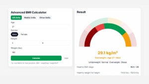
Advanced BMI Calculator: Accurate Body Mass Index & Health Insights
Discover how an Advanced BMI Calculator provides accurate, personalized health insights by considering age, gender, body fat, and more.

CSS Animation Generator – Create Stunning Animations Without Coding Skills
Discover how a CSS animation generator helps you design smooth, professional animations without coding. Learn features, benefits, tips, and integration
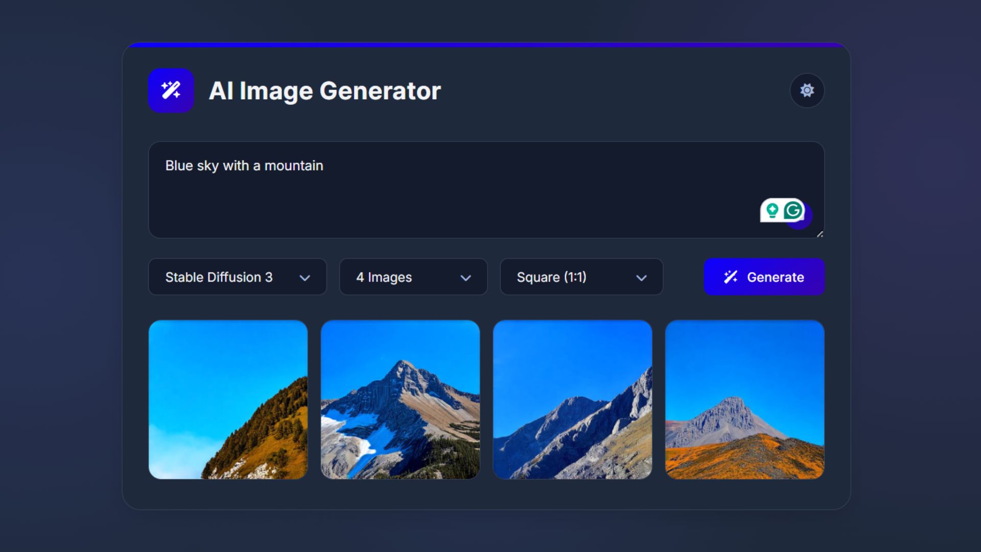
How to Build an AI Image Generator Using HTML, CSS, and JavaScript
Build a responsive AI Image Generator using HTML, CSS, and JavaScript. Learn how to integrate Hugging Face API to create