How to Design a Responsive HTML & CSS Animated Timeline?
Creating a timeline is a great way to showcase the progression of events or highlight essential milestones visually appealingly. Using HTML and CSS, you can take your timeline design to the next level by adding animations and making it responsive for different screen sizes.
This blog post will walk you through the steps to design a responsive HTML & CSS animated timeline. By the end of this tutorial, you will have a fully functional and eye-catching timeline that can be easily integrated into your website or project. So, let’s dive in and learn how to create a dynamic and engaging CSS animated timeline that impresses your audience.
Understanding the HTML & CSS Animated Timeline Concept and Design Principles
The concept of a CSS animated timeline revolves around presenting chronological events in an interactive and visually stimulating manner.
Unlike a static timeline, an animated version uses CSS (Cascading Style Sheets) to introduce motion and transitions, bringing the timeline to life when users interact with it. This not only enhances the user experience but also aids in conveying the passage of time more dynamically.
HTML (HyperText Markup Language) structures the timeline’s content, laying out events sequentially, while CSS manages the presentation, layout, and animations. Design principles for a responsive HTML & CSS animated timeline emphasize simplicity, readability, and responsiveness. Simplicity ensures that the timetable remains user-friendly and not overwhelming despite the added animations.
Readability is crucial as the primary goal of a timeline is to convey information; hence, the text and visuals must be clear and easy to digest. Responsiveness ensures that the timeline looks and functions seamlessly across various devices, adapting its layout and features to fit different screen sizes.
Adhering to these principles allows developers and designers to create engaging, informative, and enjoyable timelines, making the CSS animated timeline a powerful tool for storytelling on the web.
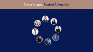
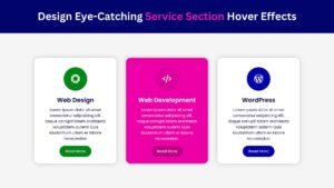
Check Out Those Useful Articles
Why Use a Responsive HTML & CSS Animated Timeline?
In today’s digital landscape, engaging your audience is critical, and a responsive HTML & CSS animated timeline does just that.
By employing a CSS animated timeline, you tap into a dynamic method of storytelling that captures the viewer’s attention through motion and interactivity. The responsiveness ensures that your content is accessible and visually appealing across all devices, from desktops to smartphones, eliminating common issues such as layout breakage or unreadable text. This universal compatibility enhances the user experience significantly, making your information not just seen but experienced.
Furthermore, a CSS animated timeline offers a unique way to present historical data, project milestones, or even future events in an educational and entertaining manner. It encourages users to interact with the content, increasing engagement and information retention.
This approach contrasts static timelines, which may only briefly hold the user’s attention. Using CSS for animation also provides a lightweight solution compared to other technologies, ensuring faster load times and smoother animations even on lower-bandwidth connections.
Integrating a responsive HTML & CSS animated timeline into your project or website means presenting information in an innovative, accessible, and memorable way.
Steps to Create a Responsive HTML and CSS Animated Timeline
To create a Responsive HTML and CSS Animated Timeline, follow these steps:
- Create a Folder: Name this folder according to your preference. Inside this folder, you’ll need to set up the following files:
- Create an index.html File: This file should be named index with the .html extension.
- Create a style.css File: This file should be named style with the .css extension.
These files will form the basis of your Responsive HTML and CSS Animated Timeline Design.
Setting Up the Basic HTML Structure for the Timeline
Before diving into the styling and animations, you’ll need to set up the basic HTML structure for your timeline. Here’s a simple structure to start with:
Copy the below HTML code and paste it into the index.html file.
<!DOCTYPE html>
<html lang="en">
<head>
<meta charset="UTF-8">
<meta name="viewport" content="width=device-width, initial-scale=1.0">
<title>Responsive HTML and CSS Animated Timeline Design by AbdulDev</title>
<!-- CSS Link -->
<link rel="stylesheet" href="style.css">
</head>
<body>
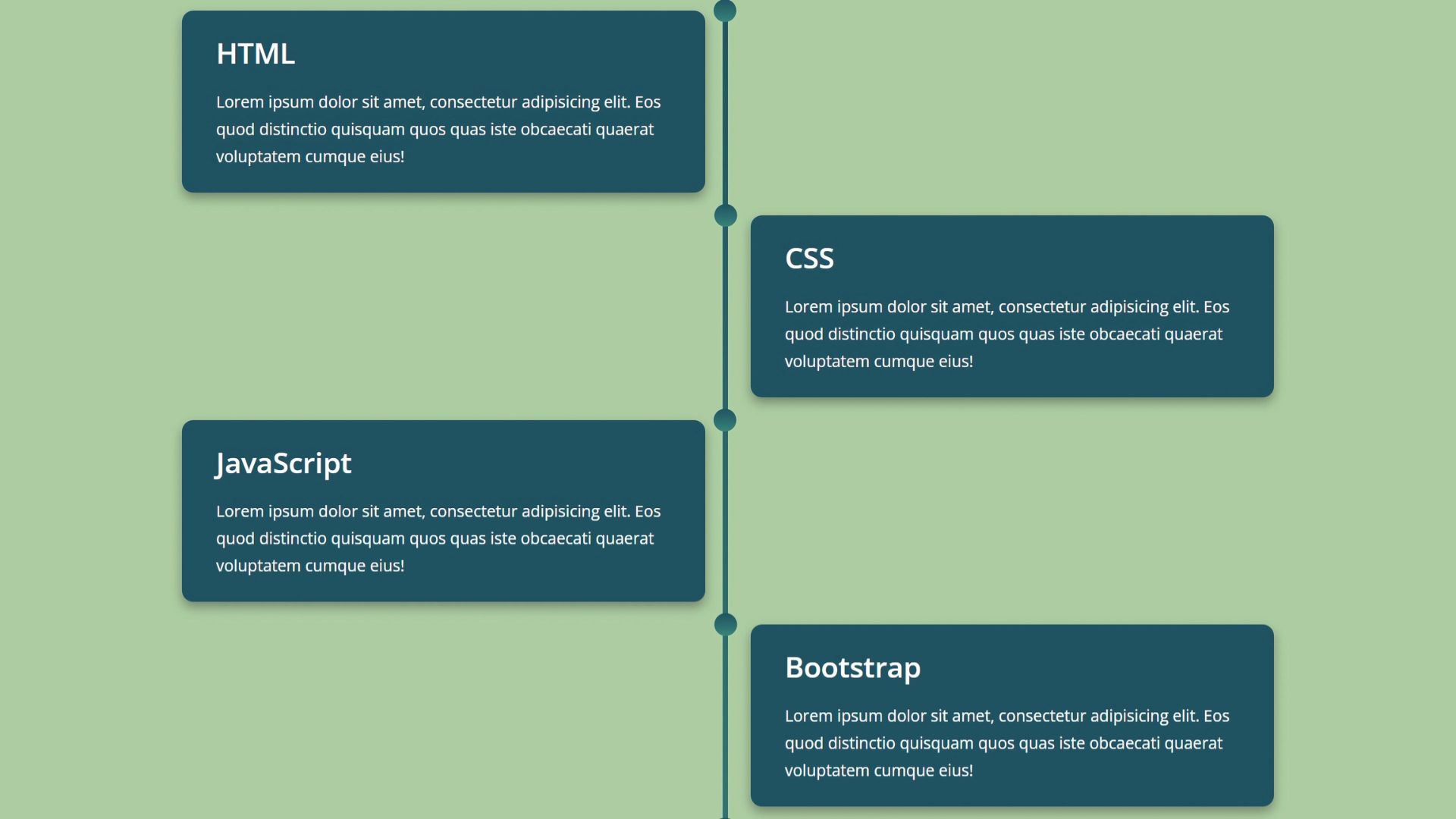
<section class="time-line">
<div class="container" style="--dt:1s">
<div class="content">
<h2>HTML</h2>
<p>Lorem ipsum dolor sit amet, consectetur adipisicing elit. Eos quod distinctio quisquam quos quas iste obcaecati quaerat voluptatem cumque eius!</p>
</div>
</div>
<div class="container" style="--dt:2s">
<div class="content">
<h2>CSS</h2>
<p>Lorem ipsum dolor sit amet, consectetur adipisicing elit. Eos quod distinctio quisquam quos quas iste obcaecati quaerat voluptatem cumque eius!</p>
</div>
</div>
<div class="container" style="--dt:3s">
<div class="content">
<h2>JavaScript</h2>
<p>Lorem ipsum dolor sit amet, consectetur adipisicing elit. Eos quod distinctio quisquam quos quas iste obcaecati quaerat voluptatem cumque eius!</p>
</div>
</div>
<div class="container" style="--dt:4s">
<div class="content">
<h2>Bootstrap</h2>
<p>Lorem ipsum dolor sit amet, consectetur adipisicing elit. Eos quod distinctio quisquam quos quas iste obcaecati quaerat voluptatem cumque eius!</p>
</div>
</div>
<div class="container" style="--dt:5s">
<div class="content">
<h2>jQuery</h2>
<p>Lorem ipsum dolor sit amet, consectetur adipisicing elit. Eos quod distinctio quisquam quos quas iste obcaecati quaerat voluptatem cumque eius!</p>
</div>
</div>
<div class="container" style="--dt:6s">
<div class="content">
<h2>WordPress</h2>
<p>Lorem ipsum dolor sit amet, consectetur adipisicing elit. Eos quod distinctio quisquam quos quas iste obcaecati quaerat voluptatem cumque eius!</p>
</div>
</div>
</section>
</body>
</html>
Applying Essential CSS for Timeline Layout and Styling
Now that we have our HTML structure let’s style it with CSS to create a visually appealing timeline.
Copy the below CSS code and paste it into the style.css file.
					@import url('https://fonts.googleapis.com/css2?family=Open+Sans:ital,wght@0,300..800;1,300..800&display=swap');

*{
    margin: 0;
    padding: 0;
    box-sizing: border-box;
    font-family: "Open Sans", sans-serif;
}
body{
    background-color: #abcd9e;
}
.time-line{
    width: 1000px;
    margin: 100px auto;
    position: relative;
    /* background:green; */
}
.time-line::after{
    content: '';
    position: absolute;
    top: 0;
    right: 50%;
    height: 100%;
    width: 5px;
    background: linear-gradient(#1b515e,#338275);
    border-radius: 50px;
    animation: animate 7s linear forwards;
    z-index: -1;
}
@keyframes animate {
    0%{
        height: 0;
    }
    100%{
        height: 100%;
    }
}
.container{
    width: 50%;
    position: relative;
    /* background: red; */
    padding: 10px 20px;
    animation: animate-container 0.5s linear forwards;
    opacity: 0;
    animation-delay: var(--dt);
}
@keyframes animate-container {
    0%{
        opacity: 0;
        transform: translateY(-30px);
    }
    100%{
        opacity: 1;
        transform: translateY(0px);
    }
}
.container:nth-child(even){
    right: -50%;
}
.container:nth-child(odd)::before{
    content: '';
    top: 0;
    right: -7px;
    position: absolute;
    height: 20px;
    width: 20px;
    background: linear-gradient(#1b515e,#338275);
    border-radius: 50%;
    z-index: 1;
}
.container:nth-child(even)::before{
    content: '';
    top: 0;
    left: -12.2px;
    position: absolute;
    height: 20px;
    width: 20px;
    background: linear-gradient(#1b515e,#338275);
    border-radius: 50%;
    z-index: 1;
}
.content{
    padding: 20px 30px;
    /* background-color: gray; */
    border-radius: 10px;
    box-shadow: 0 5px 10px #1919196d;
    background: #1b515e;
}
.content h2{
    font-size: 25px;
    font-weight: 600;
    color: #ffffff;
    padding-bottom: 14px;
}
.content p{
    font-size: 14px;
    line-height: 24px;
    color: #ffffff;
}
/* Responsive Code */
@media screen and (max-width:1020px) {
    .container:nth-child(even){
        right: 0;
    }
    .time-line{
        width: 400px;
    }
    .container{
        width: 100%;
    }
    .time-line::after{
        top: 0;
        right: 0;
    }
    .container:nth-child(even)::before{
        top: 0;
        left: 97%;
    }
}
Making the Timeline Responsive Across Various Devices
Ensuring your CSS animated timeline is responsive across various devices is critical to modern web design.
This process employs flexible grid layouts and media queries to adapt your timeline’s layout, ensuring it looks impeccable regardless of the device it’s viewed on. Start by setting relative units for the timeline components, such as percentages for widths and vh (viewport height) or vw (viewport width) for spacing, to ensure they scale proportionately.
Copy the CSS Responsive code below and paste it into the style.css file.
					/* Responsive Code */
@media screen and (max-width:1020px) {
    .container:nth-child(even){
        right: 0;
    }
    .time-line{
        width: 400px;
    }
    .container{
        width: 100%;
    }
    .time-line::after{
        top: 0;
        right: 0;
    }
    .container:nth-child(even)::before{
        top: 0;
        left: 97%;
    }
}
Testing and Debugging Your Timeline Design
Once your CSS animated timeline is in place, it’s crucial to conduct thorough testing and debugging to ensure its functionality and responsiveness across different environments.
Test the timeline on various browsers, including Chrome, Firefox, Safari, and Edge, to check for any discrepancies in how animations or layouts are rendered. Utilizing browser developer tools can greatly assist in identifying and resolving CSS or HTML issues.
Additionally, mobile responsiveness should be a key focus. Test your timeline on different devices to confirm that the layout adjusts accordingly and remains user-friendly, regardless of the screen size. Tools like Google’s Mobile-Friendly Test can offer insights into how well your timeline performs on mobile platforms.
Inspect elements for animation smoothness and loading times as well. Slow or choppy animations could indicate the need for optimization, perhaps by simplifying CSS animations or adjusting the timing and duration of effects.
For more comprehensive testing, consider using web development tools that simulate various conditions, including slower internet speeds, to ensure your CSS animated timeline provides a consistent experience for all users.
Addressing these areas diligently will refine your timeline’s design, making it a robust component of your web project.
Best Practices for Maintaining and Updating Your Timeline
Regular maintenance and updates ensure your CSS animated timeline remains effective and engaging. One best practice is to periodically review the content of your timeline for accuracy and relevance.
As new milestones are achieved or historical data changes, update your timeline to reflect these developments. This keeps your content fresh and ensures that viewers always have the latest information. Another consideration is the performance of your animations and responsiveness.
Web standards and browser capabilities evolve over time. Regularly test your CSS animated timeline across different browsers and devices to identify areas needing adjustments. This might include optimizing animations for smoother transitions, updating code to comply with the latest web standards, or adjusting the layout to accommodate new screen sizes and resolutions.
Also, engage with your audience to gather feedback on their experience with the timeline. User insights can reveal valuable information about navigation difficulties, animation speed preferences, or additional features they would find helpful. Implementing such feedback enhances user satisfaction and inspires new ideas to make your CSS animated timeline more interactive and informative.
Staying abreast of CSS and HTML developments is crucial, too. New properties and techniques could offer more efficient ways to achieve similar or better effects, enhancing your timeline’s performance and aesthetics.
Conclusion
In wrapping up, designing a responsive HTML & CSS animated timeline is a journey that combines creativity with technical prowess.
Throughout this tutorial, we’ve explored the significance of integrating animation and responsiveness to elevate timelines from mere informational elements to engaging, dynamic storytelling tools.
By adhering to the design principles and employing CSS animations thoughtfully, you’ve learned to create timelines that captivate and communicate effectively across various devices. The CSS animated timeline is a testament to how evolving web technologies can enhance user experience, making information consumption an interactive adventure.
The techniques covered here lay the foundation for creating visually appealing and interactive timelines, whether for historical timelines, project milestones, or educational purposes. Remember, the key to a successful CSS animated timeline is continuous testing, optimizing, and updating based on user feedback and technological advancements.
As we conclude, it’s clear that the power of a well-crafted CSS animated timeline extends beyond its visual appeal, serving as a versatile tool in digital storytelling. We encourage you to experiment further, pushing the boundaries of what’s possible with CSS animations and making your timelines informative and unforgettable.
Recent Posts


Categories

FAQs
What is a responsive HTML & CSS animated timeline?
A responsive HTML & CSS animated timeline is a web design feature visually represents events or milestones chronologically. It adapts to different screen sizes and includes smooth animations for an engaging user experience.
Why should I use a timeline on my website?
Timelines effectively showcase chronological information, such as project progress, company history, or personal achievements, in an organized and visually appealing way.
How do I make my timeline responsive?
To make your timeline responsive, use CSS media queries to adjust the layout based on the screen size. For example, use a vertical design for mobile devices and a horizontal layout for larger screens.
What are the fundamental CSS properties used for animations in a timeline?
The fundamental CSS properties include transform, opacity, transition, and animation. These properties help create smooth transitions and movements as timeline items appear on the screen.
Can I use JavaScript to enhance my timeline animations?
JavaScript can trigger animations as users scroll through the timeline. It adds interactivity by detecting when timeline items come into view and applying animations accordingly.
How can I ensure my timeline is accessible?
Ensure your timeline is accessible by using semantic HTML, providing descriptive alt text for images, and making it navigable via keyboard. This makes it usable for all users, including those with disabilities.
Can I customize the look of my timeline?
Absolutely! You can customize your timeline’s colors, fonts, and animations to match your website’s design and branding. CSS allows for extensive customization to fit your needs.
What are some common uses for a timeline on a website?
Common uses include showcasing company history, project milestones, product development timelines, personal achievements, and event schedules.
Is it necessary to include animations in my timeline?
While unnecessary, animations can significantly enhance the user experience by adding visual interest and making the timeline more engaging. However, keep them subtle to avoid distracting from the content.
How can I optimize my timeline for faster loading times?
To optimize for faster loading times, minimize the size of images, compress CSS and JavaScript files, and use lazy loading for images. Also, avoid overloading your timeline with too many animations or heavy scripts.
Share on Social Media
Related Articles

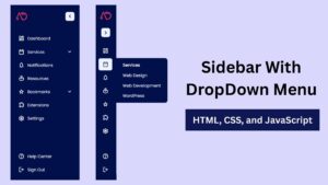
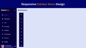
Build a Fully Responsive Sidebar with Dropdown Menu – HTML, CSS & JS
Learn how to build a fully responsive sidebar with dropdown menus using HTML, CSS, and JavaScript. Step-by-step guide with code
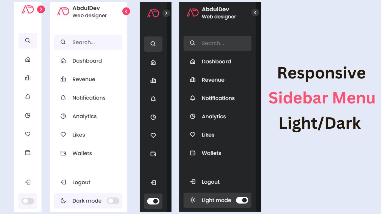
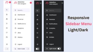
Responsive Sidebar Menu in HTML, CSS & JS | Light/Dark Mode
Learn how to create a modern responsive sidebar menu with a light and dark theme switcher using HTML, CSS, and
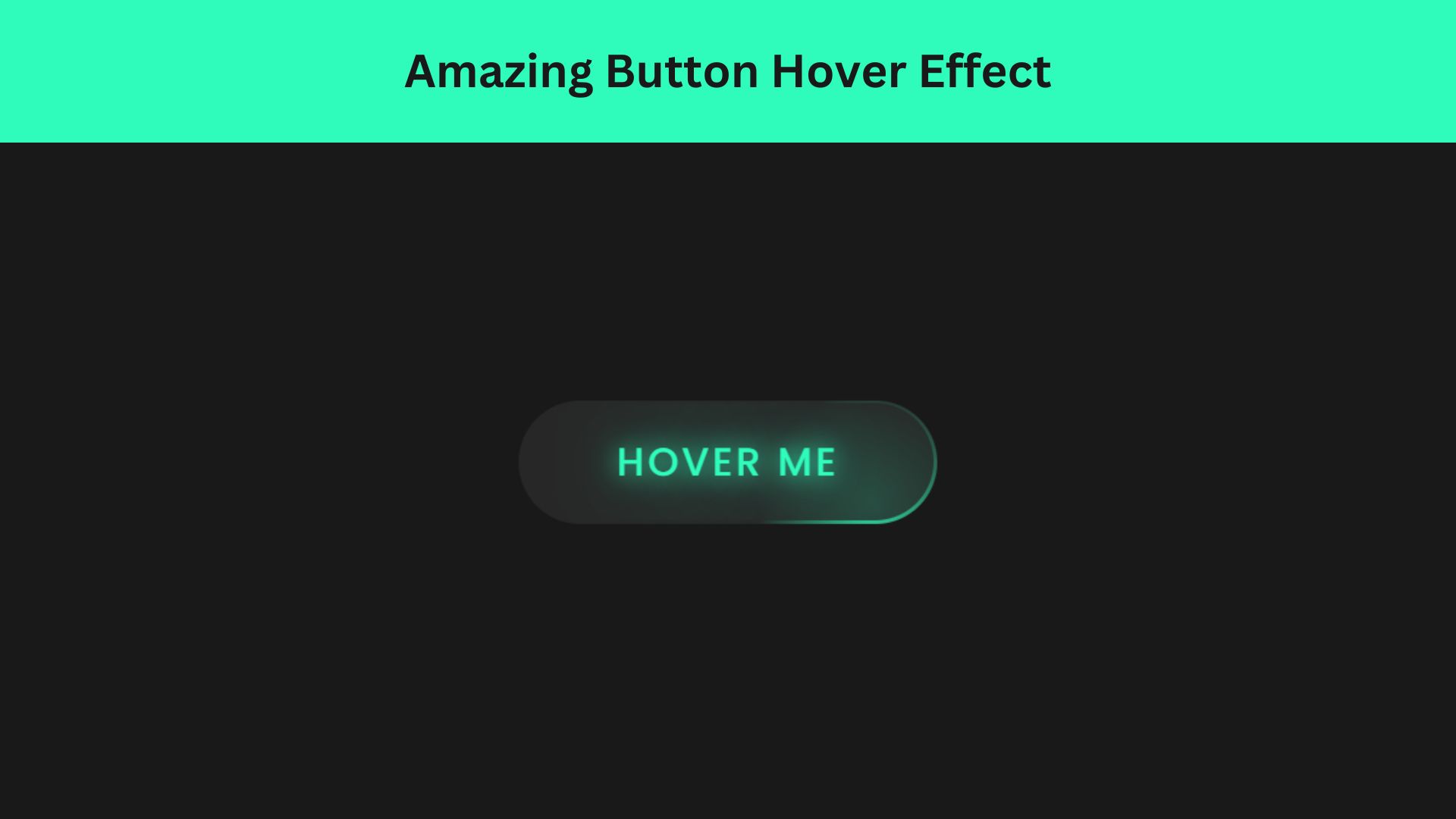
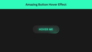
Amazing Button Hover Effect Using HTML, CSS, and JavaScript
Discover how to create amazing button hover effects using HTML, CSS, and JavaScript. Learn step-by-step with free source code to