How to Create Responsive Testimonials Using HTML and CSS
Responsive Testimonials are a powerful tool for showcasing the positive experiences of customers and clients and building trust with potential customers. However, in today’s digital age, these testimonials must be responsive and look great on all devices. This is where HTML and CSS come into play. By using these two web design languages, you can easily create a responsive testimonial section on your website that will adapt to different screen sizes and devices.
In this blog post, we will guide you through the steps of creating a responsive testimonial using HTML and CSS, so you can showcase your customer’s feedback in a visually appealing and user-friendly manner. So, let’s dive in and learn how to create a responsive testimonial that will impress your website visitors and potential customers.
Introduction to Responsive Testimonials
Responsive Testimonials play a pivotal role in modern web design, serving not only as a testament to the quality and satisfaction a service or product provides but also as a crucial element in web responsiveness and design fluidity.
As screens vary in size from desktop monitors to smartphones, ensuring that testimonials are adaptable and fluid across all devices is essential. This adaptability enhances the user’s experience by providing them with a seamless interaction, regardless of the device they are using.
It’s not just about scaling down for smaller screens; it’s about creating an engaging experience that maintains the integrity and intention of the content across all platforms. Implementing responsive testimonials involves understanding the principles of responsive web design, such as flexible grid layouts, media queries, and scalable vector graphics, to ensure that your testimonials are not just seen but are impactful and compelling.
As we proceed, we’ll delve into the nuts and bolts of using HTML and CSS to build testimonials that are not only responsive but also elevate the user experience by being aesthetically pleasing and functionally robust on any device.
Understanding the Importance of Responsiveness
In the digital landscape, the importance of responsiveness in web design cannot be overstated. A responsive testimonial is not just a decorative feature; it’s an integral part of a website’s accessibility and user satisfaction.
As users shift between devices, from desktops to tablets to smartphones, the need for web content that dynamically adapts becomes critical. A responsive testimonial ensures that positive feedback from your clients is always presented in the best possible light, regardless of how or where a potential customer views it.
This responsiveness directly influences the perception of your brand and the user’s decision-making process. In a world where online browsing habits are increasingly mobile-centric, neglecting responsiveness can lead to a frustrating user experience, characterized by difficult navigation and squint-inducing text sizes.
This, in turn, can increase bounce rates and reduce the overall effectiveness of testimonials as a trust-building tool. Incorporating responsive design principles into your testimonials is not just about maintaining aesthetics; it’s about ensuring that every visitor has an optimal viewing experience, reinforcing the credibility and professionalism of your brand.
Check Out Those Useful Articles
Steps to Create Responsive Testimonials
To create Responsive Testimonials with HTML and CSS follow these steps:
- Create a Folder: Name this folder according to your preference. Inside this folder, you’ll need to set up the following files:
- Create an index.html File: This file should be named index with the .html extension.
- Create a style.css File: This file should be named style with the .css extension.
These files will form the basis of your Responsive Testimonials Section.
Setting Up the Basic HTML Structure
Creating a basic HTML structure is the foundation for our responsive testimonial. Start by opening your preferred code editor and creating an HTML file “index.html”.
Copy the below code and Paste it in the index.html File.
<!DOCTYPE html>
<html lang="en">
<head>
<meta charset="UTF-8">
<meta name="viewport" content="width=device-width, initial-scale=1.0">
<title>Responsive Testimonial by AbdulDev</title>
<!-- CSS Link -->
<link rel="stylesheet" href="style.css">
<!-- Icon Link -->
<link href='https://unpkg.com/boxicons@2.1.4/css/boxicons.min.css' rel='stylesheet'>
</head>
<body>
<div class="container">
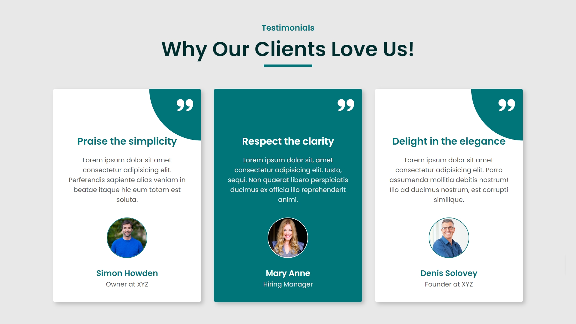
<h2>Testimonials</h2>
<h1>Why Our Clients Love Us!</h1>
<div class="section-grid">
<div class="card">
<span><i class='bx bxs-quote-alt-right'></i></span>
<h4>Praise the simplicity</h4>
<p>Lorem ipsum, dolor sit amet consectetur adipisicing elit. Voluptate omnis officiis excepturi facere quos amet tenetur temporibus quaerat, consequatur est!</p>
<img decoding="async" src="Images/Simon Howden.png" alt="User Image">
<h5>Simon Howden</h5>
<h6>Owner at XYZ</h6>
</div>
<!-- Copy and Past it 2 more times -->
<div class="card">
<span><i class='bx bxs-quote-alt-right'></i></span>
<h4>Respect the clarity</h4>
<p>Lorem ipsum, dolor sit amet consectetur adipisicing elit. Voluptate omnis officiis excepturi facere quos amet tenetur temporibus quaerat, consequatur est!</p>
<img decoding="async" src="Images/Mary Anne.png" alt="User Image">
<h5>Mary Anne</h5>
<h6>Hiring Manager</h6>
</div>
<div class="card">
<span><i class='bx bxs-quote-alt-right'></i></span>
<h4>Delight in the elegance</h4>
<p>Lorem ipsum, dolor sit amet consectetur adipisicing elit. Voluptate omnis officiis excepturi facere quos amet tenetur temporibus quaerat, consequatur est!</p>
<img decoding="async" src="Images/Denis Solovey.png" alt="User Image">
<h5>Denis Solovey</h5>
<h6>Founder at XYZ</h6>
</div>
</div>
</div>
</body>
</html>
Applying Basic CSS for Initial Styling
To start styling our responsive testimonial, let’s focus on basic CSS properties that will set the stage for further enhancements. Begin by opening your CSS file linked to the HTML document.
Copy the below CSS code and paste it into the style.css file.
					@import url('https://fonts.googleapis.com/css2?family=Poppins:wght@400;500;600;700&display=swap');

*{margin: 0;
  padding: 0;
  box-sizing: border-box;
  font-family: "Poppins", sans-serif;
}
body{
  background: #e8e8e8;
}
.container{
  max-width: 1200px;
  margin: auto;
  padding: 60px 20px;
  text-align: center;
}
.container h2{
  font-size: 20px;
  font-weight: 600;
  color: #007579;
}
.container h1{
  position: relative;
  margin-bottom: 60px;
  font-size: 50px;
  font-weight: 600;
  color: #002d2e;
}
.container h1::after{
  content: '';
  position: absolute;
  left: 50%;
  bottom: -6px;
  transform: translateX(-50%);
  width: 120px;
  height: 6px;
  background-color: #007579;
}
.section-grid{
  display: grid;
  grid-template-columns: repeat(3, 1fr);
  gap: 40px;
}
.card{
  position: relative;
  isolation: isolate;
  overflow: hidden;
  padding: 48px 32px 32px;
  background-color: #fff;
  border-radius: 10px;
  box-shadow: 0 0 20px #00000030;
  transition: 0.7s;
}
.card::before{
  content: '';
  position: absolute;
  top: 0;
  right: 0;
  transform: translate(50%, -50%);
  width: 75%;
  aspect-ratio: 1;
  border-radius: 100%;
  background: #007579;
  z-index: -1;
  transition: 0.7s;
}
.card:hover::before{
  width: 400%;
}
.card .bx{
  position: absolute;
  top: 0;
  right: 0;
  padding: 16px;
  font-size: 48px;
  color: #fff;
}
.card h4{
  margin-top: 70px;
  margin-bottom: 16px;
  font-size: 24px;
  color: #007579;
  transition: 0.5s;
}
.card p{
  margin-bottom: 16px;
  color: #585858;
  transition: 0.5s;
}
.card img{
  margin-bottom: 16px;
  max-width: 100px;
  border-radius: 100%;
  border: 2px solid #007579;
  transition: 0.5s;
}
.card h5{
  font-size: 20px;
  font-weight: 600;
  color: #007579;
  transition: 0.5s;
}
.card h6{
  font-size: 16px;
  font-weight: 400;
  color: #585858;
  transition: 0.5s;
}
.card:hover h4,
.card:hover h5{
  color: #fff;
}
.card:hover p,
.card:hover h6{
  color: #efefef;
}
.card:hover img{
  border-color: #fff;
}
Making the Testimonial Section Responsive
To ensure our testimonial section is responsive and adapts gracefully across different devices, we’ll leverage the power of CSS media queries.
Media queries allow us to apply CSS rules based on the device’s screen size, ensuring our testimonials look great whether viewed on a mobile phone, tablet, or desktop. Start by defining breakpoints in your CSS file. Common breakpoints include widths of 768px for tablets and 1024px for desktops.
For devices with widths less than 768px, you might want to adjust the `.testimonial-container` to have a `flex-direction: column;` if it isn’t already, ensuring testimonials stack vertically in a single column. This enhances readability on smaller screens. Next, adjust the padding, font sizes, and possibly the layout of the `.testimonial` items within these breakpoints to ensure the text remains legible and the elements well-spaced.
For example, on smaller screens, you might reduce the font size slightly and increase padding to prevent text from feeling cramped. Additionally, consider adjusting the `max-width` of the testimonials or the container itself to ensure it utilizes the available screen space efficiently without becoming too wide on larger screens.
By carefully crafting your media queries and testing across a range of devices, you can create a testimonial section that not only looks appealing but also provides a seamless experience for users, regardless of how they access your site.
Copy the below Responsive CSS code and paste it into the style.css file.
					/* Responsive Code */
@media screen and (max-width: 1040px) {
  .section-grid{
    display: grid;
    grid-template-columns: repeat(2, 1fr);
    gap: 40px;
  }
}
@media screen and (max-width: 740px) {
  .section-grid{
    display: grid;
    grid-template-columns: repeat(1, 1fr);
    gap: 40px;
  }
  .container h1{
    font-size: 30px;
  }
  .container h2{
    font-size: 18px;
  }
  .container{
    padding: 40px;
  }
}
Testing and Debugging Your Code
Once you’ve crafted your responsive testimonial using HTML and CSS, the next critical step is to ensure its flawless operation across different devices and browsers.
Testing and debugging are pivotal in this phase to identify and resolve any issues that might compromise the responsive design’s integrity. Utilize tools such as Chrome Developer Tools or Firefox Developer Edition to simulate various screen sizes and inspect how your testimonials adapt.
Pay close attention to layout shifts, text-overflow, or unresponsive elements that could detract from the user experience. Employ cross-browser testing to check compatibility and ensure that your design maintains its intended appearance and functionality, regardless of the user’s browser choice. This may reveal discrepancies in how different browsers interpret your code, requiring adjustments to CSS or layout properties.
Additionally, consider using online responsive design testing tools that allow you to view your site on multiple devices simultaneously. This step is crucial for refining your responsive testimonial, ensuring that every testimonial appears as intended, engaging, and accessible to every visitor, no matter their device.
Remember, thorough testing and diligent debugging are the keystones to achieving a truly responsive testimonial that elevates your site’s credibility and user engagement.
Best Practices for Consistent Design
When striving for a consistent design across your responsive testimonial section, it’s crucial to maintain a cohesive visual language and layout that aligns with your overall website design.
Consistency in design aids in reinforcing brand identity and enhances user experience. To achieve this, ensure that the font styles, sizes, and colors used in your testimonials match those utilized throughout your site. This creates a seamless transition between sections and reinforces your brand’s aesthetic.
Leverage a consistent grid layout across devices, ensuring that the structure of your responsive testimonial section aligns with other content elements on your page. This not only contributes to a harmonious appearance but also aids in predictable navigation patterns for users, regardless of their device.
Incorporate design elements such as icons, buttons, or hover effects that are in line with the design language of the rest of your site. This attention to detail signals professionalism and care in your presentation. Additionally, consider the spacing and alignment within each testimonial and between testimonials, as consistency in these aspects further supports a cohesive user experience.
By applying these best practices, your responsive testimonial section will not only stand out but also blend seamlessly with the design of your website, providing a consistent and engaging user experience across all devices.
Conclusion
In wrapping up our guide on creating a responsive testimonial using HTML and CSS, it’s evident that such a feature is not merely a luxury but a necessity in today’s ever-evolving digital landscape.
The journey from understanding the critical role of responsive testimonials in enhancing user experience to implementing and testing them ensures that your website remains accessible and appealing across all devices.
By adhering to the principles and steps outlined, you are equipped to craft testimonials that not only showcase customer satisfaction but also significantly contribute to your site’s responsiveness and overall design coherence.
Remember, the goal is to ensure that every visitor, regardless of their device, is met with a seamless and engaging experience that prompts trust and confidence in your services or products.
As you continue to refine and expand your website, let the responsive testimonial serve as a testament to your commitment to quality and accessibility. Embrace the challenge, and watch as your website’s credibility and user engagement soar.
Recent Posts


Categories

FAQs
What is an autoplay card slider?
A responsive testimonial adjusts its layout based on the device screen size, ensuring optimal readability on desktops, tablets, and smartphones.
Why should I create responsive testimonials using HTML and CSS?
Using HTML and CSS allows you to create lightweight, fast-loading testimonials that look great on any device without relying on heavy scripts or plugins.
Can I add animations to my responsive testimonials?
Yes, you can add animations using CSS transitions or keyframes to create eye-catching effects, such as fading, sliding, or zooming in your testimonials.
How do I ensure my testimonials are mobile-friendly?
Use media queries in your CSS to adjust the font size, padding, and layout of your testimonials based on different screen widths, ensuring they are mobile-friendly.
What CSS properties are essential for creating responsive testimonials?
Key CSS properties include flexbox for layout, media queries for responsiveness, padding, margins, and font sizes to ensure the testimonials are well-spaced and readable.
Can I use CSS Grid for creating responsive testimonials?
Yes, CSS Grid is an excellent option for creating complex layouts for testimonials, allowing you to precisely control the placement of text, images, and other elements.
How do I make my testimonials visually appealing?
Use consistent fonts, complementary colors, appropriate spacing, and subtle animations. Adding borders, shadows, or background colors can also enhance the visual appeal.
Should I use external libraries for responsive testimonials?
While it’s possible, it’s often unnecessary. HTML and CSS provide all the tools you need to create responsive testimonials without the need for additional libraries.
How can I test if my testimonials are responsive?
You can test responsiveness by resizing your browser window, using browser developer tools, or testing on different devices to see how the testimonials adapt to various screen sizes.
Share on Social Media
Related Articles

Build a Fully Responsive Sidebar with Dropdown Menu – HTML, CSS & JS
Learn how to build a fully responsive sidebar with dropdown menus using HTML, CSS, and JavaScript. Step-by-step guide with code
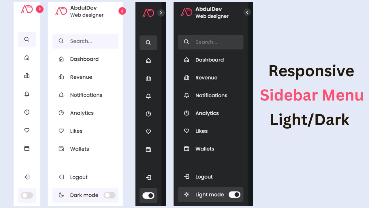
Responsive Sidebar Menu in HTML, CSS & JS | Light/Dark Mode
Learn how to create a modern responsive sidebar menu with a light and dark theme switcher using HTML, CSS, and
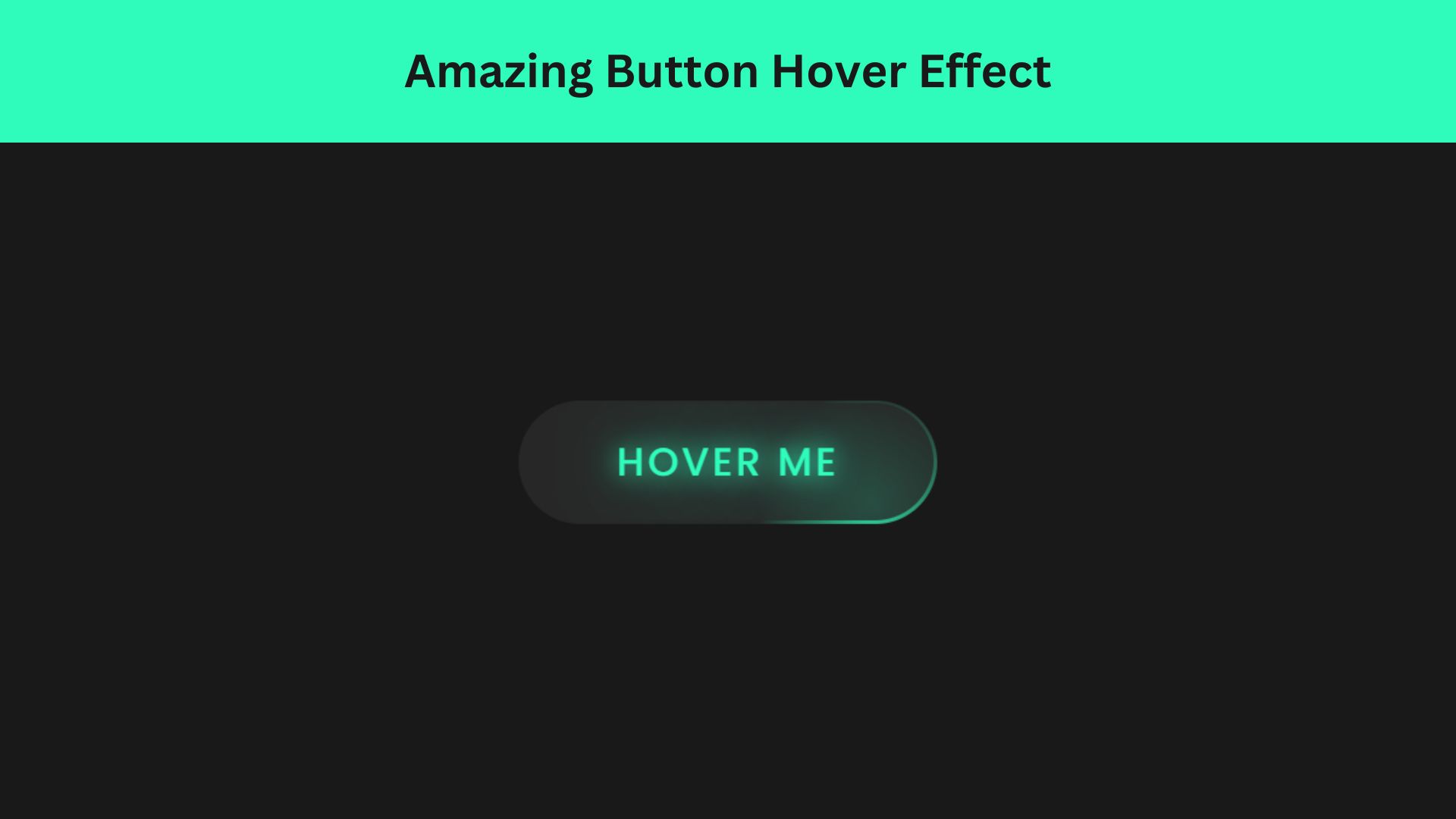
Amazing Button Hover Effect Using HTML, CSS, and JavaScript
Discover how to create amazing button hover effects using HTML, CSS, and JavaScript. Learn step-by-step with free source code to