
How to Create an Autoplay Card Slider for the Team Section using HTML, CSS, and Swiper JS
Creating an autoplay card slider interactive and visually appealing team section on your website can significantly enhance user engagement. One way to achieve this is by incorporating an Autoplay Card Slidert. This effect allows you to showcase your team members dynamically, making your website look more professional and modern.
In this article, we’ll guide you through the process of creating a stunning autoplay card slider for your team section using HTML, CSS, and Swiper JS. By following this step-by-step guide, you’ll learn how to design a responsive, smooth, and attractive slider that will make your team section stand out.
Why Use Swiper JS for Card Sliders?
Swiper JS is a powerful, modern, and free slider library that enables you to create mobile-friendly sliders with ease. It comes with a host of features, including responsive layouts, touch interaction, and customizable transitions, making it the perfect choice for implementing a Autoplay Card Slider.
Some key benefits of using Swiper JS include:
- Responsiveness: Ensures your slider looks great on all devices.
- Ease of Use: Straightforward integration with HTML and CSS.
- Customization: A wide range of options to tailor the slider to your design needs.
Check Out Those Useful Articles
Steps to Create an Autoplay Card Slider for Team Section
To create an Autoplay Card Slider with HTML, CSS and Swiper JS follow these steps:
- Create a Folder: Name this folder according to your preference. Inside this folder, you’ll need to set up the following files:
- Create an index.html File: This file should be named index with the .html extension.
- Create a style.css File: This file should be named style with the .css extension.
- Swiper JS: Integration Your HTML file with Swiper JS.
- Create a main.js File: This file should be name main with the .js extension.
These files will form the basis of your Autoplay Card Slider.
Setting Up the HTML Structure for the Autoplay Card Slider
Before we dive into the code, make sure you have a basic HTML template ready. You’ll need to include the Swiper JS library, which can be done by adding the following CDN links in the <head> section of your HTML file:
Next, create the HTML structure for the card slider. This will include a container for the Swiper slider and individual slides for each team member:
Copy the below code and Paste it in the “index.html” File.
<!DOCTYPE html>
<html lang="en">
<head>
<meta charset="UTF-8">
<meta name="viewport" content="width=device-width, initial-scale=1.0">
<title>Card Slider for Team Section By AbdulDev</title>
<!-- CSS Link -->
<link rel="stylesheet" href="style.css">
<!-- Icon Link -->
<link href='https://unpkg.com/boxicons@2.1.4/css/boxicons.min.css' rel='stylesheet'>
<!-- Swiperjs CSS Link -->
<link rel="stylesheet" href="https://cdn.jsdelivr.net/npm/swiper@11/swiper-bundle.min.css">
</head>
<body>
<div class="container-slide swiper">
<div class="slider-wrapper">
<div class="card-box swiper-wrapper">
<div class="card swiper-slide">
<div class="content-img">
<span class="overlay"></span>
<div class="card-img">
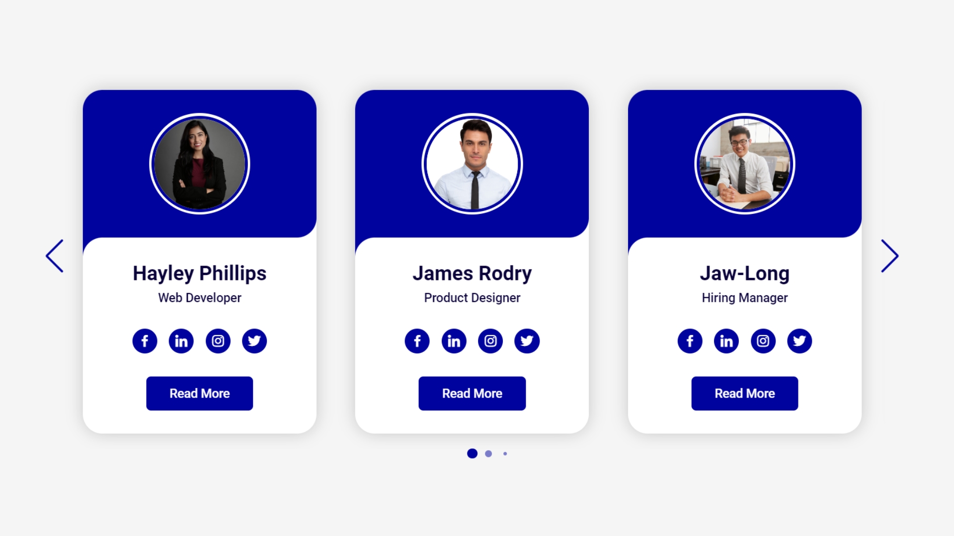
<img decoding="async" src="images/Hayley Phillips.png" alt="User Image" class="card-image">
</div>
</div>
<div class="content-box">
<h2 class="username">Hayley Phillips</h2>
<p class="user-profession">Web Developer</p>
<ul class="social-icon">
<li><a href="#"><i class='bx bxl-facebook'></i></a></li>
<li><a href="#"><i class='bx bxl-linkedin' ></i></a></li>
<li><a href="#"><i class='bx bxl-instagram' ></i></a></li>
<li><a href="#"><i class='bx bxl-twitter' ></i></a></li>
</ul>
<button class="btn">Read More</button>
</div>
</div>
<!-- Copy and Paste 5 more Times -->
<div class="card swiper-slide">
<div class="content-img">
<span class="overlay"></span>
<div class="card-img">
<img decoding="async" src="images/James Rodry.png" alt="User Image" class="card-image">
</div>
</div>
<div class="content-box">
<h2 class="username">James Rodry</h2>
<p class="user-profession">Product Designer</p>
<ul class="social-icon">
<li><a href="#"><i class='bx bxl-facebook'></i></a></li>
<li><a href="#"><i class='bx bxl-linkedin' ></i></a></li>
<li><a href="#"><i class='bx bxl-instagram' ></i></a></li>
<li><a href="#"><i class='bx bxl-twitter' ></i></a></li>
</ul>
<button class="btn">Read More</button>
</div>
</div>
<div class="card swiper-slide">
<div class="content-img">
<span class="overlay"></span>
<div class="card-img">
<img decoding="async" src="images/Jaw-Long.png" alt="User Image" class="card-image">
</div>
</div>
<div class="content-box">
<h2 class="username">Jaw-Long</h2>
<p class="user-profession">Hiring Manager</p>
<ul class="social-icon">
<li><a href="#"><i class='bx bxl-facebook'></i></a></li>
<li><a href="#"><i class='bx bxl-linkedin' ></i></a></li>
<li><a href="#"><i class='bx bxl-instagram' ></i></a></li>
<li><a href="#"><i class='bx bxl-twitter' ></i></a></li>
</ul>
<button class="btn">Read More</button>
</div>
</div>
<div class="card swiper-slide">
<div class="content-img">
<span class="overlay"></span>
<div class="card-img">
<img decoding="async" src="images/Michael Rasmussen.png" alt="User Image" class="card-image">
</div>
</div>
<div class="content-box">
<h2 class="username">Michael Rasmussen</h2>
<p class="user-profession">Project Manager</p>
<ul class="social-icon">
<li><a href="#"><i class='bx bxl-facebook'></i></a></li>
<li><a href="#"><i class='bx bxl-linkedin' ></i></a></li>
<li><a href="#"><i class='bx bxl-instagram' ></i></a></li>
<li><a href="#"><i class='bx bxl-twitter' ></i></a></li>
</ul>
<button class="btn">Read More</button>
</div>
</div>
<div class="card swiper-slide">
<div class="content-img">
<span class="overlay"></span>
<div class="card-img">
<img decoding="async" src="images/Shannon Howarth.png" alt="User Image" class="card-image">
</div>
</div>
<div class="content-box">
<h2 class="username">Shannon Howarth</h2>
<p class="user-profession">Softwre Developer</p>
<ul class="social-icon">
<li><a href="#"><i class='bx bxl-facebook'></i></a></li>
<li><a href="#"><i class='bx bxl-linkedin' ></i></a></li>
<li><a href="#"><i class='bx bxl-instagram' ></i></a></li>
<li><a href="#"><i class='bx bxl-twitter' ></i></a></li>
</ul>
<button class="btn">Read More</button>
</div>
</div>
<div class="card swiper-slide">
<div class="content-img">
<span class="overlay"></span>
<div class="card-img">
<img decoding="async" src="images/Warren Bailey.png" alt="User Image" class="card-image">
</div>
</div>
<div class="content-box">
<h2 class="username">Warren Bailey</h2>
<p class="user-profession">WordPress Expert</p>
<ul class="social-icon">
<li><a href="#"><i class='bx bxl-facebook'></i></a></li>
<li><a href="#"><i class='bx bxl-linkedin' ></i></a></li>
<li><a href="#"><i class='bx bxl-instagram' ></i></a></li>
<li><a href="#"><i class='bx bxl-twitter' ></i></a></li>
</ul>
<button class="btn">Read More</button>
</div>
</div>
</div>
<div class="swiper-pagination"></div>
<div class="swiper-slide-button swiper-button-prev"></div>
<div class="swiper-slide-button swiper-button-next"></div>
</div>
</div>
<!-- Swiper JS Script -->
<script src="https://cdn.jsdelivr.net/npm/swiper@11/swiper-bundle.min.js"></script>
<!-- Custom JS Script -->
<script src="main.js"></script>
</body>
</html>
Each swiper-slide represents a card in the slider, containing an image, name, and role of the team member.
Designing the Autoplay Card Slider Using CSS
With our HTML structure in place, it’s time to bring our card slider to life with CSS. The visual appeal of your slider heavily relies on the styling, which includes color schemes, typography, and transitions.
Copy the below CSS code and paste it into the style.css file.
					@import url('https://fonts.googleapis.com/css2?family=Roboto:wght@400;500;700&display=swap');

* {
  margin: 0;
  padding: 0;
  box-sizing: border-box;
  font-family: "Roboto", sans-serif;
}
body{
  min-height: 100vh;
  display: flex;
  align-items: center;
  justify-content: center;
  background: #f5f5f5;
}
.container-slide{
  width: 1120px;
  max-width: 100%;
}
.slider-wrapper{
  margin:  0 30px 20px;
  padding: 20px 30px;
  overflow: hidden;
}
.card{
  background: #fff;
  border-radius: 25px;
  box-shadow: 0 0 20px #00000030;
}
.content-img,
.content-box{
  padding: 30px 14px;
  display: flex;
  align-items: center;
  justify-content: center;
  flex-direction: column;
}
.content-img{
  position: relative;
  row-gap: 5px;
}
.overlay{
  position: absolute;
  left: 0;
  top: 0;
  width: 100%;
  height: 100%;
  background: #00039d;
  border-radius: 25px 25px 25px 0;
}
.overlay::before{
  content: '';
  position: absolute;
  height: 40px;
  width: 40px;
  background: #00039d;
  left: 0;
  bottom: -40px;
}
.overlay::after{
  content: '';
  position: absolute;
  height: 40px;
  width: 40px;
  background: #ffffff;
  left: 0;
  bottom: -40px;
  border-radius: 25px 0 0 0;
}
.card-img{
  width: 130px;
  height: 130px;
  position: relative;
  border-radius: 50%;
  background: #fff;
  padding: 3px;
}
.card-img .card-image{
  width: 100%;
  height: 100%;
  object-fit: cover;
  border-radius: 50%;
  border: 4px solid #00039d;
}
.content-box .username{
  font-size: 26px;
  font-weight: 600;
  color: #09003a;
  padding-bottom: 6px;
  z-index: 1;
}
.content-box .user-profession{
  font-size: 16px;
  font-weight: 500;
  color: #09003a;
}
.social-icon{
  padding: 30px 0;
  display: flex;
  align-items: center;
  justify-content: center;
  flex-direction: row;
  gap: 15px;
}
.social-icon li{
  list-style: none;
}
.social-icon li a{
  font-size: 20px;
  text-decoration: none;
  color: #fff;
  height: 32px;
  width: 32px;
  display: flex;
  align-items: center;
  justify-content: center;
  background: #00039d;
  border-radius: 50%;
  position: relative;
  overflow: hidden;
  z-index: 1;
}
.social-icon li a::before{
  content: '';
  position: absolute;
  height: 40px;
  width: 0;
  top: 0;
  left: 0;
  background: #ff008c;
  transition: 0.5s;
  z-index: -1;
}
.social-icon li a:hover::before{
  width: 100%;
}
.btn{
  cursor: pointer;
  padding: 12px 30px;
  font-size: 16px;
  font-weight: 500;
  border: none;
  background: #00039d;
  color: #fff;
  border-radius: 6px;
  z-index: 1;
  position: relative;
  overflow: hidden;
}
.btn::before{
  content: '';
  position: absolute;
  height: 44px;
  width: 0;
  top: 0;
  left: 0;
  background: #ff008c;
  transition: 0.5s;
  z-index: -1;
}
.btn:hover::before{
  width: 100%;
}
.slider-wrapper .swiper-pagination-bullet{
  background: #00039d;
  height: 13px;
  width: 13px;
  opacity: 0.5;
}
.slider-wrapper .swiper-pagination-bullet-active{
  opacity: 1;
}
.slider-wrapper .swiper-slide-button{
  color: #00039d;
  margin-top: -40px;
  transition: 0.5s;
}
.slider-wrapper .swiper-slide-button:hover{
  color: #ff008c;
}
/* Responsive Code */
@media screen and (max-width: 768px) {
  .slider-wrapper{
    margin:  0 20px 20px;
    padding: 20px 30px;
  }
}
Adding Swiper JS for Slider Functionality
With the structure and styling in place, it’s time to infuse life into our card slider with JavaScript, enhancing its interactivity and functionality.
Copy the below JS code and paste it into the main.js file.
					const swiper = new Swiper('.slider-wrapper', {
  loop: true,
  grabCursor: true,
  spaceBetween: 50,
  centerSlider: true,

  // If we need pagination
  pagination: {
    el: '.swiper-pagination',
    clickable: true,
    dynamicBullets: true,
  },

  // Navigation arrows
  navigation: {
    nextEl: '.swiper-button-next',
    prevEl: '.swiper-button-prev',
  },

  // Responsive
  breakpoints: {
    0:{
      slidesPerView: 1
    },
    768:{
      slidesPerView: 2
    },
    1024:{
      slidesPerView: 3
    }
  }

});
Enhancing the Card Slider
To further enhance your card slider, consider adding animations, lazy loading for images, or autoplay functionality. Swiper JS provides extensive documentation and options that allow you to customize your slider to meet specific design needs.
Copy the below JS code and paste it into the main.js file.
					autoplay:{
    delay: 3000,
    disableOnInteraction: false
  }
Implementing Responsiveness with CSS Media Queries
CSS media queries are pivotal in ensuring your card slider is adaptable across various devices. Media queries allow us to apply CSS styles depending on the device’s characteristics, such as width, height, or orientation.
Copy the below CSS code and paste it into the style.css file.
					/* Responsive Code */
@media screen and (max-width: 768px) {
  .slider-wrapper{
    margin:  0 20px 20px;
    padding: 20px 30px;
  }
}
Conclusion
By following these steps, you’ve now created a beautiful and functional Autoplay Card Slider for your team section using HTML, CSS, and Swiper JS. This dynamic feature not only makes your website more engaging but also ensures it remains responsive across all devices. Don’t forget to optimize your images and code for faster load times, as this can significantly impact your website’s SEO and user experience.
Implementing an Autoplay Card Slider can set your website apart from the competition, leaving a lasting impression on visitors. Keep experimenting with different styles and configurations to find the perfect fit for your brand’s identity.
Recent Posts


Categories

FAQs
What is an autoplay card slider?
An autoplay card slider is a type of slider where the slides transition automatically without user interaction. This is useful for showcasing content continuously, such as team members, in a dynamic and engaging way.
How do I enable autoplay in a Swiper JS card slider?
You can enable autoplay by adding the autoplay configuration in the Swiper initialization script, specifying the delay time between transitions. For example:
autoplay: {
delay: 3000,
disableOnInteraction: false,
},
Can users still manually navigate an autoplay slider?
Yes, users can manually navigate an autoplay slider using pagination dots, navigation arrows, or by swiping. The autoplay will pause during user interaction and resume afterward, depending on your configuration.
How can I control the autoplay speed of the slider?
The autoplay speed is controlled by the delay property in the autoplay configuration. The value is set in milliseconds, so delay: 3000 means the slides will transition every 3 seconds.
Can I stop the autoplay feature on certain screen sizes?
Yes, you can customize the autoplay feature based on screen size using the breakpoints option in Swiper JS. This allows you to disable or adjust autoplay on specific devices.
How do I pause the autoplay when the user hovers over a slide?
You can pause autoplay on hover by setting disableOnInteraction: true in the autoplay configuration. This stops the slider from automatically transitioning when the user interacts with it.
Is it possible to loop the autoplay slider infinitely?
Yes, you can make the autoplay slider loop infinitely by setting the loop: true option in the Swiper configuration. This ensures the slider continuously cycles through the slides.
How do I style the autoplay card slider for better user experience?
You can style the autoplay card slider using CSS by adjusting the appearance of the cards, navigation arrows, and pagination. Use transitions and hover effects to enhance interactivity.
What are the advantages of using an autoplay card slider for the team section?
An autoplay card slider automatically showcases your team members, providing a dynamic and engaging user experience without requiring manual input. It helps to keep visitors engaged and ensures all team members get visibility.
Can I add multiple autoplay sliders on the same page?
Yes, you can add multiple autoplay sliders on the same page by initializing different Swiper instances with unique container classes and configurations. This allows you to create diverse sliders for different sections.
Share on Social Media
Related Articles

Advanced BMI Calculator: Accurate Body Mass Index & Health Insights
Discover how an Advanced BMI Calculator provides accurate, personalized health insights by considering age, gender, body fat, and more.

CSS Animation Generator – Create Stunning Animations Without Coding Skills
Discover how a CSS animation generator helps you design smooth, professional animations without coding. Learn features, benefits, tips, and integration
How to Build an AI Image Generator Using HTML, CSS, and JavaScript
Build a responsive AI Image Generator using HTML, CSS, and JavaScript. Learn how to integrate Hugging Face API to create