Design a Glassmorphism Login Form Using HTML and CSS
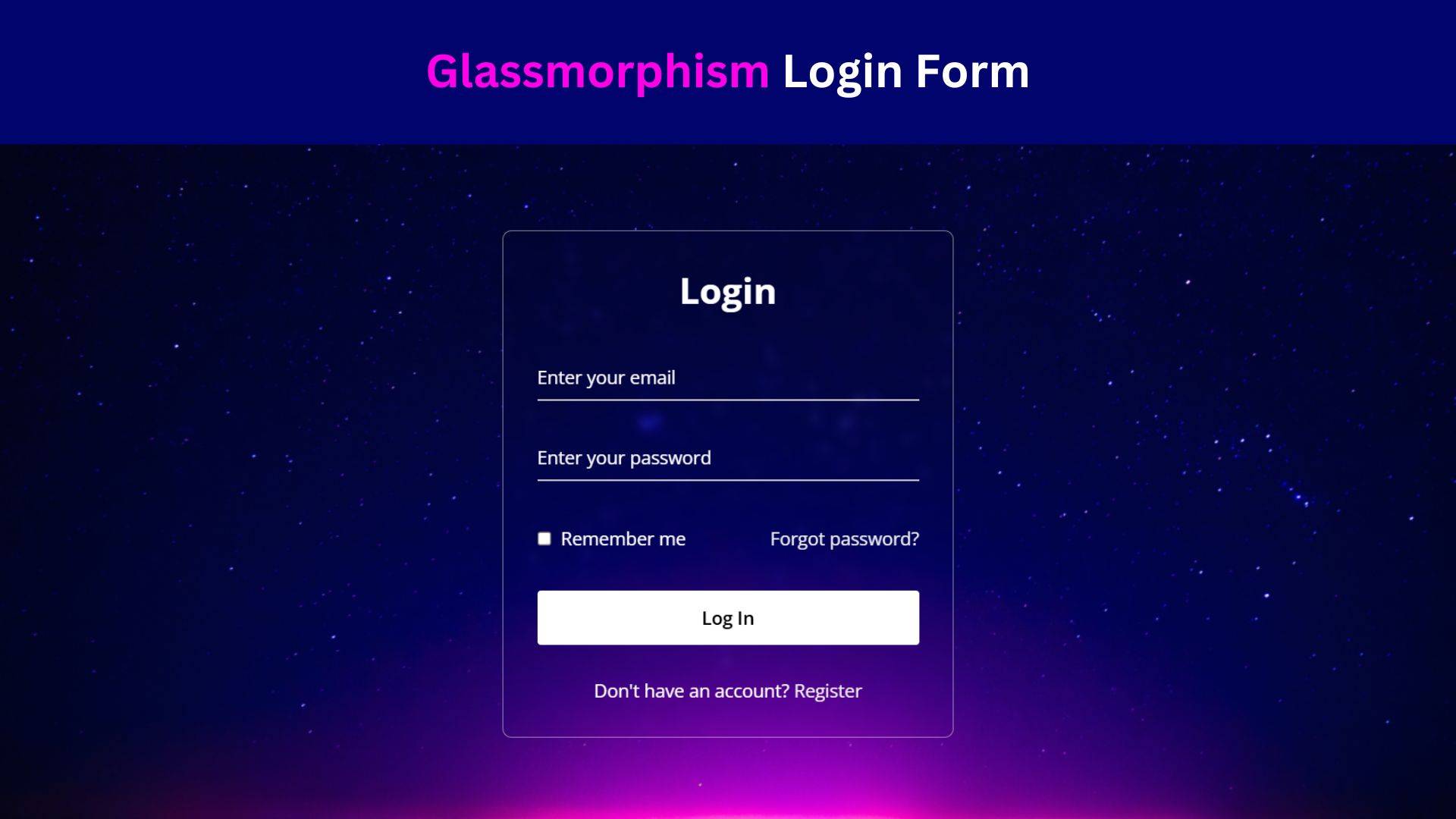
Creating a stunning, modern UI with glassmorphism can add a sophisticated touch to your projects, and a login form is a perfect example. This guide walks you through designing a Glassmorphism Login Form using HTML and CSS that combines transparency, blurring, and layered shadows to give your web page a sleek, frosted glass effect.
What is Glassmorphism?
Glassmorphism is a UI design trend inspired by frosted glass. This technique often features elements with blurred backgrounds, semi-transparency, and layered shadows, creating a soft, elegant look. Common in modern design, it’s especially effective for forms, cards, and other components.
Check Out Those Useful Articles
Steps to Design a Glassmorphism Login Form
To Design a Glassmorphism Login Form follow these steps:
- Create a Folder: Name this folder according to your preference. Inside this folder, you’ll need to set up the following files:
- Create an index.html File: This file should be named index with the .html extension.
- Create a style.css File: This file should be named style with the .css extension.
These files will form the basis of your Glassmorphism Login Form.
Setting Up the Basic HTML Structure
Now, open your code editor and set up a new HTML file, copy those HTML Codes and Paste those Codes on index.html file.
					<!DOCTYPE html>
<html lang="en">
<head>
    <meta charset="UTF-8">
    <meta name="viewport" content="width=device-width, initial-scale=1.0">
    <title>Glassmorphism Login Form Design by AbdulDev</title>
    <!-- Custom CSS Link -->
    <link rel="stylesheet" href="style.css">
</head>
<body>
    <div class="wrapper">
        <form action="#">
          <h2>Login</h2>
            <div class="input-field">
            <input type="text" required>
            <label>Enter your email</label>
          </div>
          <div class="input-field">
            <input type="password" required>
            <label>Enter your password</label>
          </div>
          <div class="forget">
            <label for="remember">
              <input type="checkbox" id="remember">
              <p>Remember me</p>
            </label>
            <a href="#">Forgot password?</a>
          </div>
          <button type="submit">Log In</button>
          <div class="register">
            <p>Don't have an account? <a href="#">Register</a></p>
          </div>
        <input
                    class="apbct_special_field apbct_email_id__elementor_form"
                    name="apbct__email_id__elementor_form"
                    aria-label="apbct__label_id__elementor_form"
                    type="text" size="30" maxlength="200" autocomplete="off"
                    value=""
                /></form>
      </div>
</body>
</html>
Styling the Sidebar with CSS
After that, copy those CSS Codes and Paste those Codes on style.css file.
					@import url("https://fonts.googleapis.com/css2?family=Open+Sans:wght@200;300;400;500;600;700&display=swap");

* {
  margin: 0;
  padding: 0;
  box-sizing: border-box;
  font-family: "Open Sans", sans-serif;
}

body {
  display: flex;
  align-items: center;
  justify-content: center;
  min-height: 100vh;
  width: 100%;
  padding: 0 10px;
  background: url("Images/bg-3.png");
  background-position: center;
  background-size: cover;
  background-repeat: no-repeat;
}

.wrapper {
  width: 400px;
  border-radius: 8px;
  padding: 30px;
  text-align: center;
  border: 1px solid rgba(255, 255, 255, 0.5);
  backdrop-filter: blur(4px);
  -webkit-backdrop-filter: blur(4px);
}

form {
  display: flex;
  flex-direction: column;
}

h2 {
  font-size: 2rem;
  margin-bottom: 20px;
  color: #fff;
}

.input-field {
  position: relative;
  border-bottom: 2px solid #ccc;
  margin: 15px 0;
}

.input-field label {
  position: absolute;
  top: 50%;
  left: 0;
  transform: translateY(-50%);
  color: #fff;
  font-size: 16px;
  pointer-events: none;
  transition: 0.15s ease;
}

.input-field input {
  width: 100%;
  height: 40px;
  background: transparent;
  border: none;
  outline: none;
  font-size: 16px;
  color: #fff;
}

.input-field input:focus~label,
.input-field input:valid~label {
  font-size: 0.8rem;
  top: 10px;
  transform: translateY(-120%);
}

.forget {
  display: flex;
  align-items: center;
  justify-content: space-between;
  margin: 25px 0 35px 0;
  color: #fff;
}

#remember {
  accent-color: #fff;
}

.forget label {
  display: flex;
  align-items: center;
}

.forget label p {
  margin-left: 8px;
}

.wrapper a {
  color: #efefef;
  text-decoration: none;
}

.wrapper a:hover {
  text-decoration: underline;
}

button {
  background: #fff;
  color: #000;
  font-weight: 600;
  border: none;
  padding: 12px 20px;
  cursor: pointer;
  border-radius: 3px;
  font-size: 16px;
  border: 2px solid transparent;
  transition: 0.3s ease;
}

button:hover {
  color: #fff;
  border-color: #fff;
  background: rgba(255, 255, 255, 0.15);
}

.register {
  text-align: center;
  margin-top: 30px;
  color: #fff;
}
Conducting Testing and Debugging
Once your Glassmorphism Login Form is built, thorough testing and debugging are essential to ensure a smooth user experience. Start by checking the form on various browsers, such as Chrome, Firefox, Safari, and Edge, to confirm cross-browser compatibility. Pay attention to any discrepancies in rendering or functionality and address them promptly.
Next, test the form on different devices, including desktops, tablets, and smartphones. Use browser developer tools to simulate various screen sizes and orientations, ensuring the form remains responsive and usable. Verify that all interactive elements, such as buttons and input fields, function correctly and provide appropriate feedback when clicked or hovered over.
Additionally, test the form’s accessibility by navigating it with a keyboard and screen reader. Ensure that all form elements are reachable and that labels and placeholders are read correctly by assistive technologies. Address any accessibility issues to provide an inclusive experience for all users.
Finally, perform stress testing by entering different types of data, including edge cases like long usernames or special characters, to ensure the form handles them gracefully. By rigorously testing and debugging, you can identify and resolve potential issues, delivering a polished and reliable Glassmorphism Login Form.
Conclusion
To wrap up, designing a Glassmorphism Login Form involves combining key CSS properties like transparency, blur, and shadow effects to achieve a frosted-glass look. Remember to structure your HTML logically and apply styles thoughtfully to ensure a consistent, modern appearance. Enhance user experience by incorporating interactive elements and providing visual feedback through hover and focus effects. Use CSS media queries and flexible units to make your form responsive across various devices, maintaining functionality and readability. Conduct thorough testing to verify cross-browser compatibility, accessibility, and performance under different conditions. By following these best practices, you can create a polished, engaging login form that leverages the sophisticated style of glassmorphism while meeting practical usability standards.
FAQs
What is Glassmorphism in web design?
Glassmorphism is a UI design trend that mimics frosted glass by using transparency, blurring, and subtle shadows. It gives elements a soft, translucent look, often paired with a colorful or gradient background to create depth.
Why use Glassmorphism for a login form?
Glassmorphism adds a modern, eye-catching look to login forms, making them stand out while maintaining a sleek and professional appearance. This style also improves user engagement by adding a visually appealing effect.
Do I need JavaScript to create a Glassmorphism effect?
No, JavaScript is not required to create a Glassmorphism effect. The effect is achieved primarily with CSS properties like backdrop-filter, rgba colors, and box-shadow. JavaScript may be added for additional interactivity, but it’s not necessary for the visual effect.
How can I make the background blur effect in CSS?
You can create a background blur using the backdrop-filter: blur(px); CSS property on the element you want to appear frosted. This property works on most modern browsers, creating a blur effect that makes background elements appear out of focus.
Is the Glassmorphism effect compatible across all browsers?
The backdrop-filter property, essential for Glassmorphism, is supported on most modern browsers, including Chrome, Edge, Safari, and Firefox. However, older browsers or certain mobile browsers may not fully support this effect, so testing is advised.
How can I make the login form responsive?
To make the login form responsive, use CSS media queries to adjust the form’s size and layout based on the screen size. Setting width percentages and adjusting padding/margin values in smaller screen resolutions can help maintain a user-friendly experience on all devices.
What type of background works best with Glassmorphism?
A colorful, gradient, or slightly blurred background works best, as it enhances the frosted glass look. Backgrounds with subtle patterns or soft gradients are ideal because they provide a nice contrast without overpowering the form.
Can I add icons to the username and password fields?
Yes, you can easily add icons to input fields by using <i> elements with icon libraries like Font Awesome or by setting background images in CSS. Place the icons inside or beside the input boxes to enhance the form’s appearance and usability.
How do I change the opacity and transparency of the form?
Use rgba colors in the form’s background (e.g., rgba(255, 255, 255, 0.2);). Adjusting the alpha value (the last value in rgba) changes the transparency, with values between 0 (fully transparent) and 1 (fully opaque).
Can I use Glassmorphism for other elements on my website?
Absolutely! Glassmorphism can be applied to other UI elements like cards, buttons, and navigation menus. It adds a cohesive, modern aesthetic to your website, especially when used consistently across different components.
Share on Social Media
Related Articles

Build a Fully Responsive Sidebar with Dropdown Menu – HTML, CSS & JS
Learn how to build a fully responsive sidebar with dropdown menus using HTML, CSS, and JavaScript. Step-by-step guide with code
Responsive Sidebar Menu in HTML, CSS & JS | Light/Dark Mode
Learn how to create a modern responsive sidebar menu with a light and dark theme switcher using HTML, CSS, and
Amazing Button Hover Effect Using HTML, CSS, and JavaScript
Discover how to create amazing button hover effects using HTML, CSS, and JavaScript. Learn step-by-step with free source code to

