Build a Stunning Filterable Image Gallery Using Bootstrap
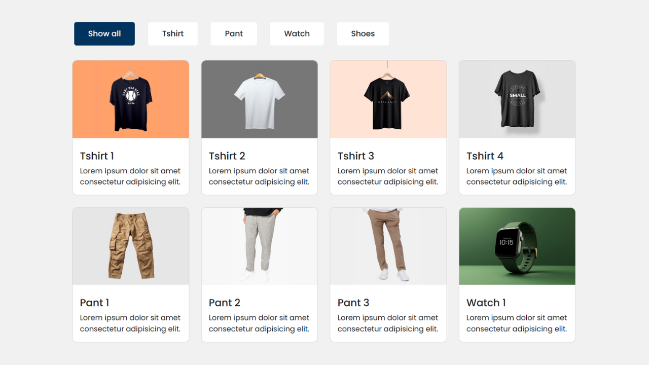
Creating a stunning filterable image gallery using Bootstrap is a fantastic way to showcase a collection of images in an organized and interactive manner. Whether you’re a photographer looking to display your portfolio or a business wanting to highlight product images, a filterable image gallery design can enhance user experience and improve engagement. This guide will walk you through building your image gallery with Bootstrap, making the process simple and enjoyable.
Understanding the Basics of Bootstrap
Bootstrap is a robust front-end framework designed to help you build responsive websites quickly and efficiently. It offers a wide array of pre-designed CSS and JavaScript components that enable you to create modern, user-friendly web interfaces without starting from scratch.
One of Bootstrap’s key features is its grid system, which allows you to design fluid layouts that adjust seamlessly across different screen sizes. This ensures your website remains accessible and visually appealing, whether viewed on a desktop, tablet, or smartphone.
Additionally, Bootstrap includes various utility classes that simplify everyday tasks like spacing, alignment, and typography, making the design process smoother and more intuitive.
Check Out Those Useful Articles
Setting Up Your Bootstrap Environment
Begin by downloading Bootstrap from its official website or including it via a CDN link in your HTML file. Ensure that both the Bootstrap CSS and JS files are linked correctly in your document to access the framework’s styles and scripts. This setup is vital for leveraging Bootstrap’s capabilities.
Steps to Build a Filterable Image Gallery
To Build a Filterable Image Gallery follow these steps:
- Create a Folder: Name this folder according to your preference. Inside this folder, you’ll need to set up the following files:
- Create an index.html File: This file should be named index with the .html extension.
- Create a style.css File: This file should be named style with the .css extension.
- Creat a main.js file: This file name should be main with .js extension.
These files will form the basis of your Filterable Image Gallery.
Designing the HTML Structure of the Gallery
Start by setting up the HTML structure of your image gallery using Bootstrap’s grid system. Create a container to hold your entire gallery. Inside this container, add a row element to arrange your images. Each image should be placed within a column, using Bootstrap’s col classes to define the width. For instance, you could use col-md-4 to display three images per row on medium-sized screens.
Assign data attributes to your images to enable filtering. Each image element should have a unique identifier or belong to a specific category. This way, when users select a filter option, the JavaScript code can quickly identify and display the corresponding images.
Additionally, incorporate Bootstrap’s responsive classes to ensure your gallery looks great on all devices. Using the img-fluid class for your images ensures they scale correctly within their parent containers. This structured approach keeps your HTML clean and makes managing and updating your gallery easier.
Now, open your code editor and set up a new HTML file, copy those HTML Codes and Paste those Codes on index.html file.
					<!DOCTYPE html>
<html lang="en" dir="ltr">
  <head>
    <meta charset="utf-8" />
    <title>Bootstrap Filterable Image Gallery Design by AbdulDev</title>
    <link rel="stylesheet" href="style.css" />
    <meta name="viewport" content="width=device-width, initial-scale=1.0" />
    <link rel="stylesheet" href="https://cdn.jsdelivr.net/npm/bootstrap@5.3.0-alpha2/dist/css/bootstrap.min.css" />
  </head>
  <body>
    <div class="container">

      <div class="row mt-5" id="filter-buttons">
        <div class="col-12">
          <button class="btn mb-2 me-1 gap-4 active" data-filter="all">Show all</button>
          <button class="btn mb-2 mx-1" data-filter="tshirt">Tshirt</button>
          <button class="btn mb-2 mx-1" data-filter="pant">Pant</button>
          <button class="btn mb-2 mx-1" data-filter="watch">Watch</button>
          <button class="btn mb-2 mx-1" data-filter="shoes">Shoes</button>
        </div>
      </div>


      <div class="row px-2 mt-4 gap-3" id="filterable-cards">
        <div class="card p-0" data-name="tshirt">
          <img data-lazyloaded="1" src="data:image/gif;base64,R0lGODdhAQABAPAAAMPDwwAAACwAAAAAAQABAAACAkQBADs=" decoding="async" data-src="images/Tshirt-1.png" alt="img" />
          <div class="card-body">
            <h6 class="card-title">Tshirt 1</h6>
            <p class="card-text">Lorem ipsum dolor sit amet consectetur adipisicing elit.</p>
          </div>
        </div>
        <div class="card p-0" data-name="tshirt">
          <img data-lazyloaded="1" src="data:image/gif;base64,R0lGODdhAQABAPAAAMPDwwAAACwAAAAAAQABAAACAkQBADs=" decoding="async" data-src="images/Tshirt-2.png" alt="img" />
          <div class="card-body">
            <h6 class="card-title">Tshirt 2</h6>
            <p class="card-text">Lorem ipsum dolor sit amet consectetur adipisicing elit.</p>
          </div>
        </div>
        <div class="card p-0" data-name="tshirt">
          <img data-lazyloaded="1" src="data:image/gif;base64,R0lGODdhAQABAPAAAMPDwwAAACwAAAAAAQABAAACAkQBADs=" decoding="async" data-src="images/Tshirt-3.png" alt="img" />
          <div class="card-body">
            <h6 class="card-title">Tshirt 3</h6>
            <p class="card-text">Lorem ipsum dolor sit amet consectetur adipisicing elit.</p>
          </div>
        </div>
        <div class="card p-0" data-name="tshirt">
          <img data-lazyloaded="1" src="data:image/gif;base64,R0lGODdhAQABAPAAAMPDwwAAACwAAAAAAQABAAACAkQBADs=" decoding="async" data-src="images/Tshirt-4.png" alt="img" />
          <div class="card-body">
            <h6 class="card-title">Tshirt 4</h6>
            <p class="card-text">Lorem ipsum dolor sit amet consectetur adipisicing elit.</p>
          </div>
        </div>

        <div class="card p-0" data-name="pant">
          <img data-lazyloaded="1" src="data:image/gif;base64,R0lGODdhAQABAPAAAMPDwwAAACwAAAAAAQABAAACAkQBADs=" decoding="async" data-src="images/Pant-1.png" alt="img" />
          <div class="card-body">
            <h6 class="card-title">Pant 1</h6>
            <p class="card-text">Lorem ipsum dolor sit amet consectetur adipisicing elit.</p>
          </div>
        </div>
        <div class="card p-0" data-name="pant">
          <img data-lazyloaded="1" src="data:image/gif;base64,R0lGODdhAQABAPAAAMPDwwAAACwAAAAAAQABAAACAkQBADs=" decoding="async" data-src="images/Pant-2.png" alt="img" />
          <div class="card-body">
            <h6 class="card-title">Pant 2</h6>
            <p class="card-text">Lorem ipsum dolor sit amet consectetur adipisicing elit.</p>
          </div>
        </div>
        <div class="card p-0" data-name="pant">
          <img data-lazyloaded="1" src="data:image/gif;base64,R0lGODdhAQABAPAAAMPDwwAAACwAAAAAAQABAAACAkQBADs=" decoding="async" data-src="images/Pant-3.png" alt="img" />
          <div class="card-body">
            <h6 class="card-title">Pant 3</h6>
            <p class="card-text">Lorem ipsum dolor sit amet consectetur adipisicing elit.</p>
          </div>
        </div>

        <div class="card p-0" data-name="watch">
          <img data-lazyloaded="1" src="data:image/gif;base64,R0lGODdhAQABAPAAAMPDwwAAACwAAAAAAQABAAACAkQBADs=" decoding="async" data-src="images/Watch-1.png" alt="img" />
          <div class="card-body">
            <h6 class="card-title">Watch 1</h6>
            <p class="card-text">Lorem ipsum dolor sit amet consectetur adipisicing elit.</p>
          </div>
        </div>
        <div class="card p-0" data-name="watch">
          <img data-lazyloaded="1" src="data:image/gif;base64,R0lGODdhAQABAPAAAMPDwwAAACwAAAAAAQABAAACAkQBADs=" decoding="async" data-src="images/Watch-2.png" alt="img" />
          <div class="card-body">
            <h6 class="card-title">Watch 2</h6>
            <p class="card-text">Lorem ipsum dolor sit amet consectetur adipisicing elit.</p>
          </div>
        </div>

        <div class="card p-0" data-name="shoes">
          <img data-lazyloaded="1" src="data:image/gif;base64,R0lGODdhAQABAPAAAMPDwwAAACwAAAAAAQABAAACAkQBADs=" decoding="async" data-src="images/Shoes-1.png" alt="img" />
          <div class="card-body">
            <h6 class="card-title">Shoes 1</h6>
            <p class="card-text">Lorem ipsum dolor sit amet consectetur adipisicing elit.</p>
          </div>
        </div>
        <div class="card p-0" data-name="shoes">
          <img data-lazyloaded="1" src="data:image/gif;base64,R0lGODdhAQABAPAAAMPDwwAAACwAAAAAAQABAAACAkQBADs=" decoding="async" data-src="images/Shoes-2.png" alt="img" />
          <div class="card-body">
            <h6 class="card-title">Shoes 2</h6>
            <p class="card-text">Lorem ipsum dolor sit amet consectetur adipisicing elit.</p>
          </div>
        </div>
        <div class="card p-0" data-name="shoes">
          <img data-lazyloaded="1" src="data:image/gif;base64,R0lGODdhAQABAPAAAMPDwwAAACwAAAAAAQABAAACAkQBADs=" decoding="async" data-src="images/Shoes-3.png" alt="img" />
          <div class="card-body">
            <h6 class="card-title">Shoes 3</h6>
            <p class="card-text">Lorem ipsum dolor sit amet consectetur adipisicing elit.</p>
          </div>
        </div>

      </div>
    </div> <script src="main.js" defer></script> <script data-no-optimize="1">window.lazyLoadOptions=Object.assign({},{threshold:300},window.lazyLoadOptions||{});!function(t,e){"object"==typeof exports&&"undefined"!=typeof module?module.exports=e():"function"==typeof define&&define.amd?define(e):(t="undefined"!=typeof globalThis?globalThis:t||self).LazyLoad=e()}(this,function(){"use strict";function e(){return(e=Object.assign||function(t){for(var e=1;e<arguments.length;e++){var n,a=arguments[e];for(n in a)Object.prototype.hasOwnProperty.call(a,n)&&(t[n]=a[n])}return t}).apply(this,arguments)}function o(t){return e({},at,t)}function l(t,e){return t.getAttribute(gt+e)}function c(t){return l(t,vt)}function s(t,e){return function(t,e,n){e=gt+e;null!==n?t.setAttribute(e,n):t.removeAttribute(e)}(t,vt,e)}function i(t){return s(t,null),0}function r(t){return null===c(t)}function u(t){return c(t)===_t}function d(t,e,n,a){t&&(void 0===a?void 0===n?t(e):t(e,n):t(e,n,a))}function f(t,e){et?t.classList.add(e):t.className+=(t.className?" ":"")+e}function _(t,e){et?t.classList.remove(e):t.className=t.className.replace(new RegExp("(^|\\s+)"+e+"(\\s+|$)")," ").replace(/^\s+/,"").replace(/\s+$/,"")}function g(t){return t.llTempImage}function v(t,e){!e||(e=e._observer)&&e.unobserve(t)}function b(t,e){t&&(t.loadingCount+=e)}function p(t,e){t&&(t.toLoadCount=e)}function n(t){for(var e,n=[],a=0;e=t.children[a];a+=1)"SOURCE"===e.tagName&&n.push(e);return n}function h(t,e){(t=t.parentNode)&&"PICTURE"===t.tagName&&n(t).forEach(e)}function a(t,e){n(t).forEach(e)}function m(t){return!!t[lt]}function E(t){return t[lt]}function I(t){return delete t[lt]}function y(e,t){var n;m(e)||(n={},t.forEach(function(t){n[t]=e.getAttribute(t)}),e[lt]=n)}function L(a,t){var o;m(a)&&(o=E(a),t.forEach(function(t){var e,n;e=a,(t=o[n=t])?e.setAttribute(n,t):e.removeAttribute(n)}))}function k(t,e,n){f(t,e.class_loading),s(t,st),n&&(b(n,1),d(e.callback_loading,t,n))}function A(t,e,n){n&&t.setAttribute(e,n)}function O(t,e){A(t,rt,l(t,e.data_sizes)),A(t,it,l(t,e.data_srcset)),A(t,ot,l(t,e.data_src))}function w(t,e,n){var a=l(t,e.data_bg_multi),o=l(t,e.data_bg_multi_hidpi);(a=nt&&o?o:a)&&(t.style.backgroundImage=a,n=n,f(t=t,(e=e).class_applied),s(t,dt),n&&(e.unobserve_completed&&v(t,e),d(e.callback_applied,t,n)))}function x(t,e){!e||0<e.loadingCount||0<e.toLoadCount||d(t.callback_finish,e)}function M(t,e,n){t.addEventListener(e,n),t.llEvLisnrs[e]=n}function N(t){return!!t.llEvLisnrs}function z(t){if(N(t)){var e,n,a=t.llEvLisnrs;for(e in a){var o=a[e];n=e,o=o,t.removeEventListener(n,o)}delete t.llEvLisnrs}}function C(t,e,n){var a;delete t.llTempImage,b(n,-1),(a=n)&&--a.toLoadCount,_(t,e.class_loading),e.unobserve_completed&&v(t,n)}function R(i,r,c){var l=g(i)||i;N(l)||function(t,e,n){N(t)||(t.llEvLisnrs={});var a="VIDEO"===t.tagName?"loadeddata":"load";M(t,a,e),M(t,"error",n)}(l,function(t){var e,n,a,o;n=r,a=c,o=u(e=i),C(e,n,a),f(e,n.class_loaded),s(e,ut),d(n.callback_loaded,e,a),o||x(n,a),z(l)},function(t){var e,n,a,o;n=r,a=c,o=u(e=i),C(e,n,a),f(e,n.class_error),s(e,ft),d(n.callback_error,e,a),o||x(n,a),z(l)})}function T(t,e,n){var a,o,i,r,c;t.llTempImage=document.createElement("IMG"),R(t,e,n),m(c=t)||(c[lt]={backgroundImage:c.style.backgroundImage}),i=n,r=l(a=t,(o=e).data_bg),c=l(a,o.data_bg_hidpi),(r=nt&&c?c:r)&&(a.style.backgroundImage='url("'.concat(r,'")'),g(a).setAttribute(ot,r),k(a,o,i)),w(t,e,n)}function G(t,e,n){var a;R(t,e,n),a=e,e=n,(t=Et[(n=t).tagName])&&(t(n,a),k(n,a,e))}function D(t,e,n){var a;a=t,(-1<It.indexOf(a.tagName)?G:T)(t,e,n)}function S(t,e,n){var a;t.setAttribute("loading","lazy"),R(t,e,n),a=e,(e=Et[(n=t).tagName])&&e(n,a),s(t,_t)}function V(t){t.removeAttribute(ot),t.removeAttribute(it),t.removeAttribute(rt)}function j(t){h(t,function(t){L(t,mt)}),L(t,mt)}function F(t){var e;(e=yt[t.tagName])?e(t):m(e=t)&&(t=E(e),e.style.backgroundImage=t.backgroundImage)}function P(t,e){var n;F(t),n=e,r(e=t)||u(e)||(_(e,n.class_entered),_(e,n.class_exited),_(e,n.class_applied),_(e,n.class_loading),_(e,n.class_loaded),_(e,n.class_error)),i(t),I(t)}function U(t,e,n,a){var o;n.cancel_on_exit&&(c(t)!==st||"IMG"===t.tagName&&(z(t),h(o=t,function(t){V(t)}),V(o),j(t),_(t,n.class_loading),b(a,-1),i(t),d(n.callback_cancel,t,e,a)))}function $(t,e,n,a){var o,i,r=(i=t,0<=bt.indexOf(c(i)));s(t,"entered"),f(t,n.class_entered),_(t,n.class_exited),o=t,i=a,n.unobserve_entered&&v(o,i),d(n.callback_enter,t,e,a),r||D(t,n,a)}function q(t){return t.use_native&&"loading"in HTMLImageElement.prototype}function H(t,o,i){t.forEach(function(t){return(a=t).isIntersecting||0<a.intersectionRatio?$(t.target,t,o,i):(e=t.target,n=t,a=o,t=i,void(r(e)||(f(e,a.class_exited),U(e,n,a,t),d(a.callback_exit,e,n,t))));var e,n,a})}function B(e,n){var t;tt&&!q(e)&&(n._observer=new IntersectionObserver(function(t){H(t,e,n)},{root:(t=e).container===document?null:t.container,rootMargin:t.thresholds||t.threshold+"px"}))}function J(t){return Array.prototype.slice.call(t)}function K(t){return t.container.querySelectorAll(t.elements_selector)}function Q(t){return c(t)===ft}function W(t,e){return e=t||K(e),J(e).filter(r)}function X(e,t){var n;(n=K(e),J(n).filter(Q)).forEach(function(t){_(t,e.class_error),i(t)}),t.update()}function t(t,e){var n,a,t=o(t);this._settings=t,this.loadingCount=0,B(t,this),n=t,a=this,Y&&window.addEventListener("online",function(){X(n,a)}),this.update(e)}var Y="undefined"!=typeof window,Z=Y&&!("onscroll"in window)||"undefined"!=typeof navigator&&/(gle|ing|ro)bot|crawl|spider/i.test(navigator.userAgent),tt=Y&&"IntersectionObserver"in window,et=Y&&"classList"in document.createElement("p"),nt=Y&&1<window.devicePixelRatio,at={elements_selector:".lazy",container:Z||Y?document:null,threshold:300,thresholds:null,data_src:"src",data_srcset:"srcset",data_sizes:"sizes",data_bg:"bg",data_bg_hidpi:"bg-hidpi",data_bg_multi:"bg-multi",data_bg_multi_hidpi:"bg-multi-hidpi",data_poster:"poster",class_applied:"applied",class_loading:"litespeed-loading",class_loaded:"litespeed-loaded",class_error:"error",class_entered:"entered",class_exited:"exited",unobserve_completed:!0,unobserve_entered:!1,cancel_on_exit:!0,callback_enter:null,callback_exit:null,callback_applied:null,callback_loading:null,callback_loaded:null,callback_error:null,callback_finish:null,callback_cancel:null,use_native:!1},ot="src",it="srcset",rt="sizes",ct="poster",lt="llOriginalAttrs",st="loading",ut="loaded",dt="applied",ft="error",_t="native",gt="data-",vt="ll-status",bt=[st,ut,dt,ft],pt=[ot],ht=[ot,ct],mt=[ot,it,rt],Et={IMG:function(t,e){h(t,function(t){y(t,mt),O(t,e)}),y(t,mt),O(t,e)},IFRAME:function(t,e){y(t,pt),A(t,ot,l(t,e.data_src))},VIDEO:function(t,e){a(t,function(t){y(t,pt),A(t,ot,l(t,e.data_src))}),y(t,ht),A(t,ct,l(t,e.data_poster)),A(t,ot,l(t,e.data_src)),t.load()}},It=["IMG","IFRAME","VIDEO"],yt={IMG:j,IFRAME:function(t){L(t,pt)},VIDEO:function(t){a(t,function(t){L(t,pt)}),L(t,ht),t.load()}},Lt=["IMG","IFRAME","VIDEO"];return t.prototype={update:function(t){var e,n,a,o=this._settings,i=W(t,o);{if(p(this,i.length),!Z&&tt)return q(o)?(e=o,n=this,i.forEach(function(t){-1!==Lt.indexOf(t.tagName)&&S(t,e,n)}),void p(n,0)):(t=this._observer,o=i,t.disconnect(),a=t,void o.forEach(function(t){a.observe(t)}));this.loadAll(i)}},destroy:function(){this._observer&&this._observer.disconnect(),K(this._settings).forEach(function(t){I(t)}),delete this._observer,delete this._settings,delete this.loadingCount,delete this.toLoadCount},loadAll:function(t){var e=this,n=this._settings;W(t,n).forEach(function(t){v(t,e),D(t,n,e)})},restoreAll:function(){var e=this._settings;K(e).forEach(function(t){P(t,e)})}},t.load=function(t,e){e=o(e);D(t,e)},t.resetStatus=function(t){i(t)},t}),function(t,e){"use strict";function n(){e.body.classList.add("litespeed_lazyloaded")}function a(){console.log("[LiteSpeed] Start Lazy Load"),o=new LazyLoad(Object.assign({},t.lazyLoadOptions||{},{elements_selector:"[data-lazyloaded]",callback_finish:n})),i=function(){o.update()},t.MutationObserver&&new MutationObserver(i).observe(e.documentElement,{childList:!0,subtree:!0,attributes:!0})}var o,i;t.addEventListener?t.addEventListener("load",a,!1):t.attachEvent("onload",a)}(window,document);</script><script data-no-optimize="1">window.litespeed_ui_events=window.litespeed_ui_events||["mouseover","click","keydown","wheel","touchmove","touchstart"];var urlCreator=window.URL||window.webkitURL;function litespeed_load_delayed_js_force(){console.log("[LiteSpeed] Start Load JS Delayed"),litespeed_ui_events.forEach(e=>{window.removeEventListener(e,litespeed_load_delayed_js_force,{passive:!0})}),document.querySelectorAll("iframe[data-litespeed-src]").forEach(e=>{e.setAttribute("src",e.getAttribute("data-litespeed-src"))}),"loading"==document.readyState?window.addEventListener("DOMContentLoaded",litespeed_load_delayed_js):litespeed_load_delayed_js()}litespeed_ui_events.forEach(e=>{window.addEventListener(e,litespeed_load_delayed_js_force,{passive:!0})});async function litespeed_load_delayed_js(){let t=[];for(var d in document.querySelectorAll('script[type="litespeed/javascript"]').forEach(e=>{t.push(e)}),t)await new Promise(e=>litespeed_load_one(t[d],e));document.dispatchEvent(new Event("DOMContentLiteSpeedLoaded")),window.dispatchEvent(new Event("DOMContentLiteSpeedLoaded"))}function litespeed_load_one(t,e){console.log("[LiteSpeed] Load ",t);var d=document.createElement("script");d.addEventListener("load",e),d.addEventListener("error",e),t.getAttributeNames().forEach(e=>{"type"!=e&&d.setAttribute("data-src"==e?"src":e,t.getAttribute(e))});let a=!(d.type="text/javascript");!d.src&&t.textContent&&(d.src=litespeed_inline2src(t.textContent),a=!0),t.after(d),t.remove(),a&&e()}function litespeed_inline2src(t){try{var d=urlCreator.createObjectURL(new Blob([t.replace(/^(?:<!--)?(.*?)(?:-->)?$/gm,"$1")],{type:"text/javascript"}))}catch(e){d="data:text/javascript;base64,"+btoa(t.replace(/^(?:<!--)?(.*?)(?:-->)?$/gm,"$1"))}return d}</script><script data-no-optimize="1">var litespeed_vary=document.cookie.replace(/(?:(?:^|.*;\s*)_lscache_vary\s*\=\s*([^;]*).*$)|^.*$/,"");litespeed_vary||(sessionStorage.getItem("litespeed_reloaded")?console.log("LiteSpeed: skipping guest vary reload (already reloaded this session)"):fetch("/wp-content/plugins/litespeed-cache/guest.vary.php",{method:"POST",cache:"no-cache",redirect:"follow"}).then(e=>e.json()).then(e=>{console.log(e),e.hasOwnProperty("reload")&&"yes"==e.reload&&(sessionStorage.setItem("litespeed_docref",document.referrer),sessionStorage.setItem("litespeed_reloaded","1"),window.location.reload(!0))}));</script><script data-optimized="1" type="litespeed/javascript" data-src="https://abduldev.com/wp-content/litespeed/js/e13a6dfaa5c84b5dddd99653146bc623.js?ver=17e9c"></script></body>
</html>
Applying CSS Styles for Visual Appeal
While Bootstrap provides a solid foundation for styling, adding custom CSS can significantly elevate the visual appeal of your gallery. Customize hover effects and transitions to make interactions more engaging.
Use CSS to fine-tune spacing, alignment, and color schemes, ensuring a cohesive look that matches your brand or personal aesthetic. Consider adding subtle animations to make your gallery more dynamic. You can also customize the appearance of the filter buttons to make them stand out, using techniques like border-radius, box-shadow, and custom fonts.
By incorporating these CSS enhancements, you can create a filterable image gallery that is not only functional but also visually captivating.
After that, copy those CSS Codes and Paste those Codes on style.css file.
					@import url('https://fonts.googleapis.com/css2?family=Poppins:wght@400;500;600&display=swap');

* {
  font-family: "Poppins", sans-serif;
}

body {
  background: #f1f1f1 !important;
}

body .container {
  max-width: 1140px;
  padding: 70px 20px;
}

#filter-buttons button {
  font-size: 17px;
  font-weight: 500;
  padding: 12px 30px;
  border-radius: 5px;
  background: #fff;
  border-color: transparent;
  margin-right: 20px !important;
  margin-top: 20px !important;
  transition: 0.5s !important;
}

#filter-buttons button:hover {
  background: #01335f;
  color: #fff;
}

#filter-buttons button.active {
  color: #fff;
  background: #01335f;
}
#filterable-cards .card {
  width: 15.9rem;
  border-radius: 10px;
  overflow: hidden;
  margin-right: 10px;
  margin-bottom: 10px;
}
.card img{
  width: 100%;
  border-radius: 10px 10px 0 0;
  transition: 0.5s;
}
.card img:hover{
  transform: scale(1.1);
  cursor: pointer;
}
.card .card-title{
  font-size: 22px;
  padding-top: 10px;
}
#filterable-cards .card.hide {
  display: none;
}

@media (max-width: 600px) {
  #filterable-cards {
    justify-content: center;
  }

  #filterable-cards .card {
    width: calc(100% / 2 - 10px);
    margin: 0;
  }
  .card .card-title{
    font-size: 18px;
    padding-top: 10px;
  }
  .card .card-text{
    font-size: 14px;
  }
  #filter-buttons button {
    margin-right: 10px !important;
    margin-top: 10px !important;
  }
}
Implementing Filterable Categories with JavaScript
To implement filterable categories in your image gallery, you will utilize JavaScript to manage the visibility of images based on the selected category. Begin by assigning unique data attributes to each image, indicating its category. Next, create filter buttons that users can click to choose different categories. Attach event listeners to these buttons to trigger a function to filter the images when clicked.
In your JavaScript code, define a function that reads the data attribute of each image and compares it with the selected category. Use the `classList` property to add or remove classes that control the display of each image. For example, you can add a class like ‘hidden’ to images that do not match the selected category, hiding them from view. Conversely, remove the ‘hidden’ class from images that match the chosen category, making them visible.
To enhance user experience, consider adding animations to the filtering process. For instance, you can use CSS transitions to fade images in and out as they are filtered smoothly. This creates a more engaging and dynamic interaction for users.
By effectively leveraging JavaScript, you can create a robust and interactive filterable image gallery that allows users to easily navigate through different categories, enhancing your gallery’s overall usability and appeal.
Finally, copy those JavaScript Codes and Paste those Codes on main.js file.
					// Select relevant HTML elements
const filterButtons = document.querySelectorAll("#filter-buttons button");
const filterableCards = document.querySelectorAll("#filterable-cards .card");

// Function to filter cards based on filter buttons
const filterCards = (e) => {
    document.querySelector("#filter-buttons .active").classList.remove("active");
    e.target.classList.add("active");

    filterableCards.forEach(card => {
        // show the card if it matches the clicked filter or show all cards if "all" filter is clicked
        if(card.dataset.name === e.target.dataset.filter || e.target.dataset.filter === "all") {
            return card.classList.replace("hide", "show");
        }
        card.classList.add("hide");
    });
}

filterButtons.forEach(button => button.addEventListener("click", filterCards));
Optimizing for Performance and Accessibility
Optimizing your filterable image gallery for performance and accessibility is vital for providing an excellent user experience. Compress images to reduce file sizes and improve load times, which is especially important for users with slower internet connections. Implement lazy loading to delay the loading of images until they enter the viewport, further enhancing page speed.
Use semantic HTML to ensure your content is meaningful and more accessible for search engines and assistive technologies to understand. Adding ARIA (Accessible Rich Internet Applications) attributes to your elements can improve accessibility for users relying on screen readers. For instance, using `aria-label` or `aria-described by` can provide additional context for your images and buttons.
Ensure your gallery is keyboard navigable by allowing users to move through images and interact with filter buttons using the keyboard. Test your design with various screen readers to confirm all content is accessible and easily navigable.
Consider implementing responsive design practices to ensure your gallery looks great and functions well on all devices. Use media queries to adjust the layout for different screen sizes and ensure that text and interactive elements are appropriately sized and spaced for touch interactions on mobile devices.
By addressing these performance and accessibility aspects, you can create an inclusive, fast, and user-friendly filterable image gallery that provides a better overall experience for all users.
Testing and Debugging Your Image Gallery
Conduct thorough testing across multiple browsers and devices to ensure your filterable image gallery operates seamlessly. Start by verifying that your layout remains consistent and visually appealing regardless of screen size or browser type. Pay close attention to any discrepancies in spacing, alignment, or responsiveness.
Next, interact with all filter buttons to confirm they accurately display the corresponding images. This includes testing different categories and combinations to ensure images are present and correctly displayed.
Use browser developer tools to check for JavaScript errors. Open the console to identify and resolve any scripting issues affecting functionality. Also, test the performance of your gallery, primarily if you have implemented lazy loading. Ensure images load quickly as users scroll through the gallery.
In addition to functionality, evaluate your gallery’s accessibility. Navigate through the gallery using only the keyboard to confirm that all interactive elements are reachable and operable. Use screen reader software to ensure descriptive labels and alternative texts are appropriately conveyed to visually impaired users.
For a more comprehensive testing process, solicit feedback from a diverse group of users. Gather insights on usability, appearance, and any potential issues they encounter. This can help you identify and address problems you have missed.
By diligently testing and debugging your image gallery, you can provide all users with a polished, enjoyable experience.
Conclusion
By following this guide, you’ve learned how to set up your Bootstrap environment, design the HTML structure of your image gallery, and apply CSS styles to enhance its visual appeal. Using Bootstrap components, you’ve also implemented filterable categories with JavaScript and added interactive features like modals and carousels. Remember, optimizing for performance and accessibility ensures your gallery is user-friendly and inclusive. Thorough testing and debugging guarantee a seamless experience across all devices and browsers. Don’t hesitate to experiment with various styles and interactive elements to make your gallery unique. With these tools and techniques, you can confidently create a filterable image gallery that showcases your images effectively and captivates and engages your audience.
FAQs
What is a filterable image gallery in Bootstrap?
A filterable image gallery is a dynamic gallery where users can view images organized by categories or tags. Using Bootstrap’s responsive grid system and JavaScript filters, users can easily select categories to display only relevant photos.
What are the critical components needed to create a filterable gallery?
The key components include Bootstrap for the grid layout, buttons or tabs for the filter categories, JavaScript (or jQuery) for the filter functionality, and images organized by relevant tags or classes.
Can I use Bootstrap’s built-in grid system to create the gallery layout?
Bootstrap’s grid system is perfect for creating a responsive gallery layout. You can use col classes (like col-md-4) to define the number of columns based on screen size, allowing the gallery to adapt to different devices.
How do I add filter buttons for the gallery?
Create buttons or tabs with unique data attributes or IDs for each category. When clicking a button, JavaScript filters the images by showing only those associated with the selected category.
What JavaScript code is needed to make the gallery filterable?
You can use JavaScript or jQuery to add click events to each filter button. When clicked, a button hides images that don’t belong to the selected category and shows only the relevant ones.
How can I make the gallery responsive?
Bootstrap’s grid system is responsive by design. Ensure you’re using appropriate column classes (col-, col-md-, etc.) and test the layout on different screen sizes to adjust as needed for optimal responsiveness.
Can I add animation to the filter transitions?
Yes, CSS animations can be applied to image elements to add a fade or slide effect when switching filters. This improves the user experience by making transitions smoother.
How do I organize images into categories?
Assign each image an HTML class or data attribute that matches the category name. This will make it easy for JavaScript to identify and display images based on the selected filter.
Share on Social Media
Related Articles

Build a Fully Responsive Sidebar with Dropdown Menu – HTML, CSS & JS
Learn how to build a fully responsive sidebar with dropdown menus using HTML, CSS, and JavaScript. Step-by-step guide with code
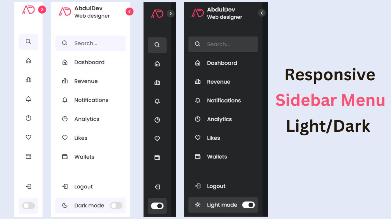
Responsive Sidebar Menu in HTML, CSS & JS | Light/Dark Mode
Learn how to create a modern responsive sidebar menu with a light and dark theme switcher using HTML, CSS, and
Amazing Button Hover Effect Using HTML, CSS, and JavaScript
Discover how to create amazing button hover effects using HTML, CSS, and JavaScript. Learn step-by-step with free source code to

