
Create a Responsive Website: Integrate Login and Registration Form
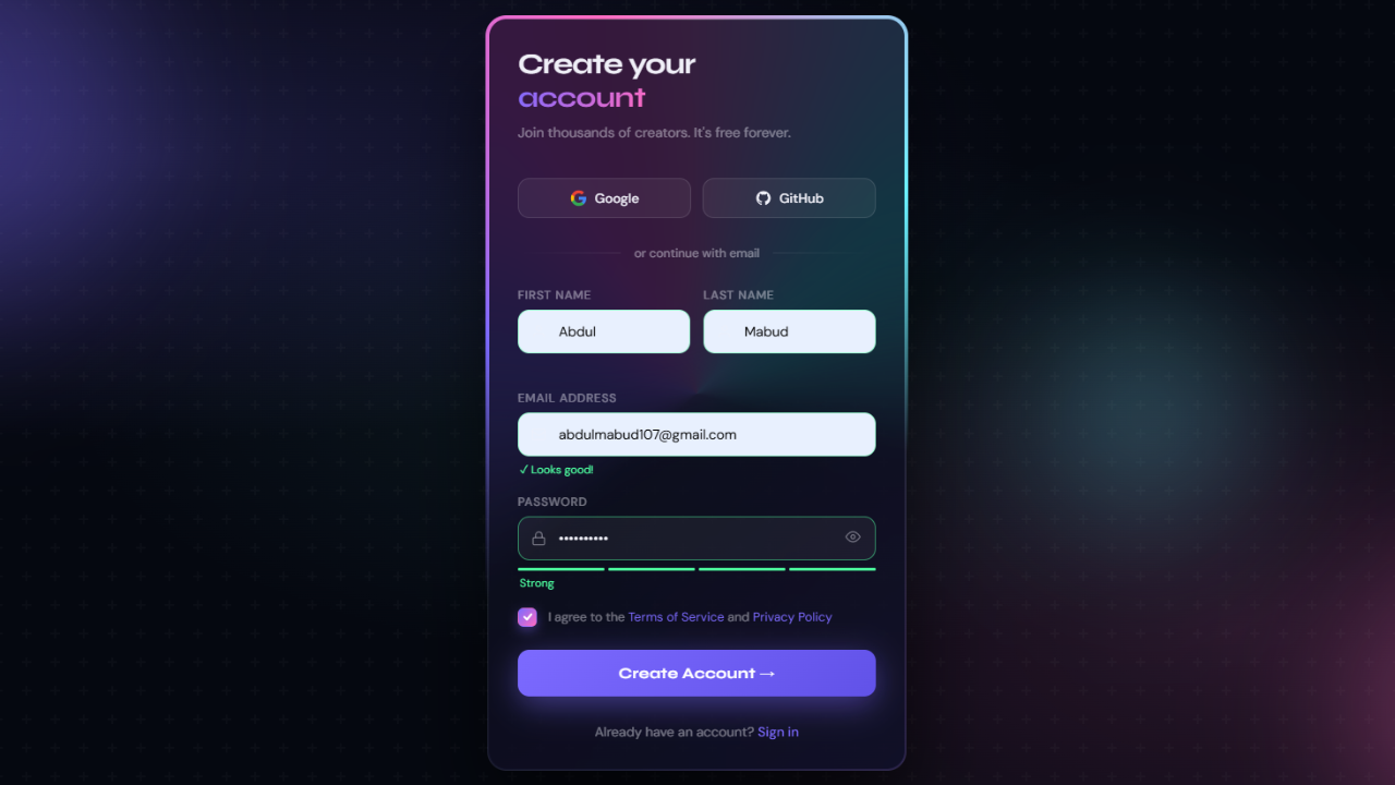
Creating a website has become essential to establishing an online presence for any business or individual. However, with the increasing use of mobile devices, it is crucial to have a responsive website that can adapt to different screen sizes and devices. In addition to responsiveness, integrating a login and registration form on your website is vital for user engagement and data collection. By allowing users to create accounts, you can personalize their experience on your website and gather valuable information for marketing purposes.
This blog post will guide you on creating a responsive website and seamlessly integrate a login and registration form using HTML, CSS, and JavaScript. Whether you are a beginner or an experienced web developer, this step-by-step tutorial will provide the necessary skills to create a user-friendly and functional website. So, let’s get started and take your website to the next level by adding a login and registration form that enhances user experience and boosts your online presence.
Understanding the Basics of Responsive Web Design
Responsive web design is a crucial element in modern web development. It ensures that a website can adapt and provide an optimal viewing experience across various devices, from desktops to smartphones.
This adaptability is essential for user satisfaction and effectively incorporating elements like login and registration forms. Responsive design involves using fluid grids, flexible images, and media queries to adjust the layout and content according to the screen size and resolution.
When integrating a login and registration form into a responsive website, it’s essential to ensure that it is easily accessible and usable on any device. This means considering input field size, button placement, and overall form layout.
A well-designed responsive form will not only make the login and registration process smoother for the user but also enhance your website’s overall usability and accessibility. Employing responsive web design principles allows seamless integration of these essential elements, providing a cohesive and user-friendly experience regardless of how visitors access your site.
By prioritizing responsiveness from the start, you can build a website that effectively meets the needs of a diverse online audience, encouraging user engagement and retention.
Planning Your Website’s Structure and Flow
Before diving into the code, it’s essential to plan the structure and flow of your website meticulously. A well-thought-out plan ensures that the user journey, especially regarding the login and registration form, is smooth and intuitive.
Start by defining the primary purpose of your site and the actions you want users to take. Should the login and registration form be the first thing a visitor sees, or is it better placed as a secondary option? Think about the navigation flow: How will users move from one section to another? Will there be direct links to every page’s login and registration form, or will it be accessible via a dedicated “Account” section? Considering user experience, these forms must be straightforward to find. This means strategically placing them in your website’s architecture and seamlessly integrating them into its overall design.
Additionally, plan how user data from the login and registration form will be managed and utilized to enhance user experience. Mapping out this structure and flow early on will guide the development process, making it easier to create a cohesive and user-friendly website that effectively incorporates the login and registration form and encourages user interaction and engagement.
Check Out Those Useful Articles
Steps to Create a Responsive Website with Login and Registration Form
To create Responsive website with Login and Registration Form follow these steps:
- Create a Folder: Name this folder according to your preference. Inside this folder, you’ll need to set up the following files:
- Create an index.html File: This file should be named index with the .html extension.
- Create a style.css File: This file should be named style with the .css extension.
- Creat a main.js file: This file name should be main with .js extension.
These files will form the basis of your Responsive Website with Login and Registration form.
Setting Up the Basic HTML Structure
Set up the basic HTML structure to lay the foundation for integrating the login and registration form into your responsive website. This foundational step is critical in ensuring that the subsequent elements, especially your forms, are correctly organized and function cohesively within the website’s framework.
Start with a simple “ declaration to define the document type, followed by the “ tag to encapsulate all your content. Inside the “ tag, include a “ section where you’ll link your CSS files for styling and set meta tags for responsiveness, such as “. This tag is crucial for ensuring your site is mobile-friendly and that your login and registration form display correctly across all devices.
Next, within the “ tag, it’s time to structure the containers that will hold your login and registration form. Use “ elements to create sections for each form, assigning them unique IDs or classes for easy CSS and JavaScript targeting. Remember, the goal is to ensure these forms are functional and seamlessly integrated into the overall design, making the user’s navigation and interaction as intuitive as possible.
While this section sets the stage for the detailed work, it’s the bedrock upon which the user experience is built, especially concerning the integration of login and registration forms. Properly setting up your HTML structure is pivotal in creating a responsive and user-friendly website.
Copy the below code and Paste it in the index.html File.
<!DOCTYPE html>
<html lang="en">
<head>
<meta charset="UTF-8">
<meta name="viewport" content="width=device-width, initial-scale=1.0">
<title>Website with Login and Signup Form by AbdulDev</title>
<link rel="stylesheet" href="style.css">
</head>
<body>
<header>
<nav class="navbar">
<span class="hamburger-btn material-symbols-rounded">menu</span>
<a href="#" class="logo">
<h2>Abdul<span>Dev</span></h2>
</a>
<ul class="links">
<span class="close-btn material-symbols-rounded">close</span>
<li><a href="#">Home</a></li>
<li><a href="#">Portfolio</a></li>
<li><a href="#">Courses</a></li>
<li><a href="#">About us</a></li>
<li><a href="#">Contact us</a></li>
</ul>
<button class="login-btn">LOG IN</button>
</nav>
</header>
<div class="blur-bg-overlay"></div>
<div class="form-popup">
<span class="close-btn material-symbols-rounded">close</span>
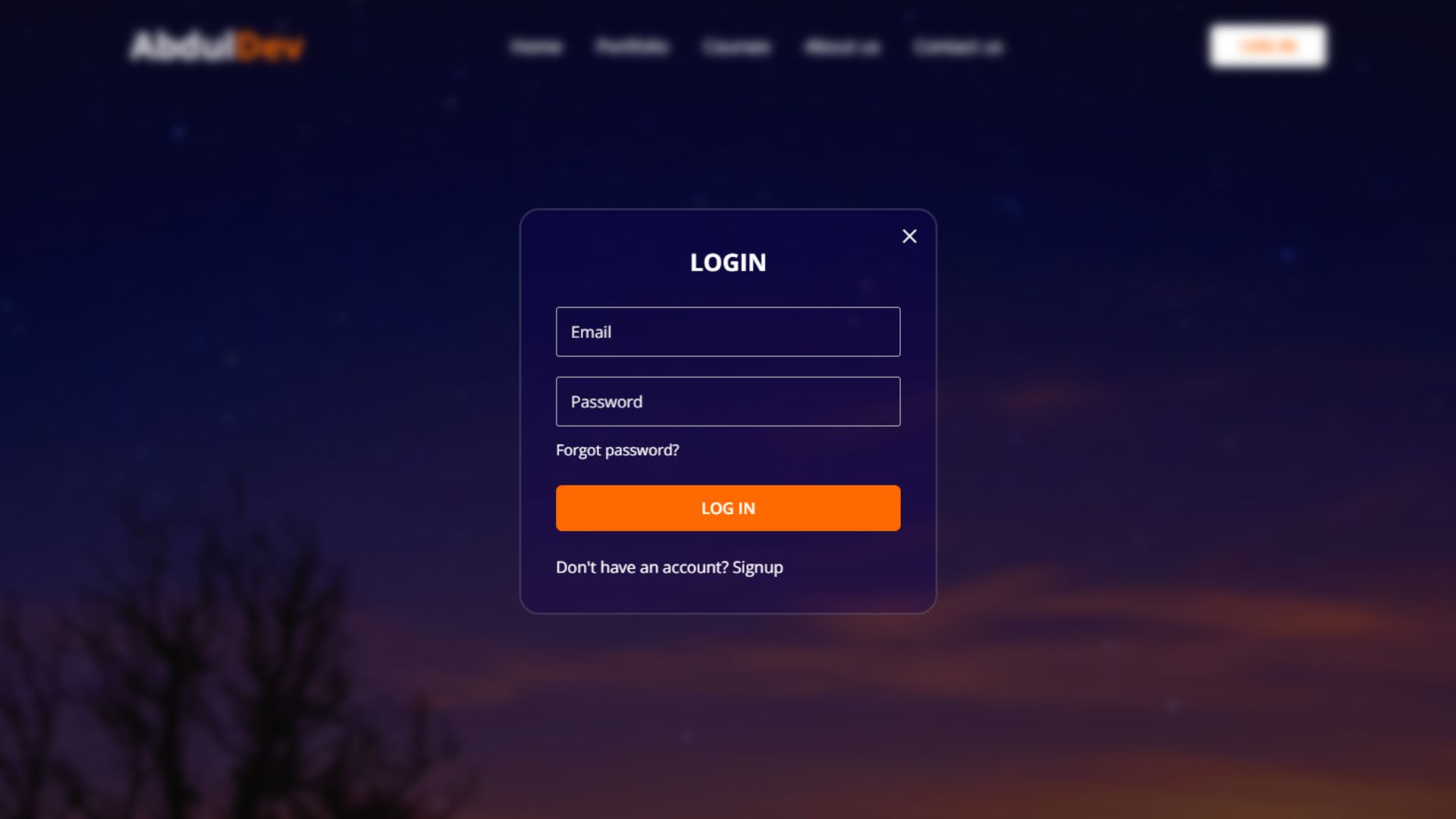
<div class="form-box login">
<div class="form-content">
<h2>LOGIN</h2>
<form action="#">
<div class="input-field">
<input type="email" required>
<label>Email</label>
</div>
<div class="input-field">
<input type="password" required>
<label>Password</label>
</div>
<a href="#" class="forgot-pass-link">Forgot password?</a>
<button type="submit">Log In</button>
<input
class="apbct_special_field apbct_email_id__elementor_form"
name="apbct__email_id__elementor_form"
aria-label="apbct__label_id__elementor_form"
type="text" size="30" maxlength="200" autocomplete="off"
value=""
/></form>
<div class="bottom-link">
<span>Don't have an account?</span>
<a href="#" id="signup-link">Signup</a>
</div>
</div>
</div>
<div class="form-box signup">
<div class="form-content">
<h2>SIGNUP</h2>
<form action="#">
<div class="input-field">
<input type="text" required>
<label>Full Name</label>
</div>
<div class="input-field">
<input type="email" required>
<label>Email</label>
</div>
<div class="input-field">
<input type="password" required>
<label>Create Password</label>
</div>
<div class="policy-text">
<input type="checkbox" id="policy">
<label for="policy">
I agree the
<a href="#" class="option">Terms & Conditions</a>
</label>
</div>
<button type="submit">Sign Up</button>
<input
class="apbct_special_field apbct_email_id__elementor_form"
name="apbct__email_id__elementor_form"
aria-label="apbct__label_id__elementor_form"
type="text" size="30" maxlength="200" autocomplete="off"
value=""
/></form>
<div class="bottom-link">
<span>Already have an account? </span>
<a href="#" id="login-link">Login</a>
</div>
</div>
</div>
</div> <script src="main.js" defer></script> <script data-no-optimize="1">window.lazyLoadOptions=Object.assign({},{threshold:300},window.lazyLoadOptions||{});!function(t,e){"object"==typeof exports&&"undefined"!=typeof module?module.exports=e():"function"==typeof define&&define.amd?define(e):(t="undefined"!=typeof globalThis?globalThis:t||self).LazyLoad=e()}(this,function(){"use strict";function e(){return(e=Object.assign||function(t){for(var e=1;e<arguments.length;e++){var n,a=arguments[e];for(n in a)Object.prototype.hasOwnProperty.call(a,n)&&(t[n]=a[n])}return t}).apply(this,arguments)}function o(t){return e({},at,t)}function l(t,e){return t.getAttribute(gt+e)}function c(t){return l(t,vt)}function s(t,e){return function(t,e,n){e=gt+e;null!==n?t.setAttribute(e,n):t.removeAttribute(e)}(t,vt,e)}function i(t){return s(t,null),0}function r(t){return null===c(t)}function u(t){return c(t)===_t}function d(t,e,n,a){t&&(void 0===a?void 0===n?t(e):t(e,n):t(e,n,a))}function f(t,e){et?t.classList.add(e):t.className+=(t.className?" ":"")+e}function _(t,e){et?t.classList.remove(e):t.className=t.className.replace(new RegExp("(^|\\s+)"+e+"(\\s+|$)")," ").replace(/^\s+/,"").replace(/\s+$/,"")}function g(t){return t.llTempImage}function v(t,e){!e||(e=e._observer)&&e.unobserve(t)}function b(t,e){t&&(t.loadingCount+=e)}function p(t,e){t&&(t.toLoadCount=e)}function n(t){for(var e,n=[],a=0;e=t.children[a];a+=1)"SOURCE"===e.tagName&&n.push(e);return n}function h(t,e){(t=t.parentNode)&&"PICTURE"===t.tagName&&n(t).forEach(e)}function a(t,e){n(t).forEach(e)}function m(t){return!!t[lt]}function E(t){return t[lt]}function I(t){return delete t[lt]}function y(e,t){var n;m(e)||(n={},t.forEach(function(t){n[t]=e.getAttribute(t)}),e[lt]=n)}function L(a,t){var o;m(a)&&(o=E(a),t.forEach(function(t){var e,n;e=a,(t=o[n=t])?e.setAttribute(n,t):e.removeAttribute(n)}))}function k(t,e,n){f(t,e.class_loading),s(t,st),n&&(b(n,1),d(e.callback_loading,t,n))}function A(t,e,n){n&&t.setAttribute(e,n)}function O(t,e){A(t,rt,l(t,e.data_sizes)),A(t,it,l(t,e.data_srcset)),A(t,ot,l(t,e.data_src))}function w(t,e,n){var a=l(t,e.data_bg_multi),o=l(t,e.data_bg_multi_hidpi);(a=nt&&o?o:a)&&(t.style.backgroundImage=a,n=n,f(t=t,(e=e).class_applied),s(t,dt),n&&(e.unobserve_completed&&v(t,e),d(e.callback_applied,t,n)))}function x(t,e){!e||0<e.loadingCount||0<e.toLoadCount||d(t.callback_finish,e)}function M(t,e,n){t.addEventListener(e,n),t.llEvLisnrs[e]=n}function N(t){return!!t.llEvLisnrs}function z(t){if(N(t)){var e,n,a=t.llEvLisnrs;for(e in a){var o=a[e];n=e,o=o,t.removeEventListener(n,o)}delete t.llEvLisnrs}}function C(t,e,n){var a;delete t.llTempImage,b(n,-1),(a=n)&&--a.toLoadCount,_(t,e.class_loading),e.unobserve_completed&&v(t,n)}function R(i,r,c){var l=g(i)||i;N(l)||function(t,e,n){N(t)||(t.llEvLisnrs={});var a="VIDEO"===t.tagName?"loadeddata":"load";M(t,a,e),M(t,"error",n)}(l,function(t){var e,n,a,o;n=r,a=c,o=u(e=i),C(e,n,a),f(e,n.class_loaded),s(e,ut),d(n.callback_loaded,e,a),o||x(n,a),z(l)},function(t){var e,n,a,o;n=r,a=c,o=u(e=i),C(e,n,a),f(e,n.class_error),s(e,ft),d(n.callback_error,e,a),o||x(n,a),z(l)})}function T(t,e,n){var a,o,i,r,c;t.llTempImage=document.createElement("IMG"),R(t,e,n),m(c=t)||(c[lt]={backgroundImage:c.style.backgroundImage}),i=n,r=l(a=t,(o=e).data_bg),c=l(a,o.data_bg_hidpi),(r=nt&&c?c:r)&&(a.style.backgroundImage='url("'.concat(r,'")'),g(a).setAttribute(ot,r),k(a,o,i)),w(t,e,n)}function G(t,e,n){var a;R(t,e,n),a=e,e=n,(t=Et[(n=t).tagName])&&(t(n,a),k(n,a,e))}function D(t,e,n){var a;a=t,(-1<It.indexOf(a.tagName)?G:T)(t,e,n)}function S(t,e,n){var a;t.setAttribute("loading","lazy"),R(t,e,n),a=e,(e=Et[(n=t).tagName])&&e(n,a),s(t,_t)}function V(t){t.removeAttribute(ot),t.removeAttribute(it),t.removeAttribute(rt)}function j(t){h(t,function(t){L(t,mt)}),L(t,mt)}function F(t){var e;(e=yt[t.tagName])?e(t):m(e=t)&&(t=E(e),e.style.backgroundImage=t.backgroundImage)}function P(t,e){var n;F(t),n=e,r(e=t)||u(e)||(_(e,n.class_entered),_(e,n.class_exited),_(e,n.class_applied),_(e,n.class_loading),_(e,n.class_loaded),_(e,n.class_error)),i(t),I(t)}function U(t,e,n,a){var o;n.cancel_on_exit&&(c(t)!==st||"IMG"===t.tagName&&(z(t),h(o=t,function(t){V(t)}),V(o),j(t),_(t,n.class_loading),b(a,-1),i(t),d(n.callback_cancel,t,e,a)))}function $(t,e,n,a){var o,i,r=(i=t,0<=bt.indexOf(c(i)));s(t,"entered"),f(t,n.class_entered),_(t,n.class_exited),o=t,i=a,n.unobserve_entered&&v(o,i),d(n.callback_enter,t,e,a),r||D(t,n,a)}function q(t){return t.use_native&&"loading"in HTMLImageElement.prototype}function H(t,o,i){t.forEach(function(t){return(a=t).isIntersecting||0<a.intersectionRatio?$(t.target,t,o,i):(e=t.target,n=t,a=o,t=i,void(r(e)||(f(e,a.class_exited),U(e,n,a,t),d(a.callback_exit,e,n,t))));var e,n,a})}function B(e,n){var t;tt&&!q(e)&&(n._observer=new IntersectionObserver(function(t){H(t,e,n)},{root:(t=e).container===document?null:t.container,rootMargin:t.thresholds||t.threshold+"px"}))}function J(t){return Array.prototype.slice.call(t)}function K(t){return t.container.querySelectorAll(t.elements_selector)}function Q(t){return c(t)===ft}function W(t,e){return e=t||K(e),J(e).filter(r)}function X(e,t){var n;(n=K(e),J(n).filter(Q)).forEach(function(t){_(t,e.class_error),i(t)}),t.update()}function t(t,e){var n,a,t=o(t);this._settings=t,this.loadingCount=0,B(t,this),n=t,a=this,Y&&window.addEventListener("online",function(){X(n,a)}),this.update(e)}var Y="undefined"!=typeof window,Z=Y&&!("onscroll"in window)||"undefined"!=typeof navigator&&/(gle|ing|ro)bot|crawl|spider/i.test(navigator.userAgent),tt=Y&&"IntersectionObserver"in window,et=Y&&"classList"in document.createElement("p"),nt=Y&&1<window.devicePixelRatio,at={elements_selector:".lazy",container:Z||Y?document:null,threshold:300,thresholds:null,data_src:"src",data_srcset:"srcset",data_sizes:"sizes",data_bg:"bg",data_bg_hidpi:"bg-hidpi",data_bg_multi:"bg-multi",data_bg_multi_hidpi:"bg-multi-hidpi",data_poster:"poster",class_applied:"applied",class_loading:"litespeed-loading",class_loaded:"litespeed-loaded",class_error:"error",class_entered:"entered",class_exited:"exited",unobserve_completed:!0,unobserve_entered:!1,cancel_on_exit:!0,callback_enter:null,callback_exit:null,callback_applied:null,callback_loading:null,callback_loaded:null,callback_error:null,callback_finish:null,callback_cancel:null,use_native:!1},ot="src",it="srcset",rt="sizes",ct="poster",lt="llOriginalAttrs",st="loading",ut="loaded",dt="applied",ft="error",_t="native",gt="data-",vt="ll-status",bt=[st,ut,dt,ft],pt=[ot],ht=[ot,ct],mt=[ot,it,rt],Et={IMG:function(t,e){h(t,function(t){y(t,mt),O(t,e)}),y(t,mt),O(t,e)},IFRAME:function(t,e){y(t,pt),A(t,ot,l(t,e.data_src))},VIDEO:function(t,e){a(t,function(t){y(t,pt),A(t,ot,l(t,e.data_src))}),y(t,ht),A(t,ct,l(t,e.data_poster)),A(t,ot,l(t,e.data_src)),t.load()}},It=["IMG","IFRAME","VIDEO"],yt={IMG:j,IFRAME:function(t){L(t,pt)},VIDEO:function(t){a(t,function(t){L(t,pt)}),L(t,ht),t.load()}},Lt=["IMG","IFRAME","VIDEO"];return t.prototype={update:function(t){var e,n,a,o=this._settings,i=W(t,o);{if(p(this,i.length),!Z&&tt)return q(o)?(e=o,n=this,i.forEach(function(t){-1!==Lt.indexOf(t.tagName)&&S(t,e,n)}),void p(n,0)):(t=this._observer,o=i,t.disconnect(),a=t,void o.forEach(function(t){a.observe(t)}));this.loadAll(i)}},destroy:function(){this._observer&&this._observer.disconnect(),K(this._settings).forEach(function(t){I(t)}),delete this._observer,delete this._settings,delete this.loadingCount,delete this.toLoadCount},loadAll:function(t){var e=this,n=this._settings;W(t,n).forEach(function(t){v(t,e),D(t,n,e)})},restoreAll:function(){var e=this._settings;K(e).forEach(function(t){P(t,e)})}},t.load=function(t,e){e=o(e);D(t,e)},t.resetStatus=function(t){i(t)},t}),function(t,e){"use strict";function n(){e.body.classList.add("litespeed_lazyloaded")}function a(){console.log("[LiteSpeed] Start Lazy Load"),o=new LazyLoad(Object.assign({},t.lazyLoadOptions||{},{elements_selector:"[data-lazyloaded]",callback_finish:n})),i=function(){o.update()},t.MutationObserver&&new MutationObserver(i).observe(e.documentElement,{childList:!0,subtree:!0,attributes:!0})}var o,i;t.addEventListener?t.addEventListener("load",a,!1):t.attachEvent("onload",a)}(window,document);</script><script data-no-optimize="1">window.litespeed_ui_events=window.litespeed_ui_events||["mouseover","click","keydown","wheel","touchmove","touchstart"];var urlCreator=window.URL||window.webkitURL;function litespeed_load_delayed_js_force(){console.log("[LiteSpeed] Start Load JS Delayed"),litespeed_ui_events.forEach(e=>{window.removeEventListener(e,litespeed_load_delayed_js_force,{passive:!0})}),document.querySelectorAll("iframe[data-litespeed-src]").forEach(e=>{e.setAttribute("src",e.getAttribute("data-litespeed-src"))}),"loading"==document.readyState?window.addEventListener("DOMContentLoaded",litespeed_load_delayed_js):litespeed_load_delayed_js()}litespeed_ui_events.forEach(e=>{window.addEventListener(e,litespeed_load_delayed_js_force,{passive:!0})});async function litespeed_load_delayed_js(){let t=[];for(var d in document.querySelectorAll('script[type="litespeed/javascript"]').forEach(e=>{t.push(e)}),t)await new Promise(e=>litespeed_load_one(t[d],e));document.dispatchEvent(new Event("DOMContentLiteSpeedLoaded")),window.dispatchEvent(new Event("DOMContentLiteSpeedLoaded"))}function litespeed_load_one(t,e){console.log("[LiteSpeed] Load ",t);var d=document.createElement("script");d.addEventListener("load",e),d.addEventListener("error",e),t.getAttributeNames().forEach(e=>{"type"!=e&&d.setAttribute("data-src"==e?"src":e,t.getAttribute(e))});let a=!(d.type="text/javascript");!d.src&&t.textContent&&(d.src=litespeed_inline2src(t.textContent),a=!0),t.after(d),t.remove(),a&&e()}function litespeed_inline2src(t){try{var d=urlCreator.createObjectURL(new Blob([t.replace(/^(?:<!--)?(.*?)(?:-->)?$/gm,"$1")],{type:"text/javascript"}))}catch(e){d="data:text/javascript;base64,"+btoa(t.replace(/^(?:<!--)?(.*?)(?:-->)?$/gm,"$1"))}return d}</script><script data-no-optimize="1">var litespeed_vary=document.cookie.replace(/(?:(?:^|.*;\s*)_lscache_vary\s*\=\s*([^;]*).*$)|^.*$/,"");litespeed_vary||(sessionStorage.getItem("litespeed_reloaded")?console.log("LiteSpeed: skipping guest vary reload (already reloaded this session)"):fetch("/wp-content/plugins/litespeed-cache/guest.vary.php",{method:"POST",cache:"no-cache",redirect:"follow"}).then(e=>e.json()).then(e=>{console.log(e),e.hasOwnProperty("reload")&&"yes"==e.reload&&(sessionStorage.setItem("litespeed_docref",document.referrer),sessionStorage.setItem("litespeed_reloaded","1"),window.location.reload(!0))}));</script><script data-optimized="1" type="litespeed/javascript" data-src="https://abduldev.com/wp-content/litespeed/js/269138bf119342ca4bb9879d089f89c9.js?ver=03c8e"></script></body>
</html>
Styling the Forms with CSS for Better User Experience
To enhance the user experience of your website’s login and registration form, CSS plays a pivotal role in styling elements for visual appeal and interaction feedback.
The first step is to ensure consistency in design, which aids users in quickly understanding the layout and operation of your forms. Use CSS to define styles for input fields, labels, and buttons that align with your website’s overall design theme.
Employing hover and focus states on these elements can significantly improve interactivity, signaling to users which field they are editing or which button is about to be clicked. Regarding the layout, CSS flexbox or grid can be used to arrange the form elements responsively, ensuring they adapt seamlessly to various screen sizes.
This responsiveness is critical in maintaining the usability and accessibility of your login and registration form on devices with smaller screens. Margin and padding can be adjusted to ensure elements are not too cramped, providing a spacious, organized appearance that enhances readability and user comfort.
Additionally, incorporating subtle animations or transitions for form interactions can make the experience more engaging without overwhelming the user. These CSS-driven enhancements should be applied judiciously to ensure they complement rather than complicate the user’s journey through the login and registration process.
By prioritizing a balance between aesthetics and functionality, you can craft login and registration forms that look good and foster a positive, frictionless user experience.
Copy the below CSS code and paste it into the style.css file.
					@import url("https://fonts.googleapis.com/css2?family=Open+Sans:wght@400;500;600;700&display=swap");

* {
    margin: 0;
    padding: 0;
    box-sizing: border-box;
    font-family: "Open Sans", sans-serif;
}

body {
    height: 100vh;
    width: 100%;
    background: url("images/bg4.png") center/cover no-repeat;
    background-repeat: no-repeat;
    background-size: cover;
    background-position: center;
    background-blend-mode: color;
    background-color: #12005289;
}

header {
    position: fixed;
    width: 100%;
    top: 0;
    left: 0;
    z-index: 10;
    padding: 0 10px;
}

.navbar {
    display: flex;
    padding: 22px 0;
    align-items: center;
    max-width: 1200px;
    margin: 0 auto;
    justify-content: space-between;
}

.navbar .hamburger-btn {
    display: none;
    color: #fff;
    cursor: pointer;
    font-size: 32px;
}

.navbar .logo {
    text-decoration: none;
}

.navbar .logo h2 {
    color: #fff;
    font-weight: 700;
    font-size: 36px;
}
.navbar .logo h2 span{
    color: #ff6a00;
}

.navbar .links {
    display: flex;
    gap: 35px;
    list-style: none;
    align-items: center;
}

.navbar .close-btn {
    position: absolute;
    right: 20px;
    top: 20px;
    display: none;
    color: #000;
    cursor: pointer;
}

.navbar .links a {
    color: #fff;
    font-size: 1.1rem;
    font-weight: 500;
    text-decoration: none;
    transition: 0.5s;
}

.navbar .links a:hover {
    color: #ff6a00;
}

.navbar .login-btn {
    border: none;
    outline: none;
    background: #fff;
    color: #ff6a00;
    font-size: 16px;
    font-weight: 700;
    padding: 10px 30px;
    border-radius: 6px;
    cursor: pointer;
    transition: 0.5s;
}

.navbar .login-btn:hover {
    background: #ff6a00;
    color: #fff;
}

.form-popup {
    position: fixed;
    top: 50%;
    left: 50%;
    z-index: 10;
    width: 100%;
    opacity: 0;
    pointer-events: none;
    max-width: 420px;
    background: #11005353;
    border: 2px solid #80808053;
    border-radius: 20px;
    transform: translate(-50%, -50%);
}

.show-popup .form-popup {
    opacity: 1;
    pointer-events: auto;
    transform: translate(-50%, -50%);
    transition: transform 0.3s, opacity 0.1s;
}

.form-popup .close-btn {
    position: absolute;
    top: 14px;
    right: 14px;
    color: #ffffff;
    cursor: pointer;
}

.blur-bg-overlay {
    position: fixed;
    top: 0;
    left: 0;
    z-index: 10;
    height: 100%;
    width: 100%;
    opacity: 0;
    pointer-events: none;
    backdrop-filter: blur(5px);
    -webkit-backdrop-filter: blur(5px);
    transition: 0.1s;
}

.show-popup .blur-bg-overlay {
    opacity: 1;
    pointer-events: auto;
}

.form-box .form-content {
    width: 100%;
    padding: 35px;
}

.form-box h2 {
    text-align: center;
    margin-bottom: 29px;
    color: #ffffff;
}

form .input-field {
    position: relative;
    height: 50px;
    width: 100%;
    margin-top: 20px;
}

.input-field input {
    height: 100%;
    width: 100%;
    background: none;
    outline: none;
    font-size: 15px;
    padding: 0 15px;
    border: 1px solid #d4d4d4d3;
    border-radius: 3px;
    color: #ffffff;
}

.input-field input:focus {
    border: 1px solid #ececec;
}

.input-field label {
    position: absolute;
    top: 50%;
    left: 15px;
    transform: translateY(-50%);
    color: #eaeaea;
    pointer-events: none;
    transition: 0.2s;
}

.input-field input:is(:focus, :valid) {
    padding: 16px 15px 0;
}

.input-field input:is(:focus, :valid)~label {
    transform: translateY(-120%);
    color: #ececec;
    font-size: 12px;
}

.form-box a {
    color: #ffffff;
    text-decoration: none;
}

.form-box a:hover {
    text-decoration: underline;
}

form :where(.forgot-pass-link, .policy-text) {
    display: inline-flex;
    margin-top: 13px;
    font-size: 15px;
}

form button {
    width: 100%;
    color: #ff6a00;
    border: none;
    outline: none;
    padding: 12px 0;
    font-size: 16px;
    font-weight: 600;
    text-transform: uppercase;
    border-radius: 6px;
    cursor: pointer;
    margin: 25px 0;
    background: #ffffff;
    transition: 0.5s;
}

form button:hover {
    background: #ff6a00;
    color: #ffffff;
}

.form-content .bottom-link span {
    text-align: center;
    color: #ffffff;
}

.form-popup .signup,
.form-popup.show-signup .login {
    display: none;
}

.form-popup.show-signup .signup {
    display: flex;
}

.signup .policy-text {
    display: flex;
    margin-top: 14px;
    align-items: center;
}

.signup .policy-text input {
    width: 14px;
    height: 14px;
    margin-right: 7px;
}
.signup .policy-text label{
    color: #fff;
}

@media (max-width: 950px) {
    .navbar :is(.hamburger-btn, .close-btn) {
        display: block;
    }

    .navbar {
        padding: 15px 20px;
    }

    .navbar .logo h2 {
        font-size: 32px;
    }

    .navbar .links {
        position: fixed;
        top: 0;
        z-index: 10;
        left: -100%;
        display: block;
        height: 100vh;
        width: 100%;
        padding-top: 60px;
        text-align: center;
        background: #fff;
        transition: 0.2s;
    }

    .navbar .links.show-menu {
        left: 0;
    }

    .navbar .links a {
        display: inline-flex;
        margin: 20px 0;
        font-size: 1.2rem;
        color: #363636;
    }

    .navbar .links a:hover {
        color: #ff6a00;
    }

    .navbar .login-btn {
        font-size: 16px;
        padding: 10px 20px;
    }
}

@media (max-width: 760px) {
    .form-popup {
        width: 80%;
    }

    .form-box .form-content {
        padding: 30px 20px;
    }
}
Making the Website, Login and Registration form Responsive
Once your website’s basic HTML structure is in place, including the areas designated for your login and registration form, the next crucial step is to employ responsive CSS to design a layout that adapts to various screen sizes and devices.
Copy the below Responsive CSS code and paste it into the style.css file.
					@media (max-width: 950px) {
    .navbar :is(.hamburger-btn, .close-btn) {
        display: block;
    }

    .navbar {
        padding: 15px 20px;
    }

    .navbar .logo h2 {
        font-size: 32px;
    }

    .navbar .links {
        position: fixed;
        top: 0;
        z-index: 10;
        left: -100%;
        display: block;
        height: 100vh;
        width: 100%;
        padding-top: 60px;
        text-align: center;
        background: #fff;
        transition: 0.2s;
    }

    .navbar .links.show-menu {
        left: 0;
    }

    .navbar .links a {
        display: inline-flex;
        margin: 20px 0;
        font-size: 1.2rem;
        color: #363636;
    }

    .navbar .links a:hover {
        color: #ff6a00;
    }

    .navbar .login-btn {
        font-size: 16px;
        padding: 10px 20px;
    }
}

@media (max-width: 760px) {
    .form-popup {
        width: 80%;
    }

    .form-box .form-content {
        padding: 30px 20px;
    }
}
Adding JavaScript for Form Validation
Adding JavaScript for form validation is critical to ensuring the accuracy and security of the data entered into your login and registration forms.
By implementing JavaScript, you can provide real-time feedback to users, indicating whether the information they’ve entered meets your requirements before the form is submitted. This enhances user experience by reducing errors and unnecessary submissions and improves the overall security and integrity of the data collected through your login and registration process.
Copy the below Responsive JavaScript code and paste it into the main.js file.
					const navbarMenu = document.querySelector(".navbar .links");
const hamburgerBtn = document.querySelector(".hamburger-btn");
const hideMenuBtn = navbarMenu.querySelector(".close-btn");
const showPopupBtn = document.querySelector(".login-btn");
const formPopup = document.querySelector(".form-popup");
const hidePopupBtn = formPopup.querySelector(".close-btn");
const signupLoginLink = formPopup.querySelectorAll(".bottom-link a");

// Show mobile menu code
hamburgerBtn.addEventListener("click", () => {
    navbarMenu.classList.toggle("show-menu");
});

// Hide mobile menu Code
hideMenuBtn.addEventListener("click", () =>  hamburgerBtn.click());

// Show login popup
showPopupBtn.addEventListener("click", () => {
    document.body.classList.toggle("show-popup");
});

// Hide login popup Code
hidePopupBtn.addEventListener("click", () => showPopupBtn.click());

// Show or hide signup form Code
signupLoginLink.forEach(link => {
    link.addEventListener("click", (e) => {
        e.preventDefault();
        formPopup.classList[link.id === 'signup-link' ? 'add' : 'remove']("show-signup");
    });
});
Best Practices for Integrating Login and Registration Forms
- User Experience (UX): Ensure the forms are easy to use, with clear labels, helpful error messages, and accessible design.
- Mobile Optimization: As shown in the CSS section, use media queries and a flexible layout to ensure the forms look good on all devices.
- Security: Always sanitize and validate user inputs on the server side to prevent security vulnerabilities like SQL injection.
Testing and Debugging for Cross-Browser Compatibility
Ensuring that your login and registration form works seamlessly across different browsers is paramount for providing a consistent user experience.
The diversity in browser engines means that HTML, CSS, and JavaScript can behave slightly differently from one browser to another. This necessitates rigorous testing and debugging to identify and fix issues that could impair functionality or appearance. Utilize cross-browser testing tools that simulate how your forms appear and function on various platforms, including mobile and desktop browsers.
This approach helps pinpoint discrepancies and layout shifts that could hinder the user’s ability to complete the login or registration process smoothly. Pay special attention to form validation scripts and CSS layout properties, as these are common areas where cross-browser compatibility issues arise.
Incorporating fallback styles for older browsers and employing feature detection can also enhance compatibility, ensuring that users, regardless of their browser choice, can access and utilize the login and registration form without impediments.
As you iterate through testing and debugging, keep refining your code to uphold a high standard of accessibility and user experience across the vast landscape of web browsers.
Conclusion
Integrating a responsive login and registration form into your website is more than just a technical endeavor; it’s a critical step towards enhancing user engagement and building a secure, interactive online platform. Throughout this guide, we’ve covered the essential phases, from planning and structuring your website to deploying responsive design principles using HTML, CSS, and JavaScript, ensuring your forms are aesthetically pleasing and functional across various devices and browsers.
Remember, the goal is to create a seamless user experience that encourages sign-ups and logins and facilitates a deeper connection with your audience. As technology and user expectations evolve, continuous testing, updating, and listening to feedback are paramount to maintaining the effectiveness and security of your login and registration forms.
This dynamic approach will help keep your website responsive, engaging, and ahead in the digital realm. By following the strategies outlined in this post, you’re well-equipped to enhance your website with effective login and registration capabilities that meet modern users’ needs.
Recent Posts


Categories


FAQs
What is a responsive login and registration form?
A responsive login and registration form is designed to adapt to different screen sizes and devices, providing a consistent and user-friendly experience on desktops, tablets, and smartphones.
Why is it essential to integrate login and registration forms on a website?
Integrating login and registration forms streamlines user access, enhances user experience, and helps websites efficiently manage user accounts.
How do I ensure my forms are mobile-friendly?
Use media queries, flexible grid layouts, and touch-friendly input fields to ensure your forms are easily accessible and functional on mobile devices.
What are the essential HTML elements needed for a login form?
The essential HTML elements for a login form include <form>, <input> for username and password, <label> for field names, and a <button> to submit the form.
Can I use CSS to style my login and registration forms?
Yes, CSS can style the forms, making them visually appealing and responsive to different screen sizes.
How can I add client-side validation to my forms?
You can add client-side validation using JavaScript to check the user input before the form is submitted, ensuring all required fields are filled out correctly.
What are the best practices for designing secure login and registration forms?
Best practices include using HTTPS, hashing passwords, implementing CAPTCHA to prevent bots, and validating inputs on both client and server sides.
How do I handle form errors and provide feedback to users?
To improve user experience, use clear and concise error messages, highlight incorrect fields, and provide instructions on how to correct the errors.
Can I integrate third-party authentication like Google or Facebook login?
You can integrate third-party authentication using OAuth or other APIs to allow users to log in using their Google, Facebook, or other accounts.
How often should I update my login and registration forms?
Update your forms regularly to incorporate the latest security practices, improve user experience, and ensure compatibility with new devices and browsers.
Share on Social Media
Related Articles
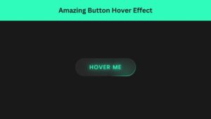
Build a Responsive Animated Portfolio Website with Dark & Light Mode | Free Source Code
Build a Responsive Animated Portfolio Website with Dark & Light Mode Free Download Code Files Preview The Demo Your portfolio

Responsive Animated Hero Section with Dark Light Theme | Free Source Code
Responsive Animated Hero Section with Dark Light Theme Let’s be real for a second. The first thing visitors notice on
Modern Animated Sign Up Form Design with Free Source Code
Modern Animated Sign Up Form Design with Free Source Code A sign up form is often the first real interaction