
Modern Animated Sign Up Form Design with Free Source Code
A sign up form is often the first real interaction a visitor has with your website. If it feels clunky, outdated, or boring, users bounce within seconds. If it feels smooth, modern, and slightly delightful, conversions climb. That is the entire reason animated sign up forms have become a quiet obsession among frontend developers and UI designers in 2026.
In this guide, you will get a complete walkthrough of building a modern animated sign up form using only HTML, CSS, and a touch of JavaScript. No frameworks. No bloated libraries. Just clean, copy-and-paste source code you can drop into any project today, plus the design thinking that makes it actually convert.
Why Animated Sign Up Forms Matter in 2026
Static forms still work, but they no longer impress. Users have been trained by apps like Notion, Linear, Vercel, and Stripe to expect interfaces that respond, breathe, and reward attention. An animated sign up form does three quiet things at once:
It guides the eye through the fields in a natural sequence, it provides instant feedback so users know what is happening, and it adds a perception of quality that builds trust before a single byte of data is submitted. Studies on form UX consistently show that micro-interactions reduce form abandonment, especially on mobile where confusion compounds quickly.
For developers, the good news is that you do not need a heavy animation library to achieve this. Modern CSS alone, combined with the transition, transform, and @keyframes properties, is powerful enough to build forms that feel premium.
Key Design Principles for a Modern Sign Up Form
Before touching code, the design itself has to earn the animation. Animation cannot rescue a bad layout, but it can amplify a good one. Here are the principles that consistently produce strong results.
Clarity over decoration. Every field should have one obvious purpose. Floating labels, generous spacing, and a single primary call-to-action button beat colorful chaos every time.
Progressive disclosure. Ask only what you need on the first screen. Email, password, and maybe a name. Anything else can be collected later inside the product.
Visual hierarchy. The submit button should be the brightest element on the form. Secondary actions like “Sign in instead” deserve smaller, lighter treatment.
Responsive by default. Roughly 60 percent of sign ups happen on mobile devices. If your form does not look beautiful on a 380-pixel screen, you have already lost half your audience.
Accessibility. Use proper label elements, sufficient color contrast, visible focus states, and ARIA attributes where appropriate. Animation should never replace these fundamentals.
Animations That Actually Improve UX
Not every animation belongs on a form. The ones that consistently help users include floating labels that rise out of the input when typing begins, soft glow or border-color transitions on focus, subtle button hover effects with scale or shadow shifts, error and success states that fade or shake gently, and a staggered entrance animation when the form first loads.
Avoid anything that delays input or distracts during typing. The user is trying to give you their data, so do not get in the way.
Check Out Those Useful Articles
Setting Up the Project Folder and Boilerplate Code
Once your design is mapped out, the next step is setting up your project environment. Creating a clean folder structure is essential when working on a modern animated sign-up form design. It keeps everything organized and makes collaboration or future updates easier.
To create animated sign-up form follow these steps:
- Create a Folder: Name this folder according to your preference. Inside this folder, you’ll need to set up the following files:
- Create an index.html File: This file should be named index with the .html extension.
- Create a style.css File: This file should be named style with the .css extension.
- Create a script.js File: This file should be name main with the .js extension.
These files will form the basis of your animated sign-up form.
Writing the HTML Structure for the Animated Sign-up Form
Now, open your code editor and set up a new HTML file, copy those HTML Codes and Paste those Codes on index.html file.
<!DOCTYPE html>
<html lang="en">
<head>
<meta charset="UTF-8" />
<meta name="viewport" content="width=device-width, initial-scale=1.0"/>
<title>Animate Sign Up Form By AbdulDev</title>
<link rel="stylesheet" href="style.css">
</head>
<body>
<div class="bg"></div>
<div class="orb orb1"></div>
<div class="orb orb2"></div>
<div class="orb orb3"></div>
<div class="page">
<div class="card">
<div class="card-inner">
<div class="success-overlay" id="successOverlay">
<div class="success-icon">
<svg width="32" height="32" viewBox="0 0 24 24" fill="none" stroke="#fff" stroke-width="2.5" stroke-linecap="round" stroke-linejoin="round"><polyline points="20 6 9 17 4 12"/></svg>
</div>
<h2>You're in! 🎉</h2>
<p>Account created successfully.</p>
</div>
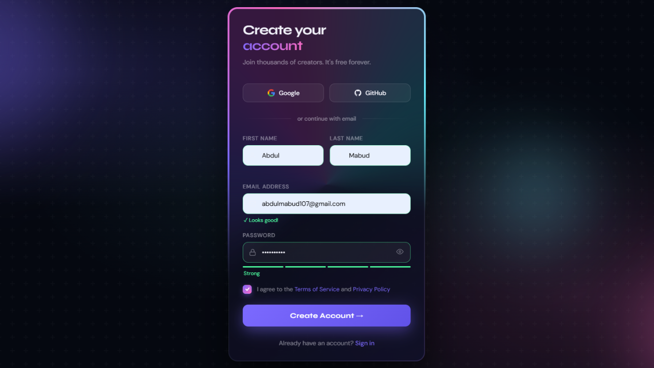
<h1 class="headline">Create your<br><span>account</span></h1>
<p class="subtext">Join thousands of creators. It's free forever.</p>
<div class="socials">
<button class="social-btn" type="button">
<svg viewBox="0 0 24 24" fill="none" xmlns="http://www.w3.org/2000/svg"><path d="M22.56 12.25c0-.78-.07-1.53-.2-2.25H12v4.26h5.92c-.26 1.37-1.04 2.53-2.21 3.31v2.77h3.57c2.08-1.92 3.28-4.74 3.28-8.09z" fill="#4285F4"/><path d="M12 23c2.97 0 5.46-.98 7.28-2.66l-3.57-2.77c-.98.66-2.23 1.06-3.71 1.06-2.86 0-5.29-1.93-6.16-4.53H2.18v2.84C3.99 20.53 7.7 23 12 23z" fill="#34A853"/><path d="M5.84 14.09c-.22-.66-.35-1.36-.35-2.09s.13-1.43.35-2.09V7.07H2.18C1.43 8.55 1 10.22 1 12s.43 3.45 1.18 4.93l3.66-2.84z" fill="#FBBC05"/><path d="M12 5.38c1.62 0 3.06.56 4.21 1.64l3.15-3.15C17.45 2.09 14.97 1 12 1 7.7 1 3.99 3.47 2.18 7.07l3.66 2.84c.87-2.6 3.3-4.53 6.16-4.53z" fill="#EA4335"/></svg>
Google
</button>
<button class="social-btn" type="button">
<svg viewBox="0 0 24 24" fill="currentColor" xmlns="http://www.w3.org/2000/svg"><path d="M12 2C6.477 2 2 6.477 2 12c0 4.42 2.865 8.166 6.839 9.489.5.092.682-.217.682-.482 0-.237-.008-.866-.013-1.7-2.782.603-3.369-1.342-3.369-1.342-.454-1.155-1.11-1.463-1.11-1.463-.908-.62.069-.608.069-.608 1.003.07 1.531 1.03 1.531 1.03.892 1.529 2.341 1.087 2.91.832.092-.647.35-1.088.636-1.338-2.22-.253-4.555-1.11-4.555-4.943 0-1.091.39-1.984 1.029-2.683-.103-.253-.446-1.27.098-2.647 0 0 .84-.268 2.75 1.026A9.578 9.578 0 0 1 12 6.836c.85.004 1.705.114 2.504.336 1.909-1.294 2.747-1.026 2.747-1.026.546 1.377.203 2.394.1 2.647.64.699 1.028 1.592 1.028 2.683 0 3.842-2.339 4.687-4.566 4.935.359.309.678.919.678 1.852 0 1.336-.012 2.415-.012 2.743 0 .267.18.578.688.48C19.138 20.161 22 16.416 22 12c0-5.523-4.477-10-10-10z"/></svg>
GitHub
</button>
</div>
<div class="divider">or continue with email</div>
<form id="signupForm" novalidate>
<div class="fields">
<div class="row">
<div class="field">
<label for="fname">First name</label>
<div class="input-wrap">
<svg class="icon" viewBox="0 0 24 24" fill="none" stroke="currentColor" stroke-width="1.8"><path d="M20 21v-2a4 4 0 0 0-4-4H8a4 4 0 0 0-4 4v2"/><circle cx="12" cy="7" r="4"/></svg>
<input type="text" id="fname" placeholder="Alex" autocomplete="given-name"/>
</div>
<p class="field-msg" id="fnameMsg"></p>
</div>
<div class="field">
<label for="lname">Last name</label>
<div class="input-wrap">
<svg class="icon" viewBox="0 0 24 24" fill="none" stroke="currentColor" stroke-width="1.8"><path d="M20 21v-2a4 4 0 0 0-4-4H8a4 4 0 0 0-4 4v2"/><circle cx="12" cy="7" r="4"/></svg>
<input type="text" id="lname" placeholder="Morgan" autocomplete="family-name"/>
</div>
<p class="field-msg" id="lnameMsg"></p>
</div>
</div>
<div class="field">
<label for="email">Email address</label>
<div class="input-wrap">
<svg class="icon" viewBox="0 0 24 24" fill="none" stroke="currentColor" stroke-width="1.8"><rect x="2" y="4" width="20" height="16" rx="2"/><path d="m2 7 10 7 10-7"/></svg>
<input type="email" id="email" placeholder="you@example.com" autocomplete="email"/>
</div>
<p class="field-msg" id="emailMsg"></p>
</div>
<div class="field">
<label for="password">Password</label>
<div class="input-wrap">
<svg class="icon" viewBox="0 0 24 24" fill="none" stroke="currentColor" stroke-width="1.8"><rect x="3" y="11" width="18" height="11" rx="2" ry="2"/><path d="M7 11V7a5 5 0 0 1 10 0v4"/></svg>
<input type="password" id="password" placeholder="Min. 8 characters" autocomplete="new-password"/>
<button type="button" class="toggle-pass" id="togglePass" tabindex="-1" aria-label="Toggle password">
<svg id="eyeIcon" width="16" height="16" viewBox="0 0 24 24" fill="none" stroke="currentColor" stroke-width="1.8"><path d="M1 12s4-8 11-8 11 8 11 8-4 8-11 8-11-8-11-8z"/><circle cx="12" cy="12" r="3"/></svg>
</button>
</div>
<div class="strength-bar" id="strengthBar">
<span></span><span></span><span></span><span></span>
</div>
<p class="field-msg" id="passwordMsg"></p>
</div>
</div>
<div class="terms">
<label class="check-wrap">
<input type="checkbox" id="terms"/>
<div class="check-box">
<svg width="11" height="11" viewBox="0 0 12 12" fill="none" stroke="#fff" stroke-width="2.2" stroke-linecap="round" stroke-linejoin="round"><polyline points="2 6 5 9 10 3"/></svg>
</div>
</label>
<p>I agree to the <a href="#">Terms of Service</a> and <a href="#">Privacy Policy</a></p>
</div>
<button type="submit" class="submit-btn" id="submitBtn">
<span class="btn-text">Create Account →</span>
<div class="spinner"></div>
</button>
<input
class="apbct_special_field apbct_email_id__elementor_form"
name="apbct__email_id__elementor_form"
aria-label="apbct__label_id__elementor_form"
type="text" size="30" maxlength="200" autocomplete="off"
value=""
/></form>
<p class="signin-link">Already have an account? <a href="#">Sign in</a></p>
</div>
</div>
</div> <script type="litespeed/javascript" data-src="script.js"></script> <script data-no-optimize="1">window.lazyLoadOptions=Object.assign({},{threshold:300},window.lazyLoadOptions||{});!function(t,e){"object"==typeof exports&&"undefined"!=typeof module?module.exports=e():"function"==typeof define&&define.amd?define(e):(t="undefined"!=typeof globalThis?globalThis:t||self).LazyLoad=e()}(this,function(){"use strict";function e(){return(e=Object.assign||function(t){for(var e=1;e<arguments.length;e++){var n,a=arguments[e];for(n in a)Object.prototype.hasOwnProperty.call(a,n)&&(t[n]=a[n])}return t}).apply(this,arguments)}function o(t){return e({},at,t)}function l(t,e){return t.getAttribute(gt+e)}function c(t){return l(t,vt)}function s(t,e){return function(t,e,n){e=gt+e;null!==n?t.setAttribute(e,n):t.removeAttribute(e)}(t,vt,e)}function i(t){return s(t,null),0}function r(t){return null===c(t)}function u(t){return c(t)===_t}function d(t,e,n,a){t&&(void 0===a?void 0===n?t(e):t(e,n):t(e,n,a))}function f(t,e){et?t.classList.add(e):t.className+=(t.className?" ":"")+e}function _(t,e){et?t.classList.remove(e):t.className=t.className.replace(new RegExp("(^|\\s+)"+e+"(\\s+|$)")," ").replace(/^\s+/,"").replace(/\s+$/,"")}function g(t){return t.llTempImage}function v(t,e){!e||(e=e._observer)&&e.unobserve(t)}function b(t,e){t&&(t.loadingCount+=e)}function p(t,e){t&&(t.toLoadCount=e)}function n(t){for(var e,n=[],a=0;e=t.children[a];a+=1)"SOURCE"===e.tagName&&n.push(e);return n}function h(t,e){(t=t.parentNode)&&"PICTURE"===t.tagName&&n(t).forEach(e)}function a(t,e){n(t).forEach(e)}function m(t){return!!t[lt]}function E(t){return t[lt]}function I(t){return delete t[lt]}function y(e,t){var n;m(e)||(n={},t.forEach(function(t){n[t]=e.getAttribute(t)}),e[lt]=n)}function L(a,t){var o;m(a)&&(o=E(a),t.forEach(function(t){var e,n;e=a,(t=o[n=t])?e.setAttribute(n,t):e.removeAttribute(n)}))}function k(t,e,n){f(t,e.class_loading),s(t,st),n&&(b(n,1),d(e.callback_loading,t,n))}function A(t,e,n){n&&t.setAttribute(e,n)}function O(t,e){A(t,rt,l(t,e.data_sizes)),A(t,it,l(t,e.data_srcset)),A(t,ot,l(t,e.data_src))}function w(t,e,n){var a=l(t,e.data_bg_multi),o=l(t,e.data_bg_multi_hidpi);(a=nt&&o?o:a)&&(t.style.backgroundImage=a,n=n,f(t=t,(e=e).class_applied),s(t,dt),n&&(e.unobserve_completed&&v(t,e),d(e.callback_applied,t,n)))}function x(t,e){!e||0<e.loadingCount||0<e.toLoadCount||d(t.callback_finish,e)}function M(t,e,n){t.addEventListener(e,n),t.llEvLisnrs[e]=n}function N(t){return!!t.llEvLisnrs}function z(t){if(N(t)){var e,n,a=t.llEvLisnrs;for(e in a){var o=a[e];n=e,o=o,t.removeEventListener(n,o)}delete t.llEvLisnrs}}function C(t,e,n){var a;delete t.llTempImage,b(n,-1),(a=n)&&--a.toLoadCount,_(t,e.class_loading),e.unobserve_completed&&v(t,n)}function R(i,r,c){var l=g(i)||i;N(l)||function(t,e,n){N(t)||(t.llEvLisnrs={});var a="VIDEO"===t.tagName?"loadeddata":"load";M(t,a,e),M(t,"error",n)}(l,function(t){var e,n,a,o;n=r,a=c,o=u(e=i),C(e,n,a),f(e,n.class_loaded),s(e,ut),d(n.callback_loaded,e,a),o||x(n,a),z(l)},function(t){var e,n,a,o;n=r,a=c,o=u(e=i),C(e,n,a),f(e,n.class_error),s(e,ft),d(n.callback_error,e,a),o||x(n,a),z(l)})}function T(t,e,n){var a,o,i,r,c;t.llTempImage=document.createElement("IMG"),R(t,e,n),m(c=t)||(c[lt]={backgroundImage:c.style.backgroundImage}),i=n,r=l(a=t,(o=e).data_bg),c=l(a,o.data_bg_hidpi),(r=nt&&c?c:r)&&(a.style.backgroundImage='url("'.concat(r,'")'),g(a).setAttribute(ot,r),k(a,o,i)),w(t,e,n)}function G(t,e,n){var a;R(t,e,n),a=e,e=n,(t=Et[(n=t).tagName])&&(t(n,a),k(n,a,e))}function D(t,e,n){var a;a=t,(-1<It.indexOf(a.tagName)?G:T)(t,e,n)}function S(t,e,n){var a;t.setAttribute("loading","lazy"),R(t,e,n),a=e,(e=Et[(n=t).tagName])&&e(n,a),s(t,_t)}function V(t){t.removeAttribute(ot),t.removeAttribute(it),t.removeAttribute(rt)}function j(t){h(t,function(t){L(t,mt)}),L(t,mt)}function F(t){var e;(e=yt[t.tagName])?e(t):m(e=t)&&(t=E(e),e.style.backgroundImage=t.backgroundImage)}function P(t,e){var n;F(t),n=e,r(e=t)||u(e)||(_(e,n.class_entered),_(e,n.class_exited),_(e,n.class_applied),_(e,n.class_loading),_(e,n.class_loaded),_(e,n.class_error)),i(t),I(t)}function U(t,e,n,a){var o;n.cancel_on_exit&&(c(t)!==st||"IMG"===t.tagName&&(z(t),h(o=t,function(t){V(t)}),V(o),j(t),_(t,n.class_loading),b(a,-1),i(t),d(n.callback_cancel,t,e,a)))}function $(t,e,n,a){var o,i,r=(i=t,0<=bt.indexOf(c(i)));s(t,"entered"),f(t,n.class_entered),_(t,n.class_exited),o=t,i=a,n.unobserve_entered&&v(o,i),d(n.callback_enter,t,e,a),r||D(t,n,a)}function q(t){return t.use_native&&"loading"in HTMLImageElement.prototype}function H(t,o,i){t.forEach(function(t){return(a=t).isIntersecting||0<a.intersectionRatio?$(t.target,t,o,i):(e=t.target,n=t,a=o,t=i,void(r(e)||(f(e,a.class_exited),U(e,n,a,t),d(a.callback_exit,e,n,t))));var e,n,a})}function B(e,n){var t;tt&&!q(e)&&(n._observer=new IntersectionObserver(function(t){H(t,e,n)},{root:(t=e).container===document?null:t.container,rootMargin:t.thresholds||t.threshold+"px"}))}function J(t){return Array.prototype.slice.call(t)}function K(t){return t.container.querySelectorAll(t.elements_selector)}function Q(t){return c(t)===ft}function W(t,e){return e=t||K(e),J(e).filter(r)}function X(e,t){var n;(n=K(e),J(n).filter(Q)).forEach(function(t){_(t,e.class_error),i(t)}),t.update()}function t(t,e){var n,a,t=o(t);this._settings=t,this.loadingCount=0,B(t,this),n=t,a=this,Y&&window.addEventListener("online",function(){X(n,a)}),this.update(e)}var Y="undefined"!=typeof window,Z=Y&&!("onscroll"in window)||"undefined"!=typeof navigator&&/(gle|ing|ro)bot|crawl|spider/i.test(navigator.userAgent),tt=Y&&"IntersectionObserver"in window,et=Y&&"classList"in document.createElement("p"),nt=Y&&1<window.devicePixelRatio,at={elements_selector:".lazy",container:Z||Y?document:null,threshold:300,thresholds:null,data_src:"src",data_srcset:"srcset",data_sizes:"sizes",data_bg:"bg",data_bg_hidpi:"bg-hidpi",data_bg_multi:"bg-multi",data_bg_multi_hidpi:"bg-multi-hidpi",data_poster:"poster",class_applied:"applied",class_loading:"litespeed-loading",class_loaded:"litespeed-loaded",class_error:"error",class_entered:"entered",class_exited:"exited",unobserve_completed:!0,unobserve_entered:!1,cancel_on_exit:!0,callback_enter:null,callback_exit:null,callback_applied:null,callback_loading:null,callback_loaded:null,callback_error:null,callback_finish:null,callback_cancel:null,use_native:!1},ot="src",it="srcset",rt="sizes",ct="poster",lt="llOriginalAttrs",st="loading",ut="loaded",dt="applied",ft="error",_t="native",gt="data-",vt="ll-status",bt=[st,ut,dt,ft],pt=[ot],ht=[ot,ct],mt=[ot,it,rt],Et={IMG:function(t,e){h(t,function(t){y(t,mt),O(t,e)}),y(t,mt),O(t,e)},IFRAME:function(t,e){y(t,pt),A(t,ot,l(t,e.data_src))},VIDEO:function(t,e){a(t,function(t){y(t,pt),A(t,ot,l(t,e.data_src))}),y(t,ht),A(t,ct,l(t,e.data_poster)),A(t,ot,l(t,e.data_src)),t.load()}},It=["IMG","IFRAME","VIDEO"],yt={IMG:j,IFRAME:function(t){L(t,pt)},VIDEO:function(t){a(t,function(t){L(t,pt)}),L(t,ht),t.load()}},Lt=["IMG","IFRAME","VIDEO"];return t.prototype={update:function(t){var e,n,a,o=this._settings,i=W(t,o);{if(p(this,i.length),!Z&&tt)return q(o)?(e=o,n=this,i.forEach(function(t){-1!==Lt.indexOf(t.tagName)&&S(t,e,n)}),void p(n,0)):(t=this._observer,o=i,t.disconnect(),a=t,void o.forEach(function(t){a.observe(t)}));this.loadAll(i)}},destroy:function(){this._observer&&this._observer.disconnect(),K(this._settings).forEach(function(t){I(t)}),delete this._observer,delete this._settings,delete this.loadingCount,delete this.toLoadCount},loadAll:function(t){var e=this,n=this._settings;W(t,n).forEach(function(t){v(t,e),D(t,n,e)})},restoreAll:function(){var e=this._settings;K(e).forEach(function(t){P(t,e)})}},t.load=function(t,e){e=o(e);D(t,e)},t.resetStatus=function(t){i(t)},t}),function(t,e){"use strict";function n(){e.body.classList.add("litespeed_lazyloaded")}function a(){console.log("[LiteSpeed] Start Lazy Load"),o=new LazyLoad(Object.assign({},t.lazyLoadOptions||{},{elements_selector:"[data-lazyloaded]",callback_finish:n})),i=function(){o.update()},t.MutationObserver&&new MutationObserver(i).observe(e.documentElement,{childList:!0,subtree:!0,attributes:!0})}var o,i;t.addEventListener?t.addEventListener("load",a,!1):t.attachEvent("onload",a)}(window,document);</script><script data-no-optimize="1">window.litespeed_ui_events=window.litespeed_ui_events||["mouseover","click","keydown","wheel","touchmove","touchstart"];var urlCreator=window.URL||window.webkitURL;function litespeed_load_delayed_js_force(){console.log("[LiteSpeed] Start Load JS Delayed"),litespeed_ui_events.forEach(e=>{window.removeEventListener(e,litespeed_load_delayed_js_force,{passive:!0})}),document.querySelectorAll("iframe[data-litespeed-src]").forEach(e=>{e.setAttribute("src",e.getAttribute("data-litespeed-src"))}),"loading"==document.readyState?window.addEventListener("DOMContentLoaded",litespeed_load_delayed_js):litespeed_load_delayed_js()}litespeed_ui_events.forEach(e=>{window.addEventListener(e,litespeed_load_delayed_js_force,{passive:!0})});async function litespeed_load_delayed_js(){let t=[];for(var d in document.querySelectorAll('script[type="litespeed/javascript"]').forEach(e=>{t.push(e)}),t)await new Promise(e=>litespeed_load_one(t[d],e));document.dispatchEvent(new Event("DOMContentLiteSpeedLoaded")),window.dispatchEvent(new Event("DOMContentLiteSpeedLoaded"))}function litespeed_load_one(t,e){console.log("[LiteSpeed] Load ",t);var d=document.createElement("script");d.addEventListener("load",e),d.addEventListener("error",e),t.getAttributeNames().forEach(e=>{"type"!=e&&d.setAttribute("data-src"==e?"src":e,t.getAttribute(e))});let a=!(d.type="text/javascript");!d.src&&t.textContent&&(d.src=litespeed_inline2src(t.textContent),a=!0),t.after(d),t.remove(),a&&e()}function litespeed_inline2src(t){try{var d=urlCreator.createObjectURL(new Blob([t.replace(/^(?:<!--)?(.*?)(?:-->)?$/gm,"$1")],{type:"text/javascript"}))}catch(e){d="data:text/javascript;base64,"+btoa(t.replace(/^(?:<!--)?(.*?)(?:-->)?$/gm,"$1"))}return d}</script><script data-no-optimize="1">var litespeed_vary=document.cookie.replace(/(?:(?:^|.*;\s*)_lscache_vary\s*\=\s*([^;]*).*$)|^.*$/,"");litespeed_vary||(sessionStorage.getItem("litespeed_reloaded")?console.log("LiteSpeed: skipping guest vary reload (already reloaded this session)"):fetch("/wp-content/plugins/litespeed-cache/guest.vary.php",{method:"POST",cache:"no-cache",redirect:"follow"}).then(e=>e.json()).then(e=>{console.log(e),e.hasOwnProperty("reload")&&"yes"==e.reload&&(sessionStorage.setItem("litespeed_docref",document.referrer),sessionStorage.setItem("litespeed_reloaded","1"),window.location.reload(!0))}));</script><script data-optimized="1" type="litespeed/javascript" data-src="https://abduldev.com/wp-content/litespeed/js/428fdd8064cb7725e5fa6e192c8a1ff2.js?ver=33c3e"></script></body>
</html>
Styling the CSS Animated Sign-up Form Using CSS
After that, copy those CSS Codes and Paste those Codes on style.css file.
					    *, *::before, *::after { box-sizing: border-box; margin: 0; padding: 0; }

    :root {
      --bg: #050810;
      --surface: rgba(255,255,255,0.04);
      --surface-hover: rgba(255,255,255,0.07);
      --border: rgba(255,255,255,0.10);
      --text: #f0f0f8;
      --muted: rgba(240,240,248,0.45);
      --accent1: #7c6aff;
      --accent2: #ff6ac1;
      --accent3: #6af0ff;
      --accent4: #ffb86a;
      --input-bg: rgba(255,255,255,0.05);
      --input-border: rgba(255,255,255,0.12);
      --input-focus: rgba(124,106,255,0.5);
      --error: #ff5f72;
      --success: #4dffa0;
      --radius: 20px;
      --radius-sm: 12px;
    }

    html, body {
      height: 100%;
      font-family: 'DM Sans', sans-serif;
      background: var(--bg);
      color: var(--text);
    }

    /* ── Animated mesh background ── */
    .bg {
      position: fixed; inset: 0; z-index: 0;
      background:
        radial-gradient(ellipse 80% 60% at 20% 20%, rgba(124,106,255,0.18) 0%, transparent 60%),
        radial-gradient(ellipse 60% 80% at 80% 80%, rgba(255,106,193,0.14) 0%, transparent 60%),
        radial-gradient(ellipse 50% 50% at 50% 50%, rgba(106,240,255,0.07) 0%, transparent 70%),
        var(--bg);
    }
    .bg::after {
      content: '';
      position: absolute; inset: 0;
      background-image: url("data:image/svg+xml,%3Csvg width='60' height='60' viewBox='0 0 60 60' xmlns='http://www.w3.org/2000/svg'%3E%3Cg fill='none' fill-rule='evenodd'%3E%3Cg fill='%23ffffff' fill-opacity='0.022'%3E%3Cpath d='M36 34v-4h-2v4h-4v2h4v4h2v-4h4v-2h-4zm0-30V0h-2v4h-4v2h4v4h2V6h4V4h-4zM6 34v-4H4v4H0v2h4v4h2v-4h4v-2H6zM6 4V0H4v4H0v2h4v4h2V6h4V4H6z'/%3E%3C/g%3E%3C/g%3E%3C/svg%3E");
    }

    /* ── Floating orbs ── */
    .orb {
      position: fixed; border-radius: 50%;
      filter: blur(80px); opacity: 0.35;
      animation: drift 12s ease-in-out infinite alternate;
      pointer-events: none; z-index: 0;
    }
    .orb1 { width: 420px; height: 420px; background: var(--accent1); top: -120px; left: -80px; animation-delay: 0s; }
    .orb2 { width: 320px; height: 320px; background: var(--accent2); bottom: -80px; right: -60px; animation-delay: -4s; }
    .orb3 { width: 200px; height: 200px; background: var(--accent3); top: 40%; right: 20%; animation-delay: -8s; }

    @keyframes drift {
      0%   { transform: translate(0, 0) scale(1); }
      100% { transform: translate(30px, 40px) scale(1.1); }
    }

    /* ── Page layout ── */
    .page {
      position: relative; z-index: 1;
      min-height: 100vh; display: flex;
      align-items: center; justify-content: center;
      padding: 24px;
    }

    /* ── Card ── */
    .card {
      position: relative;
      width: 100%; max-width: 440px;
      border-radius: var(--radius);
      padding: 2px; /* for border gradient */
      background: linear-gradient(145deg, rgba(255,255,255,0.15), rgba(255,255,255,0.03), rgba(124,106,255,0.2));
      box-shadow: 0 40px 80px rgba(0,0,0,0.6), 0 0 0 1px rgba(255,255,255,0.05) inset;
      animation: cardIn 0.8s cubic-bezier(0.16,1,0.3,1) both;
    }
    @keyframes cardIn {
      from { opacity: 0; transform: translateY(40px) scale(0.96); }
      to   { opacity: 1; transform: translateY(0) scale(1); }
    }

    /* Animated rotating border */
    .card::before {
      content: '';
      position: absolute; inset: -2px;
      border-radius: calc(var(--radius) + 2px);
      background: conic-gradient(
        from var(--angle, 0deg),
        transparent 0deg,
        var(--accent1) 60deg,
        var(--accent2) 120deg,
        var(--accent3) 180deg,
        transparent 240deg
      );
      z-index: -1;
      animation: spin 4s linear infinite;
    }
    @property --angle {
      syntax: '<angle>'; initial-value: 0deg; inherits: false;
    }
    @keyframes spin { to { --angle: 360deg; } }

    .card-inner {
      background: rgba(8, 10, 24, 0.82);
      backdrop-filter: blur(30px) saturate(1.5);
      -webkit-backdrop-filter: blur(30px) saturate(1.5);
      border-radius: calc(var(--radius) - 2px);
      padding: 30px;
      position: relative; overflow: hidden;
    }
    .card-inner::before {
      content: '';
      position: absolute; top: 0; left: 0; right: 0;
      height: 1px;
      background: linear-gradient(90deg, transparent, rgba(255,255,255,0.25), transparent);
    }

    /* ── Header ── */
    .logo {
      display: flex; align-items: center; gap: 10px;
      margin-bottom: 32px; animation: fadeUp 0.7s 0.1s both;
    }
    .logo-mark {
      width: 36px; height: 36px; border-radius: 10px;
      background: linear-gradient(135deg, var(--accent1), var(--accent2));
      display: grid; place-items: center;
      font-size: 18px; box-shadow: 0 4px 16px rgba(124,106,255,0.5);
    }
    .logo-text {
      font-family: 'Syne', sans-serif;
      font-weight: 800; font-size: 1.1rem;
      letter-spacing: -0.02em;
      background: linear-gradient(135deg, var(--text), var(--muted));
      -webkit-background-clip: text; -webkit-text-fill-color: transparent;
    }

    .headline {
      font-family: 'Syne', sans-serif;
      font-weight: 700; font-size: 1.9rem;
      line-height: 1.15; letter-spacing: -0.03em;
      margin-bottom: 8px;
      animation: fadeUp 0.7s 0.18s both;
    }
    .headline span {
      background: linear-gradient(120deg, var(--accent1), var(--accent2));
      -webkit-background-clip: text; -webkit-text-fill-color: transparent;
    }
    .subtext {
      color: var(--muted); font-size: 0.9rem;
      line-height: 1.6; margin-bottom: 36px;
      animation: fadeUp 0.7s 0.24s both;
    }

    @keyframes fadeUp {
      from { opacity: 0; transform: translateY(18px); }
      to   { opacity: 1; transform: translateY(0); }
    }

    /* ── Social buttons ── */
    .socials {
      display: grid; grid-template-columns: 1fr 1fr;
      gap: 12px; margin-bottom: 28px;
      animation: fadeUp 0.7s 0.3s both;
    }
    .social-btn {
      display: flex; align-items: center; justify-content: center; gap: 8px;
      padding: 11px 16px;
      background: var(--input-bg);
      border: 1px solid var(--input-border);
      border-radius: var(--radius-sm);
      color: var(--text); font-family: 'DM Sans', sans-serif;
      font-size: 0.875rem; font-weight: 500;
      cursor: pointer; transition: all 0.2s;
    }
    .social-btn:hover {
      background: var(--surface-hover);
      border-color: rgba(255,255,255,0.22);
      transform: translateY(-1px);
      box-shadow: 0 8px 24px rgba(0,0,0,0.3);
    }
    .social-btn svg { width: 18px; height: 18px; flex-shrink: 0; }

    /* ── Divider ── */
    .divider {
      display: flex; align-items: center; gap: 14px;
      margin-bottom: 28px; color: var(--muted); font-size: 0.8rem;
      animation: fadeUp 0.7s 0.36s both;
    }
    .divider::before, .divider::after {
      content: ''; flex: 1; height: 1px;
      background: linear-gradient(90deg, transparent, var(--border));
    }
    .divider::after { background: linear-gradient(90deg, var(--border), transparent); }

    /* ── Form fields ── */
    .fields { animation: fadeUp 0.7s 0.42s both; }

    .row { display: grid; grid-template-columns: 1fr 1fr; gap: 14px; }

    .field {
      position: relative; margin-bottom: 18px;
    }
    .field label {
      display: block; font-size: 0.78rem; font-weight: 500;
      color: var(--muted); margin-bottom: 7px;
      text-transform: uppercase; letter-spacing: 0.06em;
      transition: color 0.2s;
    }
    .field:focus-within label { color: var(--accent1); }

    .input-wrap { position: relative; }
    .input-wrap .icon {
      position: absolute; left: 14px; top: 50%; transform: translateY(-50%);
      color: var(--muted); width: 16px; height: 16px; pointer-events: none;
      transition: color 0.2s;
    }
    .field:focus-within .icon { color: var(--accent1); }

    .field input {
      width: 100%;
      padding: 13px 42px 13px 42px;
      background: var(--input-bg);
      border: 1px solid var(--input-border);
      border-radius: var(--radius-sm);
      color: var(--text);
      font-family: 'DM Sans', sans-serif; font-size: 0.9rem;
      outline: none;
      transition: border-color 0.25s, box-shadow 0.25s, background 0.25s;
    }
    .field input::placeholder { color: rgba(240,240,248,0.25); }
    .field input:focus {
      border-color: rgba(124,106,255,0.6);
      box-shadow: 0 0 0 3px rgba(124,106,255,0.15), 0 4px 16px rgba(0,0,0,0.3);
      background: rgba(124,106,255,0.06);
    }
    .field input.error { border-color: var(--error); box-shadow: 0 0 0 3px rgba(255,95,114,0.12); }
    .field input.valid { border-color: rgba(77,255,160,0.5); }

    .toggle-pass {
      position: absolute; right: 14px; top: 50%; transform: translateY(-50%);
      background: none; border: none; cursor: pointer;
      color: var(--muted); padding: 2px;
      transition: color 0.2s;
    }
    .toggle-pass:hover { color: var(--text); }

    .field-msg {
      font-size: 0.74rem; margin-top: 5px; min-height: 16px;
      padding-left: 2px; transition: all 0.2s;
    }
    .field-msg.error { color: var(--error); }
    .field-msg.success { color: var(--success); }

    /* Password strength */
    .strength-bar {
      display: flex; gap: 4px; margin-top: 8px;
    }
    .strength-bar span {
      flex: 1; height: 3px; border-radius: 99px;
      background: var(--input-border);
      transition: background 0.3s;
    }
    .strength-bar.s1 span:nth-child(1) { background: var(--error); }
    .strength-bar.s2 span:nth-child(-n+2) { background: var(--accent4); }
    .strength-bar.s3 span:nth-child(-n+3) { background: var(--accent3); }
    .strength-bar.s4 span { background: var(--success); }

    /* Terms */
    .terms {
      display: flex; align-items: flex-start; gap: 12px;
      margin-bottom: 24px; margin-top: 4px;
    }
    .check-wrap {
      position: relative; width: 20px; height: 20px; flex-shrink: 0;
    }
    .check-wrap input[type="checkbox"] {
      opacity: 0; position: absolute; inset: 0; cursor: pointer; margin: 0;
      width: 20px; height: 20px;
    }
    .check-box {
      position: absolute; inset: 0;
      border: 1.5px solid var(--input-border);
      border-radius: 6px; background: var(--input-bg);
      display: grid; place-items: center;
      transition: all 0.2s; pointer-events: none;
    }
    .check-wrap input:checked ~ .check-box {
      background: linear-gradient(135deg, var(--accent1), var(--accent2));
      border-color: transparent;
      box-shadow: 0 4px 12px rgba(124,106,255,0.4);
    }
    .check-box svg { opacity: 0; transform: scale(0.5); transition: all 0.2s; }
    .check-wrap input:checked ~ .check-box svg { opacity: 1; transform: scale(1); }
    .terms p { font-size: 0.82rem; color: var(--muted); line-height: 1.5; }
    .terms a { color: var(--accent1); text-decoration: none; }
    .terms a:hover { text-decoration: underline; }

    /* ── Submit button ── */
    .submit-btn {
      width: 100%; padding: 15px;
      background: linear-gradient(135deg, var(--accent1) 0%, #6152e8 50%, var(--accent2) 100%);
      background-size: 200% 200%;
      border: none; border-radius: var(--radius-sm);
      color: #fff; font-family: 'Syne', sans-serif;
      font-size: 1rem; font-weight: 700; letter-spacing: 0.02em;
      cursor: pointer; position: relative; overflow: hidden;
      box-shadow: 0 8px 32px rgba(124,106,255,0.45);
      transition: transform 0.2s, box-shadow 0.2s, background-position 0.4s;
      margin-bottom: 28px;
      animation: fadeUp 0.7s 0.48s both;
    }
    .submit-btn:hover:not(:disabled) {
      transform: translateY(-2px);
      box-shadow: 0 12px 40px rgba(124,106,255,0.6);
      background-position: right center;
    }
    .submit-btn:active:not(:disabled) { transform: translateY(0); }
    .submit-btn:disabled { opacity: 0.6; cursor: not-allowed; }
    .submit-btn .btn-text { transition: opacity 0.2s; }
    .submit-btn .spinner {
      display: none; width: 20px; height: 20px;
      border: 2.5px solid rgba(255,255,255,0.3);
      border-top-color: #fff; border-radius: 50%;
      animation: spin2 0.7s linear infinite;
      position: absolute; top: 50%; left: 50%; transform: translate(-50%,-50%);
    }
    @keyframes spin2 { to { transform: translate(-50%,-50%) rotate(360deg); } }

    /* Ripple */
    .ripple {
      position: absolute; border-radius: 50%;
      background: rgba(255,255,255,0.3);
      transform: scale(0); animation: ripple 0.6s ease-out forwards;
      pointer-events: none;
    }
    @keyframes ripple { to { transform: scale(4); opacity: 0; } }

    /* ── Footer ── */
    .signin-link {
      text-align: center; font-size: 0.875rem; color: var(--muted);
      animation: fadeUp 0.7s 0.54s both;
    }
    .signin-link a { color: var(--accent1); text-decoration: none; font-weight: 500; }
    .signin-link a:hover { text-decoration: underline; }

    /* ── Success overlay ── */
    .success-overlay {
      position: absolute; inset: 0;
      border-radius: calc(var(--radius) - 2px);
      background: rgba(8,10,24,0.95);
      display: flex; flex-direction: column;
      align-items: center; justify-content: center; gap: 16px;
      opacity: 0; pointer-events: none;
      transition: opacity 0.4s;
      backdrop-filter: blur(10px);
      z-index: 10;
    }
    .success-overlay.show { opacity: 1; pointer-events: all; }
    .success-icon {
      width: 72px; height: 72px; border-radius: 50%;
      background: linear-gradient(135deg, var(--accent1), var(--success));
      display: grid; place-items: center;
      box-shadow: 0 0 40px rgba(77,255,160,0.4);
      animation: popIn 0.5s cubic-bezier(0.34,1.56,0.64,1) both;
    }
    @keyframes popIn {
      from { transform: scale(0); opacity: 0; }
      to   { transform: scale(1); opacity: 1; }
    }
    .success-overlay h2 {
      font-family: 'Syne', sans-serif; font-size: 1.5rem; font-weight: 700;
    }
    .success-overlay p { color: var(--muted); font-size: 0.9rem; }

    /* ── Responsive ── */
    @media (max-width: 480px) {
      .card-inner { padding: 36px 24px 32px; }
      .row { grid-template-columns: 1fr; }
      .headline { font-size: 1.6rem; }
    }
Adding JavaScript for Animated Sign-up Form
And lastly, Copy the below JS code and paste it into the script.js file.
					  const form = document.getElementById('signupForm');
  const submitBtn = document.getElementById('submitBtn');
  const togglePass = document.getElementById('togglePass');
  const passwordInput = document.getElementById('password');
  const strengthBar = document.getElementById('strengthBar');

  // ── Validate helpers ──
  const show = (id, msg, type) => {
    const el = document.getElementById(id);
    el.textContent = msg;
    el.className = 'field-msg ' + (type || '');
  };

  const markInput = (id, state) => {
    const el = document.getElementById(id);
    el.classList.toggle('error', state === 'error');
    el.classList.toggle('valid', state === 'valid');
  };

  const validateName = (id, msgId) => {
    const val = document.getElementById(id).value.trim();
    if (!val) { show(msgId, 'This field is required.', 'error'); markInput(id, 'error'); return false; }
    if (val.length < 2) { show(msgId, 'Too short.', 'error'); markInput(id, 'error'); return false; }
    show(msgId, '', ''); markInput(id, 'valid'); return true;
  };

  const validateEmail = () => {
    const val = document.getElementById('email').value.trim();
    const re = /^[^\s@]+@[^\s@]+\.[^\s@]+$/;
    if (!val) { show('emailMsg', 'Email is required.', 'error'); markInput('email', 'error'); return false; }
    if (!re.test(val)) { show('emailMsg', 'Enter a valid email address.', 'error'); markInput('email', 'error'); return false; }
    show('emailMsg', '✓ Looks good!', 'success'); markInput('email', 'valid'); return true;
  };

  const getStrength = (pw) => {
    let score = 0;
    if (pw.length >= 8) score++;
    if (/[A-Z]/.test(pw)) score++;
    if (/[0-9]/.test(pw)) score++;
    if (/[^A-Za-z0-9]/.test(pw)) score++;
    return score;
  };

  const validatePassword = () => {
    const val = passwordInput.value;
    if (!val) { show('passwordMsg', 'Password is required.', 'error'); markInput('password', 'error'); strengthBar.className = 'strength-bar'; return false; }
    const s = getStrength(val);
    strengthBar.className = 'strength-bar s' + s;
    const labels = ['', 'Weak', 'Fair', 'Good', 'Strong'];
    const types  = ['', 'error', 'error', 'success', 'success'];
    if (val.length < 8) { show('passwordMsg', 'At least 8 characters required.', 'error'); markInput('password', 'error'); return false; }
    show('passwordMsg', labels[s], types[s]);
    markInput('password', s >= 3 ? 'valid' : 'error');
    return s >= 2;
  };

  // Live validation
  ['fname','lname'].forEach(id =>
    document.getElementById(id).addEventListener('input', () => validateName(id, id + 'Msg'))
  );
  document.getElementById('email').addEventListener('input', validateEmail);
  passwordInput.addEventListener('input', validatePassword);

  // Toggle password visibility
  togglePass.addEventListener('click', () => {
    const shown = passwordInput.type === 'text';
    passwordInput.type = shown ? 'password' : 'text';
    document.getElementById('eyeIcon').innerHTML = shown
      ? '<path d="M1 12s4-8 11-8 11 8 11 8-4 8-11 8-11-8-11-8z"/><circle cx="12" cy="12" r="3"/>'
      : '<path d="M17.94 17.94A10.07 10.07 0 0 1 12 20c-7 0-11-8-11-8a18.45 18.45 0 0 1 5.06-5.94M9.9 4.24A9.12 9.12 0 0 1 12 4c7 0 11 8 11 8a18.5 18.5 0 0 1-2.16 3.19m-6.72-1.07a3 3 0 1 1-4.24-4.24"/><line x1="1" y1="1" x2="23" y2="23"/>';
  });

  // Ripple effect
  submitBtn.addEventListener('click', function(e) {
    const rect = this.getBoundingClientRect();
    const ripple = document.createElement('span');
    ripple.className = 'ripple';
    ripple.style.width = ripple.style.height = Math.max(rect.width, rect.height) + 'px';
    ripple.style.left = (e.clientX - rect.left - rect.width / 2) + 'px';
    ripple.style.top  = (e.clientY - rect.top  - rect.height/ 2) + 'px';
    this.appendChild(ripple);
    setTimeout(() => ripple.remove(), 600);
  });

  // Submit
  form.addEventListener('submit', async (e) => {
    e.preventDefault();
    const v1 = validateName('fname', 'fnameMsg');
    const v2 = validateName('lname', 'lnameMsg');
    const v3 = validateEmail();
    const v4 = validatePassword();
    const v5 = document.getElementById('terms').checked;
    if (!v5) { /* could show toast */ }
    if (!v1 || !v2 || !v3 || !v4 || !v5) return;

    // Loading state
    submitBtn.disabled = true;
    submitBtn.querySelector('.btn-text').style.opacity = '0';
    submitBtn.querySelector('.spinner').style.display = 'block';

    await new Promise(r => setTimeout(r, 1800));

    submitBtn.querySelector('.spinner').style.display = 'none';
    document.getElementById('successOverlay').classList.add('show');
  });
Best Practices When Using This Form in Production
Even with great design, a sign up form is only as good as what surrounds it. Always serve the form over HTTPS. Hash passwords on the server using bcrypt, argon2, or a similar algorithm. Add server-side validation in addition to the client-side checks shown above. Use a CAPTCHA or honeypot field to deter bots if your sign up flow becomes a target. Send a confirmation email and verify ownership before granting full access.
For accessibility, test the form with keyboard-only navigation and a screen reader. The floating-label pattern is widely supported, but make sure the label text is always readable even when collapsed.
Conclusion
A modern animated sign up form is not about showing off. It is about removing friction, building trust, and signaling that the product behind the form has been built with the same level of care. The source code above is yours to use freely in personal or commercial projects. Drop it in, adjust the colors and copy to match your brand, and you will have a sign up experience that feels right at home next to anything shipping in 2026.
If you build something interesting with it, consider sharing your variations with the community. Most of the best form patterns in the world started as somebody’s quick weekend experiment.
Recent Posts


Categories

FAQs
What is an animated sign up form?
An animated sign up form is a registration form that uses motion effects such as floating labels, smooth transitions, hover animations, and entrance effects to create a more engaging and user-friendly experience. These animations guide the user’s attention and make the form feel modern and responsive.
Is the source code for this animated sign up form free to use?
Yes, the complete HTML, CSS, and JavaScript source code provided in this tutorial is 100% free to use in both personal and commercial projects. You can copy, modify, and customize it without any restrictions or attribution required.
Do I need JavaScript frameworks like React or Vue to build this form?
No. The animated sign up form in this guide is built using only pure HTML, CSS, and a small block of vanilla JavaScript. You do not need React, Vue, jQuery, or any external library, which keeps the form lightweight and fast.
Is this sign up form mobile-responsive?
Yes, the form is fully responsive and looks great on all screen sizes, including mobile phones, tablets, and desktops. The layout adapts automatically using modern CSS techniques like flexbox and relative units.
How do I add a password strength indicator to this form?
You can add a password strength meter by listening to the `input` event on the password field and checking criteria like length, uppercase letters, numbers, and special characters. Then, dynamically update a progress bar or color indicator using JavaScript.
Can I change the color scheme of the sign up form?
Absolutely. The form uses CSS variables (custom properties) at the top of the stylesheet. Simply update values like `–accent`, `–bg`, and `–surface` to instantly re-skin the entire form to match your brand colors.
Is this animated sign up form accessible?
Yes, the form follows accessibility best practices including proper `<label>` elements, visible focus states, sufficient color contrast, and keyboard navigation support. For full WCAG compliance, test with a screen reader and ensure ARIA attributes are added where needed.
How can I connect this sign up form to a backend?
Replace the `console.log` inside the JavaScript submit handler with a `fetch()` or `axios` call to your backend API endpoint. Make sure to send data over HTTPS and hash passwords on the server using bcrypt or argon2 before storing them.
Why use floating labels instead of regular labels?
Floating labels save space, look modern, and keep the field’s purpose visible even after the user starts typing. They are widely used by top products like Google, Stripe, and Material Design because they improve clarity without cluttering the interface.
Will this form work in all modern browsers?
Yes, the form works in all modern browsers including Chrome, Firefox, Safari, Edge, and Opera. It uses standard CSS3 and ES6 JavaScript features that are universally supported in 2026.
Share on Social Media
Related Articles
Modern Animated Sign Up Form Design with Free Source Code
Modern Animated Sign Up Form Design with Free Source Code A sign up form is often the first real interaction
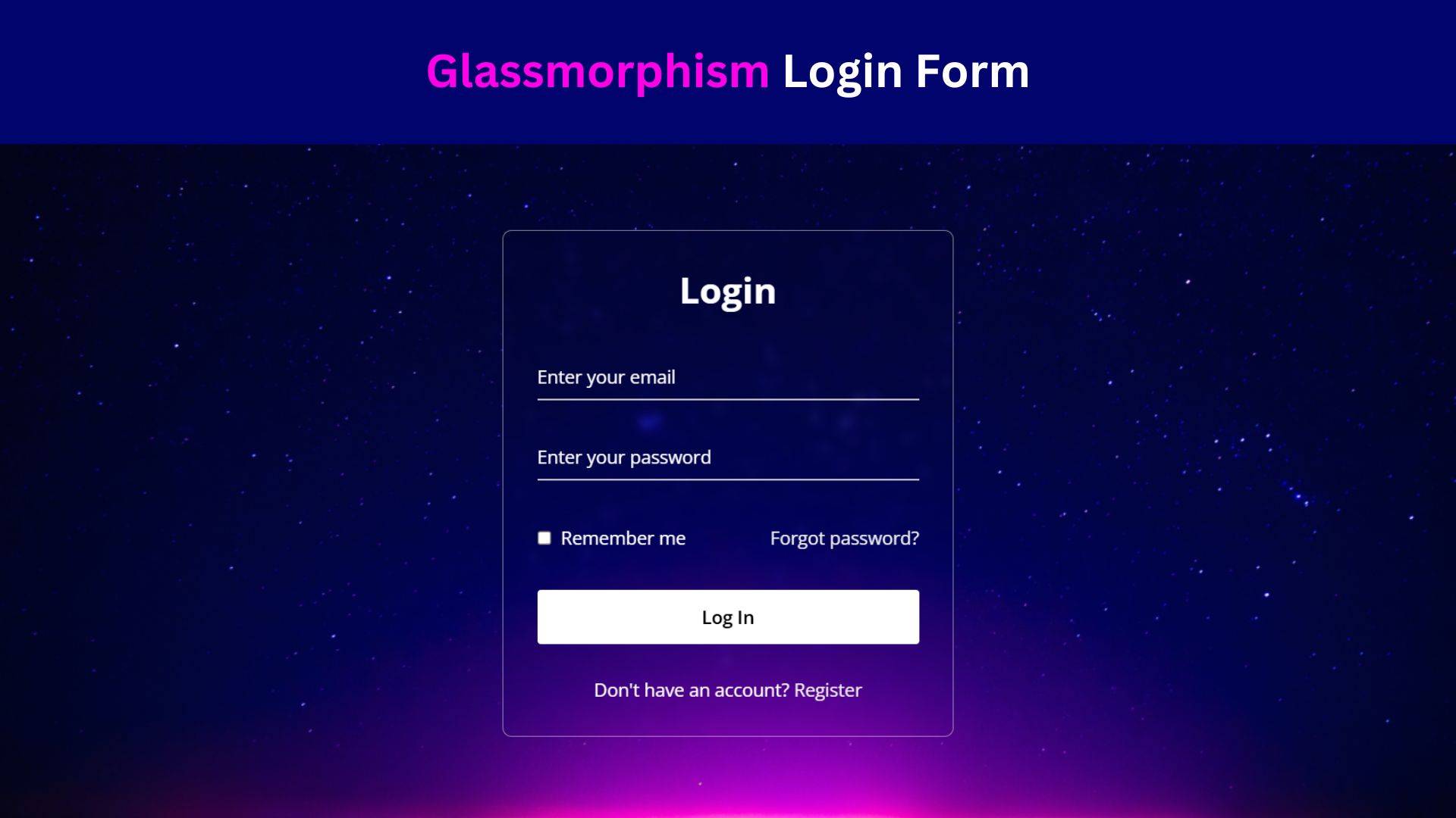
Design a Glassmorphism Login Form Using HTML and CSS
Learn how to design a sleek Glassmorphism Login Form using HTML and CSS! Follow this step-by-step guide to create a

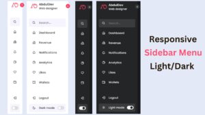
Create a Responsive Website: Integrate Login and Registration Form
Learn how to create a responsive website with integrated login and registration forms using HTML, CSS, and JavaScript. Free Source