Creating a Category Autoplay Card Slider with SwiperJS
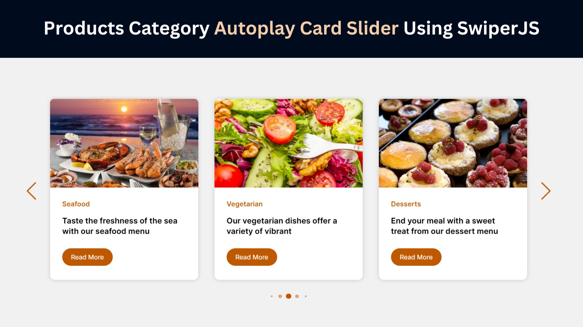
In today’s digital landscape, visual appeal and user interaction play crucial roles in enhancing the user experience on any website. One effective way to achieve this is through implementing a Products Category Autoplay Card Slider. Such sliders can display multiple categories of products dynamically, catching the user’s attention and making navigation intuitive. This blog post will guide you through creating a visually engaging and functional autoplay card slider using HTML, CSS, and SwiperJS.
Understanding the Benefits of Sliders
Sliders serve as versatile tools for enhancing both the aesthetics and functionality of a website. They allow for the presentation of multiple items, such as products, images, or testimonials, within a confined space. This approach not only makes the site more engaging but also encourages users to explore content without feeling overwhelmed. A well-implemented Products Category Autoplay Card Slider can display various product categories efficiently, driving user interaction and potentially boosting conversion rates. By making the website more interactive, sliders can captivate the user’s attention, leading to a more memorable browsing experience.
What Is SwiperJS?
SwiperJS is a robust JavaScript library designed for creating modern and mobile-friendly sliders. Known for its high customizability, SwiperJS supports essential features such as touch gestures, responsive design, and autoplay, making it ideal for developing dynamic sliders. This tool is straightforward to integrate, requiring minimal setup to function effectively across various devices. SwiperJS offers extensive options to tailor the slider’s behavior, appearance, and performance to suit specific project needs. Its flexibility and ease of use make it a popular choice for developers looking to enhance the visual and interactive aspects of their websites.
Check Out Those Useful Articles
Steps to Create Category Autoplay Card Slider
To create Category Autoplay Card Slider with HTML, CSS and Swiper JS follow these steps:
- Create a Folder: Name this folder according to your preference. Inside this folder, you’ll need to set up the following files:
- Create an index.html File: This file should be named index with the .html extension.
- Create a style.css File: This file should be named style with the .css extension.
- Swiper JS: Integration Your HTML file with Swiper JS.
- Create a main.js File: This file should be name main with the .js extension.
These files will form the basis of your Category Autoplay Card Slider.
Setting Up the Basic HTML Structure
To create your Products Category Autoplay Card Slider, start by defining the HTML structure. This includes a container element that houses the slider and individual slide items, each representing a product category.
Next, create the HTML structure for the card slider. This will include a container for the Swiper slider and individual slides for each team member:
Copy the below code and Paste it in the “index.html” File.
					<!DOCTYPE html>
<html lang="en">
<head>
    <meta charset="UTF-8">
    <meta name="viewport" content="width=device-width, initial-scale=1.0">
    <title>Category Card Slider Design by AbdulDev</title>

    <link rel="stylesheet" href="style.css">

    <link rel="stylesheet" href="https://cdn.jsdelivr.net/npm/swiper@11/swiper-bundle.min.css">
</head>
<body>
    <div class="container swiper">
        <div class="card-wrapper">

          <ul class="card-list swiper-wrapper">
            <li class="card-item swiper-slide">
              <a href="#" class="card-link">
                <div class="img-box">
                  <img data-lazyloaded="1" src="data:image/gif;base64,R0lGODdhAQABAPAAAMPDwwAAACwAAAAAAQABAAACAkQBADs=" decoding="async" data-src="images/Appetizers.png" alt="Card Image" class="card-image">
                </div>
                <div class="content-box">
                  <p class="badge">Appetizers</p>
                <h2 class="card-title">Start your meal with a delightful selection of appetizers</h2>
                <button class="card-button">Read More</button>
                </div>
              </a>
            </li>

            <li class="card-item swiper-slide">
              <a href="#" class="card-link">
                <div class="img-box">
                  <img data-lazyloaded="1" src="data:image/gif;base64,R0lGODdhAQABAPAAAMPDwwAAACwAAAAAAQABAAACAkQBADs=" decoding="async" data-src="images/Burgers.png" alt="Card Image" class="card-image">
                </div>
                <div class="content-box">
                  <p class="badge">Burgers</p>
                <h2 class="card-title">Savor our juicy burgers crafted with premium ingredients</h2>
                <button class="card-button">Read More</button>
                </div>
              </a>
            </li>

            <li class="card-item swiper-slide">
              <a href="#" class="card-link">
                <div class="img-box">
                  <img data-lazyloaded="1" src="data:image/gif;base64,R0lGODdhAQABAPAAAMPDwwAAACwAAAAAAQABAAACAkQBADs=" decoding="async" data-src="images/Sandwiches.png" alt="Card Image" class="card-image">
                </div>
                <div class="content-box">
                  <p class="badge">Sandwiches</p>
                <h2 class="card-title">Enjoy our variety of sandwiches, from classic favorites</h2>
                <button class="card-button">Read More</button>
                </div>
              </a>
            </li>

            <li class="card-item swiper-slide">
              <a href="#" class="card-link">
                <div class="img-box">
                  <img data-lazyloaded="1" src="data:image/gif;base64,R0lGODdhAQABAPAAAMPDwwAAACwAAAAAAQABAAACAkQBADs=" decoding="async" data-src="images/Noodles.png" alt="Card Image" class="card-image">
                </div>
                <div class="content-box">
                  <p class="badge">Noodles</p>
                <h2 class="card-title">Dive into a world of noodles with our selection, offering</h2>
                <button class="card-button">Read More</button>
                </div>
              </a>
            </li>

            <li class="card-item swiper-slide">
              <a href="#" class="card-link">
                <div class="img-box">
                  <img data-lazyloaded="1" src="data:image/gif;base64,R0lGODdhAQABAPAAAMPDwwAAACwAAAAAAQABAAACAkQBADs=" decoding="async" data-src="images/Barbecue.png" alt="Card Image" class="card-image">
                </div>
                <div class="content-box">
                  <p class="badge">Barbecue</p>
                <h2 class="card-title">Our barbecue dishes are smoked, grilled, or roasted to</h2>
                <button class="card-button">Read More</button>
                </div>
              </a>
            </li>

            <li class="card-item swiper-slide">
              <a href="#" class="card-link">
                <div class="img-box">
                  <img data-lazyloaded="1" src="data:image/gif;base64,R0lGODdhAQABAPAAAMPDwwAAACwAAAAAAQABAAACAkQBADs=" decoding="async" data-src="images/Seafood.png" alt="Card Image" class="card-image">
                </div>
                <div class="content-box">
                  <p class="badge">Seafood</p>
                <h2 class="card-title">Taste the freshness of the sea with our seafood menu</h2>
                <button class="card-button">Read More</button>
                </div>
              </a>
            </li>

            <li class="card-item swiper-slide">
              <a href="#" class="card-link">
                <div class="img-box">
                  <img data-lazyloaded="1" src="data:image/gif;base64,R0lGODdhAQABAPAAAMPDwwAAACwAAAAAAQABAAACAkQBADs=" decoding="async" data-src="images/Vegetarian.png" alt="Card Image" class="card-image">
                </div>
                <div class="content-box">
                  <p class="badge">Vegetarian</p>
                <h2 class="card-title">Our vegetarian dishes offer a variety of vibrant</h2>
                <button class="card-button">Read More</button>
                </div>
              </a>
            </li>

            <li class="card-item swiper-slide">
              <a href="#" class="card-link">
                <div class="img-box">
                  <img data-lazyloaded="1" src="data:image/gif;base64,R0lGODdhAQABAPAAAMPDwwAAACwAAAAAAQABAAACAkQBADs=" decoding="async" data-src="images/Desserts.png" alt="Card Image" class="card-image">
                </div>
                <div class="content-box">
                  <p class="badge">Desserts</p>
                <h2 class="card-title">End your meal with a sweet treat from our dessert menu</h2>
                <button class="card-button">Read More</button>
                </div>
              </a>
            </li>

            <li class="card-item swiper-slide">
              <a href="#" class="card-link">
                <div class="img-box">
                  <img data-lazyloaded="1" src="data:image/gif;base64,R0lGODdhAQABAPAAAMPDwwAAACwAAAAAAQABAAACAkQBADs=" decoding="async" data-src="images/Drinks.png" alt="Card Image" class="card-image">
                </div>
                <div class="content-box">
                  <p class="badge">Drinks</p>
                <h2 class="card-title">Quench your thirst with our selection of drinks, from</h2>
                <button class="card-button">Read More</button>
                </div>
              </a>
            </li>

          </ul>


          <div class="swiper-pagination"></div>


          <div class="swiper-slide-button swiper-button-prev"></div>
          <div class="swiper-slide-button swiper-button-next"></div>
        </div>
      </div>

       <script type="litespeed/javascript" data-src="https://cdn.jsdelivr.net/npm/swiper@11/swiper-bundle.min.js"></script>  <script type="litespeed/javascript" data-src="main.js"></script> <script data-no-optimize="1">window.lazyLoadOptions=Object.assign({},{threshold:300},window.lazyLoadOptions||{});!function(t,e){"object"==typeof exports&&"undefined"!=typeof module?module.exports=e():"function"==typeof define&&define.amd?define(e):(t="undefined"!=typeof globalThis?globalThis:t||self).LazyLoad=e()}(this,function(){"use strict";function e(){return(e=Object.assign||function(t){for(var e=1;e<arguments.length;e++){var n,a=arguments[e];for(n in a)Object.prototype.hasOwnProperty.call(a,n)&&(t[n]=a[n])}return t}).apply(this,arguments)}function o(t){return e({},at,t)}function l(t,e){return t.getAttribute(gt+e)}function c(t){return l(t,vt)}function s(t,e){return function(t,e,n){e=gt+e;null!==n?t.setAttribute(e,n):t.removeAttribute(e)}(t,vt,e)}function i(t){return s(t,null),0}function r(t){return null===c(t)}function u(t){return c(t)===_t}function d(t,e,n,a){t&&(void 0===a?void 0===n?t(e):t(e,n):t(e,n,a))}function f(t,e){et?t.classList.add(e):t.className+=(t.className?" ":"")+e}function _(t,e){et?t.classList.remove(e):t.className=t.className.replace(new RegExp("(^|\\s+)"+e+"(\\s+|$)")," ").replace(/^\s+/,"").replace(/\s+$/,"")}function g(t){return t.llTempImage}function v(t,e){!e||(e=e._observer)&&e.unobserve(t)}function b(t,e){t&&(t.loadingCount+=e)}function p(t,e){t&&(t.toLoadCount=e)}function n(t){for(var e,n=[],a=0;e=t.children[a];a+=1)"SOURCE"===e.tagName&&n.push(e);return n}function h(t,e){(t=t.parentNode)&&"PICTURE"===t.tagName&&n(t).forEach(e)}function a(t,e){n(t).forEach(e)}function m(t){return!!t[lt]}function E(t){return t[lt]}function I(t){return delete t[lt]}function y(e,t){var n;m(e)||(n={},t.forEach(function(t){n[t]=e.getAttribute(t)}),e[lt]=n)}function L(a,t){var o;m(a)&&(o=E(a),t.forEach(function(t){var e,n;e=a,(t=o[n=t])?e.setAttribute(n,t):e.removeAttribute(n)}))}function k(t,e,n){f(t,e.class_loading),s(t,st),n&&(b(n,1),d(e.callback_loading,t,n))}function A(t,e,n){n&&t.setAttribute(e,n)}function O(t,e){A(t,rt,l(t,e.data_sizes)),A(t,it,l(t,e.data_srcset)),A(t,ot,l(t,e.data_src))}function w(t,e,n){var a=l(t,e.data_bg_multi),o=l(t,e.data_bg_multi_hidpi);(a=nt&&o?o:a)&&(t.style.backgroundImage=a,n=n,f(t=t,(e=e).class_applied),s(t,dt),n&&(e.unobserve_completed&&v(t,e),d(e.callback_applied,t,n)))}function x(t,e){!e||0<e.loadingCount||0<e.toLoadCount||d(t.callback_finish,e)}function M(t,e,n){t.addEventListener(e,n),t.llEvLisnrs[e]=n}function N(t){return!!t.llEvLisnrs}function z(t){if(N(t)){var e,n,a=t.llEvLisnrs;for(e in a){var o=a[e];n=e,o=o,t.removeEventListener(n,o)}delete t.llEvLisnrs}}function C(t,e,n){var a;delete t.llTempImage,b(n,-1),(a=n)&&--a.toLoadCount,_(t,e.class_loading),e.unobserve_completed&&v(t,n)}function R(i,r,c){var l=g(i)||i;N(l)||function(t,e,n){N(t)||(t.llEvLisnrs={});var a="VIDEO"===t.tagName?"loadeddata":"load";M(t,a,e),M(t,"error",n)}(l,function(t){var e,n,a,o;n=r,a=c,o=u(e=i),C(e,n,a),f(e,n.class_loaded),s(e,ut),d(n.callback_loaded,e,a),o||x(n,a),z(l)},function(t){var e,n,a,o;n=r,a=c,o=u(e=i),C(e,n,a),f(e,n.class_error),s(e,ft),d(n.callback_error,e,a),o||x(n,a),z(l)})}function T(t,e,n){var a,o,i,r,c;t.llTempImage=document.createElement("IMG"),R(t,e,n),m(c=t)||(c[lt]={backgroundImage:c.style.backgroundImage}),i=n,r=l(a=t,(o=e).data_bg),c=l(a,o.data_bg_hidpi),(r=nt&&c?c:r)&&(a.style.backgroundImage='url("'.concat(r,'")'),g(a).setAttribute(ot,r),k(a,o,i)),w(t,e,n)}function G(t,e,n){var a;R(t,e,n),a=e,e=n,(t=Et[(n=t).tagName])&&(t(n,a),k(n,a,e))}function D(t,e,n){var a;a=t,(-1<It.indexOf(a.tagName)?G:T)(t,e,n)}function S(t,e,n){var a;t.setAttribute("loading","lazy"),R(t,e,n),a=e,(e=Et[(n=t).tagName])&&e(n,a),s(t,_t)}function V(t){t.removeAttribute(ot),t.removeAttribute(it),t.removeAttribute(rt)}function j(t){h(t,function(t){L(t,mt)}),L(t,mt)}function F(t){var e;(e=yt[t.tagName])?e(t):m(e=t)&&(t=E(e),e.style.backgroundImage=t.backgroundImage)}function P(t,e){var n;F(t),n=e,r(e=t)||u(e)||(_(e,n.class_entered),_(e,n.class_exited),_(e,n.class_applied),_(e,n.class_loading),_(e,n.class_loaded),_(e,n.class_error)),i(t),I(t)}function U(t,e,n,a){var o;n.cancel_on_exit&&(c(t)!==st||"IMG"===t.tagName&&(z(t),h(o=t,function(t){V(t)}),V(o),j(t),_(t,n.class_loading),b(a,-1),i(t),d(n.callback_cancel,t,e,a)))}function $(t,e,n,a){var o,i,r=(i=t,0<=bt.indexOf(c(i)));s(t,"entered"),f(t,n.class_entered),_(t,n.class_exited),o=t,i=a,n.unobserve_entered&&v(o,i),d(n.callback_enter,t,e,a),r||D(t,n,a)}function q(t){return t.use_native&&"loading"in HTMLImageElement.prototype}function H(t,o,i){t.forEach(function(t){return(a=t).isIntersecting||0<a.intersectionRatio?$(t.target,t,o,i):(e=t.target,n=t,a=o,t=i,void(r(e)||(f(e,a.class_exited),U(e,n,a,t),d(a.callback_exit,e,n,t))));var e,n,a})}function B(e,n){var t;tt&&!q(e)&&(n._observer=new IntersectionObserver(function(t){H(t,e,n)},{root:(t=e).container===document?null:t.container,rootMargin:t.thresholds||t.threshold+"px"}))}function J(t){return Array.prototype.slice.call(t)}function K(t){return t.container.querySelectorAll(t.elements_selector)}function Q(t){return c(t)===ft}function W(t,e){return e=t||K(e),J(e).filter(r)}function X(e,t){var n;(n=K(e),J(n).filter(Q)).forEach(function(t){_(t,e.class_error),i(t)}),t.update()}function t(t,e){var n,a,t=o(t);this._settings=t,this.loadingCount=0,B(t,this),n=t,a=this,Y&&window.addEventListener("online",function(){X(n,a)}),this.update(e)}var Y="undefined"!=typeof window,Z=Y&&!("onscroll"in window)||"undefined"!=typeof navigator&&/(gle|ing|ro)bot|crawl|spider/i.test(navigator.userAgent),tt=Y&&"IntersectionObserver"in window,et=Y&&"classList"in document.createElement("p"),nt=Y&&1<window.devicePixelRatio,at={elements_selector:".lazy",container:Z||Y?document:null,threshold:300,thresholds:null,data_src:"src",data_srcset:"srcset",data_sizes:"sizes",data_bg:"bg",data_bg_hidpi:"bg-hidpi",data_bg_multi:"bg-multi",data_bg_multi_hidpi:"bg-multi-hidpi",data_poster:"poster",class_applied:"applied",class_loading:"litespeed-loading",class_loaded:"litespeed-loaded",class_error:"error",class_entered:"entered",class_exited:"exited",unobserve_completed:!0,unobserve_entered:!1,cancel_on_exit:!0,callback_enter:null,callback_exit:null,callback_applied:null,callback_loading:null,callback_loaded:null,callback_error:null,callback_finish:null,callback_cancel:null,use_native:!1},ot="src",it="srcset",rt="sizes",ct="poster",lt="llOriginalAttrs",st="loading",ut="loaded",dt="applied",ft="error",_t="native",gt="data-",vt="ll-status",bt=[st,ut,dt,ft],pt=[ot],ht=[ot,ct],mt=[ot,it,rt],Et={IMG:function(t,e){h(t,function(t){y(t,mt),O(t,e)}),y(t,mt),O(t,e)},IFRAME:function(t,e){y(t,pt),A(t,ot,l(t,e.data_src))},VIDEO:function(t,e){a(t,function(t){y(t,pt),A(t,ot,l(t,e.data_src))}),y(t,ht),A(t,ct,l(t,e.data_poster)),A(t,ot,l(t,e.data_src)),t.load()}},It=["IMG","IFRAME","VIDEO"],yt={IMG:j,IFRAME:function(t){L(t,pt)},VIDEO:function(t){a(t,function(t){L(t,pt)}),L(t,ht),t.load()}},Lt=["IMG","IFRAME","VIDEO"];return t.prototype={update:function(t){var e,n,a,o=this._settings,i=W(t,o);{if(p(this,i.length),!Z&&tt)return q(o)?(e=o,n=this,i.forEach(function(t){-1!==Lt.indexOf(t.tagName)&&S(t,e,n)}),void p(n,0)):(t=this._observer,o=i,t.disconnect(),a=t,void o.forEach(function(t){a.observe(t)}));this.loadAll(i)}},destroy:function(){this._observer&&this._observer.disconnect(),K(this._settings).forEach(function(t){I(t)}),delete this._observer,delete this._settings,delete this.loadingCount,delete this.toLoadCount},loadAll:function(t){var e=this,n=this._settings;W(t,n).forEach(function(t){v(t,e),D(t,n,e)})},restoreAll:function(){var e=this._settings;K(e).forEach(function(t){P(t,e)})}},t.load=function(t,e){e=o(e);D(t,e)},t.resetStatus=function(t){i(t)},t}),function(t,e){"use strict";function n(){e.body.classList.add("litespeed_lazyloaded")}function a(){console.log("[LiteSpeed] Start Lazy Load"),o=new LazyLoad(Object.assign({},t.lazyLoadOptions||{},{elements_selector:"[data-lazyloaded]",callback_finish:n})),i=function(){o.update()},t.MutationObserver&&new MutationObserver(i).observe(e.documentElement,{childList:!0,subtree:!0,attributes:!0})}var o,i;t.addEventListener?t.addEventListener("load",a,!1):t.attachEvent("onload",a)}(window,document);</script><script data-no-optimize="1">window.litespeed_ui_events=window.litespeed_ui_events||["mouseover","click","keydown","wheel","touchmove","touchstart"];var urlCreator=window.URL||window.webkitURL;function litespeed_load_delayed_js_force(){console.log("[LiteSpeed] Start Load JS Delayed"),litespeed_ui_events.forEach(e=>{window.removeEventListener(e,litespeed_load_delayed_js_force,{passive:!0})}),document.querySelectorAll("iframe[data-litespeed-src]").forEach(e=>{e.setAttribute("src",e.getAttribute("data-litespeed-src"))}),"loading"==document.readyState?window.addEventListener("DOMContentLoaded",litespeed_load_delayed_js):litespeed_load_delayed_js()}litespeed_ui_events.forEach(e=>{window.addEventListener(e,litespeed_load_delayed_js_force,{passive:!0})});async function litespeed_load_delayed_js(){let t=[];for(var d in document.querySelectorAll('script[type="litespeed/javascript"]').forEach(e=>{t.push(e)}),t)await new Promise(e=>litespeed_load_one(t[d],e));document.dispatchEvent(new Event("DOMContentLiteSpeedLoaded")),window.dispatchEvent(new Event("DOMContentLiteSpeedLoaded"))}function litespeed_load_one(t,e){console.log("[LiteSpeed] Load ",t);var d=document.createElement("script");d.addEventListener("load",e),d.addEventListener("error",e),t.getAttributeNames().forEach(e=>{"type"!=e&&d.setAttribute("data-src"==e?"src":e,t.getAttribute(e))});let a=!(d.type="text/javascript");!d.src&&t.textContent&&(d.src=litespeed_inline2src(t.textContent),a=!0),t.after(d),t.remove(),a&&e()}function litespeed_inline2src(t){try{var d=urlCreator.createObjectURL(new Blob([t.replace(/^(?:<!--)?(.*?)(?:-->)?$/gm,"$1")],{type:"text/javascript"}))}catch(e){d="data:text/javascript;base64,"+btoa(t.replace(/^(?:<!--)?(.*?)(?:-->)?$/gm,"$1"))}return d}</script><script data-no-optimize="1">var litespeed_vary=document.cookie.replace(/(?:(?:^|.*;\s*)_lscache_vary\s*\=\s*([^;]*).*$)|^.*$/,"");litespeed_vary||(sessionStorage.getItem("litespeed_reloaded")?console.log("LiteSpeed: skipping guest vary reload (already reloaded this session)"):fetch("/wp-content/plugins/litespeed-cache/guest.vary.php",{method:"POST",cache:"no-cache",redirect:"follow"}).then(e=>e.json()).then(e=>{console.log(e),e.hasOwnProperty("reload")&&"yes"==e.reload&&(sessionStorage.setItem("litespeed_docref",document.referrer),sessionStorage.setItem("litespeed_reloaded","1"),window.location.reload(!0))}));</script><script data-optimized="1" type="litespeed/javascript" data-src="https://abduldev.com/wp-content/litespeed/js/8a3c4231cbeb27ae5aa807efd8328d06.js?ver=f496c"></script></body>
</html>
Designing the Category Autoplay Card Slider Using CSS
With our HTML structure in place, it’s time to bring our card slider to life with CSS. The visual appeal of your slider heavily relies on the styling, which includes color schemes, typography, and transitions.
Copy the below CSS code and paste it into the style.css file.
					/* Importing Google fonts - Inter */
@import url('https://fonts.googleapis.com/css2?family=Inter:opsz,wght@14..32,100..900&display=swap');

* {
  margin: 0;
  padding: 0;
  box-sizing: border-box;
  font-family: "Inter", sans-serif;
}

body {
  display: flex;
  align-items: center;
  justify-content: center;
  min-height: 100vh;
  background: #f1f1f1;
}

.card-wrapper {
  max-width: 1200px;
  margin: 0 60px 35px;
  padding: 20px 10px;
  overflow: hidden;
}

.card-list .card-item {
  list-style: none;
}

.card-list .card-item .card-link {
  display: block;
  background: #ffffff;
  user-select: none;
  border-radius: 12px;
  text-decoration: none;
  box-shadow: 0 0 10px #00000030;
  transition: 0.5s ease;
}

.card-list .card-item .card-link:active {
  cursor: grabbing;
}

.img-box{
  width: 100%;
  max-height: 220px;
  border-radius: 10px 10px 0 0;
  overflow: hidden;
}
.img-box img{
  width: 100%;
  border-radius: 10px 10px 0 0;
  transition: 0.5s;
}
.img-box img:hover{
  transform: scale(1.1);
}
.content-box{
  padding: 10px 30px 30px;
}

.card-list .card-link .badge {
  color: #be5900;
  font-size: 17px;
  font-weight: 600;
  margin: 20px 0 18px;
}

.card-list .card-link .card-title {
  color: #000;
  font-size: 19.5px;
  line-height: 26px;
  font-weight: 600;
}

.card-list .card-link .card-button {
  font-size: 16px;
  color: #fff;
  padding: 10px 20px;
  margin: 30px 0 5px;
  background: #be5900;
  cursor: pointer;
  border-radius: 45px;
  border: 2px solid #be5900;
  transition: 0.3s;
}

.card-list .card-link .card-button:hover  {
  color: #be5900;
  background: #ffffff;
}

.card-wrapper .swiper-pagination-bullet {
  height: 13px;
  width: 13px;
  opacity: 0.5;
  background: #be5900;
}

.card-wrapper .swiper-pagination-bullet-active {
  opacity: 1;
}

.card-wrapper .swiper-slide-button {
  color: #be5900;
  margin-top: -35px;
}

/* Responsive media query code for small screens */
@media (max-width: 768px) {
  .card-wrapper {
    margin: 0 40px 25px;
  }
}
Adding Swiper JS for Slider Functionality
With the structure and styling in place, it’s time to infuse life into our card slider with JavaScript, enhancing its interactivity and functionality.
Copy the below JS code and paste it into the main.js file.
					new Swiper('.card-wrapper', {
    loop: true,
    spaceBetween: 40,

    // Pagination bullets
    pagination: {
        el: '.swiper-pagination',
        clickable: true,
        dynamicBullets: true
    },

    // Navigation arrows
    navigation: {
        nextEl: '.swiper-button-next',
        prevEl: '.swiper-button-prev',
    },
    // Let's Make it Autoplay
    autoplay:{
    delay: 4000,
    disableOnInteraction: false
  },

    // Responsive breakpoints
    breakpoints: {
        0: {
            slidesPerView: 1
        },
        768: {
            slidesPerView: 2
        },
        1024: {
            slidesPerView: 3
        }
    }
});
Best Practices for Product Sliders
Effective product sliders should strike a harmonious balance between aesthetics and usability. Aim for a clean design that complements your website’s overall look and feel, without overshadowing the primary content. Utilize high-quality images to showcase products vividly, ensuring each image is optimized for quick loading times.
Minimize text to essential information, allowing visuals to take center stage. Any accompanying descriptions should be concise and informative, guiding users to make informed decisions without overwhelming them. Consistent styling across the slider elements, such as fonts and color schemes, contributes to a polished appearance.
Ensure intuitive navigation by clearly distinguishing interactive elements like navigation arrows and pagination dots. These controls should be easily recognizable and appropriately sized for both desktop and mobile users. Providing clear visual feedback for user interactions, such as highlighting active slides or hovered buttons, enhances usability.
Accessibility is paramount. Besides implementing ARIA roles and properties, consider features like pause/play buttons for autoplay sliders to cater to all users. Test the slider for responsiveness, confirming it adapts seamlessly to various screen sizes and orientations.
Regularly review performance metrics and user feedback to identify areas for improvement. Adjust the slider’s configuration based on user behavior and preferences, ensuring it remains an effective tool for displaying products and enhancing the overall user experience.
Testing and Debugging
To ensure your Products Category Autoplay Card Slider performs optimally, conduct comprehensive testing across various browsers and devices. Focus on detecting inconsistencies in appearance and functionality, especially with responsiveness on different screen sizes.
Start by interacting with the slider extensively—click through navigation buttons, observe autoplay behavior, and test pagination. Check for any lag or stutter during transitions. Use browser developer tools to inspect for JavaScript errors or warnings, and address any issues promptly. Pay special attention to user interactions; ensure buttons and interactive elements are easily clickable and responsive.
Additionally, validate accessibility features such as keyboard navigation and screen reader compatibility. Confirm that ARIA roles and properties are functioning correctly and that the slider provides a seamless experience for all users, including those relying on assistive technologies.
Gather user feedback to identify potential areas for enhancement. Employ tools like Google Lighthouse to analyze performance metrics, focusing on aspects such as load time and interactivity. By rigorously testing and debugging, you can fine-tune your slider, ensuring it delivers a smooth and engaging user experience.
Conclusion
Creating a Products Category Autoplay Card Slider with SwiperJS can significantly enhance your website’s visual appeal and user engagement. By following the steps outlined in this guide, you can seamlessly integrate an intuitive and dynamic slider that not only showcases multiple product categories but also keeps users engaged through autoplay, navigation controls, and pagination. Prioritizing accessibility and responsiveness ensures a wider audience can enjoy a consistent and inclusive browsing experience. Additionally, adhering to best practices for product sliders helps maintain a clean and user-friendly design, ultimately driving higher user satisfaction and potential conversions. As you implement and fine-tune your slider, regular testing and feedback collection are essential for continuous improvement, ensuring it remains an effective and compelling component of your website.
FAQs
What is a Product Category Card Slider, and why should I use one?
A Product Category Card Slider is a scrolling display feature that showcases various product categories in a visually appealing, organized manner. It enhances user engagement and allows visitors to browse product categories quickly, especially on mobile devices.
What is SwiperJS, and how does it benefit a card slider?
SwiperJS is a powerful JavaScript library for building sliders. It provides features like autoplay, pagination, navigation controls, and responsive design. Using SwiperJS makes it easy to implement a smooth, customizable card slider with minimal coding effort.
Do I need prior experience with JavaScript to use SwiperJS?
A basic understanding of JavaScript is helpful, but SwiperJS is beginner-friendly. It requires only a few lines of code to set up and offers clear documentation, making it accessible even for beginners.
How can I make my product slider autoplay?
You can enable autoplay in SwiperJS by setting autoplay: { delay: 4000 } in your JavaScript configuration. This starts the slider automatically, advancing each slide after a specified delay (3 seconds in this example).
Is the SwiperJS library free to use?
Yes, SwiperJS is open-source and free to use. It also provides additional premium features, but the free version includes everything you need for creating autoplay sliders.
Can I customize the autoplay speed in SwiperJS?
Absolutely. Adjust the autoplay speed by changing the delay value in milliseconds. For example, delay: 2000 will advance the slides every 2 seconds. You can also enable or disable autoplay interaction settings.
How do I make the slider responsive for all devices?
SwiperJS is built with responsive design in mind. By default, it adapts to different screen sizes. You can further control how many slides are shown per view by using the breakpoints option to specify layout adjustments for various screen widths.
Can I add navigation buttons to my slider?
Yes, SwiperJS provides built-in support for navigation buttons. You can enable them by adding the navigation option in your JavaScript configuration and including elements with classes .swiper-button-next and .swiper-button-prev in your HTML.
What file types are best for product images in a slider?
Use high-quality, compressed JPEG or WebP images to maintain clarity while ensuring fast loading times. For product-focused websites, WebP is often recommended due to its balance of quality and small file size.
How can I improve SEO for my product category slider?
Use descriptive alt text for each product image, add keywords in headings, and ensure the page loads quickly by optimizing images. Properly labeled headings and clean HTML structure help search engines understand the slider content.
Share on Social Media
Related Articles

Advanced BMI Calculator: Accurate Body Mass Index & Health Insights
Discover how an Advanced BMI Calculator provides accurate, personalized health insights by considering age, gender, body fat, and more.

CSS Animation Generator – Create Stunning Animations Without Coding Skills
Discover how a CSS animation generator helps you design smooth, professional animations without coding. Learn features, benefits, tips, and integration
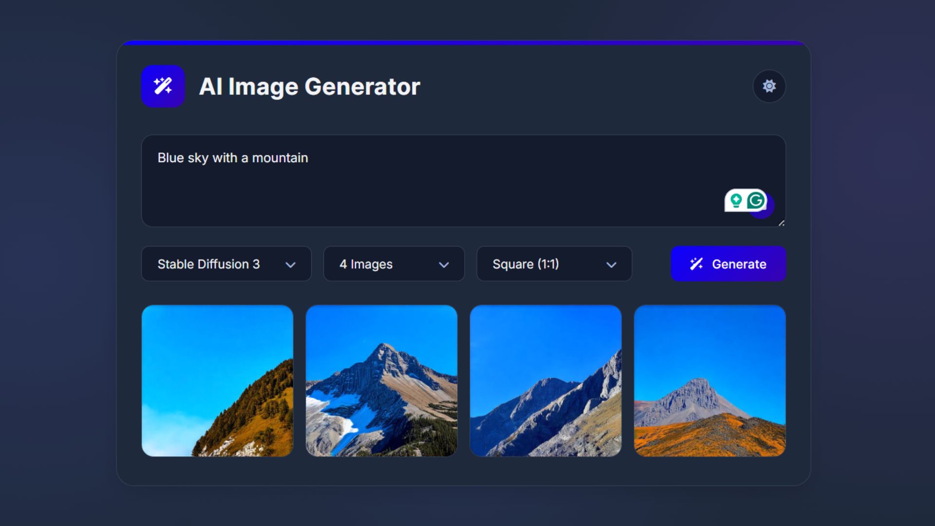
How to Build an AI Image Generator Using HTML, CSS, and JavaScript
Build a responsive AI Image Generator using HTML, CSS, and JavaScript. Learn how to integrate Hugging Face API to create

