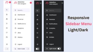
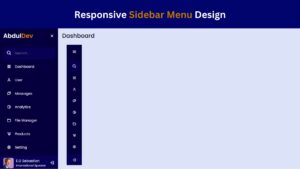
Build a Fully Responsive Sidebar with Dropdown Menu – HTML, CSS & JS

In modern web development, having a responsive sidebar with a dropdown menu is a great way to enhance user navigation and experience. Unlike traditional top navigation bars, sidebars provide a compact and space-efficient way to organize menu items, especially for mobile-friendly designs.
In this tutorial, we will create a fully responsive sidebar with dropdown functionality using HTML, CSS, and JavaScript. By the end of this guide, you’ll have a functional and stylish sidebar menu that works seamlessly on both desktop and mobile screens.
What is a Responsive Sidebar with Dropdown Menu?
A responsive sidebar with a dropdown menu is a modern navigation component used in web design to enhance user experience across all devices.
Unlike traditional top navigation bars, a sidebar appears on the side of the screen and adjusts its layout based on screen size, making it ideal for both desktop and mobile users. The dropdown feature allows menu items to expand and collapse, helping to organize multiple links or categories in a clean, compact space.
Responsive sidebars are often built using HTML, CSS, and JavaScript, and include toggle buttons for mobile views, ensuring smooth and user-friendly navigation. This type of menu structure is perfect for websites with multiple pages or sections, as it improves accessibility, reduces clutter, and boosts mobile usability.
Whether you’re building a portfolio, business site, or web application, a responsive sidebar with dropdown functionality helps keep your layout clean, intuitive, and professional—making it an essential element in modern web development.
Why Use a Sidebar Menu Instead of a Traditional Navbar?
Looking for a smarter way to organize your website navigation? A sidebar menu is a powerful alternative to the traditional top navbar.
Unlike horizontal menus, a sidebar menu offers vertical space, making it ideal for websites with multiple categories or complex navigation structures. It enhances user experience by keeping options neatly stacked and always accessible, even on scroll.
Sidebars also adapt better to smaller screens, making them a popular choice for mobile-friendly designs. With dropdown functionality, you can group related links under a single menu item, keeping your layout clean and intuitive.
Whether you’re building a dashboard, blog, portfolio, or eCommerce site, a responsive sidebar ensures easy navigation and modern design appeal. Plus, with HTML, CSS, and a touch of JavaScript, creating one is simpler than ever.
Discover why developers and designers are switching to sidebars for a better UX and SEO advantage.
Check Out Those Useful Articles
Key Features of a Fully Responsive Sidebar with Dropdown
A fully responsive sidebar with a dropdown menu is a powerful navigation tool for modern websites. It enhances user experience, especially on mobile devices, by offering a compact, intuitive, and organized layout. Whether you’re building a portfolio, blog, or business site, integrating a responsive sidebar ensures smooth navigation across all screen sizes. Here are some key features you should consider:
- Responsive Design – Adapts seamlessly to all screen sizes (mobile, tablet, desktop)
- Dropdown Menus – Allows for nested navigation items, improving content organization
- Toggle Functionality – Enables users to open or collapse the sidebar easily
- Smooth Animations – Provides a polished user experience with transitions
- Minimalist UI – Keeps the design clean and user-friendly
- Mobile-First Approach – Ensures usability on smartphones and small devices
- Customizable Styles – Easily match it with your site’s branding
This feature-rich sidebar helps improve site usability, engagement, and SEO performance.
Step-by-Step Guide to Building a Responsive Sidebar with Dropdown Menu
To Create a Responsive Sidebar with Dropdown Menu follow these steps:
- Create a Folder: Name this folder according to your preference. Inside this folder, you’ll need to set up the following files:
- Create an index.html File: This file should be named index with the .html extension.
- Create a style.css File: This file should be named style with the .css extension.
- Create a main.js File: This file should be name main with the .js extension.
These files will form the basis of your Responsive Sidebar with Dropdown Menu.
Writing the HTML Structure for the Sidebar and Dropdown
Now, open your code editor and set up a new HTML file, copy those HTML Codes and Paste those Codes on index.html file.
<!DOCTYPE html>
<html lang="en">
<head>
<meta charset="UTF-8">
<meta name="viewport" content="width=device-width, initial-scale=1.0">
<title>Responsive Sidebar with Dropdown Menu by AbdulDev</title>
<!-- Custom CSS Link -->
<link rel="stylesheet" href="style.css">
<!-- Google Font for Icons Link -->
<link rel="stylesheet" href="https://fonts.googleapis.com/css2?family=Material+Symbols+Rounded:opsz,wght,FILL,GRAD@24,400,0,0" />
</head>
<body>
<!-- Mobile Sidebar Menu Button Codes -->
<button class="sidebar-menu-button">
<span class="material-symbols-rounded">menu</span>
</button>
<aside class="sidebar">
<!-- Sidebar Header Codes -->
<header class="sidebar-header">
<a href="#" class="header-logo">
<img decoding="async" src="logo.png" alt="CodingNepal" />
</a>
<button class="sidebar-toggler">
<span class="material-symbols-rounded">chevron_left</span>
</button>
</header>
<nav class="sidebar-nav">
<!-- Primary Top Nav Codes -->
<ul class="nav-list primary-nav">
<li class="nav-item">
<a href="#" class="nav-link">
<span class="material-symbols-rounded">dashboard</span>
<span class="nav-label">Dashboard</span>
</a>
<ul class="dropdown-menu">
<li class="nav-item"><a class="nav-link dropdown-title">Dashboard</a></li>
</ul>
</li>
<!-- Dropdown Codes -->
<li class="nav-item dropdown-container">
<a href="#" class="nav-link dropdown-toggle">
<span class="material-symbols-rounded">calendar_today</span>
<span class="nav-label">Services</span>
<span class="dropdown-icon material-symbols-rounded">keyboard_arrow_down</span>
</a>
<!-- Dropdown Menu Codes -->
<ul class="dropdown-menu">
<li class="nav-item"><a class="nav-link dropdown-title">Services</a></li>
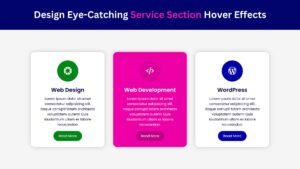
<li class="nav-item"><a href="#" class="nav-link dropdown-link">Web Design</a></li>
<li class="nav-item"><a href="#" class="nav-link dropdown-link">Web Development</a></li>
<li class="nav-item"><a href="#" class="nav-link dropdown-link">WordPress</a></li>
</ul>
</li>
<li class="nav-item">
<a href="#" class="nav-link">
<span class="material-symbols-rounded">notifications</span>
<span class="nav-label">Notifications</span>
</a>
<ul class="dropdown-menu">
<li class="nav-item"><a class="nav-link dropdown-title">Notifications</a></li>
</ul>
</li>
<li class="nav-item">
<a href="#" class="nav-link">
<span class="material-symbols-rounded">local_library</span>
<span class="nav-label">Resources</span>
</a>
<ul class="dropdown-menu">
<li class="nav-item"><a class="nav-link dropdown-title">Resources</a></li>
</ul>
</li>
<!-- Dropdown Codes -->
<li class="nav-item dropdown-container">
<a href="#" class="nav-link dropdown-toggle">
<span class="material-symbols-rounded">star</span>
<span class="nav-label">Bookmarks</span>
<span class="dropdown-icon material-symbols-rounded">keyboard_arrow_down</span>
</a>
<!-- Dropdown Menu Codes -->
<ul class="dropdown-menu">
<li class="nav-item"><a class="nav-link dropdown-title">Bookmarks</a></li>
<li class="nav-item"><a href="#" class="nav-link dropdown-link">Price List</a></li>
<li class="nav-item"><a href="#" class="nav-link dropdown-link">Favorite Articles</a></li>
<li class="nav-item"><a href="#" class="nav-link dropdown-link">Case Study</a></li>
</ul>
</li>
<li class="nav-item">
<a href="#" class="nav-link">
<span class="material-symbols-rounded">extension</span>
<span class="nav-label">Extensions</span>
</a>
<ul class="dropdown-menu">
<li class="nav-item"><a class="nav-link dropdown-title">Extensions</a></li>
</ul>
</li>
<li class="nav-item">
<a href="#" class="nav-link">
<span class="material-symbols-rounded">settings</span>
<span class="nav-label">Settings</span>
</a>
<ul class="dropdown-menu">
<li class="nav-item"><a class="nav-link dropdown-title">Settings</a></li>
</ul>
</li>
</ul>
<!-- Secondary Bottom Nav Codes -->
<ul class="nav-list secondary-nav">
<li class="nav-item">
<a href="#" class="nav-link">
<span class="material-symbols-rounded">help</span>
<span class="nav-label">Help Center</span>
</a>
<ul class="dropdown-menu">
<li class="nav-item"><a class="nav-link dropdown-title">Help Center</a></li>
</ul>
</li>
<li class="nav-item">
<a href="#" class="nav-link">
<span class="material-symbols-rounded">logout</span>
<span class="nav-label">Sign Out</span>
</a>
<ul class="dropdown-menu">
<li class="nav-item"><a class="nav-link dropdown-title">Sign Out</a></li>
</ul>
</li>
</ul>
</nav>
</aside>
<!-- Script -->
<script src="main.js"></script>
</body>
</html>
Styling the Sidebar and Dropdown Menu Using CSS
After that, copy those CSS Codes and Paste those Codes on style.css file.
					@import url('https://fonts.googleapis.com/css2?family=Poppins:wght@400;500;600;700&display=swap');

* {
  margin: 0;
  padding: 0;
  box-sizing: border-box;
  font-family: "Poppins", sans-serif;
}

body {
  min-height: 100vh;
  background: #d9d8fc;
}

.sidebar {
  position: fixed;
  top: 0;
  left: 0;
  z-index: 10;
  width: 270px;
  height: 100vh;
  background: #010f4b;
  transition: all 0.4s ease;
}

.sidebar.collapsed {
  width: 85px;
}

.sidebar .sidebar-header {
  display: flex;
  position: relative;
  padding: 25px 20px;
  align-items: center;
  justify-content: space-between;
}

.sidebar-header .header-logo img {
  width: 46px;
  height: 46px;
  display: block;
  object-fit: contain;
  border-radius: 50%;
}

.sidebar-header .sidebar-toggler,
.sidebar-menu-button {
  position: absolute;
  right: 20px;
  height: 35px;
  width: 35px;
  color: #010f4b;
  border: none;
  cursor: pointer;
  display: flex;
  background: #EEF2FF;
  align-items: center;
  justify-content: center;
  border-radius: 8px;
  transition: 0.4s ease;
}

.sidebar.collapsed .sidebar-header .sidebar-toggler {
  transform: translate(-4px, 65px);
}

.sidebar-header .sidebar-toggler span,
.sidebar-menu-button span {
  font-size: 1.75rem;
  transition: 0.4s ease;
}

.sidebar.collapsed .sidebar-header .sidebar-toggler span {
  transform: rotate(180deg);
}

.sidebar-header .sidebar-toggler:hover {
  background: #d9e1fd;
}

.sidebar-nav .nav-list {
  list-style: none;
  display: flex;
  gap: 4px;
  padding: 0 15px;
  flex-direction: column;
  transform: translateY(15px);
  transition: 0.4s ease;
}

.sidebar .sidebar-nav .primary-nav {
  overflow-y: auto;
  scrollbar-width: thin;
  padding-bottom: 20px;
  height: calc(100vh - 227px);
  scrollbar-color: transparent transparent;
}

.sidebar .sidebar-nav .primary-nav:hover {
  scrollbar-color: #EEF2FF transparent;
}

.sidebar.collapsed .sidebar-nav .primary-nav {
  overflow: unset;
  transform: translateY(65px);
}

.sidebar-nav .nav-item .nav-link {
  color: #fff;
  display: flex;
  gap: 12px;
  white-space: nowrap;
  border-radius: 8px;
  padding: 11px 15px;
  align-items: center;
  text-decoration: none;
  border: 1px solid #010f4b;
  transition: 0.4s ease;
}

.sidebar-nav .nav-item:is(:hover, .open)>.nav-link:not(.dropdown-title) {
  color: #010f4b;
  background: #EEF2FF;
}

.sidebar .nav-link .nav-label {
  transition: opacity 0.3s ease;
}

.sidebar.collapsed .nav-link :where(.nav-label, .dropdown-icon) {
  opacity: 0;
  pointer-events: none;
}

.sidebar.collapsed .nav-link .dropdown-icon {
  transition: opacity 0.3s 0s ease;
}

.sidebar-nav .secondary-nav {
  position: absolute;
  bottom: 35px;
  width: 100%;
  background: #010f4b;
}

.sidebar-nav .nav-item {
  position: relative;
}

/* Dropdown Stylings Codes */
.sidebar-nav .dropdown-container .dropdown-icon {
  margin: 0 -4px 0 auto;
  transition: transform 0.4s ease, opacity 0.3s 0.2s ease;
}

.sidebar-nav .dropdown-container.open .dropdown-icon {
  transform: rotate(180deg);
}

.sidebar-nav .dropdown-menu {
  height: 0;
  overflow-y: hidden;
  list-style: none;
  padding-left: 15px;
  transition: height 0.4s ease;
}

.sidebar.collapsed .dropdown-menu {
  position: absolute;
  top: -10px;
  left: 100%;
  opacity: 0;
  height: auto !important;
  padding-right: 10px;
  overflow-y: unset;
  pointer-events: none;
  border-radius: 0 10px 10px 0;
  background: #010f4b;
  transition: 0s;
}

.sidebar.collapsed .dropdown-menu:has(.dropdown-link) {
  padding: 7px 10px 7px 24px;
}

.sidebar.sidebar.collapsed .nav-item:hover>.dropdown-menu {
  opacity: 1;
  pointer-events: auto;
  transform: translateY(12px);
  transition: all 0.4s ease;
}

.sidebar.sidebar.collapsed .nav-item:hover>.dropdown-menu:has(.dropdown-link) {
  transform: translateY(10px);
}

.dropdown-menu .nav-item .nav-link {
  color: #F1F4FF;
  padding: 9px 15px;
}

.sidebar.collapsed .dropdown-menu .nav-link {
  padding: 7px 15px;
}

.dropdown-menu .nav-item .nav-link.dropdown-title {
  display: none;
  color: #fff;
  padding: 9px 15px;
}

.dropdown-menu:has(.dropdown-link) .nav-item .dropdown-title {
  font-weight: 500;
  padding: 7px 15px;
}

.sidebar.collapsed .dropdown-menu .nav-item .dropdown-title {
  display: block;
}

.sidebar-menu-button {
  display: none;
}

/* Responsive codes for small screens */
@media (max-width: 768px) {
  .sidebar-menu-button {
    position: fixed;
    left: 20px;
    top: 20px;
    height: 40px;
    width: 42px;
    display: flex;
    color: #F1F4FF;
    background: #010f4b;
  }

  .sidebar.collapsed {
    width: 270px;
    left: -270px;
  }

  .sidebar.collapsed .sidebar-header .sidebar-toggler {
    transform: none;
  }

  .sidebar.collapsed .sidebar-nav .primary-nav {
    transform: translateY(15px);
  }
}
Adding JavaScript to Enable Dropdown and Toggle Functions
And lastly, Copy the below JS code and paste it into the main.js file.
					// Toggle visibility of a dropdown menu
const toggleDropdown = (dropdown, menu, isOpen) => {
  dropdown.classList.toggle("open", isOpen);
  menu.style.height = isOpen ? `${menu.scrollHeight}px` : 0;
};

// Close all open dropdowns
const closeAllDropdowns = () => {
  document.querySelectorAll(".dropdown-container.open").forEach((openDropdown) => {
    toggleDropdown(openDropdown, openDropdown.querySelector(".dropdown-menu"), false);
  });
};

// Click event to all dropdown toggles
document.querySelectorAll(".dropdown-toggle").forEach((dropdownToggle) => {
  dropdownToggle.addEventListener("click", (e) => {
    e.preventDefault();

    const dropdown = dropdownToggle.closest(".dropdown-container");
    const menu = dropdown.querySelector(".dropdown-menu");
    const isOpen = dropdown.classList.contains("open");

    closeAllDropdowns(); // Close all open dropdowns
    toggleDropdown(dropdown, menu, !isOpen); // Current Toggle dropdown visibility
  });
});

// Click event to sidebar toggle buttons
document.querySelectorAll(".sidebar-toggler, .sidebar-menu-button").forEach((button) => {
  button.addEventListener("click", () => {
    closeAllDropdowns(); // Close all open dropdowns
    document.querySelector(".sidebar").classList.toggle("collapsed"); // Toggle collapsed class on sidebar
  });
});

// Default Collapse Sidebar for small screens
if (window.innerWidth <= 1024) document.querySelector(".sidebar").classList.add("collapsed");
Testing and Debugging Your Sidebar on Different Devices
Testing and debugging your responsive sidebar on different devices is crucial to ensure a seamless user experience.
A sidebar that looks great on desktop but breaks on mobile can drive users away. Start by using browser developer tools like Chrome DevTools to simulate various screen sizes and orientations. Check how the sidebar behaves on smartphones, tablets, and larger displays.
Ensure the dropdown menus open smoothly, links are clickable, and no content overlaps or breaks. Test touch gestures on mobile devices to verify dropdown functionality. Also, validate your HTML, CSS, and JavaScript code to fix any hidden errors that could affect performance. Don’t forget to check cross-browser compatibility, ensuring your sidebar works perfectly on Chrome, Firefox, Safari, and Edge.
Regular testing helps catch layout issues early and improves the overall usability of your site. A fully functional, bug-free sidebar enhances navigation, boosts SEO, and ensures a positive user experience across all platforms.
Common Mistakes to Avoid When Building a Sidebar Menu
When building a responsive sidebar menu, avoiding common mistakes is crucial for a smooth user experience and better website performance.
One major error is neglecting mobile responsiveness, which can lead to poor navigation on smaller screens. Overcomplicating the sidebar layout with too many links or dropdowns can overwhelm users, making it harder to find essential pages. Ignoring accessibility features, such as keyboard navigation and ARIA labels, can alienate a significant portion of your audience.
Another frequent mistake is forgetting to test the sidebar across different browsers and devices, which can cause unexpected layout issues. Slow loading times caused by heavy animations or unoptimized code also hurt user engagement and SEO. Additionally, inconsistent design between the sidebar and the rest of the website can confuse users and weaken brand identity.
By understanding and avoiding these common mistakes, you can create a responsive, user-friendly, and visually appealing sidebar that enhances your site’s functionality and ranking.
Final Thoughts: Improving and Customizing Your Sidebar Design
Building a fully responsive sidebar with a dropdown menu using HTML, CSS, and JavaScript is a major step toward creating a user-friendly website.
However, the real power lies in continuously improving and customizing your sidebar design. Consider adding features like icons, collapsible menus, smooth animations, and dark mode support to enhance user experience. Always focus on accessibility by ensuring keyboard navigation and using proper ARIA labels.
Customize the color schemes and layouts to match your website’s branding while keeping mobile responsiveness a priority. Testing across multiple devices and browsers ensures your sidebar works flawlessly for all users.
With a few advanced tweaks and optimizations, your sidebar can become a powerful navigation tool that boosts engagement and improves SEO performance. Keep experimenting with modern UI trends and refine your sidebar to meet user needs and business goals.
A well-designed, responsive sidebar not only improves navigation but also strengthens the overall website experience.
Recent Posts


Categories

FAQs
What is a responsive sidebar with a dropdown menu?
A responsive sidebar with a dropdown menu is a vertical navigation menu that adjusts automatically for different screen sizes and contains expandable dropdown items for better organization.
Why should I use a sidebar instead of a top navigation bar?
Sidebars save horizontal space, making them ideal for mobile devices and content-heavy websites. They allow better categorization through dropdowns and improve the user experience.
Which technologies are needed to build a responsive sidebar?
You only need HTML for structure, CSS for styling and responsiveness, and JavaScript to add dropdown interactivity and toggle functions.
How can I make my sidebar mobile-friendly?
Use CSS media queries to adjust the sidebar layout for smaller screens and include a toggle button or collapsible feature for easier navigation on mobile devices.
How do I create a dropdown inside the sidebar?
Add a nested <ul> list inside a <li> element and use JavaScript to toggle its visibility when the user clicks the parent link or button.
Can I build a responsive sidebar without JavaScript?
Yes, basic dropdown functionality can be created using only HTML and CSS by utilizing techniques like the :hover pseudo-class, but JavaScript provides more control and better mobile support.
How do I add animations to the sidebar and dropdown?
You can add CSS transitions to sidebar elements and dropdowns to create smooth slide, fade, or expand/collapse animations for better user experience.
What are common mistakes when building a responsive sidebar?
Common mistakes include ignoring mobile responsiveness, creating complicated navigation structures, forgetting accessibility, and not testing across different browsers and devices.
How can I improve the accessibility of my sidebar menu?
Use ARIA attributes, proper semantic HTML elements, and ensure that users can navigate dropdown menus using only a keyboard (tab, enter, arrow keys).
Can I use frameworks like Bootstrap to create a sidebar?
Yes, frameworks like Bootstrap and Tailwind CSS provide pre-built sidebar components, but creating one manually with HTML, CSS, and JavaScript offers more flexibility and customization.
Share on Social Media
Related Articles

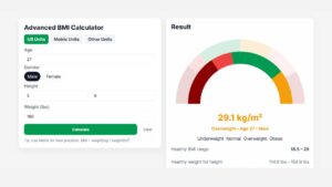
Advanced BMI Calculator: Accurate Body Mass Index & Health Insights
Discover how an Advanced BMI Calculator provides accurate, personalized health insights by considering age, gender, body fat, and more.

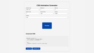
CSS Animation Generator – Create Stunning Animations Without Coding Skills
Discover how a CSS animation generator helps you design smooth, professional animations without coding. Learn features, benefits, tips, and integration
How to Build an AI Image Generator Using HTML, CSS, and JavaScript
Build a responsive AI Image Generator using HTML, CSS, and JavaScript. Learn how to integrate Hugging Face API to create