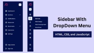
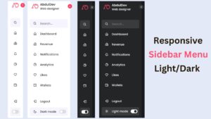
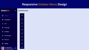
Responsive Sidebar Menu in HTML, CSS & JS | Light/Dark Mode
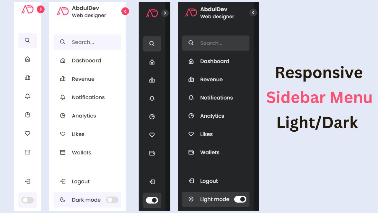
Creating a user-friendly navigation system is critical to ensure a seamless user experience in today’s web development landscape. A responsive sidebar menu is an excellent choice for websites and web applications, as it saves space while providing easy access to important links and features. Adding a light and dark theme switcher enhances user satisfaction by catering to their visual preferences. This guide will walk you through creating a modern responsive sidebar menu with a built-in theme switcher.
Why Choose a Responsive Sidebar Menu?
A responsive sidebar menu is a versatile tool that can transform your website’s navigation system. Let’s dive deeper into the benefits:
- Space Efficiency: Sidebar menus save screen space, making them ideal for mobile-first designs. They tuck away links and options neatly, ensuring the main content remains the focal point. Unlike traditional top navigation bars, sidebars can house extensive menus without cluttering the interface. For mobile users, a collapsible sidebar ensures they have a clean and accessible layout.
- Improved User Experience: A sidebar provides intuitive navigation, especially when designed with clear labels and icons. It lets users locate essential links quickly, ensuring a smoother browsing experience. A well-structured sidebar also supports submenus, allowing websites with multiple pages to organize content efficiently. This improves user retention and reduces bounce rates.
- Enhanced Aesthetics: Adding a theme switcher to your sidebar makes your site more visually appealing, catering to users who prefer light or dark modes. This personalization option resonates with modern web users who appreciate control over their browsing experience.
A beautifully designed sidebar enhances your site’s branding, contributing to a cohesive visual identity.Investing time in crafting a responsive sidebar menu is a step toward creating a functional and visually appealing website catering to diverse user needs.
Features of the Sidebar Menu We’ll Create
Our sidebar menu will have many features designed to elevate your web design. Let’s take a closer look:
- Fully Responsive Design: Responsiveness is the cornerstone of modern web development. Our sidebar menu will adapt seamlessly to various screen sizes, from desktops to smartphones. This ensures users can navigate your site effortlessly, regardless of their device.
- Collapsible Menu Items: To further enhance usability, we’ll incorporate collapsible menu items. This feature is handy for websites with extensive navigation options, as it keeps the interface clean and manageable. Users can expand or collapse sections as needed, making the menu intuitive and organized.
- Light and Dark Theme Toggle: The light and dark theme toggle is a game-changer. By offering this option, you cater to users’ visual preferences, whether they’re browsing during the day or night. This feature also aligns with accessibility standards, ensuring your site is inclusive and user-friendly.
- Smooth Animations for Transitions: Smooth animations make interactions more engaging. We’ll add subtle animations to menu transitions, providing users with a polished and professional experience. When done right, animations can enhance usability by visually indicating state changes.
- Easy Customization with CSS Variables: Customization is key to adapting the sidebar to different projects. By leveraging CSS variables, we’ll make it simple to adjust colors, spacing, and other design elements. This will ensure developers can tweak the menu to match their branding without rewriting the entire stylesheet.
These features collectively make the sidebar menu a powerful addition to any website, combining functionality with aesthetic appeal.
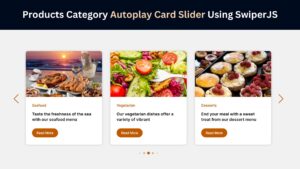
Check Out Those Useful Articles
Tools and Technologies Needed
Following this guide, you’ll need the right tools and a basic understanding of web development concepts. Here’s what you’ll require:
- Basic Knowledge of HTML, CSS, and JavaScript: Understanding the fundamentals of these three technologies is crucial. HTML will structure the sidebar menu, CSS will style it, and JavaScript will add interactivity. If you’re new to web development, there are plenty of resources online, such as free courses on FreeCodeCamp or MDN Web Docs.
- A Text Editor: A reliable text editor is essential for writing and editing code. Popular options include VS Code, Sublime Text, and Atom. These tools offer syntax highlighting and code completion features, making development more efficient.
- A Web Browser for Testing: Testing your sidebar menu in a web browser ensures it functions as intended. Modern browsers like Google Chrome and Mozilla Firefox have developer tools that help debug and refine your design. Testing on multiple browsers and devices ensures compatibility and responsiveness.
By preparing these tools, you can create a professional-grade sidebar menu.
Step-by-Step Guide to Building the Sidebar Menu
To Create a Sidebar Menu follow these steps:
- Create a Folder: Name this folder according to your preference. Inside this folder, you’ll need to set up the following files:
- Create an index.html File: This file should be named index with the .html extension.
- Create a style.css File: This file should be named style with the .css extension.
- Create a main.js File: This file should be name main with the .js extension.
These files will form the basis of your Sidebar Menu.
Setting Up the HTML Structure
Now, open your code editor and set up a new HTML file, copy those HTML Codes and Paste those Codes on index.html file.
					<!DOCTYPE html>
<html lang="en">
<head>
    <meta charset="UTF-8">
    <meta http-equiv="X-UA-Compatible" content="IE=edge">
    <meta name="viewport" content="width=device-width, initial-scale=1.0">
    <!-- Custom CSS Link -->
    <link rel="stylesheet" href="style.css">
    <!-- Box Icon Link -->
    <link href='https://unpkg.com/boxicons@2.1.1/css/boxicons.min.css' rel='stylesheet'>
    <title>Responsive Light and Dark Sidebar Menu Design by AbdulDev</title>
</head>
<body>
    <nav class="sidebar close">
        <header>
            <div class="image-text">
                <span class="image">
                    <img decoding="async" src="logo.webp" alt="logo">
                </span>

                <div class="text logo-text">
                    <span class="name">AbdulDev</span>
                    <span class="profession">Web designer</span>
                </div>
            </div>

            <i class='bx bx-chevron-right toggle'></i>
        </header>

        <div class="menu-bar">
            <div class="menu">

                <li class="search-box">
                    <i class='bx bx-search icon'></i>
                    <input type="text" placeholder="Search...">
                </li>

                <ul class="menu-links">
                    <li class="nav-link">
                        <a href="#">
                            <i class='bx bx-home-alt icon' ></i>
                            <span class="text nav-text">Dashboard</span>
                        </a>
                    </li>

                    <li class="nav-link">
                        <a href="#">
                            <i class='bx bx-bar-chart-alt-2 icon' ></i>
                            <span class="text nav-text">Revenue</span>
                        </a>
                    </li>

                    <li class="nav-link">
                        <a href="#">
                            <i class='bx bx-bell icon'></i>
                            <span class="text nav-text">Notifications</span>
                        </a>
                    </li>

                    <li class="nav-link">
                        <a href="#">
                            <i class='bx bx-pie-chart-alt icon' ></i>
                            <span class="text nav-text">Analytics</span>
                        </a>
                    </li>

                    <li class="nav-link">
                        <a href="#">
                            <i class='bx bx-heart icon' ></i>
                            <span class="text nav-text">Likes</span>
                        </a>
                    </li>

                    <li class="nav-link">
                        <a href="#">
                            <i class='bx bx-wallet icon' ></i>
                            <span class="text nav-text">Wallets</span>
                        </a>
                    </li>

                </ul>
            </div>

            <div class="bottom-content">
                <li class="">
                    <a href="#">
                        <i class='bx bx-log-out icon' ></i>
                        <span class="text nav-text">Logout</span>
                    </a>
                </li>

                <li class="mode">
                    <div class="sun-moon">
                        <i class='bx bx-moon icon moon'></i>
                        <i class='bx bx-sun icon sun'></i>
                    </div>
                    <span class="mode-text text">Dark mode</span>

                    <div class="toggle-switch">
                        <span class="switch"></span>
                    </div>
                </li>

            </div>
        </div>

    </nav>

    <section class="home">
        <div class="text">Dashboard Sidebar</div>
    </section>

    <script src="main.js"></script>

</body>
</html>
Styling the Sidebar with CSS
After that, copy those CSS Codes and Paste those Codes on style.css file.
					@import url('https://fonts.googleapis.com/css2?family=Poppins:wght@300;400;500;600;700&display=swap');
*{
    margin: 0;
    padding: 0;
    box-sizing: border-box;
    font-family: 'Poppins', sans-serif;
}

:root{
    /* Global Colors */
    --body-color: #E4E9F7;
    --sidebar-color: #FFF;
    --primary-color: #ff3e66;
    --primary-color-light: #F6F5FF;
    --toggle-color: #DDD;
    --text-color: #383838;

    /* Global Transitions */
    --tran-03: all 0.2s ease;
    --tran-03: all 0.3s ease;
    --tran-04: all 0.3s ease;
    --tran-05: all 0.3s ease;
}

body{
    min-height: 100vh;
    background-color: var(--body-color);
    transition: var(--tran-05);
}

::selection{
    background-color: var(--primary-color);
    color: #fff;
}

body.dark{
    --body-color: #18191a;
    --sidebar-color: #242526;
    --primary-color: #3a3b3c;
    --primary-color-light: #3a3b3c;
    --toggle-color: #fff;
    --text-color: #eaeaea;
}

/* Sidebar */
 .sidebar{
    position: fixed;
    top: 0;
    left: 0;
    height: 100%;
    width: 250px;
    padding: 10px 14px;
    background: var(--sidebar-color);
    transition: var(--tran-05);
    z-index: 100;
}
.sidebar.close{
    width: 88px;
}

.sidebar li{
    height: 50px;
    list-style: none;
    display: flex;
    align-items: center;
    margin-top: 10px;
}

.sidebar header .image,
.sidebar .icon{
    min-width: 60px;
    border-radius: 6px;
}

.sidebar .icon{
    min-width: 60px;
    border-radius: 6px;
    height: 100%;
    display: flex;
    align-items: center;
    justify-content: center;
    font-size: 20px;
}

.sidebar .text,
.sidebar .icon{
    color: var(--text-color);
    transition: var(--tran-03);
}

.sidebar .text{
    font-size: 17px;
    font-weight: 500;
    white-space: nowrap;
    opacity: 1;
}
.sidebar.close .text{
    opacity: 0;
}

.sidebar header{
    position: relative;
}

.sidebar header .image-text{
    display: flex;
    align-items: center;
}
.sidebar header .logo-text{
    display: flex;
    flex-direction: column;
}
header .image-text .name {
    margin-top: 2px;
    font-size: 18px;
    font-weight: 600;
}

header .image-text .profession{
    font-size: 16px;
    margin-top: -2px;
    display: block;
}

.sidebar header .image{
    display: flex;
    align-items: center;
    justify-content: center;
}

.sidebar header .image img{
    width: 40px;
    border-radius: 6px;
}

.sidebar header .toggle{
    position: absolute;
    top: 50%;
    right: -25px;
    transform: translateY(-50%) rotate(180deg);
    height: 25px;
    width: 25px;
    background-color: var(--primary-color);
    color: var(--sidebar-color);
    border-radius: 50%;
    display: flex;
    align-items: center;
    justify-content: center;
    font-size: 22px;
    cursor: pointer;
    transition: var(--tran-05);
}

body.dark .sidebar header .toggle{
    color: var(--text-color);
}

.sidebar.close .toggle{
    transform: translateY(-50%) rotate(0deg);
}

.sidebar .menu{
    margin-top: 40px;
}

.sidebar li.search-box{
    border-radius: 6px;
    background-color: var(--primary-color-light);
    cursor: pointer;
    transition: var(--tran-05);
}

.sidebar li.search-box input{
    height: 100%;
    width: 100%;
    outline: none;
    border: none;
    background-color: var(--primary-color-light);
    color: var(--text-color);
    border-radius: 6px;
    font-size: 17px;
    font-weight: 500;
    transition: var(--tran-05);
}
.sidebar li a{
    list-style: none;
    height: 100%;
    background-color: transparent;
    display: flex;
    align-items: center;
    height: 100%;
    width: 100%;
    border-radius: 6px;
    text-decoration: none;
    transition: var(--tran-03);
}

.sidebar li a:hover{
    background-color: var(--primary-color);
}
.sidebar li a:hover .icon,
.sidebar li a:hover .text{
    color: var(--sidebar-color);
}
body.dark .sidebar li a:hover .icon,
body.dark .sidebar li a:hover .text{
    color: var(--text-color);
}

.sidebar .menu-bar{
    height: calc(100% - 55px);
    display: flex;
    flex-direction: column;
    justify-content: space-between;
    overflow-y: scroll;
}
.menu-bar::-webkit-scrollbar{
    display: none;
}
.sidebar .menu-bar .mode{
    border-radius: 6px;
    background-color: var(--primary-color-light);
    position: relative;
    transition: var(--tran-05);
}

.menu-bar .mode .sun-moon{
    height: 50px;
    width: 60px;
}

.mode .sun-moon i{
    position: absolute;
}
.mode .sun-moon i.sun{
    opacity: 0;
}
body.dark .mode .sun-moon i.sun{
    opacity: 1;
}
body.dark .mode .sun-moon i.moon{
    opacity: 0;
}

.menu-bar .bottom-content .toggle-switch{
    position: absolute;
    right: 0;
    height: 100%;
    min-width: 60px;
    display: flex;
    align-items: center;
    justify-content: center;
    border-radius: 6px;
    cursor: pointer;
}
.toggle-switch .switch{
    position: relative;
    height: 22px;
    width: 40px;
    border-radius: 25px;
    background-color: var(--toggle-color);
    transition: var(--tran-05);
}

.switch::before{
    content: '';
    position: absolute;
    height: 15px;
    width: 15px;
    border-radius: 50%;
    top: 50%;
    left: 5px;
    transform: translateY(-50%);
    background-color: var(--sidebar-color);
    transition: var(--tran-04);
}

body.dark .switch::before{
    left: 20px;
}

.home{
    position: absolute;
    top: 0;
    top: 0;
    left: 250px;
    height: 100vh;
    width: calc(100% - 250px);
    background-color: var(--body-color);
    transition: var(--tran-05);
}
.home .text{
    font-size: 30px;
    font-weight: 500;
    color: var(--text-color);
    padding: 12px 60px;
}

.sidebar.close ~ .home{
    left: 78px;
    height: 100vh;
    width: calc(100% - 78px);
}
body.dark .home .text{
    color: var(--text-color);
}
/* Responsive Code */
@media screen and (max-width: 560px) {
    .sidebar{
        width: 220px;
    }
    .sidebar .text{
        font-size: 14px;
    }
    .sidebar .icon{
        font-size: 18px;
    }
    .sidebar li.search-box input{
        font-size: 14px;
    }
    .home{
        left: 220px;
        width: calc(100% - 220px);
    }
    .home .text{
        font-size: 28px;
        font-weight: 500;
        color: var(--text-color);
        padding: 12px 50px;
    }
    body{
        overflow: hidden;
    }
}
Adding Theme Switcher Functionality with JavaScript
And lastly, Copy the below JS code and paste it into the main.js file.
					const body = document.querySelector('body'),
      sidebar = body.querySelector('nav'),
      toggle = body.querySelector(".toggle"),
      searchBtn = body.querySelector(".search-box"),
      modeSwitch = body.querySelector(".toggle-switch"),
      modeText = body.querySelector(".mode-text");


toggle.addEventListener("click" , () =>{
    sidebar.classList.toggle("close");
})

searchBtn.addEventListener("click" , () =>{
    sidebar.classList.remove("close");
})

modeSwitch.addEventListener("click" , () =>{
    body.classList.toggle("dark");

    if(body.classList.contains("dark")){
        modeText.innerText = "Light mode";
    }else{
        modeText.innerText = "Dark mode";

    }
});
Best Practices for Sidebar Menus
When designing a sidebar menu, keep the following best practices in mind:
- Accessibility: Ensure your menu is keyboard-navigable and supports screen readers. To enhance accessibility, use semantic HTML elements and ARIA attributes. For example, include ARIA-expanded attributes for collapsible menu items.
- Performance: To maintain optimal performance, minimize the use of heavy animations. CSS animations are more efficient than JavaScript.
- Customization: Use CSS variables to make your sidebar easily customizable for different projects. This approach allows developers to adapt the design quickly without diving into the CSS codebase.
By following these best practices, you’ll create a sidebar menu that is not only functional but also user-friendly and inclusive.
Conclusion
Creating a modern responsive sidebar menu with a light and dark theme switcher doesn’t have to be complicated. Following this guide, you can build a stylish, functional sidebar menu that enhances your website’s user experience. Customize the design and functionality further to match your project’s unique needs.
Recent Posts


Categories

FAQs
What is a responsive sidebar menu?
A responsive sidebar menu is a navigation system designed to adapt to different screen sizes. It intuitively accesses links and features on desktops and mobile devices and ensures a seamless user experience by maintaining functionality across all devices.
Why is a theme switcher necessary in web design?
A theme switcher allows users to toggle between light and dark modes, catering to personal preferences and improving accessibility. This feature enhances user satisfaction, reduces eye strain, and makes websites more visually versatile.
What tools do I need to build a responsive sidebar menu?
You need a text editor (like VS Code), a web browser for testing, and basic knowledge of HTML, CSS, and JavaScript. These tools are sufficient to design, style, and add interactivity to your sidebar menu.
How do CSS variables simplify theme switching?
CSS variables enable developers to define reusable values for colors, spacing, and other properties. Changing the values of these variables based on the selected theme allows you to easily switch between light and dark modes without altering the entire stylesheet.
Can I make the sidebar collapsible?
Yes, you can use CSS and JavaScript to create collapsible sidebar menus. Toggling visibility or expanding/collapsing menu items can improve usability, especially for multiple-layer navigation systems.
How can I ensure my sidebar menu is accessible?
Use semantic HTML elements, include ARIA attributes (like aria-expanded for collapsible sections), and ensure keyboard navigation. This will ensure that the menu is usable by people with disabilities.
What are the performance considerations for a sidebar menu?
To optimize performance, minimize the use of JavaScript for animations, use lightweight libraries, and test your menu on different devices and browsers. This ensures smooth functionality without compromising speed.
How can I save the user’s theme preference?
You can use the browser’s localStorage API to save the selected theme. When the page loads, check for the saved theme and apply it automatically, ensuring a consistent user experience across sessions.
Is it possible to customize the sidebar design for branding?
Absolutely! Using CSS variables and modular code, you can easily customize colors, fonts, spacing, and other design elements to align with your brand’s identity.
Where can I find the source code for this project?
The complete source code for creating a responsive sidebar menu with a light and dark theme switcher is available in this guide. You can also explore more free tutorials and resources on abduldev.com.
Share on Social Media
Related Articles

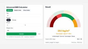
Advanced BMI Calculator: Accurate Body Mass Index & Health Insights
Discover how an Advanced BMI Calculator provides accurate, personalized health insights by considering age, gender, body fat, and more.

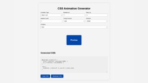
CSS Animation Generator – Create Stunning Animations Without Coding Skills
Discover how a CSS animation generator helps you design smooth, professional animations without coding. Learn features, benefits, tips, and integration
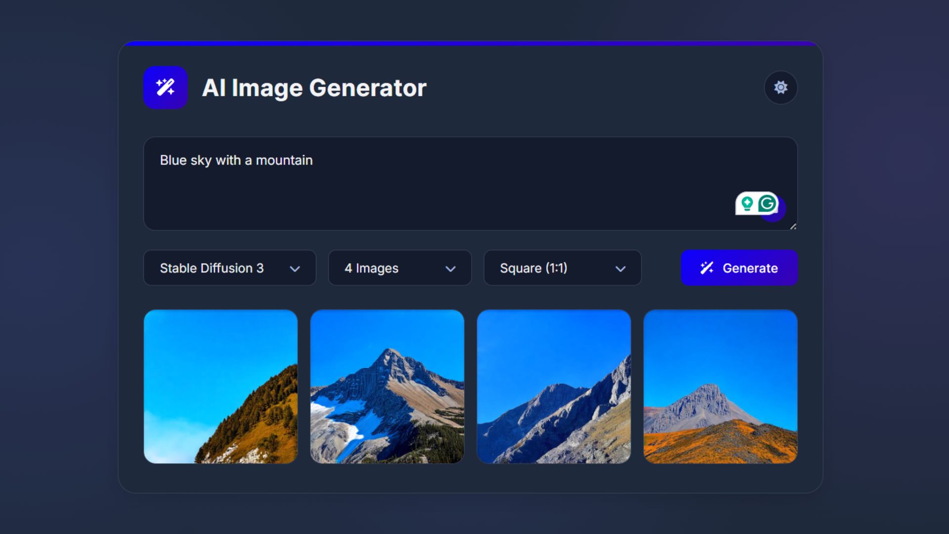
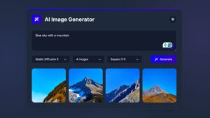
How to Build an AI Image Generator Using HTML, CSS, and JavaScript
Build a responsive AI Image Generator using HTML, CSS, and JavaScript. Learn how to integrate Hugging Face API to create