How to Design a Responsive Footer Using HTML and CSS
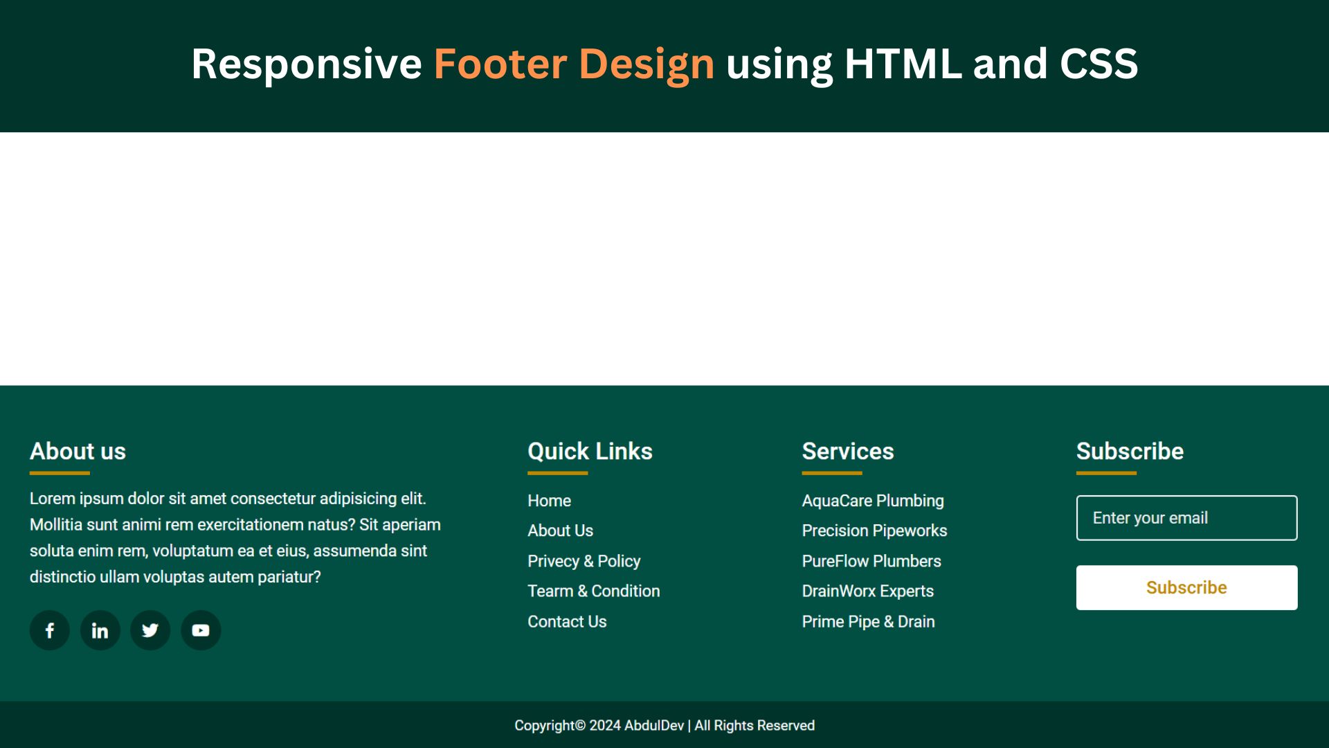
In today’s digital landscape, having a responsive footer is essential for creating a seamless user experience across all devices. Whether you’re building a personal blog or a commercial website, a well-designed footer can enhance navigation, provide important information, and contribute to the overall aesthetics of your site. This blog post will guide you through creating a responsive footer using HTML and CSS.
Understanding the Importance of a Responsive Footer
A responsive footer ensures that content within the footer adapts seamlessly to different screen sizes, from desktops to smartphones. When a footer remains static and fails to adjust its layout, it can lead to a poor user experience, frustrating visitors who may struggle to access critical information—crafting a responsive footer guarantees that vital elements like links, contact details, and additional resources remain easily accessible regardless of the device used. This not only improves usability but also enhances the overall navigation of your site. A responsive footer can also contribute to the aesthetics of your site, ensuring a polished and professional appearance across all devices.
Check Out Those Useful Articles
Choosing the Right Layout and Elements
Before diving into coding, decide on the layout and elements that your footer should include. Common elements in a footer are contact information, social media links, copyright notices, and quick links to other parts of the website. Consider the hierarchy and importance of each element to determine their arrangement. A multi-column layout is often a popular choice for footers, as it organizes information neatly and is easier to adapt to different screen sizes.
Steps to Design a Responsive Footer
To Design a Responsive Footer follow these steps:
- Create a Folder: Name this folder according to your preference. Inside this folder, you’ll need to set up the following files:
- Create an index.html File: This file should be named index with the .html extension.
- Create a style.css File: This file should be named style with the .css extension.
These files will form the basis of your Responsive Footer.
Setting Up Your HTML Structure
Now, open your code editor and set up a new HTML file, copy those HTML Codes and Paste those Codes on index.html file.
					<!DOCTYPE html>
<html lang="en">
<head>
    <meta charset="UTF-8">
    <meta name="viewport" content="width=device-width, initial-scale=1.0">
    <title>Responsive Footer Design by AbdulDev</title>
    <link rel="stylesheet" href="style.css">
    <link href='https://unpkg.com/boxicons@2.1.4/css/boxicons.min.css' rel='stylesheet'>
</head>
<body>
    <footer>
        <div class="container">
            <div class="sec about">
                <h2>About us</h2>
                <p>Lorem ipsum dolor sit amet consectetur adipisicing elit. Mollitia sunt animi rem exercitationem natus? Sit aperiam soluta enim rem, voluptatum ea et eius, assumenda sint distinctio ullam voluptas autem pariatur?</p>
                <ul class="socila-icon">
                    <li><a href="#"><i class='bx bxl-facebook'></i></a></li>
                    <li><a href="#"><i class='bx bxl-linkedin'></i></a></li>
                    <li><a href="#"><i class='bx bxl-twitter'></i></a></li>
                    <li><a href="#"><i class='bx bxl-youtube'></i></a></li>
                </ul>
            </div>
            <div class="sec usefullinks">
                <h2>Quick Links</h2>
                <ul>
                    <li><a href="#">Home</a></li>
                    <li><a href="#">About Us</a></li>
                    <li><a href="#">Privecy & Policy</a></li>
                    <li><a href="#">Tearm & Condition</a></li>
                    <li><a href="#">Contact Us</a></li>
                </ul>
            </div>
            <div class="sec shop">
                <h2>Services</h2>
                <ul>
                    <li><a href="#">AquaCare Plumbing</a></li>
                    <li><a href="#">Precision Pipeworks</a></li>
                    <li><a href="#">PureFlow Plumbers</a></li>
                    <li><a href="#">DrainWorx Experts</a></li>
                    <li><a href="#">Prime Pipe & Drain</a></li>
                </ul>
            </div>
            <div class="sec contact">
                <h2>Subscribe</h2>
                <ul class="info">
                  <li><input type="text" placeholder="Enter your email"></li>
                  <li><input type="button" value="Subscribe"></li>
                </ul>
            </div>
        </div>
    </footer>
    <div class="copyright">
        <p>Copyright© 2024 AbdulDev | All Rights Reserved</p>
    </div>
</body>
</html>
Styling the Footer with CSS
With the HTML structure in place, use CSS to style the footer for visual appeal and functionality. Start by setting background colors and text styles to match your website’s theme. Utilize Flexbox or CSS Grid for a flexible layout that adjusts to various screen sizes. Flexbox is particularly effective for creating a responsive design.
After that, copy those CSS Codes and Paste those Codes on style.css file.
					@import url('https://fonts.googleapis.com/css2?family=Roboto:wght@400;500;700&display=swap');

*{
    margin: 0;
    padding: 0;
    box-sizing: border-box;
    font-family: "Roboto", sans-serif;
}
body{
    min-height: 100vh;
    display: grid;
    justify-content: end;
    align-content: end;
}
footer{
    position: relative;
    width: 100%;
    height: auto;
    padding: 50px 80px;
    background: #004f42;
}
footer .container{
    width: 100%;
    display: grid;
    grid-template-columns: 2fr 1fr 1fr 1fr;
    grid-gap: 50px;
}
footer .container .sec h2{
    position: relative;
    color: #fff;
    font-weight: 500;
    margin-bottom: 20px;
}
footer .container .sec h2::before{
    content: '';
    position: absolute;
    bottom: -10px;
    left: 0;
    width: 60px;
    height: 4px;
    background: #c18700;
}
footer .container .sec p{
    font-size: 16px;
    line-height: 26px;
    color: #fff;
}
.socila-icon{
    margin-top: 20px;
    display: grid;
    grid-template-columns: repeat(4, 40px);
    grid-gap: 10px;
}
.socila-icon li{
    list-style: none;
}
.socila-icon li a{
    font-size: 20px;
    color: #fff;
    text-decoration: none;
    height: 40px;
    width: 40px;
    display: inline-block;
    background: #00342b;
    border-radius: 50%;
    display: grid;
    align-content: center;
    justify-content: center;
    transition: 0.5s;
    position: relative;
    overflow: hidden;
    z-index: 1;
}
.socila-icon li a::before{
    content: '';
    position: absolute;
    height: 40px;
    width: 0;
    top: 0;
    left: 0;
    background: #c18700;
    transition: 0.5s;
    z-index: -1;
}
.socila-icon li a:hover::before{
    width: 40px;
}
.usefullinks{
    position: relative;
}
.usefullinks li{
    list-style: none;
}
.usefullinks li a{
    text-decoration: none;
    font-size: 16px;
    list-style: none;
    line-height: 30px;
    color: #fff;
    transition: 0.3s;
}
.usefullinks li a:hover{
    color: #c18700;
}
.shop{
    position: relative;
}
.shop li{
    list-style: none;
}
.shop li a{
    text-decoration: none;
    font-size: 16px;
    list-style: none;
    line-height: 30px;
    color: #fff;
    transition: 0.3s;
}
.shop li a:hover{
    color: #c18700;
}
.info{
  position: relative;
  margin-top: 25px;
}
.info li{
  display: grid;
  grid-template-columns: 35px 1fr;
  margin-bottom: 20px;
}
input{
  height: 45px;
  width: 220px;
  outline: none;
  border: 2px solid #f3f3f3;
  background: #004f42;
  border-radius: 4px;
  padding: 0 15px;
  font-size: 15px;
  color: #fff;
  margin-top: 5px;
}
input::placeholder{
  color: #ededed;
  font-size: 16px;
}
input[type="button"]{
  background: #fff;
  color: #c18700;
  border: none;
  font-size: 18px;
  font-weight: 500;
  margin: 4px 0;
  cursor: pointer;
  transition: all 0.4s ease;
}
input[type="button"]:hover{
  background: #c18700;
  color: #fff;
}
footer .container .sec p a{
    font-size: 16px;
    text-decoration: none;
    color: #fff;
    transition: 0.3s;
}
footer .container .sec p a:hover{
    color: #ff008c;
}
.copyright{
    position: relative;
    padding: 16px 20px;
    background: #00342b;
}
.copyright p{
    font-size: 14px;
    color: #fff;
    text-align: center;
}
@media screen and (max-width:990px) {
    footer .container{
        grid-template-columns: repeat(2, 1fr);
        grid-gap: 40px;
    }
    footer{
        padding: 50px 40px;
    }
}
@media screen and (max-width:500px){
    footer .container{
        grid-template-columns: repeat(1, 1fr);
    }
}
Testing and Debugging Your Responsive Footer Design
Thorough testing and debugging are essential to ensure your responsive footer functions correctly across various browsers and devices. Begin by previewing your footer in different web browsers like Chrome, Firefox, Safari, and Edge to check for inconsistencies in layout and styling. Use browser developer tools to inspect elements and make real-time CSS and HTML code adjustments.
Next, test the footer on various devices, including smartphones, tablets, and desktop computers, to verify that it adapts seamlessly to different screen sizes. Emulators and responsive design testing tools can help simulate how your footer will appear on multiple devices, making it easier to spot issues.
Pay attention to common pitfalls such as overlapping elements, text too small to read, or links that are difficult to tap on touchscreens. Debug these issues by tweaking your CSS, such as adjusting margins, padding, and font sizes, or refining your media queries.
Check for broken links and ensure that all interactive elements, like social media icons and contact forms, function as expected. If you have used JavaScript for interactive features, verify that the scripts run smoothly without causing errors.
Finally, gather user feedback to identify any usability issues you missed. Sometimes, real-world usage can reveal problems that testing tools miss. By rigorously testing and debugging your footer, you ensure a polished, functional design that enhances the overall user experience.
Best Practices and Final Touches
As you refine your responsive footer design, focus on clarity and functionality. Keep the layout simple and avoid overcrowding it with too much information. Ensure each element serves a purpose and is easily accessible. Test all links to verify they lead to the correct destinations and update them regularly to keep your information current.
Consider incorporating whitespace to enhance readability and prevent the footer from appearing cluttered. Use consistent styling throughout to align with the overall design of your site. This includes maintaining uniform colors, fonts, and spacing.
Ensure interactive elements, like social media icons and buttons, are visible and provide feedback upon interaction, such as hover effects or focus outlines. Regularly gather user feedback to identify any areas for improvement and make adjustments accordingly.
Lastly, always prioritize accessibility. Use semantic HTML, provide descriptive labels, and ensure sufficient color contrast for all users. By adhering to these best practices, you’ll create a responsive footer that looks polished and enhances the overall user experience on your website.
FAQs
What is a responsive footer, and why is it important?
A responsive footer adjusts its layout and elements to look good on all screen sizes, from desktops to smartphones. It’s important because it enhances user experience, making it easier for visitors to navigate and access information on any device.
What should a footer include?
Common footer elements include links to important pages (like About, Contact, Privacy Policy), social media icons, contact information, newsletter signup, and sometimes a mini sitemap or copyright notice.
How can I make my footer responsive using CSS?
Use flexible CSS units like percentages, em, or rem for widths and padding. You can also use media queries to adjust the layout based on screen size, ensuring the footer adapts to smaller or larger screens.
What are media queries, and how do they help create a responsive footer?
Media queries allow you to apply styles based on screen width, height, or device orientation. For a responsive footer, media queries help arrange footer elements, adjust font sizes, and change layout on smaller screens.
How do I make a multi-column footer layout?
To create a multi-column footer, you can use CSS Grid or Flexbox. Flexbox is great for simpler layouts, while Grid offers more control for complex, multi-column designs that might need rearranging on smaller screens.
What CSS units should I use for a responsive footer?
Relative units like percentages (%), viewport units (vw and vh), and em or rem for font size and spacing are best for responsiveness. These units adjust to different screen sizes better than fixed units like pixels.
How can I add social media icons to my footer?
You can use icon libraries like Font Awesome or insert SVG icons directly into your HTML. Style them with CSS to adjust size, color, and spacing, ensuring alignment and responsiveness within your footer.
How do I keep my footer on all devices at the bottom of the page?
Use CSS with position: sticky or position: fixed to make the footer stick to the bottom of the viewport. Alternatively, ensure your main content has enough height so the footer naturally appears at the bottom.
How can I make my footer text and links readable on all devices?
Choose font sizes and colors that provide good contrast and readability. Use em or rem units for font size to ensure text scales with the user’s device settings. Test on different screen sizes to confirm legibility.
Share on Social Media
Related Articles

Build a Fully Responsive Sidebar with Dropdown Menu – HTML, CSS & JS
Learn how to build a fully responsive sidebar with dropdown menus using HTML, CSS, and JavaScript. Step-by-step guide with code
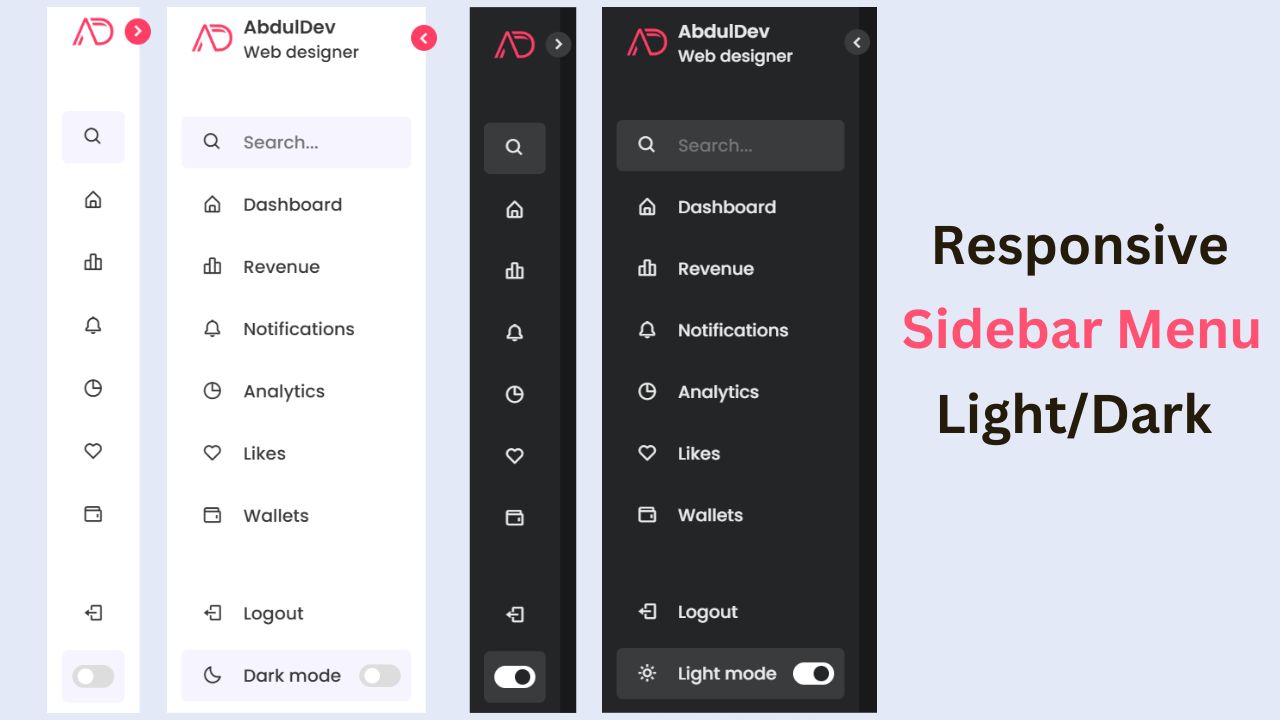
Responsive Sidebar Menu in HTML, CSS & JS | Light/Dark Mode
Learn how to create a modern responsive sidebar menu with a light and dark theme switcher using HTML, CSS, and
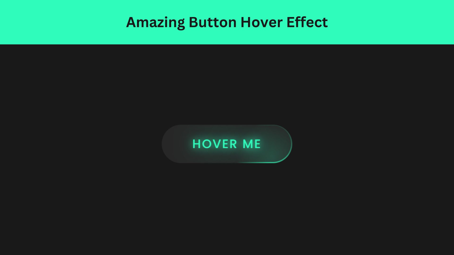
Amazing Button Hover Effect Using HTML, CSS, and JavaScript
Discover how to create amazing button hover effects using HTML, CSS, and JavaScript. Learn step-by-step with free source code to

