CSS Animation Generator – Create Stunning Animations Without Coding Skills

A CSS animation generator is a powerful tool that lets you create smooth, eye-catching animations without writing a single line of code. With its visual interface, you can choose effects, customize settings like duration and delay, and instantly preview results. Once satisfied, you simply copy the generated CSS and apply it to your website. Whether you’re a beginner or an experienced developer, a CSS animation generator saves time, reduces errors, and makes designing animations easier than ever. From buttons to text and images, it’s the quickest way to add professional motion effects that enhance user experience and engagement.
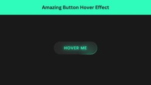
CSS Animation Generator
A CSS animation generator is a powerful tool that allows web designers and developers to create smooth, eye-catching animations without manually writing complex CSS code. Instead of spending hours learning animation syntax, you can simply use an intuitive interface to design effects and instantly generate ready-to-use CSS. This approach makes animations accessible to beginners while saving valuable time for professionals.
Animations created with a CSS animation generator can enhance user experience, improve engagement, and give your website a polished, modern look. Whether you want a button to bounce, text to fade in, or elements to slide across the screen, these tools make it easy to achieve your vision.
The best part is that you can preview your animation in real-time before applying it to your site. This eliminates trial-and-error coding and ensures you get exactly the effect you want. CSS animation generators are especially popular among designers who need quick results for client projects.
In today’s competitive digital landscape, adding smooth animations can set your website apart. By leveraging a CSS animation generator, you can produce professional-quality results with minimal effort—making it an essential tool for anyone working on modern web projects.
How to Use a CSS Animation Generator Step-by-Step
Using a CSS animation generator is straightforward. First, open your chosen generator in your web browser. Most tools have a simple interface with sliders, dropdown menus, and checkboxes for customization.
- Step 1: Select the type of animation you want, such as fade-in, bounce, or slide.
- Step 2: Adjust parameters like duration, delay, iteration count, and easing to suit your design.
- Step 3: Preview the animation in real-time to ensure it matches your vision.
- Step 4: Once satisfied, click the “Copy CSS” or “Download CSS” button.
- Step 5: Paste the generated CSS into your project’s stylesheet or inline style section.
If you’re applying the animation to a specific element, make sure to add the appropriate class or ID selector in your CSS file.
Some CSS animation generators even provide HTML structure suggestions, making integration even simpler. You can also test your animation across different devices directly within the generator.
Following these steps ensures a smooth workflow, helping you produce polished, professional animations without the hassle of manual coding. Whether you’re designing for a client or your own portfolio, a CSS animation generator streamlines the process and delivers consistent results.
CSS Animation Generator
Preview
Generated CSS:
How CSS Animation Generators Work
A CSS animation generator works by providing an interactive interface where you can choose animation properties like duration, delay, iteration count, and easing type. Instead of coding from scratch, you adjust sliders, select options, and see immediate visual feedback. Once satisfied, you copy the generated CSS code and paste it into your project.
Under the hood, these generators use standard CSS animation properties such as @keyframes, animation-name, and animation-duration. The difference is that you don’t need to remember exact syntax or worry about typos. The generator handles the technical details, ensuring the output is valid and ready to use.
Many CSS animation generators allow you to chain multiple effects together. For example, you could combine a fade-in with a slide-up for more dynamic movement. Some tools even let you export animations in formats compatible with popular frameworks like Tailwind CSS or Bootstrap.
Additionally, most CSS animation generators feature responsive previews, so you can see how animations behave on mobile, tablet, and desktop screens. This ensures your design remains visually appealing across devices. By automating code generation, these tools bridge the gap between design creativity and technical execution, making animations faster and easier to implement.
Check Out Those Useful Articles
Benefits of Using a CSS Animation Generator
Using a CSS animation generator offers multiple advantages for web designers, developers, and even non-technical users. One of the biggest benefits is time efficiency. Instead of writing animations line-by-line, you can create them visually in minutes. This speed is especially valuable when working under tight deadlines or handling multiple projects.
Another benefit is accuracy. Hand-coding animations can lead to syntax errors or inconsistent behavior across browsers. A CSS animation generator ensures the output is clean, valid, and optimized for performance.
Accessibility is another key advantage. Even beginners with no prior coding experience can design professional animations by simply adjusting options like speed, delay, and easing. This democratizes web design, allowing more people to create interactive, engaging websites.
Moreover, CSS animation generators help in experimentation. You can try multiple styles, tweak settings, and instantly preview results without having to refresh your website repeatedly. This encourages creativity and innovation in design.
Lastly, animations generated this way are lightweight and SEO-friendly, as they rely purely on CSS rather than heavy JavaScript libraries. This ensures fast loading times and a better user experience, which can positively impact search engine rankings.
Setting Up the Project Folder and Boilerplate Code
Once your design is mapped out, the next step is setting up your project environment. Creating a clean folder structure is essential when working on a CSS Animation Generator with HTML, CSS, and JavaScript. It keeps everything organized and makes collaboration or future updates easier.
To create CSS Animation Generator follow these steps:
- Create a Folder: Name this folder according to your preference. Inside this folder, you’ll need to set up the following files:
- Create an index.html File: This file should be named index with the .html extension.
- Create a style.css File: This file should be named style with the .css extension.
- Create a script.js File: This file should be name main with the .js extension.
These files will form the basis of your CSS Animation Generator.
Writing the HTML Structure for the CSS Animation Generator
Now, open your code editor and set up a new HTML file, copy those HTML Codes and Paste those Codes on index.html file.
					<!DOCTYPE html>
<html lang="en">
<head>
  <meta charset="UTF-8" />
  <meta name="viewport" content="width=device-width, initial-scale=1" />
  <title>CSS Animation Generator by AbdulDev</title>
  <link rel="stylesheet" href="style.css" />
</head>
<body>
  <div class="container">
    <header>
      <h1>CSS Animation Generator</h1>
    </header>

    <div class="controls">
        <label>Animation Type:
                <select id="animationType">
                <option value="fadeIn">Fade In</option>
                <option value="fadeOut">Fade Out</option>

                <option value="slideInLeft">Slide In Left</option>
                <option value="slideInRight">Slide In Right</option>
                <option value="slideInUp">Slide In Up</option>
                <option value="slideInDown">Slide In Down</option>

                <option value="slideOutLeft">Slide Out Left</option>
                <option value="slideOutRight">Slide Out Right</option>
                <option value="slideOutUp">Slide Out Up</option>
                <option value="slideOutDown">Slide Out Down</option>

                <option value="scaleIn">Scale In</option>
                <option value="scaleOut">Scale Out</option>

                <option value="rotateIn">Rotate In</option>
                <option value="rotateOut">Rotate Out</option>

                <option value="bounceIn">Bounce In</option>
                <option value="bounceOut">Bounce Out</option>

                <option value="flipInX">Flip In X</option>
                <option value="flipInY">Flip In Y</option>
                <option value="flipOutX">Flip Out X</option>
                <option value="flipOutY">Flip Out Y</option>

                <option value="zoomIn">Zoom In</option>
                <option value="zoomOut">Zoom Out</option>

                <option value="shake">Shake</option>
                <option value="headShake">Head Shake</option>
                <option value="pulse">Pulse</option>
                <option value="flash">Flash</option>
                <option value="spin">Spin</option>
            </select>
        </label>

      <label>Duration (s): <input type="number" id="duration" min="0" step="0.1" value="1" /></label>

      <label>Delay (s): <input type="number" id="delay" min="0" step="0.1" value="0" /></label>

      <label>Iteration Count:
        <input type="text" id="iterationCount" value="1" placeholder="e.g. 1, 3, infinite" />
      </label>

      <label>Timing Function:
        <select id="timingFunction">
          <option value="ease">ease</option>
          <option value="linear">linear</option>
          <option value="ease-in">ease-in</option>
          <option value="ease-out">ease-out</option>
          <option value="ease-in-out">ease-in-out</option>
        </select>
      </label>

      <label>Direction:
        <select id="direction">
          <option value="normal">normal</option>
          <option value="reverse">reverse</option>
          <option value="alternate">alternate</option>
          <option value="alternate-reverse">alternate-reverse</option>
        </select>
      </label>

      <label>Fill Mode:
        <select id="fillMode">
          <option value="none">none</option>
          <option value="forwards">forwards</option>
          <option value="backwards">backwards</option>
          <option value="both">both</option>
        </select>
      </label>
    </div>

    <div class="preview">
      <div id="box">Preview</div>
    </div>
    <h2>Generated CSS:</h2>
    <textarea id="cssOutput" readonly></textarea>

    <div class="buttons">
      <button onclick="copyCSS()">Copy CSS</button>
      <button onclick="downloadCSS()">Download CSS</button>
    </div>
  </div>

  <script src="script.js"></script>
</body>
</html>
Styling the CSS Animation Generator Using CSS
After that, copy those CSS Codes and Paste those Codes on style.css file.
					:root {
  --bg-color: #f4f4f4;
  --text-color: #000;
  --box-color: #0047ab;
  --box-text: #fff;
}

body {
  font-family: Arial, sans-serif;
  background: var(--bg-color);
  color: var(--text-color);
  padding: 30px 20px;
  transition: all 0.3s ease;
}

.container {
  max-width: 800px;
  margin: auto;
  background: var(--bg-color);
  padding: 25px;
  border-radius: 12px;
  box-shadow: 0 0 15px rgba(0,0,0,0.1);
  color: var(--text-color);
}

header {
  margin-bottom: 20px;
  text-align: center;
}

.controls {
  display: flex;
  flex-wrap: wrap;
  gap: 15px;
  justify-content: space-between;
  margin-bottom: 20px;
}

.controls label {
  display: flex;
  flex-direction: column;
  font-size: 14px;
  flex: 1 1 200px;
  min-width: 160px;
}

select,
input[type="number"],
input[type="text"] {
  padding: 8px;
  margin-top: 6px;
  width: 100%;
  box-sizing: border-box;
}

button {
  margin-top: 10px;
  padding: 10px 20px;
  font-size: 16px;
  background-color: var(--box-color);
  color: white;
  border: none;
  border-radius: 6px;
  cursor: pointer;
  transition: background-color 0.3s ease;
}

button:hover {
  background-color: #333;
}

.preview {
    margin: 30px 0;
    text-align: center;
    display: flex;
    align-items: center;
    justify-content: center;
    padding: 50px 0;
}

#box {
  width: 180px;
  height: 120px;
  background: var(--box-color);
  color: var(--box-text);
  display: flex;
  align-items: center;
  justify-content: center;
  border-radius: 10px;
  font-weight: bold;
  user-select: none;
  font-size: 22px;
}

textarea {
  width: 96%;
  height: 160px;
  margin-top: 10px;
  padding: 15px;
  font-family: monospace;
  font-size: 14px;
  background: #eee;
  color: #111;
  border: 1px solid #ccc;
  border-radius: 8px;
  resize: vertical;
}

.buttons {
  display: flex;
  flex-wrap: wrap;
  gap: 10px;
  margin-top: 10px;
}

/* 📱 Responsive Enhancements */
@media (max-width: 768px) {
  .container {
    padding: 20px;
  }

  .controls label {
    margin-bottom: 16px;
  }

  select,
  input[type="number"],
  input[type="text"] {
    width: 100%;
    margin-left: 0;
    margin-top: 6px;
  }

  .buttons {
    flex-direction: column;
    gap: 10px;
  }

  button {
    width: 100%;
  }

  #box {
    width: 180px;
    height: 120px;
    font-size: 22px;
  }

  textarea {
    font-size: 13px;
    width: 93%;
  }

  .box-wrapper {
    width: 160px;
    height: 160px;
  }
}

@media (max-width: 480px) {
  body {
    padding: 20px 10px;
  }

  .container {
    padding: 15px;
  }

  #box {
    width: 180px;
    height: 120px;
    font-size: 22px;
  }

  textarea {
    padding: 10px;
  }

  button {
    font-size: 14px;
  }
}
Adding JavaScript for CSS Animation Generator
And lastly, Copy the below JS code and paste it into the script.js file.
					// Listen for changes on inputs including iterationCount
[
  "animationType",
  "duration",
  "delay",
  "iterationCount",
  "timingFunction",
  "direction",
  "fillMode"
].forEach(id => {
  document.getElementById(id).addEventListener("input", showPreviewAnimation);
});

showPreviewAnimation();

function showPreviewAnimation() {
  const type = document.getElementById("animationType").value;
  const duration = document.getElementById("duration").value;
  const delay = document.getElementById("delay").value;
  let iterationCount = document.getElementById("iterationCount").value.trim();
  const timing = document.getElementById("timingFunction").value;
  const direction = document.getElementById("direction").value;
  const fillMode = document.getElementById("fillMode").value;

  // Validate iterationCount: allow "infinite" or positive integer else fallback to 1
  if (iterationCount.toLowerCase() !== "infinite") {
    if (!/^\d+$/.test(iterationCount) || parseInt(iterationCount) <= 0) {
      iterationCount = "1";
    }
  }

  const box = document.getElementById("box");
  const cssOutput = document.getElementById("cssOutput");

  // Reset animation
  box.style.animation = "none";
  void box.offsetWidth; // reflow

  const animations = {
    fadeIn: {
      name: "fadeIn",
      keyframes: `
@keyframes fadeIn {
  from { }
  to { }
}`
    },
    fadeOut: {
      name: "fadeOut",
      keyframes: `
@keyframes fadeOut {
  from { }
  to { }
}`
    },
    slideInLeft: {
      name: "slideInLeft",
      keyframes: `
@keyframes slideInLeft {
  from { transform: translateX(-100%); }
  to { transform: translateX(0); }
}`
    },
    slideInRight: {
      name: "slideInRight",
      keyframes: `
@keyframes slideInRight {
  from { transform: translateX(100%); }
  to { transform: translateX(0); }
}`
    },
    slideInUp: {
      name: "slideInUp",
      keyframes: `
@keyframes slideInUp {
  from { transform: translateY(100%); }
  to { transform: translateY(0); }
}`
    },
    slideInDown: {
      name: "slideInDown",
      keyframes: `
@keyframes slideInDown {
  from { transform: translateY(-100%); }
  to { transform: translateY(0); }
}`
    },
    slideOutLeft: {
      name: "slideOutLeft",
      keyframes: `
@keyframes slideOutLeft {
  from { transform: translateX(0); }
  to { transform: translateX(-100%); }
}`
    },
    slideOutRight: {
      name: "slideOutRight",
      keyframes: `
@keyframes slideOutRight {
  from { transform: translateX(0); }
  to { transform: translateX(100%); }
}`
    },
    slideOutUp: {
      name: "slideOutUp",
      keyframes: `
@keyframes slideOutUp {
  from { transform: translateY(0); }
  to { transform: translateY(-100%); }
}`
    },
    slideOutDown: {
      name: "slideOutDown",
      keyframes: `
@keyframes slideOutDown {
  from { transform: translateY(0); }
  to { transform: translateY(100%); }
}`
    },
    scaleIn: {
      name: "scaleIn",
      keyframes: `
@keyframes scaleIn {
  from { transform: scale(0); }
  to { transform: scale(1); }
}`
    },
    scaleOut: {
      name: "scaleOut",
      keyframes: `
@keyframes scaleOut {
  from { transform: scale(1); }
  to { transform: scale(0); }
}`
    },
    rotateIn: {
      name: "rotateIn",
      keyframes: `
@keyframes rotateIn {
  from { transform: rotate(-200deg); }
  to { transform: rotate(0); }
}`
    },
    rotateOut: {
      name: "rotateOut",
      keyframes: `
@keyframes rotateOut {
  from { transform: rotate(0); }
  to { transform: rotate(200deg); }
}`
    },
    bounceIn: {
      name: "bounceIn",
      keyframes: `
@keyframes bounceIn {
  0%   { transform: scale(0.3); }
  50%  { transform: scale(1.05); }
  70%  { transform: scale(0.9); }
  100% { transform: scale(1); }
}`
    },
    bounceOut: {
      name: "bounceOut",
      keyframes: `
@keyframes bounceOut {
  0%   { transform: scale(1); }
  20%  { transform: scale(0.9); }
  50%  { transform: scale(1.1); }
  100% { transform: scale(0.3); }
}`
    },
    flipInX: {
      name: "flipInX",
      keyframes: `
@keyframes flipInX {
  from { transform: perspective(400px) rotateX(90deg); }
  to { transform: perspective(400px) rotateX(0deg); }
}`
    },
    flipInY: {
      name: "flipInY",
      keyframes: `
@keyframes flipInY {
  from { transform: perspective(400px) rotateY(90deg); }
  to { transform: perspective(400px) rotateY(0deg); }
}`
    },
    flipOutX: {
      name: "flipOutX",
      keyframes: `
@keyframes flipOutX {
  from { transform: perspective(400px) rotateX(0deg); }
  to { transform: perspective(400px) rotateX(90deg); }
}`
    },
    flipOutY: {
      name: "flipOutY",
      keyframes: `
@keyframes flipOutY {
  from { transform: perspective(400px) rotateY(0deg); }
  to { transform: perspective(400px) rotateY(90deg); }
}`
    },
    zoomIn: {
      name: "zoomIn",
      keyframes: `
@keyframes zoomIn {
  from { transform: scale(0); }
  to { transform: scale(1); }
}`
    },
    zoomOut: {
      name: "zoomOut",
      keyframes: `
@keyframes zoomOut {
  from { transform: scale(1); }
  to { transform: scale(0); }
}`
    },
    shake: {
      name: "shake",
      keyframes: `
@keyframes shake {
  0%, 100% { transform: translateX(0); }
  10%, 30%, 50%, 70%, 90% { transform: translateX(-10px); }
  20%, 40%, 60%, 80% { transform: translateX(10px); }
}`
    },
    headShake: {
      name: "headShake",
      keyframes: `
@keyframes headShake {
  0% { transform: translateX(0); }
  6.5% { transform: translateX(-6px) rotateY(-9deg); }
  18.5% { transform: translateX(5px) rotateY(7deg); }
  31.5% { transform: translateX(-3px) rotateY(-5deg); }
  43.5% { transform: translateX(2px) rotateY(3deg); }
  50% { transform: translateX(0); }
}`
    },
    pulse: {
      name: "pulse",
      keyframes: `
@keyframes pulse {
  0% { transform: scale(1); }
  50% { transform: scale(1.05); }
  100% { transform: scale(1); }
}`
    },
    flash: {
      name: "flash",
      keyframes: `
@keyframes flash {
  0%, 100% { }
  50% { }
}`
    },
    spin: {
      name: "spin",
      keyframes: `
@keyframes spin {
  from { transform: rotate(0deg); }
  to { transform: rotate(360deg); }
}`
    }
  };

  const animation = animations[type] || animations.fadeIn;

  // Remove old keyframe style if exists
  const oldStyle = document.getElementById("dynamicKeyframes");
  if (oldStyle) oldStyle.remove();

  // Inject keyframes style
  const style = document.createElement("style");
  style.id = "dynamicKeyframes";
  style.innerHTML = animation.keyframes;
  document.head.appendChild(style);

  // Apply animation
  box.style.animation = `${animation.name} ${duration}s ${timing} ${delay}s ${iterationCount} ${direction} ${fillMode}`;

  // Update CSS output textarea
  cssOutput.value = `${animation.keyframes}

.box {
  animation: ${animation.name} ${duration}s ${timing} ${delay}s ${iterationCount} ${direction} ${fillMode};
}`;
}

// Copy CSS to clipboard
function copyCSS() {
  const textarea = document.getElementById("cssOutput");
  textarea.select();
  document.execCommand("copy");
  alert("CSS copied to clipboard!");
}

// Download CSS file
function downloadCSS() {
  const css = document.getElementById("cssOutput").value;
  const blob = new Blob([css], { type: "text/css" });
  const link = document.createElement("a");
  link.download = "animation.css";
  link.href = URL.createObjectURL(blob);
  link.click();
}
Key Features to Look For in a CSS Animation Generator
Not all CSS animation generators are created equal, so it’s important to know which features to prioritize. A good tool should offer a wide range of animation effects, including fades, bounces, rotations, and slides. This variety ensures you can find the perfect style for any project.
Customizability is another crucial factor. You should be able to control properties like duration, delay, iteration count, and easing functions. Some advanced generators even allow you to create custom @keyframes sequences for unique animations.
A real-time preview is essential. This feature lets you see exactly how the animation will look before adding it to your site, saving time and preventing mistakes.
Responsive design previews are also valuable. Animations that look great on a desktop might not work as well on mobile, so testing across devices is key.
Additionally, the generator should produce clean, minimal CSS code that’s easy to integrate. Some tools even include copy-to-clipboard functionality for faster workflow.
Finally, consider whether the generator offers export options for popular frameworks or design tools. This makes it easier to integrate animations into existing projects without extra coding. Choosing a feature-rich CSS animation generator ensures flexibility, efficiency, and professional results.
Common Mistakes to Avoid When Using a CSS Animation Generator
A CSS animation generator can make your design process easier, but it’s still possible to misuse it. One common mistake is overusing animations. Adding too many effects can overwhelm visitors and make your site look unprofessional. Instead, choose a few well-placed animations that guide user attention.
Another mistake is ignoring mobile responsiveness. An animation that looks smooth on a desktop may appear clunky on smaller screens. Always test animations across devices before finalizing them.
Some users also make the error of choosing inconsistent animation styles. For example, mixing sharp, snappy animations with slow, smooth ones can create a disjointed feel. Stick to a consistent style that aligns with your brand.
Failing to optimize for performance is another pitfall. While CSS animations are efficient, applying them to large images or multiple high-resolution elements can slow page load times. Keep animations lightweight and efficient.
Lastly, don’t forget accessibility. Some users may have motion sensitivity or prefer reduced motion. Including a “prefers-reduced-motion” media query in your CSS can make your site more inclusive. By avoiding these mistakes, you can make the most of your CSS animation generator without sacrificing user experience.
Conclusion
A CSS animation generator is an invaluable tool for modern web design, offering a fast, accessible way to create professional animations without deep coding knowledge. By using one, you can bring your ideas to life in minutes, customize every detail, and instantly see how your design will look across devices.
Whether you’re a beginner exploring web design or an experienced developer seeking efficiency, a CSS animation generator bridges the gap between creativity and execution. These tools not only save time but also reduce errors, ensuring that your animations are clean, optimized, and ready for production.
When using a generator, remember to keep animations subtle, consistent, and mobile-friendly. Test them thoroughly to ensure they enhance rather than hinder your user experience. With the right approach, animations can guide attention, improve navigation, and make your site feel more dynamic and engaging.
In today’s competitive online space, a well-chosen animation can make your website stand out from the crowd. Start experimenting with a CSS animation generator today, and you’ll discover just how easy it is to create stunning visual effects that leave a lasting impression on your visitors.
Recent Posts


Categories

FAQs
What is a CSS animation generator?
A CSS animation generator is an online tool that allows you to create animations visually without manually writing CSS code. You simply select an effect, customize settings like duration or delay, and copy the generated CSS for use on your website.
Is a CSS animation generator free to use?
Many CSS animation generators are free, such as Animista or CSS3 Generator. Some premium tools offer additional features, like exporting animations for specific frameworks or saving custom templates, but free options are enough for most projects.
Do I need coding knowledge to use a CSS animation generator?
No. Most CSS animation generators are designed for beginners. You can create animations by adjusting sliders and dropdown menus without knowing how to write CSS. However, basic CSS knowledge helps when integrating the code into your website.
Can I use CSS animation generator output in WordPress?
Yes. You can paste the generated CSS code into your theme’s custom CSS section or a page builder’s advanced styling options. WordPress supports CSS animations as long as the code is correctly linked to your page elements.
Are animations from a CSS animation generator mobile-friendly?
Most CSS animations are mobile-friendly by default, but it’s important to preview and test them. Many generators offer responsive previews so you can adjust settings for smaller screens.
Will using a CSS animation generator slow down my website?
CSS animations are lightweight and generally won’t slow your site. However, adding too many animations or applying them to large elements can affect performance, so use them strategically.
Can I create custom keyframes with a CSS animation generator?
Yes, advanced generators let you design custom @keyframes for unique effects. This gives you full creative control while still avoiding manual coding.
Which is the best CSS animation generator?
Popular choices include Animista, Keyframes.app, and CSS3 Generator. The best tool depends on your needs—Animista is great for beginners, while Keyframes.app is ideal for advanced animation design.
Do CSS animations work in all browsers?
Most modern browsers support CSS animations, including Chrome, Firefox, Edge, and Safari. However, certain advanced effects may not work in older browsers, so always test your animations.
Can I combine multiple animations using a CSS animation generator?
Yes. Many generators allow you to chain animations, such as fading in and then sliding up. You can combine effects for a more dynamic look, but be careful not to overwhelm your design.
Share on Social Media
Related Articles
How to Design Agency Website Using HTML, CSS, and JavaScript
Learn how to build a stunning, responsive design agency website using HTML, CSS, and JavaScript. This beginner-friendly guide covers planning,
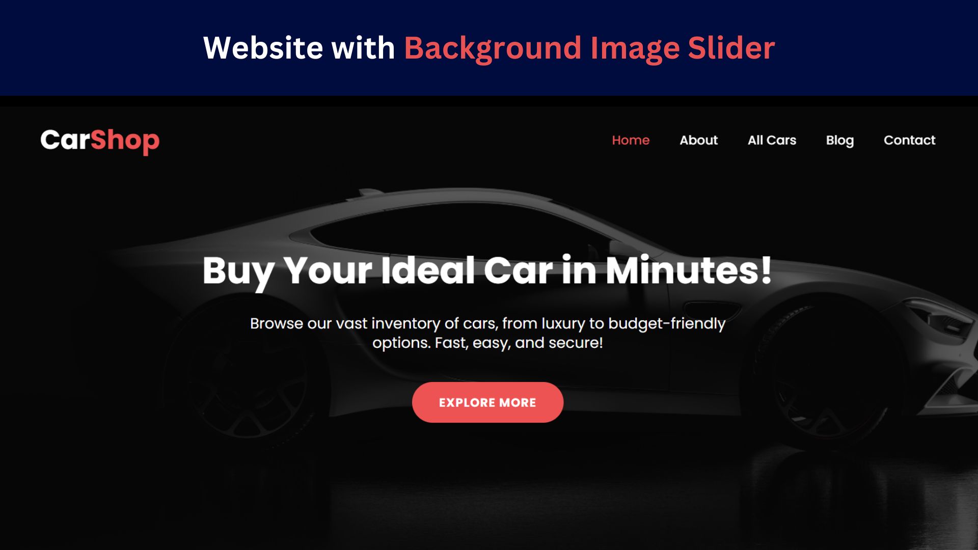
How to Design a Website with Background Image Slider
Learn how to create a stunning, responsive background image slider for your website using HTML, CSS, and JavaScript. Follow our

Responsive Website Homepage Design Using HTML and CSS
Learn how to create a responsive website homepage using HTML and CSS. This step-by-step guide covers mobile-friendly layouts, styling tips,