How to Create a Stunning Testimonial Section with HTML and CSS
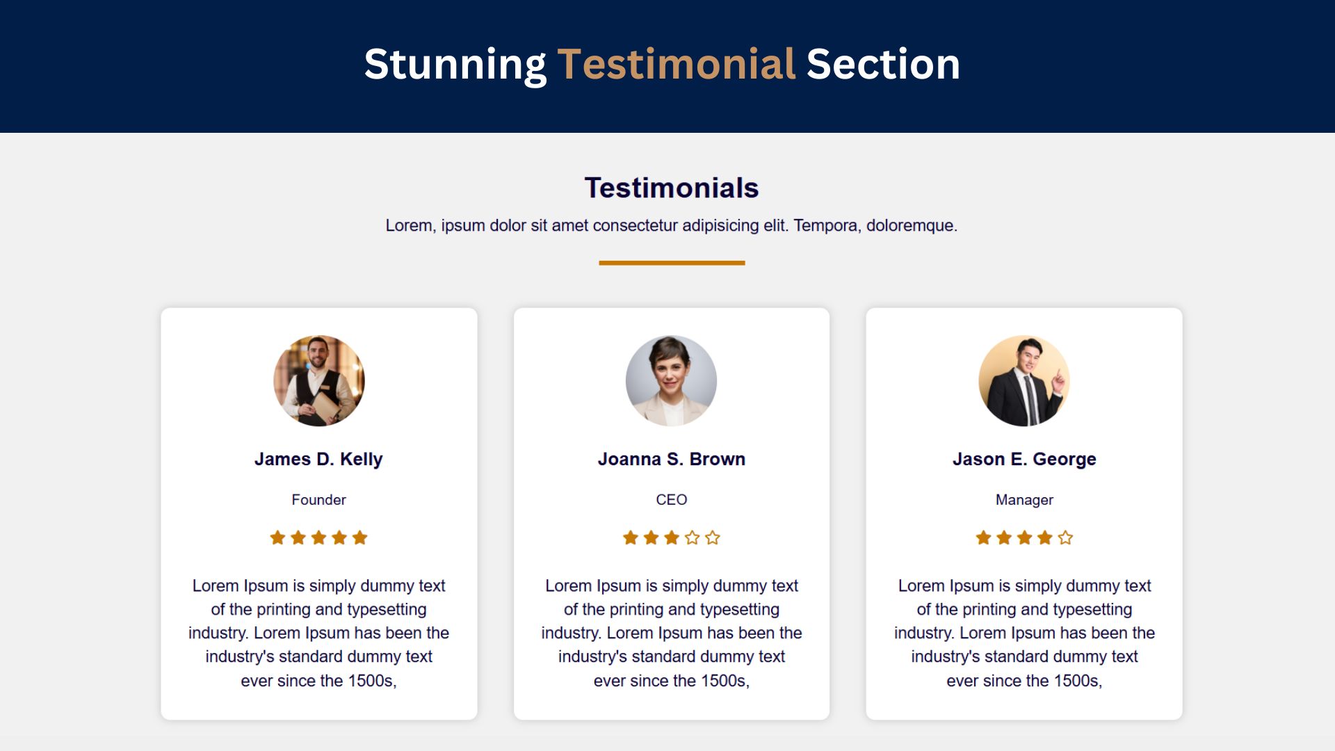
In today’s digital world, testimonials play a crucial role in building trust and showcasing the positive experiences of your users. A well-designed testimonial section can significantly enhance your website’s credibility and help convert visitors into customers. In this tutorial, we’ll guide you through creating a stunning testimonial section using HTML and CSS.
Why Testimonial Sections Matter
Testimonials validate your brand and are key for building trust with potential customers. A well-crafted testimonial section can:
- Enhance credibility: Real feedback from satisfied customers reassures new visitors.
- Boost user engagement: Stylish, animated, or interactive testimonial sections can captivate users.
- Improve conversion rates: Positive reviews increase the likelihood of conversions.
With HTML and CSS, you can create a simple yet professional testimonial section. Let’s dive into the steps!
Check Out Those Useful Articles
Steps to Create a Stunning Testimonial Section
To Create a Stunning Testimonial Section follow these steps:
- Create a Folder: Name this folder according to your preference. Inside this folder, you’ll need to set up the following files:
- Create an index.html File: This file should be named index with the .html extension.
- Create a style.css File: This file should be named style with the .css extension.
These files will form the basis of your Stunning Testimonial Section.
Setting Up Your HTML Structure
Now, open your code editor and set up a new HTML file, copy those HTML Codes and Paste those Codes on index.html file.
<!DOCTYPE html>
<html lang="en">
<head>
    <meta charset="UTF-8">
    <meta name="viewport" content="width=device-width, initial-scale=1.0">
    <title>Stunning Testimonial Section Design by AbdulDev</title>
    <!-- CSS Link -->
    <link rel="stylesheet" href="style.css">
    <!-- Font Awesome Link -->
    <link rel="stylesheet" href="https://use.fontawesome.com/releases/v5.5.0/css/all.css">
</head>
<body>
    <div class="testimonials">
        <div class="inner">
          <h1>Testimonials</h1>
          <p>Lorem, ipsum dolor sit amet consectetur adipisicing elit. Tempora, doloremque.</p>
          <div class="border"></div>

          <div class="row">
            <div class="col">
              <div class="testimonial">
                <img decoding="async" src="Images/Image-1.png" alt="Image 1">
                <div class="name"><h2>James D. Kelly</h2></div>
                <div class="position"><p>Founder</p></div>
                <div class="stars">
                  <i class="fas fa-star"></i>
                  <i class="fas fa-star"></i>
                  <i class="fas fa-star"></i>
                  <i class="fas fa-star"></i>
                  <i class="fas fa-star"></i>
                </div>

                <p>
                  Lorem Ipsum is simply dummy text of the printing and typesetting industry. Lorem Ipsum has been the industry's standard dummy text ever since the 1500s,
                </p>
              </div>
            </div>

            <div class="col">
              <div class="testimonial">
                <img decoding="async" src="Images/Image-2.png" alt="Image 2">
                <div class="name"><h2>Joanna S. Brown</h2></div>
                <div class="position"><p>CEO</p></div>
                <div class="stars">
                  <i class="fas fa-star"></i>
                  <i class="fas fa-star"></i>
                  <i class="fas fa-star"></i>
                  <i class="far fa-star"></i>
                  <i class="far fa-star"></i>
                </div>

                <p>
                  Lorem Ipsum is simply dummy text of the printing and typesetting industry. Lorem Ipsum has been the industry's standard dummy text ever since the 1500s,
                </p>
              </div>
            </div>

            <div class="col">
              <div class="testimonial">
                <img decoding="async" src="Images/Image-3.png" alt="Image 3">
                <div class="name"><h2>Jason E. George</h2></div>
                <div class="position"><p>Manager</p></div>
                <div class="stars">
                  <i class="fas fa-star"></i>
                  <i class="fas fa-star"></i>
                  <i class="fas fa-star"></i>
                  <i class="fas fa-star"></i>
                  <i class="far fa-star"></i>
                </div>

                <p>
                  Lorem Ipsum is simply dummy text of the printing and typesetting industry. Lorem Ipsum has been the industry's standard dummy text ever since the 1500s,
                </p>
              </div>
            </div>
          </div>
        </div>
      </div>
</body>
</html>
Styling the Testimonial Section with CSS
After that, copy those CSS Codes and Paste those Codes on style.css file.
					*{
  margin: 0;
  padding: 0;
  font-family: "montserrat",sans-serif;
  box-sizing: border-box;
}
.testimonials{
  min-height: 100vh;
  padding: 70px 0;
  background: #f1f1f1;
  color: #090033;
  text-align: center;
}
.inner{
  max-width: 1200px;
  margin: auto;
  overflow: hidden;
  padding: 0 20px;
}
.inner p{
  font-size: 18px;
  line-height: 26px;
  padding-top: 10px;
}
.border{
  width: 160px;
  height: 5px;
  background: #c67802;
  margin: 26px auto;
}

.row{
  display: flex;
  flex-wrap: wrap;
  justify-content: center;
}
.col{
  flex: 33.33%;
  max-width: 33.33%;
  padding: 20px;
  transition: 0.5s;
}
.col:hover{
  transform: translateY(-15px);
  cursor: pointer;
}
.testimonial{
  background: #fff;
  padding: 30px;
  border-radius: 10px;
  box-shadow: 0 0 10px #00000030;
}
.testimonial img{
  width: 100px;
  height: 100px;
  border-radius: 50%;
}
.name h2{
  font-size: 20px;
  font-weight: 600;
  margin: 20px 0 10px 0;
}
.position p{
  margin: 0 0 20px 0;
  font-size: 16px;
  font-weight: 500;

}
.stars{
  color: #c67802;
  margin-bottom: 20px;
}


@media screen and (max-width:960px) {
.col{
  flex: 100%;
  max-width: 95%;
}
}
Testing and Debugging Your Stunning Testimonial Section
After designing your testimonial section, it’s essential to test and debug to ensure it works seamlessly across all browsers and devices. Here are some tips for effective testing:
1. Cross-Browser Compatibility
Check how your testimonial section appears on popular browsers like Chrome, Firefox, Safari, and Edge. Different browsers may render certain CSS properties slightly differently, so make sure all visual elements and animations are consistent.
2. Responsive Testing
Test your design on various screen sizes, including desktops, tablets, and smartphones. You can use your browser’s developer tools (usually accessed with F12 or right-click > Inspect) to simulate different screen sizes. Adjust padding, margins, and font sizes if elements look too cramped or spread out on smaller screens.
3. Performance Optimization
Images are crucial for testimonials but can slow down page loading if not optimized. Use compressed, web-friendly images (like JPEG or WebP) for faster load times. CSS animations should also be minimal to avoid impacting page speed on mobile devices.
4. Check for Accessibility
Ensure that your testimonial section is accessible for all users:
- Alt Text: Add meaningful
alttext to customer images. - Text Contrast: Ensure sufficient contrast between text and background colors for readability.
- Keyboard Navigation: Check that users can tab through testimonial cards and access the content without a mouse.
5. Fix Common Bugs
Sometimes, elements may shift unexpectedly or overlap, especially with animations. Debug by:
- Checking for overflow issues: Ensure no content goes beyond the edges of cards or the section container.
- Using CSS DevTools: Inspect each element to locate and resolve padding, margin, or layout issues.
6. Validate Your Code
Use HTML and CSS validators (like the W3C Validator) to check for any syntax errors or invalid code. Clean code ensures better compatibility and performance.
Conclusion
By following this tutorial, you’ve learned how to create a stunning, responsive testimonial section using HTML and CSS. This simple yet effective section will add credibility and enhance user trust, helping you make a great impression on visitors. Experiment with additional styling, animations, and layouts to personalize your design further!
FAQs
What is the importance of a testimonial section on a website?
A testimonial section builds trust by showcasing real feedback from satisfied customers. It boosts credibility, encourages user engagement, and can increase conversion rates by assuring potential customers of your product or service quality.
How can I make my testimonial section responsive?
Use CSS Flexbox or Grid layout for responsiveness. Apply media queries to adjust layout and font sizes for different screen sizes, ensuring the testimonial section looks good on both mobile and desktop devices.
Can I add animations to my testimonial section?
Yes, you can use CSS animations to make your testimonial section more engaging. For example, you could add a fade-in effect on load or a hover effect on testimonial cards. Keep animations minimal to avoid impacting page load speed.
How do I optimize images for the testimonial section?
Compress images before adding them to your website to reduce load time. Use formats like JPEG or WebP for smaller file sizes, and set appropriate dimensions to avoid loading unnecessarily large images.
What is the best way to display multiple testimonials?
You can display multiple testimonials in a grid layout or use a slider or carousel to rotate through them. Using a slider is especially useful for saving space on the page while still showcasing multiple reviews.
How do I ensure accessibility in my testimonial section?
Use meaningful alt text for images, ensure a high contrast between text and background colors, and test keyboard navigation. This helps make your testimonial section accessible for users with disabilities.
Can I add customer ratings (stars) to my testimonial section?
Yes, you can add ratings using star icons from a library like Font Awesome. Use CSS to style the stars and add them as a rating element to each testimonial, reflecting customer feedback visually.
What are some common issues when designing testimonial sections?
Common issues include non-responsive layouts, text overflow, poor image quality, and inconsistent styling across different devices or browsers. Regular testing and debugging can help identify and fix these issues.
How do I test my testimonial section across different devices?
Use the developer tools in your browser to simulate various screen sizes and orientations. You can also test on actual mobile devices and different browsers to ensure consistent design and functionality.
Share on Social Media
Related Articles

Build a Fully Responsive Sidebar with Dropdown Menu – HTML, CSS & JS
Learn how to build a fully responsive sidebar with dropdown menus using HTML, CSS, and JavaScript. Step-by-step guide with code
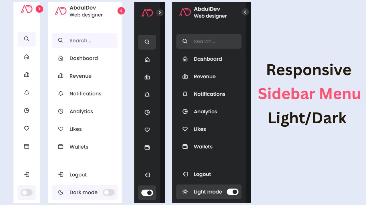
Responsive Sidebar Menu in HTML, CSS & JS | Light/Dark Mode
Learn how to create a modern responsive sidebar menu with a light and dark theme switcher using HTML, CSS, and
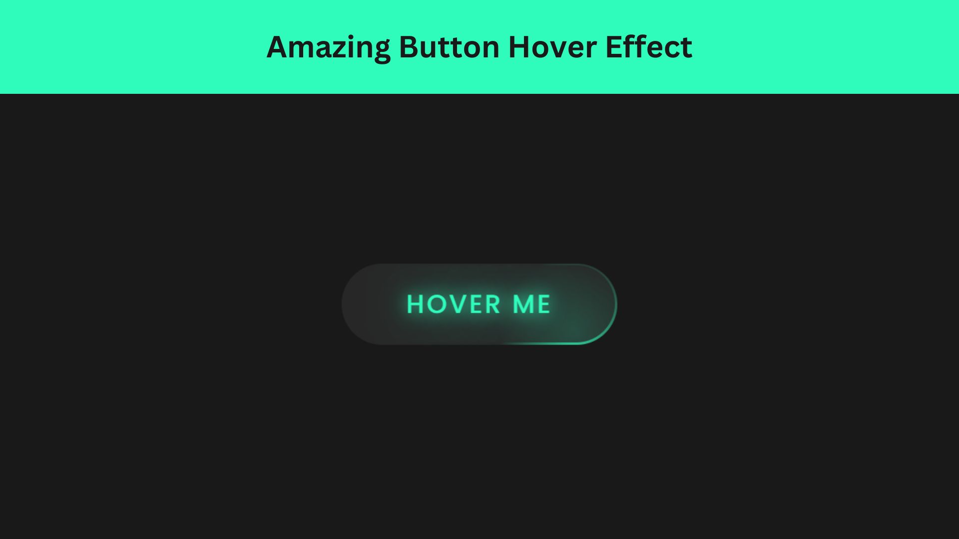
Amazing Button Hover Effect Using HTML, CSS, and JavaScript
Discover how to create amazing button hover effects using HTML, CSS, and JavaScript. Learn step-by-step with free source code to

