How to Create a 3D Flip Card Hover Effect Using HTML and CSS
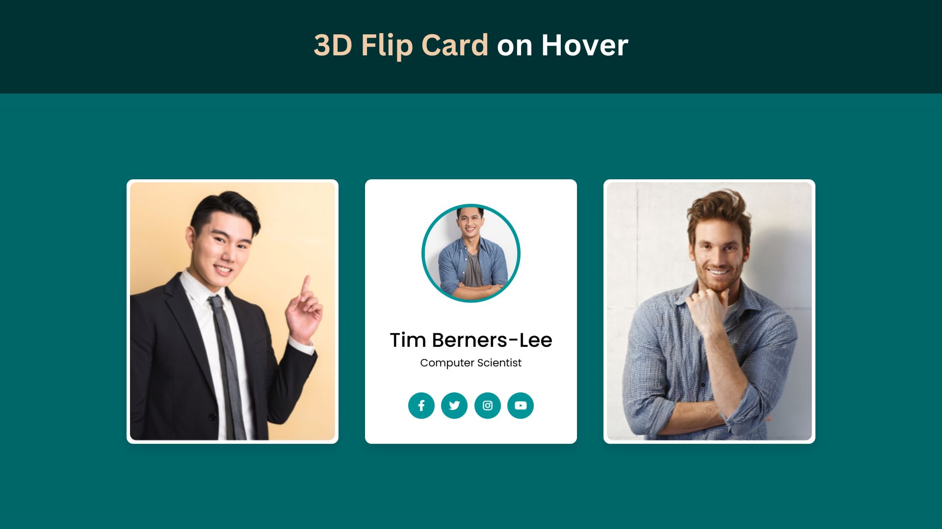
In web design, visual appeal and interactivity play crucial roles in engaging users. One captivating design element that can enhance any website is the 3D Flip Card. Using HTML and CSS, you can create an interactive card that flips when hovered over, offering a modern and dynamic touch to your web pages. This blog post will walk you through creating a 3D Flip Card from scratch, ensuring a smooth and aesthetically pleasing addition to your design toolkit.
Introduction to 3D Flip Cards
3D Flip Cards are web components that offer a fun and engaging way to display content by flipping to reveal additional information when hovered over. They consist of two sides: the front and the back. This technique is famous for portfolios, product showcases, and more due to its ability to present content concisely while maintaining user engagement. Unlike traditional flat designs, 3D Flip Cards add depth and intrigue, making them an excellent choice for any creative project.
Benefits of Using Flip Cards
3D Flip Cards offer a unique and interactive experience that encourages user engagement, leading to more extended site visits and increased retention. These cards efficiently manage space, allowing you to present more information in a compact, visually appealing format. You can showcase creativity and reinforce branding by utilizing custom styles and animations, making your website stand out. Additionally, flip cards add depth and intrigue, capturing user attention and enhancing the overall professionalism of your site. They are versatile tools suitable for portfolios, product showcases, and other creative projects, ensuring your content remains engaging and memorable.
Check Out Those Useful Articles
Steps to Create a 3D Flip Card Hover Effect
To Create a 3D Flip Card Hover Effect follow these steps:
- Create a Folder: Name this folder according to your preference. Inside this folder, you’ll need to set up the following files:
- Create an index.html File: This file should be named index with the .html extension.
- Create a style.css File: This file should be named style with the .css extension.
These files will form the basis of your3D Flip Card Hover Effect.
Create a 3D Flip Card Hover Effect
Now, open your code editor and set up a new HTML file, copy those HTML Codes and Paste those Codes on index.html file.
					<!DOCTYPE html>
<html lang="en">
<head>
    <meta charset="UTF-8">
    <meta name="viewport" content="width=device-width, initial-scale=1.0">
    <title>3D Flip Card on Hover by AbdulDev</title>
    <!-- Custom CSS Link -->
    <link rel="stylesheet" href="style.css">
    <!-- Font-Awesome Link -->
    <link rel="stylesheet" href="https://cdnjs.cloudflare.com/ajax/libs/font-awesome/5.15.3/css/all.min.css"/>
</head>
<body>
    <div class="main-container">
        <div class="wrapper">
           <div class="card front-face">
              <img decoding="async" src="Images/card-1.png" alt="card 1">
           </div>
           <div class="card back-face">
              <img decoding="async" src="Images/card-1.png" alt="card 1">
              <div class="info">
                 <div class="title">
                  Linus Torvalds
                 </div>
                 <p>Software Engineer</p>
              </div>
              <ul>
                 <a href="#"><i class="fab fa-facebook-f"></i></a>
                 <a href="#"><i class="fab fa-twitter"></i></a>
                 <a href="#"><i class="fab fa-instagram"></i></a>
                 <a href="#"><i class="fab fa-youtube"></i></a>
              </ul>
           </div>

        </div>
        <div class="wrapper">
          <div class="card front-face">
             <img decoding="async" src="Images/card-2.png" alt="card 2">
          </div>
          <div class="card back-face">
             <img decoding="async" src="Images/card-2.png" alt="card 2">
             <div class="info">
                <div class="title">
                  Tim Berners-Lee
                </div>
                <p>Computer Scientist</p>
             </div>
             <ul>
                <a href="#"><i class="fab fa-facebook-f"></i></a>
                <a href="#"><i class="fab fa-twitter"></i></a>
                <a href="#"><i class="fab fa-instagram"></i></a>
                <a href="#"><i class="fab fa-youtube"></i></a>
             </ul>
          </div>

       </div>
       <div class="wrapper">
          <div class="card front-face">
             <img decoding="async" src="Images/card-3.png" alt="card 3">
          </div>
          <div class="card back-face">
             <img decoding="async" src="Images/card-3.png" alt="card 3">
             <div class="info">
                <div class="title">
                  Steve Wozniak
                </div>
                <p>Electronics Engineer</p>
             </div>
             <ul>
                <a href="#"><i class="fab fa-facebook-f"></i></a>
                <a href="#"><i class="fab fa-twitter"></i></a>
                <a href="#"><i class="fab fa-instagram"></i></a>
                <a href="#"><i class="fab fa-youtube"></i></a>
             </ul>
          </div>

       </div>
      </div>
</body>
</html>
Styling the Card with CSS
After that, copy those CSS Codes and Paste those Codes on style.css file.
					@import url('https://fonts.googleapis.com/css?family=Poppins:400,500,600,700&display=swap');
*{
  margin: 0;
  padding: 0;
  box-sizing: border-box;
  font-family: 'Poppins', sans-serif;
}
body{

  background: #006769;
}
::selection{
  color: #fff;
  background: #006769;
}
.main-container{
    min-height: 100vh;
    width: 100%;
    display: flex;
    align-items: center;
    justify-content: center;
    flex-wrap: wrap;
    gap: 40px;
}
.wrapper{
  height: 400px;
  width: 320px;
  position: relative;
  transform-style: preserve-3d;
 perspective: 1000px;
}
.wrapper .card{
  position: absolute;
  height: 100%;
  width: 100%;
  padding: 5px;
  background: #fff;
  border-radius: 10px;
  transform: translateY(0deg);
  transform-style: preserve-3d;
  backface-visibility: hidden;
  box-shadow: 0px 10px 15px rgba(0,0,0,0.1);
  transition: transform 0.7s cubic-bezier(0.4,0.2,0.2,1);
}
.wrapper:hover > .front-face{
  transform: rotateY(-180deg);
}
.wrapper .card img{
  height: 100%;
  width: 100%;
  object-fit: cover;
  border-radius: 10px;
}
.wrapper .back-face{
  display: flex;
  align-items: center;
  justify-content: space-evenly;
  flex-direction: column;
  transform: rotateY(180deg);
}
.wrapper:hover > .back-face{
  transform: rotateY(0deg);
}
.wrapper .back-face img{
  height: 150px;
  width: 150px;
  padding: 5px;
  border-radius: 50%;
  background: #009699;
}
.wrapper .back-face .info{
  text-align: center;
}
.back-face .info .title{
  font-size: 30px;
  font-weight: 500;
}
.back-face ul{
  display: flex;
}
.back-face ul a{
  display: block;
  height: 40px;
  width: 40px;
  color: #fff;
  text-align: center;
  margin: 0 5px;
  line-height: 38px;
  border: 2px solid transparent;
  border-radius: 50%;
  background: #009699;
  transition: 0.5s;
}
.back-face ul a:hover{
  color: #009699;
  border-color: #009699;
  background: transparent;
}
@media screen and (max-width: 900px) {
    .main-container{
        padding: 70px 0;
    }
}
Enhancing the Card with Additional Features
Once you’ve mastered the essential 3D Flip Card, consider adding additional features to elevate its functionality and visual appeal. For example, you can incorporate CSS animations or transitions to the content inside the card, such as having text fade in or images slide into view. Adding subtle shadows or reflections can enhance the card’s realism, giving it a more polished 3D appearance. Experiment with various background colors, fonts, and media types to better align the flip card with your website’s overall design theme.
Consider adding interactive elements such as clickable buttons or links within the card to make it more functional. You could also implement advanced animations, like rotating the card along different axes or adding perspective distortions for a dramatic effect. Using CSS keyframes, you can create complex sequences of animations that trigger on hover, adding layers of interactivity.
To improve user experience on touchscreens, consider incorporating JavaScript to detect touch events and trigger the flip effect, as hover states may not work well on these devices. This ensures your 3D Flip Card is accessible to all users, regardless of their device.
Another feature to explore is responsive design. Ensure your flip card scales properly on different screen sizes and orientations. Use CSS media queries to adjust the dimensions, spacing, and content layout for mobile, tablet, and desktop views.
Finally, think about adding sound effects that play when the card flips, providing an additional sensory experience. This could further engage users and make interactions more memorable.
Testing and Debugging
After implementing the 3D Flip Card, testing it on various devices and browsers is essential to ensure a consistent user experience. Pay particular attention to how the card behaves on touchscreens since hover effects may not work seamlessly on these devices.
Utilize browser developer tools to inspect elements, identify issues, and fine-tune your CSS properties for optimal performance. Check for common problems such as flickering, misalignment, or unexpected behaviors, and adjust your code accordingly.
Additionally, test the flip card’s responsiveness by resizing the browser window and ensuring it scales correctly on different screen sizes. Revisit your CSS and HTML structure to debug any alignment or transition problems. For a comprehensive evaluation, consider using online tools and platforms that provide insights into how your design performs across various devices and browsers.
Regularly revisiting and refining your code based on feedback from these tests will help maintain a polished and functional 3D Flip Card and enhance the overall user experience.
Conclusion
Creating a 3D Flip Card using HTML and CSS can significantly boost your website’s interactivity and visual appeal. Combining these technologies allows you to craft a dynamic and engaging element that captures user attention and provides a memorable browsing experience. The step-by-step process outlined in this blog post equips you with the foundational skills to design a flip card, from setting up the HTML structure to styling it with CSS and adding interactive hover effects.
This technique is particularly effective for showcasing portfolios, product displays, or any content that benefits from a creative presentation. The flexibility of 3D Flip Cards allows for extensive customization, enabling you to align them perfectly with your website’s design and branding. Additionally, the tips for enhancing your card with advanced features like animations, responsive design, and touchscreen compatibility ensure that your flip card is visually appealing and functional across various devices.
As you continue experimenting and refining your flip card designs, you’ll discover more ways to utilize this powerful tool in your web projects. The key is to balance creativity and usability, ensuring that the 3D Flip Card adds value to your site without overwhelming users. With practice and experimentation, you can master this technique and elevate your web design skills.
FAQs
What is a 3D flip card effect in web design?
A 3D flip card effect is an interactive animation in which a card element “flips” on its axis when hovered over, revealing additional content on the backside. It adds a dynamic and engaging effect to the website and is often used to display extra information in a compact space.
What HTML structure is needed to create a 3D flip card?
To create a 3D flip card, you need a container div for the flip card and two inner divs: one for the front face and one for the back face. These inner divs will hold the content displayed on each side of the card.
How does the 3D flip effect work in CSS?
The 3D flip effect is achieved by setting transform: rotateY(180deg) on hover. With perspective on the container, transform-style: preserve-3d on the inner card, and backface-visibility: hidden on both sides, the card flips smoothly, revealing the back content.
Why must I use perspective for a 3D flip card?
The perspective property creates the 3D depth effect, allowing the card to appear like it’s flipping in 3D space. Without it, the flip effect would look flat and less engaging.
Can I add images and text to each side of the flip card?
Yes, you can add any type of content, such as images, text, icons, or buttons, to both the front and back faces of the card. Simply style and position them within each side as you would with regular HTML elements.
How can I change the flip direction of the card?
To change the flip direction, modify the rotateY property to rotateX or adjust it to a different degree. For instance, rotateX(180deg) will flip the card vertically instead of horizontally.
Is it possible to make the 3D flip card responsive?
Yes, you can make the 3D flip card responsive by using relative units like percentages, em, or rem for the card dimensions. Additionally, media queries can help adjust the card size and layout on different screen sizes.
What browsers support CSS 3D transformations?
Most modern browsers, including Chrome, Firefox, Safari, Edge, and Opera, support CSS 3D transformations. However, always check compatibility for older versions, as some may require prefixes or have limited support.
How can I adjust the flip speed of the card?
The flip speed can be adjusted by changing the transition duration on .flip-card-inner. For example, transition: transform 1s; will make the flip slower, while transition: transform 0.3s; will make it faster.
Can I add a shadow effect to enhance the 3D look?
Yes, adding box-shadow to each side of the card can enhance the 3D effect. Shadows make the card look more lifelike and can improve visual depth, especially on the front face of the card.
Share on Social Media
Related Articles

Build a Fully Responsive Sidebar with Dropdown Menu – HTML, CSS & JS
Learn how to build a fully responsive sidebar with dropdown menus using HTML, CSS, and JavaScript. Step-by-step guide with code
Responsive Sidebar Menu in HTML, CSS & JS | Light/Dark Mode
Learn how to create a modern responsive sidebar menu with a light and dark theme switcher using HTML, CSS, and
Amazing Button Hover Effect Using HTML, CSS, and JavaScript
Discover how to create amazing button hover effects using HTML, CSS, and JavaScript. Learn step-by-step with free source code to

