Circle Images Rotated Animation Using HTML and CSS
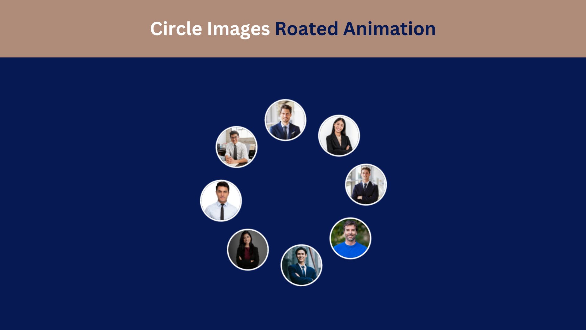
Creating engaging animations on a webpage enhances the user experience and captures visitor interest. One popular effect involves rotating images in a circular pattern, which provides a smooth and visually appealing animation. In this tutorial, we’ll explore how to create a Circle Images Rotated Animation using HTML and CSS, making it easy to add to any project.
Why Use Circle Images Rotated Animation?
This animation style is often used in galleries, portfolios, and hero sections to give a dynamic, modern touch. By rotating images in a circular layout, you create a unique design element that emphasizes the content. It’s lightweight, requires minimal coding, and can be customized to suit your design.
Check Out Those Useful Articles
Steps to Design a Circle Images Rotated Animation
To Design a Circle Images Rotated Animation follow these steps:
- Create a Folder: Name this folder according to your preference. Inside this folder, you’ll need to set up the following files:
- Create an index.html File: This file should be named index with the .html extension.
- Create a style.css File: This file should be named style with the .css extension.
These files will form the basis of your Images Rotated Animation.
Setting Up the Basic HTML Structure
Now, open your code editor and set up a new HTML file, copy those HTML Codes and Paste those Codes on index.html file.
					<!DOCTYPE html>
<html lang="en">
<head>
    <meta charset="UTF-8">
    <meta name="viewport" content="width=device-width, initial-scale=1.0">
    <title>Circle Images Roated Animation by AbdulDev</title>
    <!-- Custom CSS Link -->
     <link rel="stylesheet" href="style.css">
</head>
<body>
    <div class="container">
        <div class="box">
            <div class="img">
                <div class="imgBx" style="--i:1;">
                    <img decoding="async" src="images/img-1.png" alt="img 1">
                </div>
                <div class="imgBx" style="--i:2;">
                    <img decoding="async" src="images/img-2.png" alt="img 2">
                </div>
                <div class="imgBx" style="--i:3;">
                    <img decoding="async" src="images/img-3.png" alt="img 3">
                </div>
                <div class="imgBx" style="--i:4;">
                    <img decoding="async" src="images/img-4.png" alt="img 4">
                </div>
                <div class="imgBx" style="--i:5;">
                    <img decoding="async" src="images/img-5.png" alt="img 5">
                </div>
                <div class="imgBx" style="--i:6;">
                    <img decoding="async" src="images/img-6.png" alt="img 6">
                </div>
                <div class="imgBx" style="--i:7;">
                    <img decoding="async" src="images/img-7.png" alt="img 7">
                </div>
                <div class="imgBx" style="--i:8;">
                    <img decoding="async" src="images/img-8.png" alt="img 8">
                </div>
            </div>
        </div>
    </div>
</body>
</html>
Styling the Circle Images Rotated Animation with CSS
After that, copy those CSS Codes and Paste those Codes on style.css file.
					*{
    margin: 0;
    padding: 0;
    box-sizing: border-box;
}
body{
    min-height: 100vh;
    display: flex;
    align-items: center;
    justify-content: center;
    background: #071952;
    overflow: hidden;
}
.box{
    position: relative;
    width: 300px;
    height: 300px;
    animation: animate 15s linear infinite;
}
@keyframes animate {
    0%{
        rotate: 0deg;
    }
    100%{
        rotate: 360deg;
    }
}
.container:hover .box{
    animation-play-state: paused;
}
.box .img{
    position: relative;
    left: -50%;
    width: 100%;
    height: 100%;
    display: flex;
    align-items: center;
    justify-content: center;
    cursor: pointer;
}
.box .img .imgBx{
position: absolute;
width: 80px;
height: 80px;
border-radius: 50%;
box-shadow: 0 0 0 3px #ffffff;
transform: rotate(calc(360deg/8 * var(--i)));
transform-origin: 190px;
}
.box .img .imgBx img{
    position: absolute;
    top: 0;
    left: 0;
    width: 100%;
    height: 100%;
    object-fit: cover;
    border-radius: 50%;
    transform: rotate(calc(-360deg/8 * var(--i)));
    animation: animateImgBx 15s linear infinite;
}
@keyframes animateImgBx {
    0%{
        rotate: 0deg;
    }
    100%{
        rotate: -360deg;
    }
}
.container:hover .box .img .imgBx img{
    animation-play-state: paused;
}
Customization Tips
- Speed: Adjust the
15sin theanimationproperty to make the rotation faster or slower. - Image Size: Adjust
widthandheightof the images for larger or smaller images. - Number of Images: You can add more images by simply adding more
imgtags in the HTML. For additional images, update CSS positions accordingly.
Conclusion
The Circle Images Rotated Animation is a fantastic way to add a visually captivating element to your webpage. With just a few lines of HTML and CSS, you can create an animation that looks complex yet is simple to implement and lightweight for performance.
Experiment with different images, hover effects, and rotation speeds to make the effect your own. This animation style is a great way to elevate your website design and engage users with interactive visuals.
FAQs
What is Circle Images Rotated Animation?
Circle Images Rotated Animation is a visual effect where images are positioned in a circular layout and continuously rotate around a central point. This effect adds a dynamic, modern touch to a website and can be used for galleries, portfolios, or hero sections.
Do I need JavaScript to create this animation?
No, you don’t need JavaScript for this basic animation. HTML and CSS alone can create the rotating circle effect. CSS animations handle the continuous rotation, while CSS positioning places images in a circular layout.
How can I control the speed of rotation?
You can control the speed by adjusting the duration in the animation property. For example, animation: rotate 10s linear infinite; sets a 10-second rotation cycle. Increase the duration for a slower rotation or decrease it for a faster effect.
Can I add more than four images to the circle?
Yes, you can add as many images as you like. However, you’ll need to adjust the CSS to position additional images evenly around the circle. This typically involves using additional CSS nth-child selectors for each new image.
How do I make the images circular?
To make images appear circular, use border-radius: 50%; on the image elements in CSS. This will create a circle shape as long as the width and height of each image are equal.
Can I apply this effect to text or other elements instead of images?
Yes, you can apply the rotating effect to any HTML element, including text, icons, or buttons. Simply replace the <img> tags with the elements you want, and adjust the CSS styling as needed.
How can I stop the rotation when users hover over the images?
To stop the rotation on hover, you can add a CSS :hover effect on the .circle class to pause the animation. For example:
.circle:hover {
animation-play-state: paused;
}
Is this animation responsive for all screen sizes?
The animation can be made responsive by using relative units (like percentages) for sizing instead of fixed pixels. CSS Flexbox can help center the circle on all screen sizes, and @media queries can further adjust the layout for smaller screens.
Can I change the direction of the rotation?
Yes, you can reverse the rotation direction by changing rotate(360deg) to rotate(-360deg) in the @keyframes animation. This will make the images rotate counterclockwise.
Share on Social Media
Related Articles

Build a Fully Responsive Sidebar with Dropdown Menu – HTML, CSS & JS
Learn how to build a fully responsive sidebar with dropdown menus using HTML, CSS, and JavaScript. Step-by-step guide with code
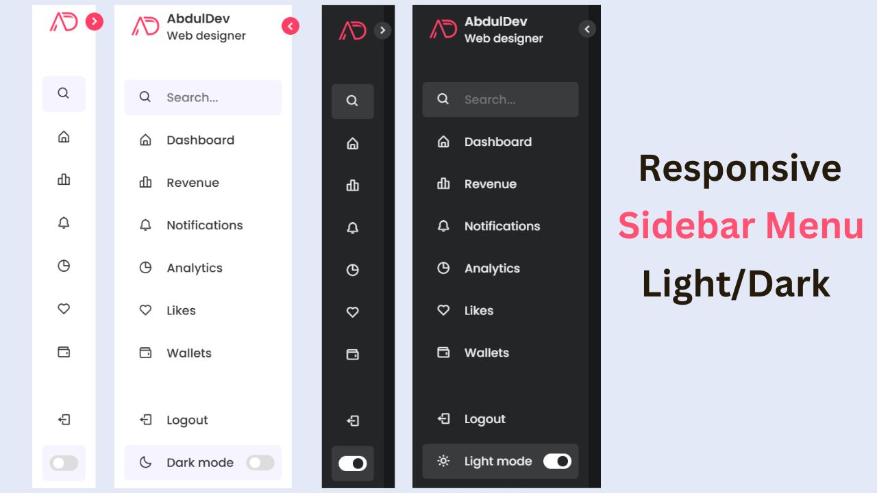
Responsive Sidebar Menu in HTML, CSS & JS | Light/Dark Mode
Learn how to create a modern responsive sidebar menu with a light and dark theme switcher using HTML, CSS, and
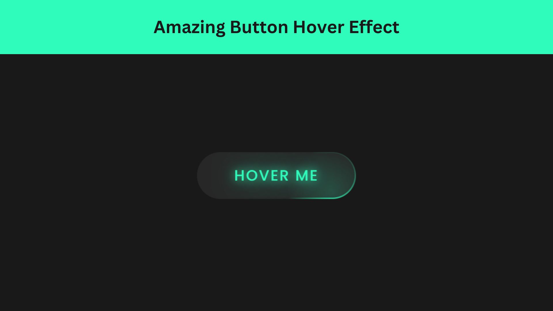
Amazing Button Hover Effect Using HTML, CSS, and JavaScript
Discover how to create amazing button hover effects using HTML, CSS, and JavaScript. Learn step-by-step with free source code to

